Download as PDF, PPTX


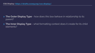


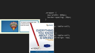


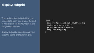


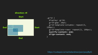

![.Prose {
display: grid;
grid-template-columns:
[full-start] minmax(1em, 1fr)
[main-start] minmax(0, 40em) [main-end]
minmax(1em, 1fr) [full-end];
}
.Prose > * {
grid-column: main;
}
.Prose-splash {
grid-column: full;
}
Just do this!
Magic occurs.](https://image.slidesharecdn.com/cssdaynl2017-170616051326/85/What-I-discovered-about-layout-vis-CSS-Grid-57-320.jpg)
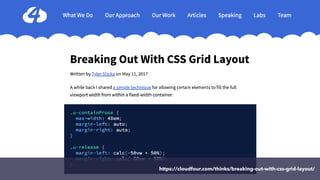

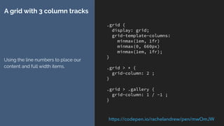
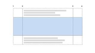
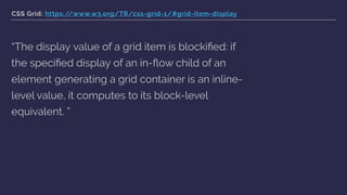
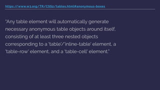
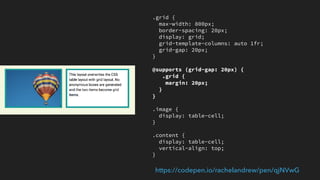
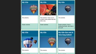
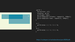
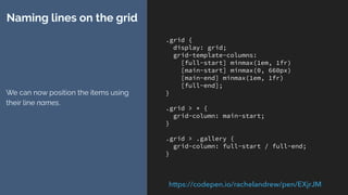
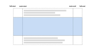
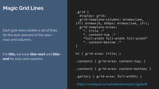
![.grid {
display: grid;
grid-template-columns:
[full-start] minmax(1em, 1fr)
[main-start] minmax(0, 660px)
[main-end] minmax(1em, 1fr)
[full-end];
}
.grid > * {
grid-column: main-start;
}
.grid > .gallery {
grid-column: full-start / full-end;
}
Naming lines on the grid
We can now position the items using
their line names.
https://codepen.io/rachelandrew/pen/EXjrJM](https://image.slidesharecdn.com/cssdaynl2017-170616051326/85/What-I-discovered-about-layout-vis-CSS-Grid-64-320.jpg)

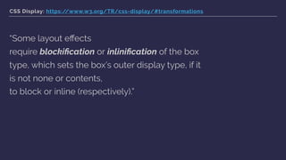
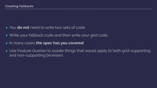
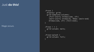
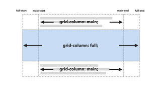
![.grid {
display: grid;
max-width: 960px;
margin: 0 auto;
grid-template-columns: [full-start]
minmax(1em, 1fr)
[main-start] minmax(0, 660px) [main-end]
minmax(1em, 1fr) [full-end];
}
.grid > * {
grid-column: main;
}
.grid > .gallery {
grid-column: full;
}
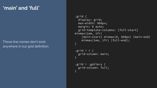
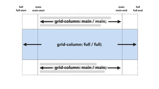
‘main’ and ‘full’
These line names don’t exist
anywhere in our grid definition.](https://image.slidesharecdn.com/cssdaynl2017-170616051326/85/What-I-discovered-about-layout-vis-CSS-Grid-68-320.jpg)
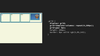
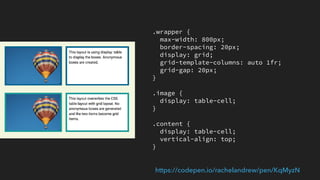
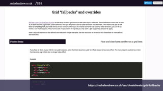
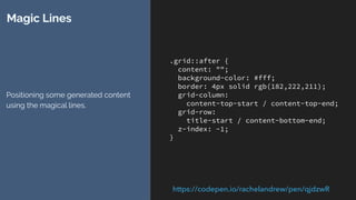
![.grid {
display: grid;
grid-gap: 20px;
grid-template-columns:
100px [main-start]
100px 100px 100px [main-end]
100px 100px;
grid-template-rows:
100px [main-start]
100px 100px [main-end] 100px;
}
.item {
grid-area: main;
}
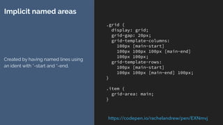
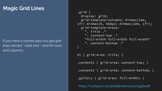
Implicit named areas
Created by having named lines using
an ident with *-start and *-end.
https://codepen.io/rachelandrew/pen/EXNmvj](https://image.slidesharecdn.com/cssdaynl2017-170616051326/85/What-I-discovered-about-layout-vis-CSS-Grid-71-320.jpg)
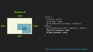
![.grid {
display: grid;
grid-template-columns: [full-start]
minmax(1em, 1fr)
[main-start] minmax(0, 660px) [main-
end]
minmax(1em, 1fr) [full-end];
grid-template-rows: auto auto [full-
start] auto [full-end];
}
.grid > * {
grid-column: main-start;
}
.grid > .gallery {
grid-area: full;
}
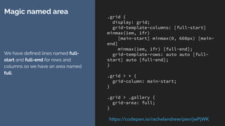
Magic named area
We have defined lines named full-
start and full-end for rows and
columns so we have an area named
full.
https://codepen.io/rachelandrew/pen/jwPjWK](https://image.slidesharecdn.com/cssdaynl2017-170616051326/85/What-I-discovered-about-layout-vis-CSS-Grid-72-320.jpg)
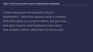
![https://www.w3.org/TR/css-grid-1/#placement-shorthands
“[when using grid-row and grid-column
shorthands] … When the second value is omitted,
if the first value is a <custom-ident>, the grid-row-
end/grid-column-end longhand is also set to
that <custom-ident>; otherwise, it is set to auto.”](https://image.slidesharecdn.com/cssdaynl2017-170616051326/85/What-I-discovered-about-layout-vis-CSS-Grid-75-320.jpg)

![.grid {
display: grid;
max-width: 960px;
margin: 0 auto;
grid-template-columns: [full-start]
minmax(1em, 1fr)
[main-start] minmax(0, 660px) [main-end]
minmax(1em, 1fr) [full-end];
}
.grid > * {
grid-column: main;
}
.grid > .gallery {
grid-column: full;
}
Targeting the column track
The line name ‘main’ is created from
the named area created by our
named lines.
https://codepen.io/rachelandrew/pen/owXKMd](https://image.slidesharecdn.com/cssdaynl2017-170616051326/85/What-I-discovered-about-layout-vis-CSS-Grid-78-320.jpg)
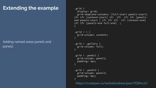
![.grid {
display: grid;
grid-template-columns: [full-start panel1-start]
1fr 1fr [content-start] 1fr 1fr 1fr 1fr [panel1-
end panel2-start ] 1fr 1fr 1fr 1fr [content-end]
1fr 1fr [panel2-end full-end] ;
}
.grid > * {
grid-column: content;
}
.grid > .gallery {
grid-column: full;
}
.grid > .panel1 {
grid-column: panel1;
padding: 4px;
}
.grid > .panel2 {
grid-column: panel2;
padding: 4px;
}
Extending the example
Adding named areas panel1 and
panel2.
https://codepen.io/rachelandrew/pen/YQXmJJ/](https://image.slidesharecdn.com/cssdaynl2017-170616051326/85/What-I-discovered-about-layout-vis-CSS-Grid-80-320.jpg)


![.grid {
display: grid;
grid-gap: 10px;
grid-template-columns: 100px [main-start]
100px 100px [main-end];
}
.a {
grid-column: 1 / 3;
grid-row: 1;
}
.b {
grid-column: 3;
grid-row: 1 / 3;
}
.c {
grid-column: 1;
}
.d {
grid-column: 2;
grid-row: 2;
}
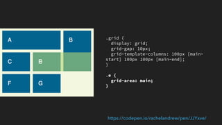
https://codepen.io/rachelandrew/pen/JJYxve/](https://image.slidesharecdn.com/cssdaynl2017-170616051326/85/What-I-discovered-about-layout-vis-CSS-Grid-87-320.jpg)
![.grid {
display: grid;
grid-gap: 10px;
grid-template-columns: 100px [main-
start] 100px 100px [main-end];
}
.e {
grid-area: main;
}
https://codepen.io/rachelandrew/pen/JJYxve/](https://image.slidesharecdn.com/cssdaynl2017-170616051326/85/What-I-discovered-about-layout-vis-CSS-Grid-88-320.jpg)
![.grid {
display: grid;
grid-gap: 10px;
grid-template-columns: 100px [main-
start] 100px 100px [main-end];
}
.e {
grid-area: auto/ main;
}
https://codepen.io/rachelandrew/pen/JJYxve/](https://image.slidesharecdn.com/cssdaynl2017-170616051326/85/What-I-discovered-about-layout-vis-CSS-Grid-89-320.jpg)


The document summarizes key concepts the author learned about CSS Grid layout. Some key points include: - CSS Grid handles box alignment and positioning in a logical way based on writing direction rather than physical positioning. - The display property controls how elements generate boxes and formatting contexts for child elements. Grid items are always blockified. - Features like subgrid, display: contents, and logical properties give more control over layout. - Understanding how CSS Grid handles boxes and positioning provides tools to build flexible and accessible layouts.