This document summarizes key details about the magazine "Top of Pops":
- It focuses on pop music and has been published monthly since 1995 by BBC Magazines.
- The current editor is Peter Hart and it costs £2.99 in stores and online.
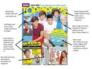
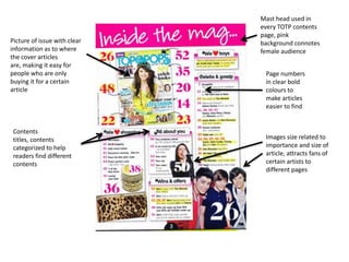
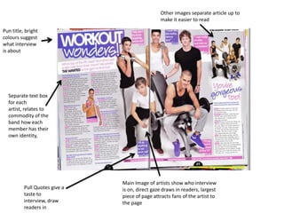
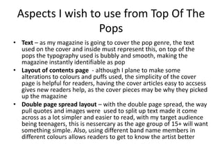
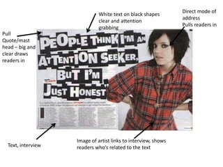
- The summary highlights aspects of its layout that effectively draw in readers, such as bright colors, bold titles, and placing cover article information prominently.
- Pull quotes and splitting text into boxes makes articles easier to read, as does relating images and text to specific band members.
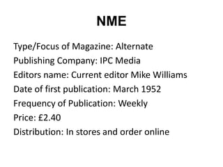
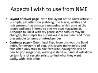
The document also summarizes the magazine "NME":
- It is an alternative music magazine published weekly since 1952 by IPC Media.