Textual analysis - Genre 
Charlie O’Sullivan
The task 
 With magazines, there is different genres, and for each genre, there is 
often different conventions. I will be comparing each of the genres, and 
how they use different conventions to show what genre they are.
The music magazine 
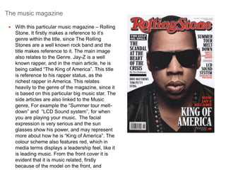
 With this particular music magazine – Rolling 
Stone. It firstly makes a reference to it’s 
genre within the title, since The Rolling 
Stones are a well known rock band and the 
title makes reference to it. The main image 
also relates to the Genre. Jay-Z is a well 
known rapper, and in the main article, he is 
being called “The King of America”. This title 
is reference to his rapper status, as the 
richest rapper in America. This relates 
heavily to the genre of the magazine, since it 
is based on this particular big music star. The 
side articles are also linked to the Music 
genre, For example the “Summer tour melt-down” 
and “LCD Sound system”, for when 
you are playing your music. The facial 
expression is very serious and the sun 
glasses show his power, and may represent 
more about how he is “King of America”. The 
colour scheme also features red, which in 
media terms displays a leadership feel, like it 
is leading music. From the front cover it is 
evident that it is music related, firstly 
because of the model on the front, and
Glamour magazine 
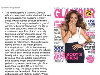
 The next magazine is Glamour. Glamour 
refers to beauty and health, which will link well 
to the magazine. The magazine is mainly 
aimed towards women because of the title. 
The name of the magazine is often a goal of 
women, to become “Glamorous” The title is 
also in the colour pink, which will signify 
romance and love. Plus pink is commonly 
known as a woman’s favourite colour. The 
model for the cover is Jennifer Lopez, Who 
appears as a successful woman who also 
appears as “Glamorous”. The model is also 
looking directly at the reader, possibly 
indicating that you could be the same way. 
Also, she is smiling, which means she is happy 
with her life style. The side articles also relate 
heavily to the magazine since they are related 
to women. The side articles feature things 
such as losing weight and achieving your 
perfect body. Also at the bottom right of the 
page, there is a 25% Off for a common 
women’s shop. The colour scheme heavily 
represents white and pink. Pink for women 
and romance, and white for modern, Which
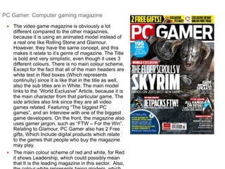
PC Gamer: Computer gaming magazine 
 The video game magazine is obviously a lot 
different compared to the other magazines, 
because it is using an animated model instead of 
a real one like Rolling Stone and Glamour. 
However, they have the same concept, and this 
makes it relate to it’s genre of magazine. The Title 
is bold and very simplistic, even though it uses 3 
different colours. There is no main colour scheme, 
Except for the fact that all of the main headers are 
white text in Red boxes (Which represents 
continuity) since it is like that in the title as well, 
also the sub titles are in White. The main model 
links to the “World Exclusive” Article, because it is 
the main character from that particular game. The 
side articles also link since they are all video 
games related. Featuring “The biggest PC 
games”, and an Interview with one of the biggest 
game developers. On the front, the magazine also 
uses gamer jargon, such as “FTW – For the Win”. 
Relating to Glamour, PC Gamer also has 2 Free 
gifts, Which Include digital products which relate 
to the games that people who buy the magazine 
may play. 
 The main colour scheme of red and white, for Red 
it shows Leadership, which could possibly mean 
that It is the leading magazine in this sector. Also, 
the colour white represents being modern, which
Comparison 
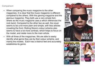
 When comparing the music magazine to the other 
magazines, It is clear that the music magazine is different 
compared to the others. With the gaming magazine and the 
glamour magazine, They both use a very simple font, 
where as the music magazine uses a which references the 
rock band. Compared to the other two as well, the cover 
seems to be a lot more plain and simple, with less articles 
crowding the front. Rolling Stone’s colour scheme also 
seems to have a lot more contrast, which helps to focus on 
the model, and relate more to the main article. 
 With all three of the magazines, We are able to easily 
identify what genre they are by their colour scheme, and 
mainly the models. Each has a distinct feel and accurately 
establishes its genre.

Textual analysis genre

  • 1.
    Textual analysis -Genre Charlie O’Sullivan
  • 2.
    The task With magazines, there is different genres, and for each genre, there is often different conventions. I will be comparing each of the genres, and how they use different conventions to show what genre they are.
  • 3.
    The music magazine  With this particular music magazine – Rolling Stone. It firstly makes a reference to it’s genre within the title, since The Rolling Stones are a well known rock band and the title makes reference to it. The main image also relates to the Genre. Jay-Z is a well known rapper, and in the main article, he is being called “The King of America”. This title is reference to his rapper status, as the richest rapper in America. This relates heavily to the genre of the magazine, since it is based on this particular big music star. The side articles are also linked to the Music genre, For example the “Summer tour melt-down” and “LCD Sound system”, for when you are playing your music. The facial expression is very serious and the sun glasses show his power, and may represent more about how he is “King of America”. The colour scheme also features red, which in media terms displays a leadership feel, like it is leading music. From the front cover it is evident that it is music related, firstly because of the model on the front, and
  • 4.
    Glamour magazine The next magazine is Glamour. Glamour refers to beauty and health, which will link well to the magazine. The magazine is mainly aimed towards women because of the title. The name of the magazine is often a goal of women, to become “Glamorous” The title is also in the colour pink, which will signify romance and love. Plus pink is commonly known as a woman’s favourite colour. The model for the cover is Jennifer Lopez, Who appears as a successful woman who also appears as “Glamorous”. The model is also looking directly at the reader, possibly indicating that you could be the same way. Also, she is smiling, which means she is happy with her life style. The side articles also relate heavily to the magazine since they are related to women. The side articles feature things such as losing weight and achieving your perfect body. Also at the bottom right of the page, there is a 25% Off for a common women’s shop. The colour scheme heavily represents white and pink. Pink for women and romance, and white for modern, Which
  • 5.
    PC Gamer: Computergaming magazine  The video game magazine is obviously a lot different compared to the other magazines, because it is using an animated model instead of a real one like Rolling Stone and Glamour. However, they have the same concept, and this makes it relate to it’s genre of magazine. The Title is bold and very simplistic, even though it uses 3 different colours. There is no main colour scheme, Except for the fact that all of the main headers are white text in Red boxes (Which represents continuity) since it is like that in the title as well, also the sub titles are in White. The main model links to the “World Exclusive” Article, because it is the main character from that particular game. The side articles also link since they are all video games related. Featuring “The biggest PC games”, and an Interview with one of the biggest game developers. On the front, the magazine also uses gamer jargon, such as “FTW – For the Win”. Relating to Glamour, PC Gamer also has 2 Free gifts, Which Include digital products which relate to the games that people who buy the magazine may play.  The main colour scheme of red and white, for Red it shows Leadership, which could possibly mean that It is the leading magazine in this sector. Also, the colour white represents being modern, which
  • 6.
    Comparison  Whencomparing the music magazine to the other magazines, It is clear that the music magazine is different compared to the others. With the gaming magazine and the glamour magazine, They both use a very simple font, where as the music magazine uses a which references the rock band. Compared to the other two as well, the cover seems to be a lot more plain and simple, with less articles crowding the front. Rolling Stone’s colour scheme also seems to have a lot more contrast, which helps to focus on the model, and relate more to the main article.  With all three of the magazines, We are able to easily identify what genre they are by their colour scheme, and mainly the models. Each has a distinct feel and accurately establishes its genre.