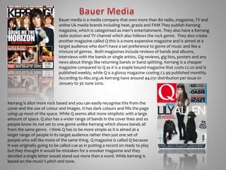
Originated from Rock and Roll in the 1960’s, has many sub genres like pop-rock, Heavy metal and Christian-rock.Electric guitars, drums, bass guitars and vocalist.Loud!  About RockInstrumentals generally guitarsHeavy beats and sometimes screams  or shoutingSometimes include classical influences and instruments like cello, piano and violins.Fashion is Leather, rips, metals like chains, skulls, bats, inspiration from historical or other cultures. (military coats or Celtic designs)Mixture of colours mostly dark like browns, blacks, greys but also include red, yellow and blue.
Media in this genreThere is allot of media surrounding the rock genre including magazines, websites and television channels.  The magazines include NME by  IPC media, Kerrang by Bauer music and Metal Hammer  by Future publishing. They are all aimed at the rock genre , although Metal hammer is aimed more at the heavy metal rather then the entire genre.  Kerrang seems to be aimed at the Teenagers to young adults as it is affordable and doesn't have a massive amount of gore compared to the Metal hammer magazine which is allot more expensive and has a lot of gore on the front page.There is also allot of websites for the bands to allow fans to find out about new albums and tours directly from the band them selves, these websites also have things like gallery's and  music videos. Sometimes it also offers the fans a chance to ask the band questions. This keeps fans interested in the bands while there not releasing new albums or music.There is also a RockworldTv channel from sky which shows  music videos of the latest music as well as filmed gigs and interviews with bands. They also have a website to give the listings for the channel and any latest news about the channel and its contents.  These are all targeted at teenagers to  young adults who  enjoy listening to rock music.
Bauer MediaBauer media is a media company that own more than 80 radio, magazine, TV and online Uk media brands including heat, grazia and FHM They publish Kerrang magazine, which is categorised as men’s entertainment. They also have a Kerrang radio station and TV channel which also follows the rock genre.  They also create another magazine called Q this is a more expensive magazine and is aimed at a target audience who don't have a set preference to genre of music and like a mixture of genres.  Both magazines include reviews of bands and albums, interviews with the bands or single artists, Gig reviews, gig lists, posters and any news about things like returning bands or band splitting. Kerrang is a cheaper magazine compared to Q as it is a staple bound magazine that costs £2.20 and is published weekly, while Q is a glossy magazine costing £3.99 published monthly. According to Abc.org.uk Kerranghave around 44,031 distribution per issue 01 January to 30 June 2010. Kerrang is allot more rock based and you can easily recognise this from the cover and the use of colour and images. It has dark colours and fills the page using up most of the space. While Q seems allot more simplistic with a large amount of space. Q also has a wider range of bands in the cover lines and so people know its not set to one genre unlike Kerrang which shows bands all from the same genre.  I think Q has to be more simple as it is aimed at a larger range of people in its target audience rather then just one set of people who will like more of the same thing. Q magazine is called Q because It was originally going to be called cue as in putting a record on ready to play but they thought it would be mistaken for a snooker magazine and they decided a single letter would stand out more then a word. While kerrang is based on the music's pitch and tone.
Masthead behind the person in the picture but in front of the back groundSub headings on the bannerPhotos of other bands down the side with a yellow borderMast head is always the same colours black and white large and has looks like cracked glass emphasis strong/tough. Loud enough to shatter glass.Main cover line is a different type font to the other coverlines, to make it stand out.All the colours are taken from the cover photo to make it stand out and fit together. Photos have a border round them.  To make them stand out from the cover photo.Colours- Red, Black, Yellow, White, Green.The main cover line also has a slight transparent black background to allow the white to stand out from the photo with out getting lost in it. Low angle, mid shot even though he is on his knees for the cover photo of him playing a Electric guitar. Like the audience looking up at him on stage. Not looking at the camera. The person is more centre, but very slightly to the right. Little bit of backgorund broken up by the yellow light fading across the photo.Barcode for price and edition dateand/or number
Masthead behind the person in the picture but in front of the back groundBanner along the top with some images about the what’s in side.Masthead doesn't have usual black background but is still recognisable.Main coverline is large and has a textured effect to the font, same sort of style as the band would want it, looks like warn out material.Colours are black, white, blue, yellow and green. These all go together  and stand out in the bold letters from the rather dull black/grey cover photo.Photos in boxes and coverlines beneath them to link them together. The box has a torn paper effect to them to make it look more like a added note and adds to the rock style of rips.Puff /plug to emphasis added extras.Coverlines in boxes to stand out from background and draw attention to them.Low angle mid shot, playing a guitar.  Like an audience at a show. Band at the top of there game.  Not looking at the camera. Person is slightly to the left. Lots of background.Barcode tells price and date/edition
Masthead behind the main person but in front of the two behind him.Big clear writing along the top banner to stand out and draw the reader in.The colours are black, white and red. Stand out but are all colours from the cover photo. Fills up the entire page with the men's bodies and faces. Looking at the camera.Cover photo is a mid shot of three people, but they are very high up along the top line of sight. All eyes of the people are along the same line/ at the same height. Main heading is clear and bold with no textures to contrast with the photos at the bottom which look rather hectic. Makes it stand out.Photo cut out to contrast with the other two photos, to show there separate articles. Looks like rough paint strokes across the page as the text background to add the effect of rough unfinished/ quick work.Barcode to tell price and edition number and date.All the photos at the bottom are layered slightly to look like a stack of photos. They have a small white border to make them stand out from the cover photos. They also have coverlines to explain the photos. Red banner along the bottom to stand out and add colour to the rest of the black and white.
Masthead behind the person in the picture but in front of the back groundPuff/pug line to stand out and is in graffiti style paint look to appeal to target audience of teenagers.Banner across the top with a photo explained with a coverline.Cover photo is a mid shot of the entire band.  All different angles and different heights and all different lengths away from camera emphasis’s there differences while showing there together. His red hair and the jackets stand out as it fits in with theme colours . Clothes style emphasis's bands look as being bright and confident. Not much background. They are all looking at the camera.Main heading is My Chemical Romance logo, Bright Red and yellow stand out and match the lightening bolt, which looks like old warn leather. The covers colours go with the logo and cover photo, they are red, yellow, black and white.Banner along the bottom with over coverlines.Torn style across the bottom page to stand out from the background and allow the pictures and text to be seen.Barcode with price and edition or date.

Research

  • 1.
    Originated from Rockand Roll in the 1960’s, has many sub genres like pop-rock, Heavy metal and Christian-rock.Electric guitars, drums, bass guitars and vocalist.Loud! About RockInstrumentals generally guitarsHeavy beats and sometimes screams or shoutingSometimes include classical influences and instruments like cello, piano and violins.Fashion is Leather, rips, metals like chains, skulls, bats, inspiration from historical or other cultures. (military coats or Celtic designs)Mixture of colours mostly dark like browns, blacks, greys but also include red, yellow and blue.
  • 2.
    Media in thisgenreThere is allot of media surrounding the rock genre including magazines, websites and television channels. The magazines include NME by IPC media, Kerrang by Bauer music and Metal Hammer by Future publishing. They are all aimed at the rock genre , although Metal hammer is aimed more at the heavy metal rather then the entire genre. Kerrang seems to be aimed at the Teenagers to young adults as it is affordable and doesn't have a massive amount of gore compared to the Metal hammer magazine which is allot more expensive and has a lot of gore on the front page.There is also allot of websites for the bands to allow fans to find out about new albums and tours directly from the band them selves, these websites also have things like gallery's and music videos. Sometimes it also offers the fans a chance to ask the band questions. This keeps fans interested in the bands while there not releasing new albums or music.There is also a RockworldTv channel from sky which shows music videos of the latest music as well as filmed gigs and interviews with bands. They also have a website to give the listings for the channel and any latest news about the channel and its contents. These are all targeted at teenagers to young adults who enjoy listening to rock music.
  • 3.
    Bauer MediaBauer mediais a media company that own more than 80 radio, magazine, TV and online Uk media brands including heat, grazia and FHM They publish Kerrang magazine, which is categorised as men’s entertainment. They also have a Kerrang radio station and TV channel which also follows the rock genre. They also create another magazine called Q this is a more expensive magazine and is aimed at a target audience who don't have a set preference to genre of music and like a mixture of genres. Both magazines include reviews of bands and albums, interviews with the bands or single artists, Gig reviews, gig lists, posters and any news about things like returning bands or band splitting. Kerrang is a cheaper magazine compared to Q as it is a staple bound magazine that costs £2.20 and is published weekly, while Q is a glossy magazine costing £3.99 published monthly. According to Abc.org.uk Kerranghave around 44,031 distribution per issue 01 January to 30 June 2010. Kerrang is allot more rock based and you can easily recognise this from the cover and the use of colour and images. It has dark colours and fills the page using up most of the space. While Q seems allot more simplistic with a large amount of space. Q also has a wider range of bands in the cover lines and so people know its not set to one genre unlike Kerrang which shows bands all from the same genre. I think Q has to be more simple as it is aimed at a larger range of people in its target audience rather then just one set of people who will like more of the same thing. Q magazine is called Q because It was originally going to be called cue as in putting a record on ready to play but they thought it would be mistaken for a snooker magazine and they decided a single letter would stand out more then a word. While kerrang is based on the music's pitch and tone.
  • 4.
    Masthead behind theperson in the picture but in front of the back groundSub headings on the bannerPhotos of other bands down the side with a yellow borderMast head is always the same colours black and white large and has looks like cracked glass emphasis strong/tough. Loud enough to shatter glass.Main cover line is a different type font to the other coverlines, to make it stand out.All the colours are taken from the cover photo to make it stand out and fit together. Photos have a border round them. To make them stand out from the cover photo.Colours- Red, Black, Yellow, White, Green.The main cover line also has a slight transparent black background to allow the white to stand out from the photo with out getting lost in it. Low angle, mid shot even though he is on his knees for the cover photo of him playing a Electric guitar. Like the audience looking up at him on stage. Not looking at the camera. The person is more centre, but very slightly to the right. Little bit of backgorund broken up by the yellow light fading across the photo.Barcode for price and edition dateand/or number
  • 5.
    Masthead behind theperson in the picture but in front of the back groundBanner along the top with some images about the what’s in side.Masthead doesn't have usual black background but is still recognisable.Main coverline is large and has a textured effect to the font, same sort of style as the band would want it, looks like warn out material.Colours are black, white, blue, yellow and green. These all go together and stand out in the bold letters from the rather dull black/grey cover photo.Photos in boxes and coverlines beneath them to link them together. The box has a torn paper effect to them to make it look more like a added note and adds to the rock style of rips.Puff /plug to emphasis added extras.Coverlines in boxes to stand out from background and draw attention to them.Low angle mid shot, playing a guitar. Like an audience at a show. Band at the top of there game. Not looking at the camera. Person is slightly to the left. Lots of background.Barcode tells price and date/edition
  • 6.
    Masthead behind themain person but in front of the two behind him.Big clear writing along the top banner to stand out and draw the reader in.The colours are black, white and red. Stand out but are all colours from the cover photo. Fills up the entire page with the men's bodies and faces. Looking at the camera.Cover photo is a mid shot of three people, but they are very high up along the top line of sight. All eyes of the people are along the same line/ at the same height. Main heading is clear and bold with no textures to contrast with the photos at the bottom which look rather hectic. Makes it stand out.Photo cut out to contrast with the other two photos, to show there separate articles. Looks like rough paint strokes across the page as the text background to add the effect of rough unfinished/ quick work.Barcode to tell price and edition number and date.All the photos at the bottom are layered slightly to look like a stack of photos. They have a small white border to make them stand out from the cover photos. They also have coverlines to explain the photos. Red banner along the bottom to stand out and add colour to the rest of the black and white.
  • 7.
    Masthead behind theperson in the picture but in front of the back groundPuff/pug line to stand out and is in graffiti style paint look to appeal to target audience of teenagers.Banner across the top with a photo explained with a coverline.Cover photo is a mid shot of the entire band. All different angles and different heights and all different lengths away from camera emphasis’s there differences while showing there together. His red hair and the jackets stand out as it fits in with theme colours . Clothes style emphasis's bands look as being bright and confident. Not much background. They are all looking at the camera.Main heading is My Chemical Romance logo, Bright Red and yellow stand out and match the lightening bolt, which looks like old warn leather. The covers colours go with the logo and cover photo, they are red, yellow, black and white.Banner along the bottom with over coverlines.Torn style across the bottom page to stand out from the background and allow the pictures and text to be seen.Barcode with price and edition or date.