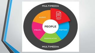
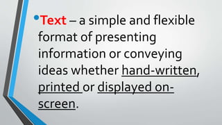
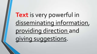
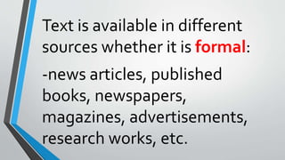
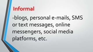
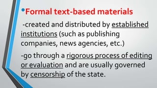
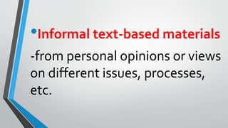
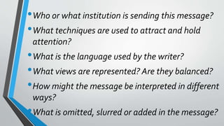
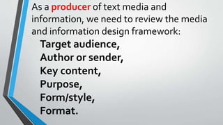
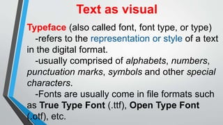
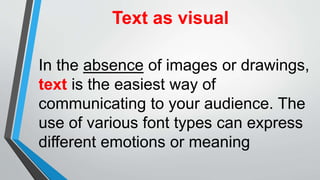
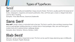
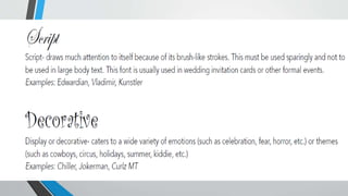
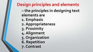
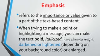
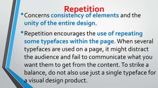
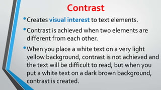
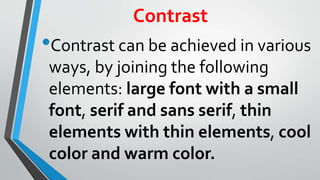
MEDIA AND INFORMATION
LITERACY
Text Media and Information
I am Attorney Robert Limco of Happy Cola
Company.Congratulations!Your SIM card
number has been chosen in our raffle draw.
You have won 500,000 pesos. Please give me
your bank account umber so we can deposit
your reward. For more details, please contact
me.
•Text – a simple and flexible
format of presenting
information or conveying
ideas whether hand-written,
printed or displayed on-
screen.
Text is very powerful in
disseminating information,
providing direction and
giving suggestions.
Text is available in different
sources whether it is formal:
-news articles, published
books, newspapers,
magazines, advertisements,
research works, etc.
Informal
-blogs, personal e-mails, SMS
or text messages, online
messengers, social media
platforms, etc.
•Formal text-based materials
-created and distributed by established
institutions (such as publishing
companies, news agencies, etc.)
-go through a rigorous process of editing
or evaluation and are usually governed
by censorship of the state.
•Informal text-based materials
-from personal opinions or views
on different issues, processes,
etc.
Text can be as short such as a
single sentence or phrase, or they
can be as lengthy as news articles
or investigative reporting.
Text is always carefully written
with the intent of sending a
very specific message to the
target audience.
In our exposure to text
media and information, we
can either be a consumer or
a producer of content.
As a consumer, these are the
questions that you need to ask
with regards to the content of
text media and information:
•Who or what institution is sending this message?
•What techniques are used to attract and hold
attention?
•What is the language used by the writer?
•What views are represented? Are they balanced?
•How might the message be interpreted in different
ways?
•What is omitted, slurred or added in the message?
As a producer of text media and
information, we need to review the media
and information design framework:
Target audience,
Author or sender,
Key content,
Purpose,
Form/style,
Format.
Text as visual
Typeface (also called font, font type, or type)
-refers to the representation or style of a text
in the digital format.
-usually comprised of alphabets, numbers,
punctuation marks, symbols and other special
characters.
-Fonts are usually come in file formats such
as True Type Font (.ttf), Open Type Font
(.otf), etc.
Text as visual
In the absence of images or drawings,
text is the easiest way of
communicating to your audience. The
use of various font types can express
different emotions or meaning
Types ofTypefaces:
Design principles and elements
– the principles in designing text
elements are
1. Emphasis
2. Appropriateness
3. Proximity
4. Alignment
5. Organization
6. Repetition
7. Contrast
Emphasis
•refers to the importance or value given to
a part of the text-based content.
•When trying to make a point or
highlighting a message, you can make
the text bold, italicized, have a heavier weight,
darkened or lightened (depending on
your background color) or enlarged.
Appropriateness
•refers to how fitting or suitable the text is
used for a specific audience, purpose or
event.
•In the creation of text-based content, make sure
that the selection criteria (tone, style, purpose,
clarity) is followed. As for the choice of typefaces
to be used, refer to the discussion of the
characteristics of the fonts. When it comes to large
body text, the font should be clear enough to read.
Proximity
•refers to how near or how far are the text
elements from each other.When two
things are closely related, we bring them
close together. Otherwise, we put text
elements far from each other. For
example, the main title and subtitle are
usually placed close to each other.
Alignment
•refers to how the text is
positioned in the page.This can
be left, right, center or justified.
Organization
•- refers to a conscious effort to organize the
different text elements in a page.
Organization ensures that while some text
elements are separated from each other
(based on the principle of proximity), they
are still somehow connected with the rest
of the elements in the page.
Repetition
•Concerns consistency of elements and the
unity of the entire design.
•Repetition encourages the use of repeating
some typefaces within the page. When several
typefaces are used on a page, it might distract
the audience and fail to communicate what you
want them to get from the content.To strike a
balance, do not also use just a single typeface for
a visual design product.
Contrast
•Creates visual interest to text elements.
•Contrast is achieved when two elements are
different from each other.
•When you place a white text on a very light
yellow background, contrast is not achieved and
the text will be difficult to read, but when you
put a white text on a dark brown background,
contrast is created.
Contrast
•Contrast can be achieved in various
ways, by joining the following
elements: large font with a small
font, serif and sans serif, thin
elements with thin elements, cool
color and warm color.
ACTIVITY
1. Divide the class into four groups.
2. Have the learners imagine that each group is an advertising firm.The task
for each group is to discuss creating a brochure for a client with specific needs.
3. Assign each group based on the topics:
a. Group 1 –Tourism Campaign –This brochure will invite the readers to spend
their summer vacation in your city.
b. Group 2 – Election Campaign –This brochure will promote to the readers a
local politician who will run for mayor in the upcoming election.
c. Group 3 – School Admission –This brochure will advertise to the readers a
college/university in your place.
d. Group 4 – CommunityAdvisory –This brochure will inform the readers
about the new policy for garbage collection schedule and segregation in your
community.
4. Have the learners identify the appropriate content for the brochure based
on the Media and Information Design Framework. In a one whole sheet of
paper ,the learners will provide answers in the table:
Text-Media-and-Information-Lec.pptx

Text-Media-and-Information-Lec.pptx

  • 1.
  • 3.
    I am AttorneyRobert Limco of Happy Cola Company.Congratulations!Your SIM card number has been chosen in our raffle draw. You have won 500,000 pesos. Please give me your bank account umber so we can deposit your reward. For more details, please contact me.
  • 4.
    •Text – asimple and flexible format of presenting information or conveying ideas whether hand-written, printed or displayed on- screen.
  • 5.
    Text is verypowerful in disseminating information, providing direction and giving suggestions.
  • 6.
    Text is availablein different sources whether it is formal: -news articles, published books, newspapers, magazines, advertisements, research works, etc.
  • 7.
    Informal -blogs, personal e-mails,SMS or text messages, online messengers, social media platforms, etc.
  • 8.
    •Formal text-based materials -createdand distributed by established institutions (such as publishing companies, news agencies, etc.) -go through a rigorous process of editing or evaluation and are usually governed by censorship of the state.
  • 9.
    •Informal text-based materials -frompersonal opinions or views on different issues, processes, etc.
  • 10.
    Text can beas short such as a single sentence or phrase, or they can be as lengthy as news articles or investigative reporting.
  • 11.
    Text is alwayscarefully written with the intent of sending a very specific message to the target audience.
  • 12.
    In our exposureto text media and information, we can either be a consumer or a producer of content.
  • 13.
    As a consumer,these are the questions that you need to ask with regards to the content of text media and information:
  • 14.
    •Who or whatinstitution is sending this message? •What techniques are used to attract and hold attention? •What is the language used by the writer? •What views are represented? Are they balanced? •How might the message be interpreted in different ways? •What is omitted, slurred or added in the message?
  • 15.
    As a producerof text media and information, we need to review the media and information design framework: Target audience, Author or sender, Key content, Purpose, Form/style, Format.
  • 16.
    Text as visual Typeface(also called font, font type, or type) -refers to the representation or style of a text in the digital format. -usually comprised of alphabets, numbers, punctuation marks, symbols and other special characters. -Fonts are usually come in file formats such as True Type Font (.ttf), Open Type Font (.otf), etc.
  • 17.
    Text as visual Inthe absence of images or drawings, text is the easiest way of communicating to your audience. The use of various font types can express different emotions or meaning
  • 19.
  • 21.
    Design principles andelements – the principles in designing text elements are 1. Emphasis 2. Appropriateness 3. Proximity 4. Alignment 5. Organization 6. Repetition 7. Contrast
  • 22.
    Emphasis •refers to theimportance or value given to a part of the text-based content. •When trying to make a point or highlighting a message, you can make the text bold, italicized, have a heavier weight, darkened or lightened (depending on your background color) or enlarged.
  • 23.
    Appropriateness •refers to howfitting or suitable the text is used for a specific audience, purpose or event. •In the creation of text-based content, make sure that the selection criteria (tone, style, purpose, clarity) is followed. As for the choice of typefaces to be used, refer to the discussion of the characteristics of the fonts. When it comes to large body text, the font should be clear enough to read.
  • 24.
    Proximity •refers to hownear or how far are the text elements from each other.When two things are closely related, we bring them close together. Otherwise, we put text elements far from each other. For example, the main title and subtitle are usually placed close to each other.
  • 25.
    Alignment •refers to howthe text is positioned in the page.This can be left, right, center or justified.
  • 26.
    Organization •- refers toa conscious effort to organize the different text elements in a page. Organization ensures that while some text elements are separated from each other (based on the principle of proximity), they are still somehow connected with the rest of the elements in the page.
  • 27.
    Repetition •Concerns consistency ofelements and the unity of the entire design. •Repetition encourages the use of repeating some typefaces within the page. When several typefaces are used on a page, it might distract the audience and fail to communicate what you want them to get from the content.To strike a balance, do not also use just a single typeface for a visual design product.
  • 28.
    Contrast •Creates visual interestto text elements. •Contrast is achieved when two elements are different from each other. •When you place a white text on a very light yellow background, contrast is not achieved and the text will be difficult to read, but when you put a white text on a dark brown background, contrast is created.
  • 29.
    Contrast •Contrast can beachieved in various ways, by joining the following elements: large font with a small font, serif and sans serif, thin elements with thin elements, cool color and warm color.
  • 30.
    ACTIVITY 1. Divide theclass into four groups. 2. Have the learners imagine that each group is an advertising firm.The task for each group is to discuss creating a brochure for a client with specific needs.
  • 31.
    3. Assign eachgroup based on the topics: a. Group 1 –Tourism Campaign –This brochure will invite the readers to spend their summer vacation in your city. b. Group 2 – Election Campaign –This brochure will promote to the readers a local politician who will run for mayor in the upcoming election. c. Group 3 – School Admission –This brochure will advertise to the readers a college/university in your place. d. Group 4 – CommunityAdvisory –This brochure will inform the readers about the new policy for garbage collection schedule and segregation in your community.
  • 32.
    4. Have thelearners identify the appropriate content for the brochure based on the Media and Information Design Framework. In a one whole sheet of paper ,the learners will provide answers in the table:

Editor's Notes

  • #4 • What is the tone of this fraudulent message? (enticing, scary, informative, formal, encouraging, etc.) • Why do you think Filipinos fall for this kind of fraudulent or scam text message? • Do you think that text-based messages are powerful?