
Recommended
Recommended
More Related Content
Similar to TEXT MEDIA AND INFORMATION a presentation.pptx
Similar to TEXT MEDIA AND INFORMATION a presentation.pptx (20)
Recently uploaded
Recently uploaded (20)
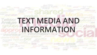
TEXT MEDIA AND INFORMATION a presentation.pptx
- 3. TEXT MEDIA Text media are publications that disseminate information through media products such as newspapers, flyers, books, magazines, tarpaulins, advertisements, television, banners, websites, and posters.
- 4. TYPEFACE also called font, font type, or type refers to the representation or style of a text in the digital format usually comprised of alphabets, numbers, punctuation marks, symbols and other special characters
- 10. DESIGN PRINCIPLES AND ELEMENTS design elements and principles in text media are effective means of conveying a message.
- 11. • Emphasis • refers to the importance or value given to a part of the text-based content.
- 12. Times New Roman Arial Aharoni Rockwell Edwardian Script Jokerman • Appropriateness • refers to how fitting or suitable the text is used for a specific audience, purpose, or event.
- 15. • Proximity • refers to how near or how far are the text elements from each other.
- 16. • Alignment • refers to how the text is positioned on the page. This can be left, right, center or justified.
- 17. Source: http://www.printwand.com/blog/basic-alignment-principles-in-graphic-design-with-examples
- 18. • Organization • refers to a conscious effort to organize the different text elements on a page. • ensures that while some text elements are separated from each other, they are still somehow connected with the rest of the elements in the page
- 20. • Repetition • concerns consistency of elements and the unity of the entire design. • repeating some typefaces within the page
- 22. • Contrast • creates visual interest to text elements. • achieved when two elements are different from each other. white text on a dark background large fontwith a small font serif and sans serif thin elements with wide elements cool color and warm color
- 24. Application Questions a. If you will be writing an application for a job opening, what font will you be using and why?
- 25. Application Questions b. You plan to create a birthday party greeting for your five-year old niece, what typeface will be appropriate and why?
- 26. Application Questions c. You will create a cleanliness drive campaign poster for your school. Which of the design principle and elements will ensure that the text in your poster is readable?
- 27. • Activity 1: Think of a word that you can associate with media, then create a word cloud out of it applying text designs and elements. Be creative. • Example:
Editor's Notes
- 1. Emphasis - refers to the importance or value given to a part of the text-based content. When trying to make a point or highlighting a message, you can make the text bold, italicized, have a heavier weight, darkened or lightened (depending on your background color) or enlarged.
- 2. Appropriateness - refers to how fitting or suitable the text is used for a specific audience, purpose or event. In the creation of text-based content, make sure that the selection criteria (tone, style, purpose, clarity) is followed. As for the choice of typefaces to be used, refer to the discussion of the characteristics of the fonts. When it comes to large body text, the font should be clear enough to read.
- Why is this font a wrong choice for a gravestone? What font do you think is more fitting?
- Would you trust Dr. Brown if this is the font used in his calling card? Why?
- 3. Proximity - refers to how near or how far are the text elements from each other. When two things are closely related, we bring them close together. Otherwise, we put text elements far from each other. For example, the main title and subtitle are usually placed close to each other. Which one shows text proximity? Why?
- 4. Alignment - refers to how the text is positioned in the page. This can be left, right, center or justified.
- 5. Organization - refers to a conscious effort to organize the different text elements in a page. Organization ensures that while some text elements are separated from each other (based on the principle of proximity), they are still somehow connected with the rest of the elements in the page. When there are many elements needed to fit in a page, start by creating a framework or a compartment for the elements. Divide the space by creating lines across the page, making it look like a cabinet with various space sizes. Once you are done compartmentalizing, you can place the different text elements on the boxes.
- How is organization achieved in this design?
- 6. Repetition- concerns consistency of elements and the unity of the entire design. Repetition encourages the use of repeating some typefaces within the page. When several typefaces are used on a page, it might distract the audience and fail to communicate what you want them to get from the content. To strike a balance, do not also use just a single typeface for a visual design product.
- How is contrast repetition achieved in this design?