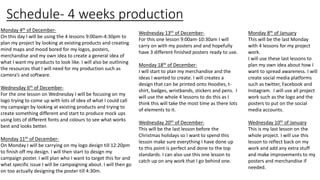
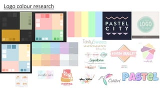
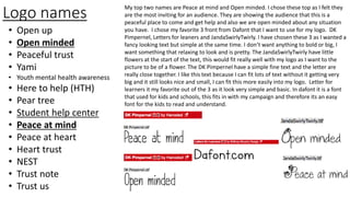
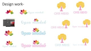
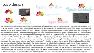
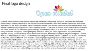
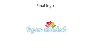
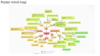
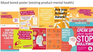
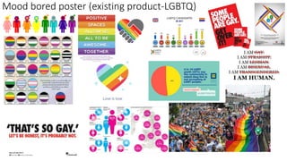
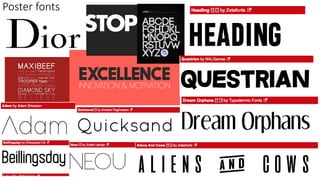
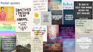
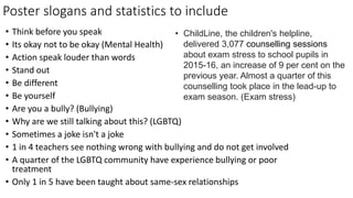
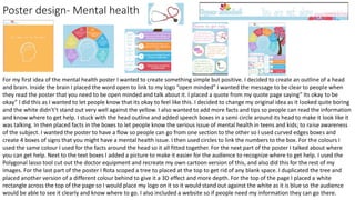
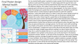
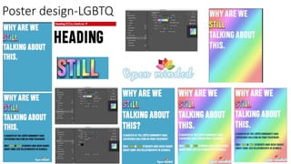
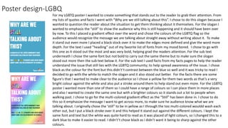
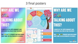
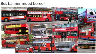
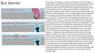
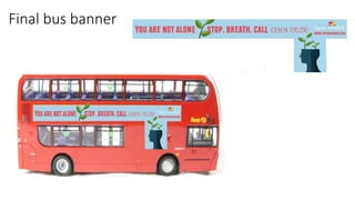
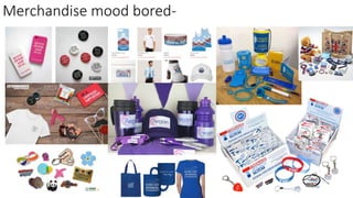
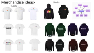
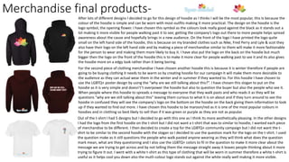
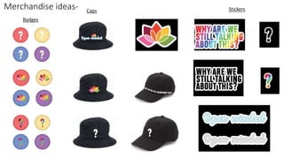
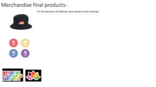
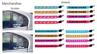
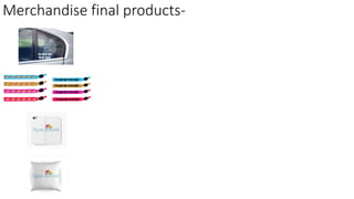
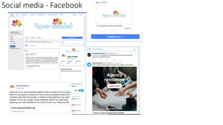
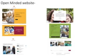
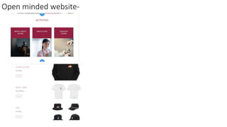
SlideShare a Scribd company logo
Social action
task 5
Rachel Hewitson
Schedule- 4 weeks production
Monday 4th of December-
On this day I will be using the 4 lessons 9:00am-4:30pm to
plan my project by looking at existing products and creating
mind maps and mood bored for my logos, posters,
merchandise and my own idea to create a general idea of
what I want my products to look like. I will also be outlining
the resources that I will need for my production such as
camera’s and software.
Wednesday 6th of December-
For the one lesson on Wednesday I will be focusing on my
logo trying to come up with lots of idea of what I could call
my campaign by looking at existing products and trying to
create something different and start to produce mock ups
using lots of different fonts and colours to see what works
best and looks better.
Monday 11th of December-
On Monday I will be carrying on my logo design till 12:20pm
to finish off my design. I will then start to design my
campaign poster. I will plan who I want to target this for and
what specific issue I will be campaigning about. I will then go
on too actually designing the poster till 4:30m.
Wednesday 13th of December-
For this one lesson 9:00am-10:30am I will
carry on with my posters and and hopefully
have 3 different finished posters ready to use.
Monday 18th of December-
I will start to plan my merchandise and the
ideas I wanted to create. I will creates a
design that can be printed onto Hoodies, t-
shirt, badges, wristbands, stickers and pens. I
will use the whole 4 lessons to do this as I
think this will take the most time as there lots
of elements to it.
Wednesday 20th of December-
This will be the last lesson before the
Christmas holidays so I want to spend this
lesson make sure everything I have done up
to this point is perfect and done to the top
standards. I can also use this one lesson to
catch up on any work that I go behind one.
Monday 8th of January
This will be the last Monday
with 4 lessons for my project
work.
I will use these last lessons to
plan my own idea about how I
want to spread awareness. I will
create social media platforms
such as twitter, Facebook and
Instagram. I will use all project
work such as the logo and the
posters to put on the social
media accounts.
Wednesday 10th of January
This is my last lesson on the
whole project. I will use this
lesson to reflect back on my
work and add any extra stuff
and make improvements to my
posters and merchandise if
needed.
Logo colour research
Logo layout/design my ideas-Logo Existing designs
Logo fonts
Dafonts-
Logo names
• Open up
• Open minded
• Peaceful trust
• Yami
• Youth mental health awareness
• Here to help (HTH)
• Pear tree
• Student help center
• Peace at mind
• Peace at heart
• Heart trust
• NEST
• Trust note
• Trust us
My top two names are Peace at mind and Open minded. I chose these top as I felt they
are the most inviting for an audience. They are showing the audience that this is a
peaceful place to come and get help and also we are open minded about any situation
you have. I chose my favorite 3 front from Dafont that I want to use for my logo. DK
Pimpernel, Letters for leaners and JandaSwirlyTwirly. I have chosen these 3 as I wanted a
fancy looking text but simple at the same time. I don’t want anything to bold or big, I
want something that relaxing to look and is pretty. The JandaSwirlyTwirly have little
flowers at the start of the text, this would fit really well with my logo as I want to the
picture to be of a flower. The DK Pimpernel have a simple fine text and the letter are
really close together. I like this text because I can fit lots of text without it getting very
big and it still looks nice and small, I can fit this more easily into my logo. Letter for
learners it my favorite out of the 3 as it look very simple and basic. In dafont it is a font
that used for kids and schools, this fits in with my campaign and therefore its an easy
font for the kids to read and understand.
Design work-
Logo design
For my logo I wanted to create something that resembles a flower so I started by going to shape a picking something that most
looks like a petal. To make them resemble a flower I just the warp tool to drag the bottom and top of the flower into more of a
pointed shape. After creating row of the petal I wanted to put small petal in the inside to make it look like it was opening and
you could see the inside. I did the same thing again but put a stroke onto the petal to give it a white outline to it separates the
first yet of petal apart. For the smaller petal I also changed the colour to a light version of the original petal so they all stood
out more and didn't’t blend together. For the font I wanted it to be elegant with flicks at the end and fine text instead of
massive bold text. I chose this type to it was more relaxing and nice to look at, as big bold text can sometime be too much and
overpower the logo. I went with the text “letters for leaners”. I decided to placed the picture in different places of the text to
see which one looked the best. I went with the flower over the I as it look liked the I was the stalk for the flower so it fitted
really well together. After placing everything it write position, I felt like the text still wasn’t how I wanted it. It did not stand out
enough and I didn't’t think it would catch the audience eye, so I decided to make the text white and put a blue stroke over it so
it stood out more and made the text a bit bigger. I put the text in pastel blue and pink but I have decided to go with the blue
as the flower has pink in to the text blended in to much; blue has not been use in the flower therefore stands out agaisnt it.
Final logo design
I have decided to pick this one as my final logo as I feel it’s aesthetically pleasing, because of the colours and font I have
chosen. I have chosen a pastel blue for the logo because blue conveys peace, trust and confidence and that is what I want
my audience to feel when they see my logo or come to my website. Open minded is an organization that helps people going
through hard times so by using peaceful colour hopefully makes it a calm place for them to visit or look at. I have chosen the
title “Open minded” as this is the message I want to get across to kids in school to be more open minded about situations,
willing to consider new options such as getting help when their feeling low. In the logo I wanted to have a flower to
represent opening up. I create flower petals and colored them all in different shades of pink red yellow and green. I wanted
them to be different colours because I wanted it to stand out against the title as that’s a light blue and to stand out but also
to show that we are all different, open minded it a place for people to get help in any situation in school not just exam
pressure and mental health the LGBT are welcome for any advice as the flowers are showing the LGBTQ flag colours to show
the audience that we welcome anyone. I placed the flower over the I to make it look more like a flower and the I is the stalk,
I think this is the best placed for the flower to be placed as it isn't to big, it fits perfectly with the writing. For the font I chose
to have it quite large so people could read it but I actually put the text in white and but a blue stroke over it. I chose to do
this as it make the text more bold and bigger to stand out more and the white and blue complemented against each other.
Final logo
Poster mind map
Poster (Colour)
Mood bored poster (existing product-mental health)
Mood bored poster (existing product-LGBTQ)
Poster fonts
Poster quotes
Poster slogans and statistics to include
• Think before you speak
• Its okay not to be okay (Mental Health)
• Action speak louder than words
• Stand out
• Be different
• Be yourself
• Are you a bully? (Bullying)
• Why are we still talking about this? (LGBTQ)
• Sometimes a joke isn't a joke
• 1 in 4 teachers see nothing wrong with bullying and do not get involved
• A quarter of the LGBTQ community have experience bullying or poor
treatment
• Only 1 in 5 have been taught about same-sex relationships
• ChildLine, the children's helpline,
delivered 3,077 counselling sessions
about exam stress to school pupils in
2015-16, an increase of 9 per cent on the
previous year. Almost a quarter of this
counselling took place in the lead-up to
exam season. (Exam stress)
Poster design- Mental health
For my first idea of the mental health poster I wanted to create something simple but positive. I decided to create an outline of a head
and brain. Inside the brain I placed the word open to link to my logo “open minded” I wanted the message to be clear to people when
they read the poster that you need to be open minded and talk about it. I placed a quote from my quote page saying” Its okay to be
okay” I did this as I wanted to let people know that its okay to feel like this. I decided to change my original idea as it looked quite boring
and the white didn't’t stand out very well against the yellow. I also wanted to add more facts and tips so people can read the information
and know where to get help. I stuck with the head outline and added speech boxes in a semi circle around its head to make it look like it
was talking. In then placed facts in the boxes to let people know the serious issue of mental health in teens and kids; to raise awareness
of the subject. I wanted the poster to have a flow so people can go from one section to the other so I used curved edges boxes and
create 4 boxes of signs that you might have a mental health issue. I then used circles to link the numbers to the box. For the colours I
used the same colour I used for the facts around the head so it all fitted together. For the next part of the poster I talked about where
you can get help. Next to the text boxes I added a picture to make it easier for the audience to recognize where to get help. I used the
Polygonal lasso tool cut out the doctor equipment and recreate my own cartoon version of this, and also did this for the rest of my
images. For the last part of the poster I Rota scoped a tree to placed at the top to get rid of any blank space. I duplicated the tree and
placed another version of a different colour behind to give it a 3D effect and more depth. For the top of the page I placed a white
rectangle across the top of the page so I would place my logo on it so it would stand out against the white as it is blue so the audience
would be able to see it clearly and know where to go. I also included a website so if people need my information they can go there.
Final Poster design
-Mental health
For my mental health poster I wanted to create a poster full of information that the
audience could used if they wanted. I’m really happy with the way the facts and
figures came out as they all evenly proportioned away from each other separating
the different subjects, this makes it more clear for the audience to read the
separate parts and easy as its not just one big paragraph. For the colour scheme I
made the background a pastel blue to match my logo and decided to go with lots
of pastel colours so they stood out against the blue to catch the audience
attention. I went with pastel colours as I didn't’t want the colours being to harsh to
look at I wanted to create a poster that was calm so the person reading could
relaxed, this is why I chose to go for a pastel blue as the background as blue
conveys with peace and this will help the audience feel peaceful when reading it. I
create a tree as trees represent growth and strength. I wanted this to be a
representation of what they can become and will become when they get help, that
they can grow and become a stronger person. For the text I went with something
very simple as the poster are full of facts I wanted the text to be easy to read and
not to complicated. I created mini icons at the side of the text where they can help
to show the reader straight away without reading it an idea of where they can
help, this is useful for people that are in a rush and cannot read the whole text. I
also added in mini symbols in the pictures such as the love heart in the doctors
equipment and the ”believe” in the wire of the microphone. These are to just keep
spreading a positive message through the posters to try make the reader happier
or more confident. At the top of the poster I added a website so people could get
more information if they wanted to and a positive message at the top saying” You
are not alone” as this will be the last thing they read and stick in their mind more
therefore carrying away a nice reassuring message.
Poster design-LGBTQ
Poster design-LGBQ
For my LGBTQ poster I wanted to create something that stands out to the reader to grab their attention. From
my lists of quotes and facts I went with “Why are we still talking about this”. I chose to do this slogan because I
wanted to question the reader about the situation to get them thinking about it themselves. For the slogan I
wanted to emphasis the ”still” to show the audience why this is still happening and it should have been over
by now. To this I placed a gradient effect over the word and chose the colours of the LGBTQ flag so the
audience would recognize the message we are talking about straight away without writing about it. To make
it stand out even more I placed a black stock over it to make the edges more defined and give the word more
depth. For the text I used ”heading” out of my favorite list of fonts from my mood bored. I chose to go with
this one as it stood out the most and was very bold, helping grad the readers attention. For the sub text
underneath I chose the same font but not bold to carry out the same theme but to make sure the slogan
stood out more then the sub text below it. For the sub text I used facts from my facts pages to help the reader
understand the issue that still lies with the LGBTQ community; to help spread awareness of the issue. I chose
black as the colour for the font but this didn't’t contrast between the blue so well and it was tricky to read I
decided to go with the white to match the slogan and it also stood out better. For the facts there are some
figure's that I wanted to make clear to the audience so I chose a yellow for them two words as that’s a very
bright colour against the white and also put a stroke around them to help stand out even more. For the LGBTQ
poster I wanted more than one of them so I could have a range of colours so I can place them in more places
and also I wanted to create the same one but with a brighter colours so it stands out a lot to people when
walking past. I chose to go for the multi-colored gradient effect as the “Still” has been done in. I chose to do
this so it emphasize the message I want to get across more, to make sure he audience know what we are
talking about. I originally chose the ‘still” to be in yellow as I through the too multi-colored wouldd wash each
other out, but I put a black stroke over it and this helped it stand out against the different colours. I kept the
same font and text but the white was quite hard to read as it was placed of light colours, so I changed this to a
dark blue to make it easier to read. I didn't’t chose black as i didn’t want it being to sharp against the other
colours.
3 final posters
Bus banner mood bored-
Bus banner For bus banner I decided to chose pinks and blue for my colour scheme as
the blue stands out against the white and red buses allowing people to see
it better but also blue conveys peacefulness and calmness therefore the
people who read my banner will feel calm instead of it being black and red
and standing out too much creating a sense of force to read it. In the
beginning I decided to use the tree from my poster on mental health as this
will link my products together in the campaign making it more recognizable
for the audience to know what is about as they might of seen it on the
poster. This didn't’t help the poster for the people who haven't seen the
campaign before as it didn't’t show any information about what this could
be about as a tree could mean anything, so I decided to use a head with a
tree coming out of it to represent growth of the person dealing with mental
health. By using the brain in the advert its showing people an idea about
the cause as it must have something to do with you mind and this links it
with the logo that’s next to it. At first I separated the “you are not alone”
with the “stop.brethe.call” with a grey line to create a pause when the
audience is reading it so they could breathe and think about what there
going do as I want my to make sure my audience are calm and in a right
mind set when making decisions, but this did not look do good as the grey
didn't’t match the colour scheme. I then went on and changed the grey line
to a branch to match the tree growing out of the mind, this helped with the
colour scheme as it match and also linked in with the theme I was creating.
On the right hand side of the advert I added the campaign logo so people
could see out company and who we are and I also added and phone
number and website for people to visit and call incase they need help when
reading the advert or write it down for later use incase they do not this
campaign again.
Final bus banner
Merchandise mood bored-
Merchandise ideas- Hoodies
T-shirts
Merchandise final products-
After lots of different designs I decided to go for this design of hoodie as I thinks I will be the most popular, this Is because the
colour of the hoodie is simple and can be worn with most outfits making it more practical. The design on the hoodie is the
logo symbol, the opening flower. I have chosen this symbol as the colours look really good against the black as it stands out a
lot making it more visible for people walking past it to see; getting the company’s logo out there to more people helps spread
awareness about the cause and hopefully brings in a new audience. On the front of the logo I have printed the logo quite
small on the left hand side of the hoodie, this is because on my branded clothes such as Nike, Fred Perry and Lyle & scot they
also have their logo on the left hand side and by making a piece of merchandise similar to them will make it more fashionable
for the person to wear and making them more likely to buy it. I have also put the logo on the back on the hoodie but much
bigger then the logo on the front of the hoodie this is to make it more clear for people walking past to see it and its also gives
the hoodie more on a edgy look rather than it being boring.
For the second piece of clothing merchandise I have chosen another hoodie this is because it is winter therefore if people are
going to be buying clothing it needs to be warm so by creating hoodie for our campaign it will make them more desirable to
the audience as they can actual wear them in the winter and in summer if they wanted to. For this hoodie I have chosen to
use the LGBTQ+ poster design by using the “why are we still talking about this?”. I have chosen this slogan to put on the
hoodie as it is very simple and doesn't’t overpower the hoodie but also to question the buyer but also the people who see it.
When people where this hoodie to spreads a message to everyone that they walk pasts and who reads it as they will be
questions ”why are we still talking about this” leaving them curious to what it is on about and if they turn around to see the
hoodie in confused they will see the company's logo on the bottom on the hoodie on the back giving them information to look
up if they wanted to find out more. I have chosen this hoodie to be maroon/red as it is one of the most popular colours in
hoodies and in clothing so best likely to sell than if it was green or purple as they are not as popular.
Out of the t-shirt I had 5 designs but I decided to go with this one as I think its more aesthetically pleasing. In the other designs
I had the logo from the first hoodie on the t-shirt but I did not want a t-shirt that was to similar to hoodie, I wanted each piece
of merchandise to be different. I then decided to create a top for the LGBTQ+ community campaign but I did not want the t-
shirt to be similar to the second hoodie with the slogan so I decided to use the question mark for the logo on the t-shirt. I used
the question make as it still questions the people who walk pasted anyone wearing as they will think what does the question
mark mean, what are they questioning and I also use the LGBTQ+ colors to fil in the question to make it more clear about the
message we are trying to get across and by not telling them the message straight away it leaves people thinking about it more
trying to figure It out. I went with a white t-shirt as this type of clothing that will be worn in summer therefore a white t-shirt is
useful as it helps cool you down also the mutli-colour logo stands out against the white really well making it more visible.
Merchandise ideas-
Badges
Caps Stickers
Merchandise final products-
For the last piece of clothing I have chosen to do a hat/cap.
Merchandise-
Wristbands
Car stickers
Merchandise final products-
Social media accounts-
Twitter
Social media- Instagram
Social media - Facebook
Open Minded website-
Open minded website-

More Related Content

What's hot (15)

Modified giarritano practicum work journal
Modified giarritano practicum work journalModified giarritano practicum work journal
Modified giarritano practicum work journal
 
6. production reflection (fmp)
6. production reflection (fmp)6. production reflection (fmp)
6. production reflection (fmp)
 
Question 7
Question 7Question 7
Question 7
 
Generic conventions of a magazine
Generic conventions of a magazineGeneric conventions of a magazine
Generic conventions of a magazine
 
Preliminary Task Evaluation
Preliminary Task EvaluationPreliminary Task Evaluation
Preliminary Task Evaluation
 
Evaluation
EvaluationEvaluation
Evaluation
 
L3 cmpt y2 evaluation
L3 cmpt y2 evaluationL3 cmpt y2 evaluation
L3 cmpt y2 evaluation
 
Digital graphics evaluation pro forma
Digital graphics evaluation pro formaDigital graphics evaluation pro forma
Digital graphics evaluation pro forma
 
Veganuary evaluation
Veganuary evaluationVeganuary evaluation
Veganuary evaluation
 
School magazine front cover analysis and evaluation
School magazine front cover analysis and evaluationSchool magazine front cover analysis and evaluation
School magazine front cover analysis and evaluation
 
School Magazine Activities
School Magazine ActivitiesSchool Magazine Activities
School Magazine Activities
 
School Magazine Ideas
School Magazine IdeasSchool Magazine Ideas
School Magazine Ideas
 
6. production reflection
6. production reflection6. production reflection
6. production reflection
 
Diary
DiaryDiary
Diary
 
Scheduel 1
Scheduel 1 Scheduel 1
Scheduel 1
 

Similar to Task5 social action (up to date) (20)

Evaluation
EvaluationEvaluation
Evaluation
 
Initial Plans
Initial PlansInitial Plans
Initial Plans
 
Initial Plans
Initial PlansInitial Plans
Initial Plans
 
Task 8
Task 8Task 8
Task 8
 
Initial Plans
Initial PlansInitial Plans
Initial Plans
 
Social Action Evaluation
Social Action EvaluationSocial Action Evaluation
Social Action Evaluation
 
Evaluation
EvaluationEvaluation
Evaluation
 
Digital graphics evaluation pro forma
Digital graphics evaluation pro formaDigital graphics evaluation pro forma
Digital graphics evaluation pro forma
 
Digital graphics evaluation pro forma
Digital graphics evaluation pro formaDigital graphics evaluation pro forma
Digital graphics evaluation pro forma
 
1. communication methods pro forma(1) (3)
1. communication methods pro forma(1) (3)1. communication methods pro forma(1) (3)
1. communication methods pro forma(1) (3)
 
1. communication methods pro forma(1) (3)
1. communication methods pro forma(1) (3)1. communication methods pro forma(1) (3)
1. communication methods pro forma(1) (3)
 
4. pre production fmp
4. pre production fmp4. pre production fmp
4. pre production fmp
 
Digital graphics evaluation pro forma
Digital graphics evaluation pro formaDigital graphics evaluation pro forma
Digital graphics evaluation pro forma
 
Task 8
Task 8 Task 8
Task 8
 
4. pre production(1)
4. pre production(1)4. pre production(1)
4. pre production(1)
 
Evaluation
Evaluation Evaluation
Evaluation
 
Evaluation
Evaluation Evaluation
Evaluation
 
Evaluation
Evaluation Evaluation
Evaluation
 
Digital graphics evaluation pro forma
Digital graphics evaluation pro formaDigital graphics evaluation pro forma
Digital graphics evaluation pro forma
 
Evaluation
EvaluationEvaluation
Evaluation
 

More from rachel hewitson (20)

Evaluation
EvaluationEvaluation
Evaluation
 
Evaluation
EvaluationEvaluation
Evaluation
 
Development pro forma
Development pro formaDevelopment pro forma
Development pro forma
 
Working to a brief pro forma
Working to a brief pro formaWorking to a brief pro forma
Working to a brief pro forma
 
Production
ProductionProduction
Production
 
Development pro forma
Development pro formaDevelopment pro forma
Development pro forma
 
Pitch
PitchPitch
Pitch
 
Task 5
Task 5Task 5
Task 5
 
task 4 Pre production
task 4 Pre productiontask 4 Pre production
task 4 Pre production
 
Audience theories handout blank copy 2
Audience theories handout blank copy 2Audience theories handout blank copy 2
Audience theories handout blank copy 2
 
Hypodermic needle model
Hypodermic needle model Hypodermic needle model
Hypodermic needle model
 
Audience theories reception thoery
Audience theories reception thoeryAudience theories reception thoery
Audience theories reception thoery
 
Pre production
Pre productionPre production
Pre production
 
Audience theories hypodermic Needle Model
Audience theories hypodermic Needle ModelAudience theories hypodermic Needle Model
Audience theories hypodermic Needle Model
 
Task 3- Research
Task 3- ResearchTask 3- Research
Task 3- Research
 
Censorship done
Censorship doneCensorship done
Censorship done
 
Task 4 critical approchaes
Task 4 critical approchaesTask 4 critical approchaes
Task 4 critical approchaes
 
Task 1
Task 1 Task 1
Task 1
 
task 2 bias
task 2 biastask 2 bias
task 2 bias
 
Task 3
Task 3Task 3
Task 3
 

Recently uploaded

Heuristic Evaluation of System & Application
Heuristic Evaluation of System & ApplicationHeuristic Evaluation of System & Application
Heuristic Evaluation of System & Application
Jaime Brown
 
Research about Venice ppt for grade 6f anas
Research about Venice ppt for grade 6f anasResearch about Venice ppt for grade 6f anas
Research about Venice ppt for grade 6f anas
anasabutalha2013
 
National-Learning-Camp 2024 deped....pptx
National-Learning-Camp 2024 deped....pptxNational-Learning-Camp 2024 deped....pptx
National-Learning-Camp 2024 deped....pptx
AlecAnidul
 

Recently uploaded (16)

BIT- Pinal .H. Prajapati Graphic Designer
BIT- Pinal .H. Prajapati  Graphic DesignerBIT- Pinal .H. Prajapati  Graphic Designer
BIT- Pinal .H. Prajapati Graphic Designer
 
Design lessons from Singapore | Volume 3
Design lessons from Singapore | Volume 3Design lessons from Singapore | Volume 3
Design lessons from Singapore | Volume 3
 
Pitch Presentation for Service Design in Technology
Pitch Presentation for Service Design in TechnologyPitch Presentation for Service Design in Technology
Pitch Presentation for Service Design in Technology
 
Heuristic Evaluation of System & Application
Heuristic Evaluation of System & ApplicationHeuristic Evaluation of System & Application
Heuristic Evaluation of System & Application
 
CA OFFICE office office office _VIEWS.pdf
CA OFFICE office office office _VIEWS.pdfCA OFFICE office office office _VIEWS.pdf
CA OFFICE office office office _VIEWS.pdf
 
Claire's designing portfolio presentation
Claire's designing portfolio presentationClaire's designing portfolio presentation
Claire's designing portfolio presentation
 
Spring 2024 wkrm_Enhancing Campus Mobility.pdf
Spring 2024 wkrm_Enhancing Campus Mobility.pdfSpring 2024 wkrm_Enhancing Campus Mobility.pdf
Spring 2024 wkrm_Enhancing Campus Mobility.pdf
 
Extended Reality(XR) Development in immersive design
Extended Reality(XR) Development in immersive designExtended Reality(XR) Development in immersive design
Extended Reality(XR) Development in immersive design
 
Art Nouveau Movement Presentation for Art History.
Art Nouveau Movement Presentation for Art History.Art Nouveau Movement Presentation for Art History.
Art Nouveau Movement Presentation for Art History.
 
The Design Code Google Developer Student Club.pptx
The Design Code Google Developer Student Club.pptxThe Design Code Google Developer Student Club.pptx
The Design Code Google Developer Student Club.pptx
 
The Evolution of Fashion Trends: History to Fashion
The Evolution of Fashion Trends: History to FashionThe Evolution of Fashion Trends: History to Fashion
The Evolution of Fashion Trends: History to Fashion
 
Common Designing Mistakes and How to avoid them
Common Designing Mistakes and How to avoid themCommon Designing Mistakes and How to avoid them
Common Designing Mistakes and How to avoid them
 
FW25-26 Fashion Key Items Trend Book Peclers Paris
FW25-26 Fashion Key Items Trend Book Peclers ParisFW25-26 Fashion Key Items Trend Book Peclers Paris
FW25-26 Fashion Key Items Trend Book Peclers Paris
 
Dos And Dont's Of Logo Design For 2024..
Dos And Dont's Of Logo Design For 2024..Dos And Dont's Of Logo Design For 2024..
Dos And Dont's Of Logo Design For 2024..
 
Research about Venice ppt for grade 6f anas
Research about Venice ppt for grade 6f anasResearch about Venice ppt for grade 6f anas
Research about Venice ppt for grade 6f anas
 
National-Learning-Camp 2024 deped....pptx
National-Learning-Camp 2024 deped....pptxNational-Learning-Camp 2024 deped....pptx
National-Learning-Camp 2024 deped....pptx
 

Task5 social action (up to date)

  • 2. Schedule- 4 weeks production Monday 4th of December- On this day I will be using the 4 lessons 9:00am-4:30pm to plan my project by looking at existing products and creating mind maps and mood bored for my logos, posters, merchandise and my own idea to create a general idea of what I want my products to look like. I will also be outlining the resources that I will need for my production such as camera’s and software. Wednesday 6th of December- For the one lesson on Wednesday I will be focusing on my logo trying to come up with lots of idea of what I could call my campaign by looking at existing products and trying to create something different and start to produce mock ups using lots of different fonts and colours to see what works best and looks better. Monday 11th of December- On Monday I will be carrying on my logo design till 12:20pm to finish off my design. I will then start to design my campaign poster. I will plan who I want to target this for and what specific issue I will be campaigning about. I will then go on too actually designing the poster till 4:30m. Wednesday 13th of December- For this one lesson 9:00am-10:30am I will carry on with my posters and and hopefully have 3 different finished posters ready to use. Monday 18th of December- I will start to plan my merchandise and the ideas I wanted to create. I will creates a design that can be printed onto Hoodies, t- shirt, badges, wristbands, stickers and pens. I will use the whole 4 lessons to do this as I think this will take the most time as there lots of elements to it. Wednesday 20th of December- This will be the last lesson before the Christmas holidays so I want to spend this lesson make sure everything I have done up to this point is perfect and done to the top standards. I can also use this one lesson to catch up on any work that I go behind one. Monday 8th of January This will be the last Monday with 4 lessons for my project work. I will use these last lessons to plan my own idea about how I want to spread awareness. I will create social media platforms such as twitter, Facebook and Instagram. I will use all project work such as the logo and the posters to put on the social media accounts. Wednesday 10th of January This is my last lesson on the whole project. I will use this lesson to reflect back on my work and add any extra stuff and make improvements to my posters and merchandise if needed.
  • 4. Logo layout/design my ideas-Logo Existing designs
  • 7. Logo names • Open up • Open minded • Peaceful trust • Yami • Youth mental health awareness • Here to help (HTH) • Pear tree • Student help center • Peace at mind • Peace at heart • Heart trust • NEST • Trust note • Trust us My top two names are Peace at mind and Open minded. I chose these top as I felt they are the most inviting for an audience. They are showing the audience that this is a peaceful place to come and get help and also we are open minded about any situation you have. I chose my favorite 3 front from Dafont that I want to use for my logo. DK Pimpernel, Letters for leaners and JandaSwirlyTwirly. I have chosen these 3 as I wanted a fancy looking text but simple at the same time. I don’t want anything to bold or big, I want something that relaxing to look and is pretty. The JandaSwirlyTwirly have little flowers at the start of the text, this would fit really well with my logo as I want to the picture to be of a flower. The DK Pimpernel have a simple fine text and the letter are really close together. I like this text because I can fit lots of text without it getting very big and it still looks nice and small, I can fit this more easily into my logo. Letter for learners it my favorite out of the 3 as it look very simple and basic. In dafont it is a font that used for kids and schools, this fits in with my campaign and therefore its an easy font for the kids to read and understand.
  • 9. Logo design For my logo I wanted to create something that resembles a flower so I started by going to shape a picking something that most looks like a petal. To make them resemble a flower I just the warp tool to drag the bottom and top of the flower into more of a pointed shape. After creating row of the petal I wanted to put small petal in the inside to make it look like it was opening and you could see the inside. I did the same thing again but put a stroke onto the petal to give it a white outline to it separates the first yet of petal apart. For the smaller petal I also changed the colour to a light version of the original petal so they all stood out more and didn't’t blend together. For the font I wanted it to be elegant with flicks at the end and fine text instead of massive bold text. I chose this type to it was more relaxing and nice to look at, as big bold text can sometime be too much and overpower the logo. I went with the text “letters for leaners”. I decided to placed the picture in different places of the text to see which one looked the best. I went with the flower over the I as it look liked the I was the stalk for the flower so it fitted really well together. After placing everything it write position, I felt like the text still wasn’t how I wanted it. It did not stand out enough and I didn't’t think it would catch the audience eye, so I decided to make the text white and put a blue stroke over it so it stood out more and made the text a bit bigger. I put the text in pastel blue and pink but I have decided to go with the blue as the flower has pink in to the text blended in to much; blue has not been use in the flower therefore stands out agaisnt it.
  • 10. Final logo design I have decided to pick this one as my final logo as I feel it’s aesthetically pleasing, because of the colours and font I have chosen. I have chosen a pastel blue for the logo because blue conveys peace, trust and confidence and that is what I want my audience to feel when they see my logo or come to my website. Open minded is an organization that helps people going through hard times so by using peaceful colour hopefully makes it a calm place for them to visit or look at. I have chosen the title “Open minded” as this is the message I want to get across to kids in school to be more open minded about situations, willing to consider new options such as getting help when their feeling low. In the logo I wanted to have a flower to represent opening up. I create flower petals and colored them all in different shades of pink red yellow and green. I wanted them to be different colours because I wanted it to stand out against the title as that’s a light blue and to stand out but also to show that we are all different, open minded it a place for people to get help in any situation in school not just exam pressure and mental health the LGBT are welcome for any advice as the flowers are showing the LGBTQ flag colours to show the audience that we welcome anyone. I placed the flower over the I to make it look more like a flower and the I is the stalk, I think this is the best placed for the flower to be placed as it isn't to big, it fits perfectly with the writing. For the font I chose to have it quite large so people could read it but I actually put the text in white and but a blue stroke over it. I chose to do this as it make the text more bold and bigger to stand out more and the white and blue complemented against each other.
  • 14. Mood bored poster (existing product-mental health)
  • 15. Mood bored poster (existing product-LGBTQ)
  • 16. Mood bored poster (existing product-LGBTQ)
  • 19. Poster slogans and statistics to include • Think before you speak • Its okay not to be okay (Mental Health) • Action speak louder than words • Stand out • Be different • Be yourself • Are you a bully? (Bullying) • Why are we still talking about this? (LGBTQ) • Sometimes a joke isn't a joke • 1 in 4 teachers see nothing wrong with bullying and do not get involved • A quarter of the LGBTQ community have experience bullying or poor treatment • Only 1 in 5 have been taught about same-sex relationships • ChildLine, the children's helpline, delivered 3,077 counselling sessions about exam stress to school pupils in 2015-16, an increase of 9 per cent on the previous year. Almost a quarter of this counselling took place in the lead-up to exam season. (Exam stress)
  • 20. Poster design- Mental health For my first idea of the mental health poster I wanted to create something simple but positive. I decided to create an outline of a head and brain. Inside the brain I placed the word open to link to my logo “open minded” I wanted the message to be clear to people when they read the poster that you need to be open minded and talk about it. I placed a quote from my quote page saying” Its okay to be okay” I did this as I wanted to let people know that its okay to feel like this. I decided to change my original idea as it looked quite boring and the white didn't’t stand out very well against the yellow. I also wanted to add more facts and tips so people can read the information and know where to get help. I stuck with the head outline and added speech boxes in a semi circle around its head to make it look like it was talking. In then placed facts in the boxes to let people know the serious issue of mental health in teens and kids; to raise awareness of the subject. I wanted the poster to have a flow so people can go from one section to the other so I used curved edges boxes and create 4 boxes of signs that you might have a mental health issue. I then used circles to link the numbers to the box. For the colours I used the same colour I used for the facts around the head so it all fitted together. For the next part of the poster I talked about where you can get help. Next to the text boxes I added a picture to make it easier for the audience to recognize where to get help. I used the Polygonal lasso tool cut out the doctor equipment and recreate my own cartoon version of this, and also did this for the rest of my images. For the last part of the poster I Rota scoped a tree to placed at the top to get rid of any blank space. I duplicated the tree and placed another version of a different colour behind to give it a 3D effect and more depth. For the top of the page I placed a white rectangle across the top of the page so I would place my logo on it so it would stand out against the white as it is blue so the audience would be able to see it clearly and know where to go. I also included a website so if people need my information they can go there.
  • 21. Final Poster design -Mental health For my mental health poster I wanted to create a poster full of information that the audience could used if they wanted. I’m really happy with the way the facts and figures came out as they all evenly proportioned away from each other separating the different subjects, this makes it more clear for the audience to read the separate parts and easy as its not just one big paragraph. For the colour scheme I made the background a pastel blue to match my logo and decided to go with lots of pastel colours so they stood out against the blue to catch the audience attention. I went with pastel colours as I didn't’t want the colours being to harsh to look at I wanted to create a poster that was calm so the person reading could relaxed, this is why I chose to go for a pastel blue as the background as blue conveys with peace and this will help the audience feel peaceful when reading it. I create a tree as trees represent growth and strength. I wanted this to be a representation of what they can become and will become when they get help, that they can grow and become a stronger person. For the text I went with something very simple as the poster are full of facts I wanted the text to be easy to read and not to complicated. I created mini icons at the side of the text where they can help to show the reader straight away without reading it an idea of where they can help, this is useful for people that are in a rush and cannot read the whole text. I also added in mini symbols in the pictures such as the love heart in the doctors equipment and the ”believe” in the wire of the microphone. These are to just keep spreading a positive message through the posters to try make the reader happier or more confident. At the top of the poster I added a website so people could get more information if they wanted to and a positive message at the top saying” You are not alone” as this will be the last thing they read and stick in their mind more therefore carrying away a nice reassuring message.
  • 23. Poster design-LGBQ For my LGBTQ poster I wanted to create something that stands out to the reader to grab their attention. From my lists of quotes and facts I went with “Why are we still talking about this”. I chose to do this slogan because I wanted to question the reader about the situation to get them thinking about it themselves. For the slogan I wanted to emphasis the ”still” to show the audience why this is still happening and it should have been over by now. To this I placed a gradient effect over the word and chose the colours of the LGBTQ flag so the audience would recognize the message we are talking about straight away without writing about it. To make it stand out even more I placed a black stock over it to make the edges more defined and give the word more depth. For the text I used ”heading” out of my favorite list of fonts from my mood bored. I chose to go with this one as it stood out the most and was very bold, helping grad the readers attention. For the sub text underneath I chose the same font but not bold to carry out the same theme but to make sure the slogan stood out more then the sub text below it. For the sub text I used facts from my facts pages to help the reader understand the issue that still lies with the LGBTQ community; to help spread awareness of the issue. I chose black as the colour for the font but this didn't’t contrast between the blue so well and it was tricky to read I decided to go with the white to match the slogan and it also stood out better. For the facts there are some figure's that I wanted to make clear to the audience so I chose a yellow for them two words as that’s a very bright colour against the white and also put a stroke around them to help stand out even more. For the LGBTQ poster I wanted more than one of them so I could have a range of colours so I can place them in more places and also I wanted to create the same one but with a brighter colours so it stands out a lot to people when walking past. I chose to go for the multi-colored gradient effect as the “Still” has been done in. I chose to do this so it emphasize the message I want to get across more, to make sure he audience know what we are talking about. I originally chose the ‘still” to be in yellow as I through the too multi-colored wouldd wash each other out, but I put a black stroke over it and this helped it stand out against the different colours. I kept the same font and text but the white was quite hard to read as it was placed of light colours, so I changed this to a dark blue to make it easier to read. I didn't’t chose black as i didn’t want it being to sharp against the other colours.
  • 25. Bus banner mood bored-
  • 26. Bus banner For bus banner I decided to chose pinks and blue for my colour scheme as the blue stands out against the white and red buses allowing people to see it better but also blue conveys peacefulness and calmness therefore the people who read my banner will feel calm instead of it being black and red and standing out too much creating a sense of force to read it. In the beginning I decided to use the tree from my poster on mental health as this will link my products together in the campaign making it more recognizable for the audience to know what is about as they might of seen it on the poster. This didn't’t help the poster for the people who haven't seen the campaign before as it didn't’t show any information about what this could be about as a tree could mean anything, so I decided to use a head with a tree coming out of it to represent growth of the person dealing with mental health. By using the brain in the advert its showing people an idea about the cause as it must have something to do with you mind and this links it with the logo that’s next to it. At first I separated the “you are not alone” with the “stop.brethe.call” with a grey line to create a pause when the audience is reading it so they could breathe and think about what there going do as I want my to make sure my audience are calm and in a right mind set when making decisions, but this did not look do good as the grey didn't’t match the colour scheme. I then went on and changed the grey line to a branch to match the tree growing out of the mind, this helped with the colour scheme as it match and also linked in with the theme I was creating. On the right hand side of the advert I added the campaign logo so people could see out company and who we are and I also added and phone number and website for people to visit and call incase they need help when reading the advert or write it down for later use incase they do not this campaign again.
  • 30. Merchandise final products- After lots of different designs I decided to go for this design of hoodie as I thinks I will be the most popular, this Is because the colour of the hoodie is simple and can be worn with most outfits making it more practical. The design on the hoodie is the logo symbol, the opening flower. I have chosen this symbol as the colours look really good against the black as it stands out a lot making it more visible for people walking past it to see; getting the company’s logo out there to more people helps spread awareness about the cause and hopefully brings in a new audience. On the front of the logo I have printed the logo quite small on the left hand side of the hoodie, this is because on my branded clothes such as Nike, Fred Perry and Lyle & scot they also have their logo on the left hand side and by making a piece of merchandise similar to them will make it more fashionable for the person to wear and making them more likely to buy it. I have also put the logo on the back on the hoodie but much bigger then the logo on the front of the hoodie this is to make it more clear for people walking past to see it and its also gives the hoodie more on a edgy look rather than it being boring. For the second piece of clothing merchandise I have chosen another hoodie this is because it is winter therefore if people are going to be buying clothing it needs to be warm so by creating hoodie for our campaign it will make them more desirable to the audience as they can actual wear them in the winter and in summer if they wanted to. For this hoodie I have chosen to use the LGBTQ+ poster design by using the “why are we still talking about this?”. I have chosen this slogan to put on the hoodie as it is very simple and doesn't’t overpower the hoodie but also to question the buyer but also the people who see it. When people where this hoodie to spreads a message to everyone that they walk pasts and who reads it as they will be questions ”why are we still talking about this” leaving them curious to what it is on about and if they turn around to see the hoodie in confused they will see the company's logo on the bottom on the hoodie on the back giving them information to look up if they wanted to find out more. I have chosen this hoodie to be maroon/red as it is one of the most popular colours in hoodies and in clothing so best likely to sell than if it was green or purple as they are not as popular. Out of the t-shirt I had 5 designs but I decided to go with this one as I think its more aesthetically pleasing. In the other designs I had the logo from the first hoodie on the t-shirt but I did not want a t-shirt that was to similar to hoodie, I wanted each piece of merchandise to be different. I then decided to create a top for the LGBTQ+ community campaign but I did not want the t- shirt to be similar to the second hoodie with the slogan so I decided to use the question mark for the logo on the t-shirt. I used the question make as it still questions the people who walk pasted anyone wearing as they will think what does the question mark mean, what are they questioning and I also use the LGBTQ+ colors to fil in the question to make it more clear about the message we are trying to get across and by not telling them the message straight away it leaves people thinking about it more trying to figure It out. I went with a white t-shirt as this type of clothing that will be worn in summer therefore a white t-shirt is useful as it helps cool you down also the mutli-colour logo stands out against the white really well making it more visible.
  • 32. Merchandise final products- For the last piece of clothing I have chosen to do a hat/cap.
  • 37. Social media - Facebook