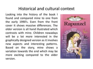
The document is a graphic narrative evaluation by a student. In the summary:
- The student's final product mostly followed their original intentions, though some pages differed slightly from the original plan.
- They constructed images well with consistent textures, colors, and character styles, but could have added more character variations.
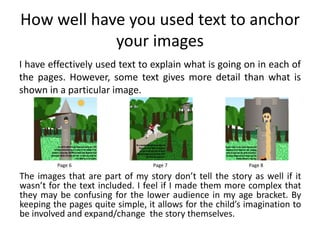
- Text effectively explains the images to anchor the story, though some text provides more detail than images.
- The book is now aimed at 3-6 year olds due to simpler images that still leave room for imagination compared to the original 4-8 year old audience.