The document discusses the strengths and weaknesses of different music magazine genres - rap, indie, and pop - for a school magazine project.
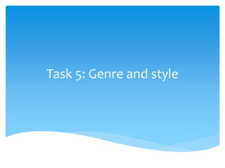
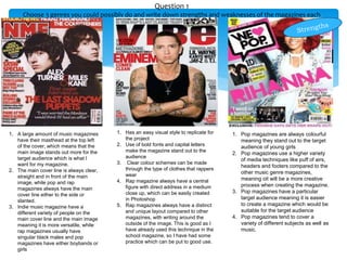
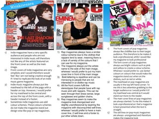
Rap magazines have a consistent color scheme but lack variety, and their bold lettering and stereotypical cover images may alienate some readers. Indie magazines have a niche audience and simplistic covers. Pop magazines appear unprofessional with their bright colors, childlike images, and disorganized text.
Overall, the document evaluates elements like layout, target audience, creativity, and professional appearance to determine which genre style would be best to reference for the school magazine project.