
More Related Content
What's hot
What's hot (17)
Similar to Question 1 evaluation
Similar to Question 1 evaluation (20)
Recently uploaded
Recently uploaded (18)
Question 1 evaluation
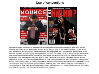
- 1. Use of conventions My model is using a similar pose to the one in the Hip Hop magazine, this made the magazine seem more Hip Hop related as it is quite a serious pose and Hip Hop is a serious genre of music. It also makes the model look like he has been through a lot which is the main theme of most Hip Hop songs. I have put a barcode in the bottom corner of the magazine to make it look more official but not stand out too much. The reason I chose to put the barcode in this corner is because statistically, when looking at something most people start with the top left of the image and move to the bottom right. I had my strapline in black and white to make the writing stand out but the box will blend in with the background. I chose a font that uses all capitol letters to show the importance of the news and to match the masthead. Both my model and the model on the Hip Hop magazine are wearing black jackets and glasses this creates a dark theme that links to Hip Hop. This similar outfit also makes my magazine seem more realistic. I have put my subheadings in numerous fonts to show importance, for example the longer subheadings are in a smaller font because the short snappy ones will grab the readers attention more when buying the magazine.
- 2. I have used a masthead font that uses all capitol letters, this represents the significance of the magazine and the brand itself. I have put my subheadings in numerous font sizes to show importance, for example the longer subheadings are in a smaller font because the short snappy ones will grab the readers attention more when buying the magazine. I have used the same red, white and black colour scheme as this is a commonly used colour scheme in Hip Hop magazines and create dark and dangerous connotations which further link to the theme. Both my model and the model in the actual Hip Hop magazine are looking directly at the reader and both have serious facial expressions, this keeps with the reoccurring theme of danger and tough backgrounds and entices the reader into wanting to find out more about the model.
- 3. Both my model and the model from the Hip Hop magazine are looking directly at the reader, this is attention grabbing and makes the reader want to find out more about this person and why they have such a serious look of importance on their face. Both models are wearing caps which suits the Hip Hop genre, and both are dressed casual which links to the theme of streets and fits into my genre. I used capitol letters for the masthead to suggest importance, I have also used only two colours on the text so the magazine is dark and not too colourful. Both magazines have a black background on one of the pages putting more focus on the photos of the model/ artist and showing that he is the main focus of the magazine.
- 4. Developing conventions I have put the barcode in the bottom right corner instead of the bottom left, this is to draw less attention to it and draw more attention to the subheadings. This is because the target market’s eyes will move left to right on a page because they read left to right being English. I have used Photoshop to change the colour of the models jumper to red which matches the colour scheme, unlike the model is the Hip Hop magazine who has only dark clothing. I have put my subheadings in boxes to stand out better against the background, I have also put my masthead and the smaller subheadings in boxes to keep a reoccurring theme. I have put the more in depth subheadings in white text boxes instead of white writing, this is because I felt that the short, snappy headlines should match the masthead so that they show easily what is in the magazine. I have used a longer strapline so that the info looks like news that is taking place now instead of just having the issue name. I also used a font that uses all caps to emphasize the importance of the news.
- 5. I have used a masthead font that has a box around it, this creates significance and the dirty look of the font links to the Hip Hop theme as most Hip Hop artists claim to have come from rough backgrounds. I have chosen to use a brighter shade of red to catch the attention of the target market, it also stands out more against the colourless background and the white text used for the subheadings and masthead. I have put my subheadings in boxes to stand out better against the background, I have also put my masthead in a box to keep a reoccurring theme. I have used a long shot which shows all of my model and displays setting/ background whereas the Hip Hop magazine uses a close up to emphasize the models facial expression.
- 6. For the larger photo of my model I used a mid-close up so that the reader can see he has his arms folded which creates connotations of seriousness relating to the genre; the Hip Hop magazine has used a close up on the artists face to put more emphasis on the smoke and the models facial expression. Both magazines use a small text on the in depth writing as the pictures are more likely to attract the readers’ attention and the magazine would come across as too informational if the page was filled with writing. I have chosen to include multiple photos for this reason and all of my photos have parts of the streets in the background whereas the Hip Hop magazine only has one large photo with a black background. I have used a colour scheme of red and black as opposed to the yellow and black used by the Hip Hop magazine, this is because its generates connotations of danger which therefor links to the Hip Hop theme.
- 7. Challenge conventions I have used a photo where the model is not showing eye contact with the camera and instead is looking at the ground to create a sad or angry mood which therefor links to the theme. The pose that the model is using also links to the theme as he is putting on his jacket which might suggest he is in the street. I have made it so that there is a lot of stuff on my page and not much empty space, this contrasts with the other magazine as the subheadings are quite spaced out and there is a lot of empty space on the cover. I have taken my photo from the legs upward instead of using a mid-close up where you can only see the chest upwards of the model. This allows the reader to see more of the model and shows the pose more clearly. The model in my magazine is not wearing any jewelry but the one in the real magazine is, this is to show that the person in my magazine is from a rough background which is what most Hip Hop songs suggest about their artists. My magazine has the date that the issue was made on it whereas the Hip Hop magazine doesn’t, this does not achieve any certain effects but is relevant information for the reader. I have used a flash (sticker) on my magazine to show that the issue is limited edition instead of using the strapline to do this, I did this because I think that the strapline should have news on instead of acting as a subheading.
- 8. I have written my subheadings more about the contents of magazine as opposed to the news in the music industry, this works as advertisement to persuade people to want to buy the magazine. I have taken my photo from the legs upward instead of using a mid-close up where you can only see the chest upwards of the model. This allows the reader to see more of the model and shows the pose more clearly which therefor attracts the readers attention making them want to read about the model. I have out my masthead in the top left as naturally people read from top left to bottom right, this mean that the first thing that people will see is the masthead for that page.
- 9. For this page I have used multiple photos with less info because the magazine could come across as too informational and might not interest people from my target market; the Hip Hop magazine however has used a lot of information with only one photo. I have included the backgrounds in the photos as opposed to just black, this way it keeps with the theme of streets and gives the reader some setting and background. The Hip Hop magazine has used a much larger font than I have for the masthead, this has created a lot of blank space on the page so instead I filled my space with photos so that there is more on the page. I decided to use black as my background instead of white because this way it keeps with the colour scheme and matches the models clothing.