
Recommended
More Related Content
What's hot
What's hot (16)
Similar to Task 4 ellen media
Similar to Task 4 ellen media (20)
Recently uploaded
Recently uploaded (20)
Task 4 ellen media
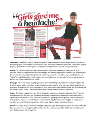
- 1. Typography- Serif fontisusedforthe Headline whichsuggestsamore feminine appeal whichissuitable for the demographicaudience thatwe heartpopreaches.Thisuse of fontalsosuggeststhatJustinsolelyappeals to younggirlswhichisa stereotypical assumptionmade bythe mediatowardsyoungmale artists. Colour- The coloursredand blackare usedthroughoutthe double page spreadandalsointhe artist’s costume.The blacksuggestsmasculinityandstrengthandthe redsuggestslove,romance andpromiscuityall these beingstereotypical traitsandinterestsof ateenage male.The use of these colourslabelsJustinasa ‘typical’teenage boyanddisregardhistalentandknowledge,thisisstereotypical tohow hisage groupand genderare representedwithinthe media. Language- Tabooand intriguinglanguage suchas‘Girls’and‘Dating’are usedcontinuouslythroughoutthe article to attract readersattention,howeverthisalsounderminesthe artistandmakesJustinappeartolack substance. Throughthe use of thislanguage the artistis perhapsrepresentedasshallow andall consumedby the interestingirls.Thisisa stereotypical portrayal of youngmale artistswithinthe media. Images- The largerimage onthe right side of the double page spreadshowsamidto longshot of the artist posingfroma chair. Hisopenand relaxedbodylanguage sendsasuggestiveandopenmessage andonce againovertlysexualisesthe artist.Thisoverall portrayal isappealingtothe magazinestargetaudience but disregardsthe artist’spersonality,talentorinterestsandsolelyfocusesonappealingtopicssuchaslove, romance and girls.Thisisreiteratedinthe otherimage of JustinBieberandSelenaGomez. Layout- The image of Justindominatesthe rightside of the page,thussuggestingpowerandmasculinity.The boldand sharplinesrunningthroughthe article give the article astructuredandedgyfeel whichcorrelates withthe house style of the magazine.
- 2. Typography- The font usedforthe coverline issansserif fontwhichisunconventional asthisisusually associatedwithmale artists.The boldandedgyfontisrelevanttothe house style of the magazine andthe use of pinkfontconnotesfemininity. Colour- The maincoloursusedare pinkand purple.These coloursare associatedwithwomenandare stereotypical tothe coloursusedtopresentwomeninthe media.The use of colourpresentswomenasgirly and feminine. Language- Taboolanguage isusedto highlightinterestingelementsinthe magazine ‘wetand1D’throughthis use of taboolanguage the artistsrepresentedinthe magazine are sexualisedinordertoattract the reader’s attention. Images- The image of Cheryl Cole onthe frontcovershowsherwithopenbodylanguage thismidshot sexualisesandrepresentsherassuggestive.Thisisastereotypical portrayal of womeninthe media.The toplessimagesof HarryStylesalsosexualiseshimandappealstothe targetaudience of younggirls. Layout- The layoutis unorganisedandjumbledthisgivesthe magazine ayoungandfunappeal.The female artistis inthe centre of the magazine anddominatesthe spread,thisisun-stereotypicalasmenare more often presentedasthe dominate genderwithinthenmedia,Thisthendifferentiatesfromthe norm.
- 3. Typography- A mixture of serif andsansserif fontisused onthe contentspage thisappealstoboth boysand girlsandmakesthe page appeargenderneutral. Language- Once againtaboo language isusedthroughoutthe magazine ‘I’dpose nakedforabouta hundredquid’‘we lookedlikecondoms’thisportraysthe boybandas funandenergetic.The use of thislanguage normalisesthe artistsandmakesthemappearmore normal.Italso reinforcesnegative stereotypesaboutteenage boysastheyappearpromiscuousandimmature. Images- The imagesare mainlyof boybandswhichisstereotypical asmalesare stereotypically knownto be the more dominantgenderof the two.In the mainphoto of one directionall boysare seensmilingwhichportraysall the boysas approachable andkindthiscontradictsnegative stereotypesaboutyoungteenage boysandrepresentstheminagoodway. Colour- Blue,redand yelloware usedinthe contentspage andall of thiscoloursare genderneutral. Layout- the layoutisdominatedbyphotosandpull quotesfrommale artists.Thisisstereotypicalas menare sometimesseentodominate the industry.