1. Vibe double page spread
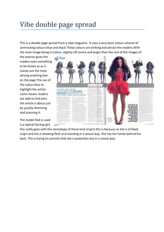
This is a double page spread from a vibe magazine. It uses a very basic colour scheme of
contrasting colours blue and black.These colours are striking and attract the readers.With
the main image being in colour, slightly off centre and larger than the rest of the images of
the woman gives the
readers eyes something
to be drawn to as it
stands out the most
among anything else
on the page.The use of
the colour blue to
highlight the artists
name means readers
are able to find who
the article is about just
by quickly skimming
and scanning it.
The model that is used
is a typical hip hop girl,
this really goes with the stereotype of these kind of girls this is because as she is of black
origin and she is showing flesh and standing in a sexual way. She has her hands behind her
back. This is trying to connote that she is powerless but in a sexual way.