Bezvýchodnou situaci pomohlo vyřešit oddluženíInsolvence
Patrik chtěl pomoci rodičům zachránit jejich rodný dům před dražbou a vzal si několik půjček. Bohužel jeho plán nevyšel a do finančních problémů dostal i sám sebe. Pomohlo oddlužení a Abivia http://abivia.cz/ Vytloukal klín klínem a ze svého invalidního důchodu a brigády nebyl schopen dluh uhradit. Oddlužení mu pomohlo vrátit se do normálního života.
To Get any Project for CSE, IT ECE, EEE Contact Me @ 09666155510, 09849539085 or mail us - ieeefinalsemprojects@gmail.com-Visit Our Website: www.finalyearprojects.org
Gerard Schomaker - De toegevoegde waarde van e-mailmarketing bij het verkopen...Copernica BV
Het nieuwe loyaliteitsprogramma Valk Loyal vergroot het aantal eigen website boekingen en levert terugkerende gasten voor Van der Valk Hotels & Restaurants op. Tezamen met Valk Bonus is het ook een bewezen manier om nieuwe gasten aan te trekken en omzet te genereren. Niet voor niets werd het online platform, waar een deel van de Van der Valk familie onder de noemer Valk Exclusief op draait, afgelopen jaar door Hospitality Sales & Marketing Association International beloond met de Silver Adrian Award.
Persoonlijke e-mailmarketing speelt een centrale rol bij het optimaliseren van de kwaliteitsbeleving voor de gasten van de Valk Exclusief hotels. Het levert aansprekende resultaten op.
Van der Valk deelt in deze presentatie de resultaten van de Valk Loyal e-mailmarketing en de Valk Bonus WK Actie 2014.
Unit 8 - Information and Communication Technology (Paper I).pdfThiyagu K
This slides describes the basic concepts of ICT, basics of Email, Emerging Technology and Digital Initiatives in Education. This presentations aligns with the UGC Paper I syllabus.
The French Revolution, which began in 1789, was a period of radical social and political upheaval in France. It marked the decline of absolute monarchies, the rise of secular and democratic republics, and the eventual rise of Napoleon Bonaparte. This revolutionary period is crucial in understanding the transition from feudalism to modernity in Europe.
For more information, visit-www.vavaclasses.com
Read| The latest issue of The Challenger is here! We are thrilled to announce that our school paper has qualified for the NATIONAL SCHOOLS PRESS CONFERENCE (NSPC) 2024. Thank you for your unwavering support and trust. Dive into the stories that made us stand out!
Operation “Blue Star” is the only event in the history of Independent India where the state went into war with its own people. Even after about 40 years it is not clear if it was culmination of states anger over people of the region, a political game of power or start of dictatorial chapter in the democratic setup.
The people of Punjab felt alienated from main stream due to denial of their just demands during a long democratic struggle since independence. As it happen all over the word, it led to militant struggle with great loss of lives of military, police and civilian personnel. Killing of Indira Gandhi and massacre of innocent Sikhs in Delhi and other India cities was also associated with this movement.
Ethnobotany and Ethnopharmacology:
Ethnobotany in herbal drug evaluation,
Impact of Ethnobotany in traditional medicine,
New development in herbals,
Bio-prospecting tools for drug discovery,
Role of Ethnopharmacology in drug evaluation,
Reverse Pharmacology.
Instructions for Submissions thorugh G- Classroom.pptxJheel Barad
This presentation provides a briefing on how to upload submissions and documents in Google Classroom. It was prepared as part of an orientation for new Sainik School in-service teacher trainees. As a training officer, my goal is to ensure that you are comfortable and proficient with this essential tool for managing assignments and fostering student engagement.
This is a presentation by Dada Robert in a Your Skill Boost masterclass organised by the Excellence Foundation for South Sudan (EFSS) on Saturday, the 25th and Sunday, the 26th of May 2024.
He discussed the concept of quality improvement, emphasizing its applicability to various aspects of life, including personal, project, and program improvements. He defined quality as doing the right thing at the right time in the right way to achieve the best possible results and discussed the concept of the "gap" between what we know and what we do, and how this gap represents the areas we need to improve. He explained the scientific approach to quality improvement, which involves systematic performance analysis, testing and learning, and implementing change ideas. He also highlighted the importance of client focus and a team approach to quality improvement.
Model Attribute Check Company Auto PropertyCeline George
In Odoo, the multi-company feature allows you to manage multiple companies within a single Odoo database instance. Each company can have its own configurations while still sharing common resources such as products, customers, and suppliers.
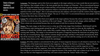
1. Language- The language used on this front cover appeals to the target audience as it uses words that are not used in a
pop magazine. One example of this is ‘the more people hate the stronger we’ll become’. This is conventional because
they are saying that nothing can get to them and they will just keep on getting stronger and more powerful as a band.
This uses of this connotes masculine and power which is conventional for the male leaning audience. Also the use
repetition of the word ‘danger’, this is conventional because the audience will want to read the content of the magazine
because they will want to read about the danger. The use of ‘2 free CD’s’ is conventional because more people will but
it because they know they will get free stuff.
Colour-The colour used on this front cover appeals to the target audience because the colours connote danger and fire
which fits in with the use of the repetition of the word ‘danger’. These colours are red, orange, yellow and black.
These colours are conventional because they are all meant to look fire to connote the danger.
Images- The main image on this front cover is a close up of the main singer from Architects. Both himself and the
band influence male leaning people around the age of 17. The one shot type used is a close up, this enables the
audience to identify the celebrity easily rather than a smaller images that they can barely see. On the front cover he is
wearing dark clothing. This image is conventional for the genre of magazine because the musicians are pulling faces
like they are screaming/being angry and this connotes danger and anger and that is what people stereotypically think
that all the musicians are like. The typography used is in a sans serif font with fire coming out of it, this also fits in
with the colour theme as the colours connote fire and danger.
Content- All of the content is conventional for this genre of music/magazine because it is all related to metal/rock. For
example some of the bands/artists featured in this magazine is; Bring me the Horizon, Architects, Slipknot, Machine
head, Metallica and 5 finger death punch. All these will make the audience want to read the magazine as their
favourite bands are inside the magazine. Some of the content is about Download festival and the ‘hot’ list of 2011 all
these things are conventional for a metal/rock magazine because if the readers didn’t get a chance to go to the festival
they can find out what happened and all they will want to know about the ‘hottest’ bands of the year.
Task 4-Target
Audience
appeal- Front
cover.
2. Language- The language used on this front cover appeals to the target audience as it uses words that are not used
in a pop magazine and in context rather than talking about things unconventional. For example they use ‘what’s
on your CD’, this is conventional because of the use of the word ‘you’ and makes it personal to the reader. Also
‘them crooked culture’, this is conventional because of the word crooked the word connotes brokenness.
Colour-The colour used on this front cover appeals to the target audience. The main colours that have been used
is red, black and white. These are conventional because all of the colours are conventional for men and connotes
masculinity. It is also conventional because this colour scheme is the same throughout every single metal hammer
issue.
Images- There are many images on the context page, this is because it shows the audience what type of
bands/artists are inside and gives a visual representation instead of just giving a cover line on what the article is
about. All of the people on this context page influence male leaning people around the age of 17. The shot types
used range from close-ups to midshots. In all of the images none of them are smiling, they are either making a
stern and serious face or making a screaming face. This is conventional because if they were smiling and being
all happy it wouldn’t fit in with the genre of music and people wouldn’t want to read it.
Content- All of the content is conventional for this genre of music/magazine because it is all related to
metal/rock. For example some of the bands/artists featured in this magazine is; August burns red and many more.
All these will make the audience want to read the magazine as their favourite bands are inside the magazine.
Some of the content is about catching up with bands, reviews and posters. All of this stuff is very conventional
for a metal/rock magazine, this is because they can find out what has happened in the band lives and what new is
coming up. Also the posters are conventional for a content because they will want to put their favourite influences
onto their walls.
Task 4-Target
Audience appeal-
Content page.
3. Language- The quote ‘When Jimmy passed away the first thought about the band was its over’.
This is conventional because it shows that they band is very powerful because of that they
thought they were over but now they are back. Also ‘2000 was the year that changes
everything’ this is conventional because it shows that they band are very sad that Jimmy had
passed away and that how sad they are.
Colour- The colours used on this double page spread is very dark which connotes danger/death
which helps with the content of the double page spread as it is about Jimmy passing away and it
wouldn’t be right if the colours were bright and pink. The colour used on this double page
spread appeals to the target audience. The main colours that have been used is cream, black and
white. These are conventional because all of the colours are conventional for men and connotes
masculinity and also morning because of the tragic death.
Images- One of the sides of the whole double page spread is Jimmy from Avenged Sevenfold,
this is a midshots. Also the camera angle shows him as powerful and that he will always be
remembered. The ‘2000’ has parts of the typography smudged off and the background is all
cracked, this connotes that even though there is death that had happening there is still light at
the end of the tunnel. This is conventional for the target audience because they wouldn’t want
their favourite band to break up and they still want hope that they are still together.
Content- The content is very simple because it is about the death of Jimmy and how the band
will cope and to try and move on from it. All of this stuff about the death is very conventional
for a metal/rock magazine, this is because they can find out what has happened in the band
lives and what new is coming up.
Task 4-Target Audience
appeal- Double page
spread.