
More Related Content
What's hot
What's hot (20)
Similar to Front covers
Similar to Front covers (20)
Recently uploaded
Recently uploaded (18)
Front covers
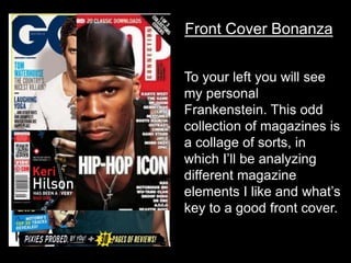
- 1. Front Cover Bonanza To your left you will see my personal Frankenstein. This odd collection of magazines is a collage of sorts, in which I’ll be analyzing different magazine elements I like and what’s key to a good front cover.
- 2. Though not a music magazine, I really like GQs use of a colour, sticking to a variety of simple blues and and grays which look pretty good. Vibe used an interesting main cover line where they alternated colours between the main red and white. They advertise free content here as well. The language is also fairly colloquial, which is fitting for the hip-hop genre. Both magazines use similar mastheads: they use sans-serif fonts to convey the more serious genres of these two magazines. They’re big and bold, but are still overlapped by images because people know the magazines. They also use the put the rest of the magazines name in a separate colour within the wording. Pretty funky. This use of the bottom strip to show off another big article in the magazine is interesting as it widens the target audience to readers who only want to see this without taking anything away from the main article.
- 3. What else? So in a good front cover you’re gonna want to have a it suited to your target audience. You won’t aim heavy metal stuff at elderly people (probably). This requires a genre firstly, pop, reggae; what’s your magazine all about? Then you need a good masthead. Your ship won’t set sail without one. Get it? Dumb pirate analogy? No? Oh well. It should be accompanied by a sell line. You also need to check your use of language. Maybe in a hip-hop magazine you can be a bit more laid back in your wording, but not so much in a magazine about orchestral music. You’ll also need purchasing details like a barcode, so you can make money. Can’t sell it if you can’t scan it. Advertising/promotions is important too! People love free stuff and might be more enticed to buy your magazine if there’s a chance for a free shirt. Your main image should take center stage, with additional images to attract more people. Mise-en-scene. Great phrase, but you need to have a good looking magazine because who wants to buy something that looks like it was made by a seven year old. That was wordy, yikes.