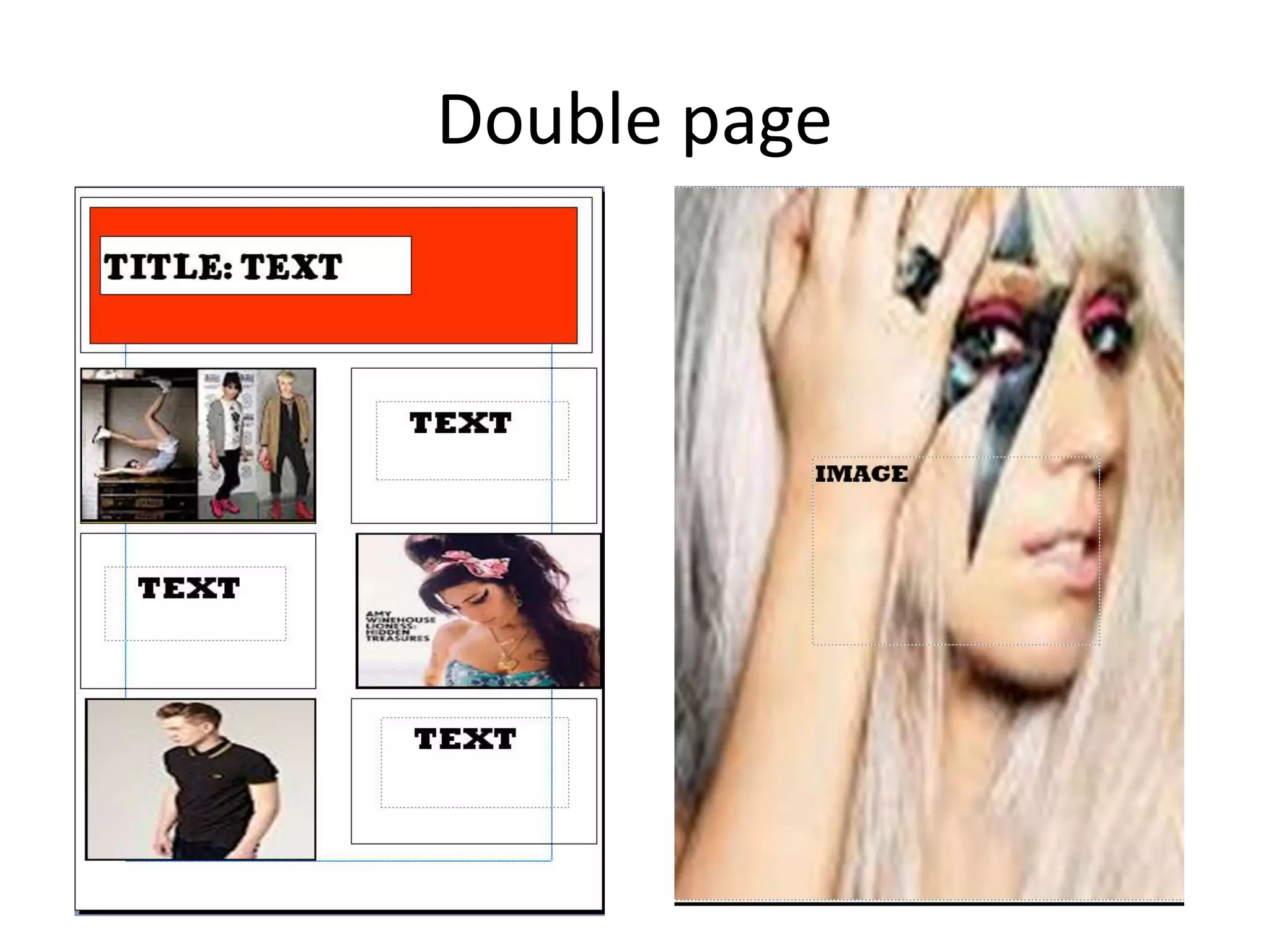
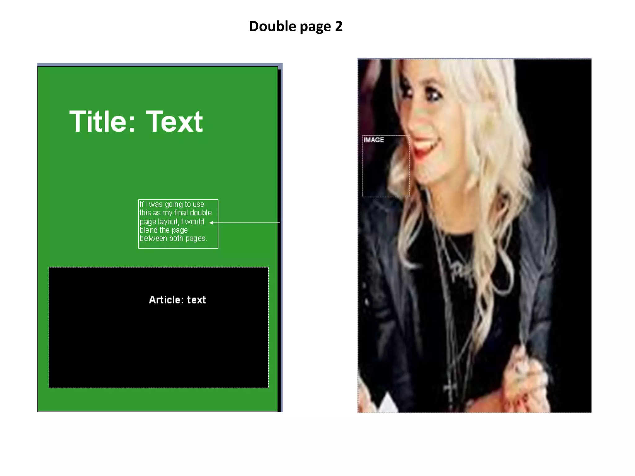
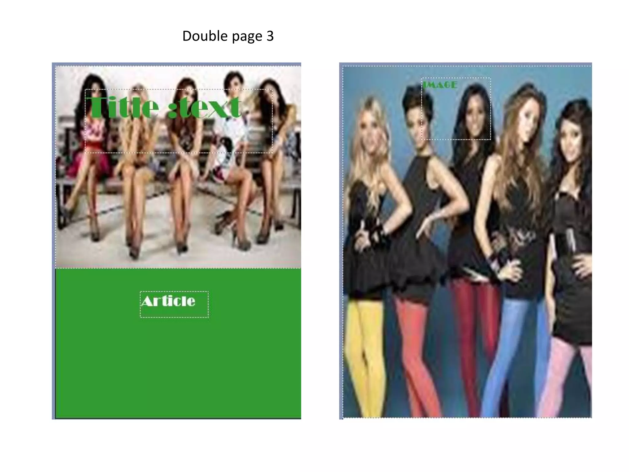
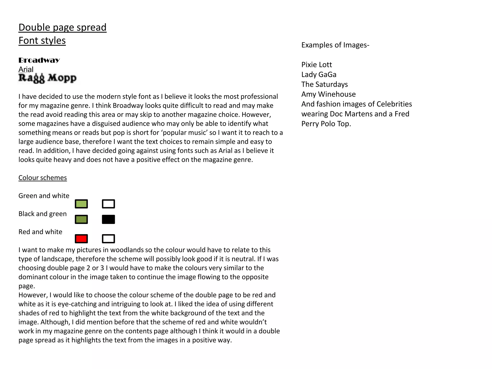
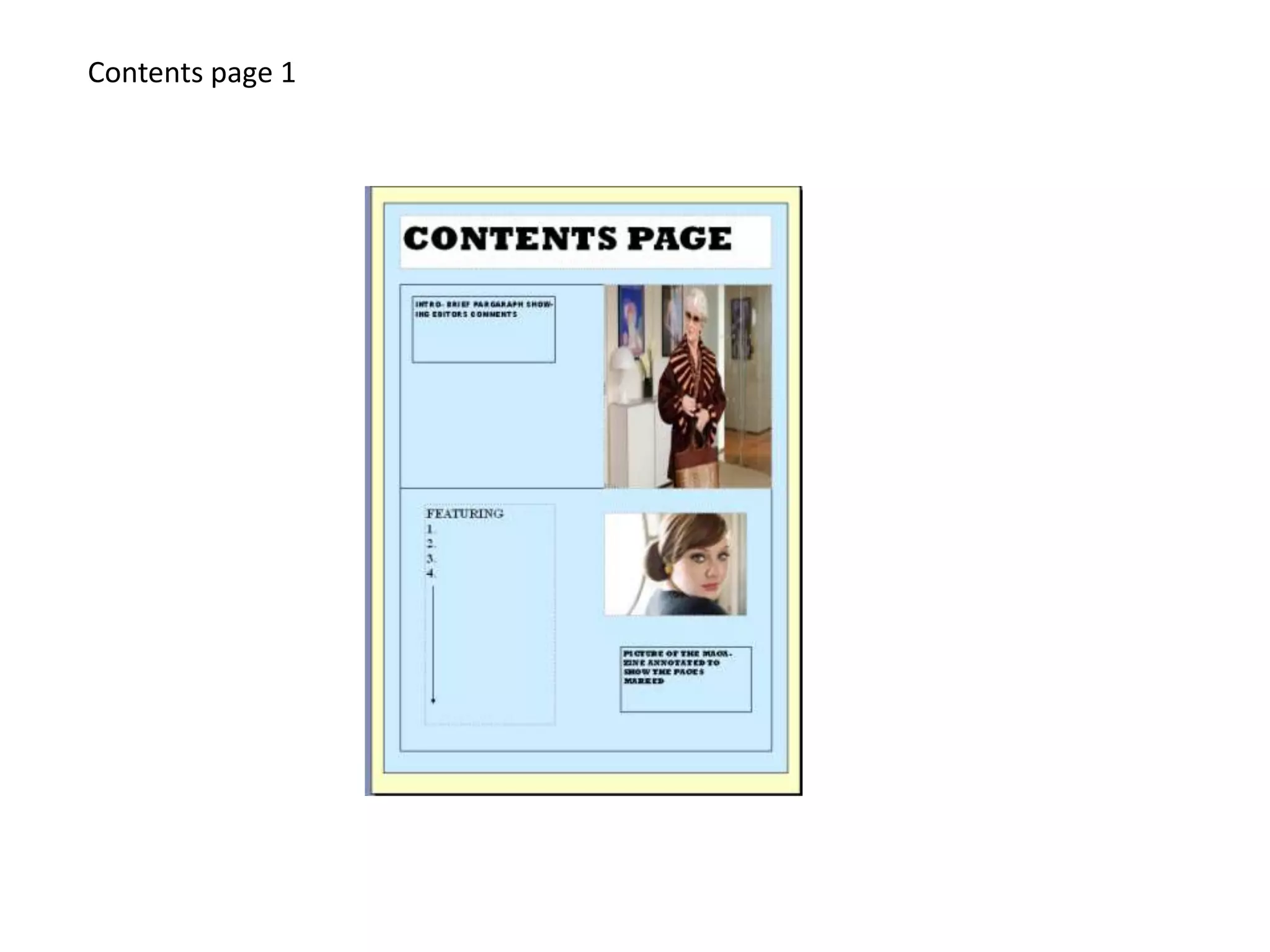
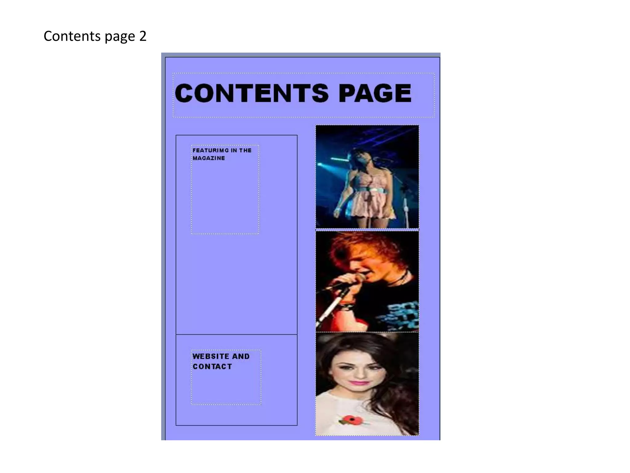
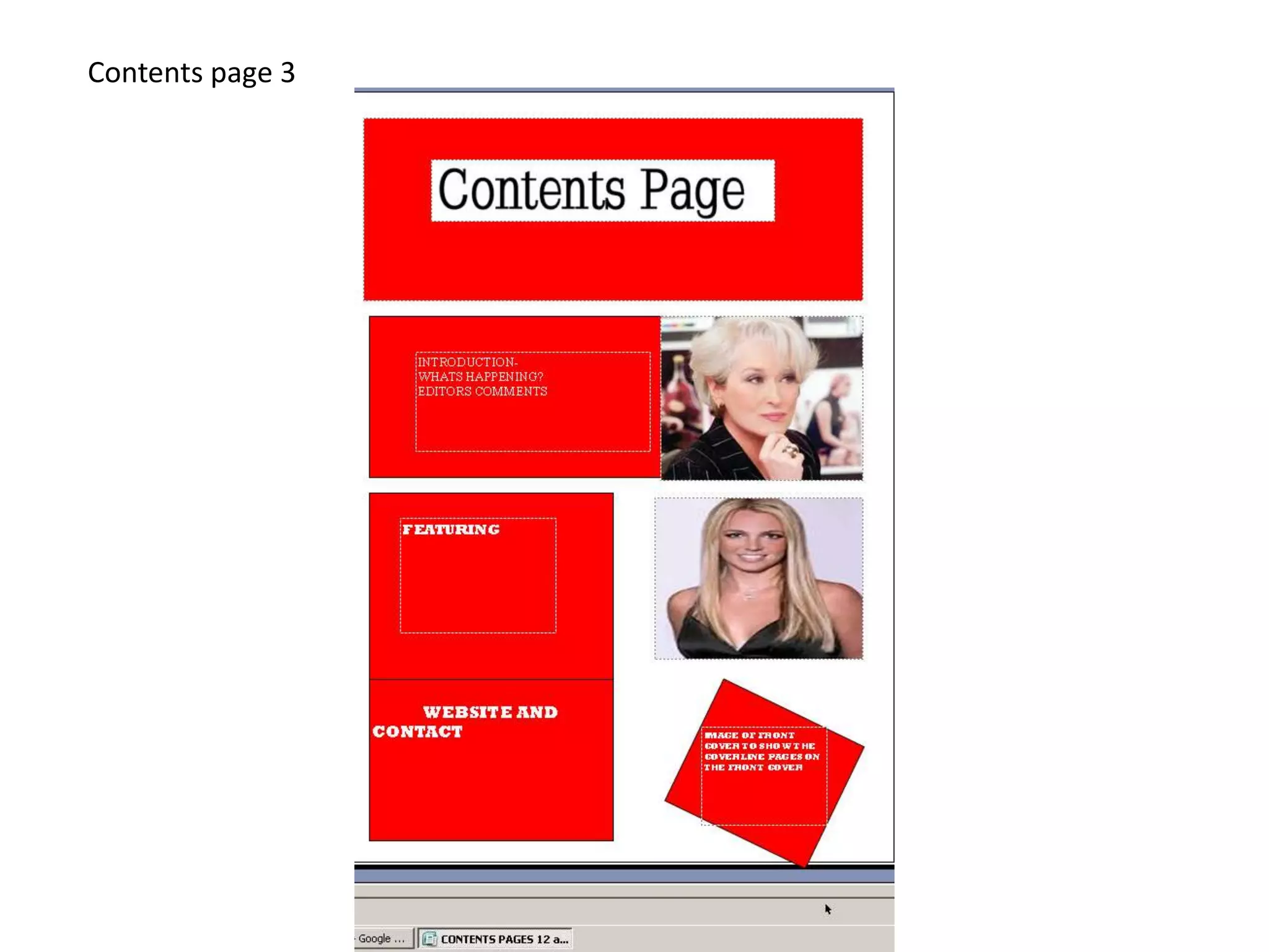
The document discusses font and color scheme options for different pages in a music magazine, including the contents page and double page spreads. For the contents page, the author selects Aerial Rounded MT Bold font in different shades of blue to match the magazine cover. Red and white is considered but deemed not suitable for the music genre. For double page spreads, red and white is selected as eye-catching while still allowing text and images to stand out. Green and white, black and green, and other neutral colors are also considered for nature photography spreads. Broadway and Arial fonts are rejected as too difficult to read or heavy for the intended audience and genre.


![Planning production ]](https://cdn.slidesharecdn.com/ss_thumbnails/planningproduction-131212143738-phpapp02-thumbnail.jpg?width=640&height=640&fit=bounds)


![Vibe Coding vs. Spec-Driven Development [Free Meetup]](https://cdn.slidesharecdn.com/ss_thumbnails/vibecodingvsspecdrivendevelopment-251209105622-43f455e7-thumbnail.jpg?width=640&height=640&fit=bounds)


