Download as PDF, PPTX

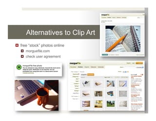
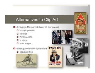
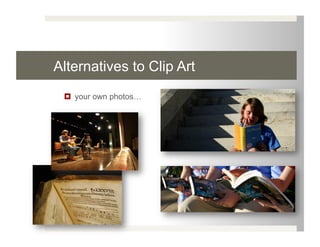
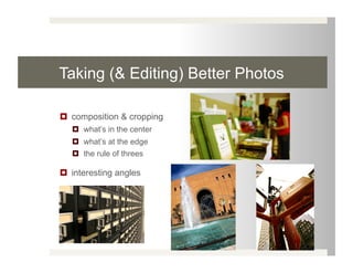
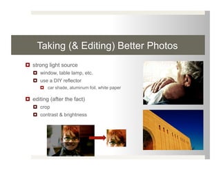
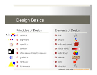
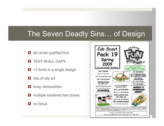
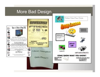
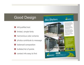
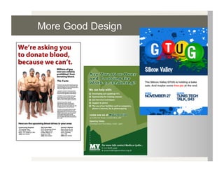

The document discusses alternatives to using clip art in design, such as free stock photos online, photos from the Library of Congress, and taking one's own photos. It provides tips for better photo composition and editing. The document also covers basic design principles and elements, common design mistakes to avoid, and considerations for printing like file format and resolution.


