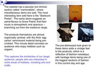
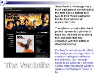
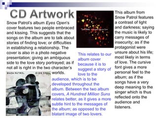
Website
The way that the t-shirt references
                                    the album cover further advertises
                                    the wearer’s love for Snow Patrol;
                                    due to them being bold enough to
                                    wear things that actually say “Snow
                                    Patrol” on them.


Despite Snow Patrol‟s music being like that of our chosen
band‟s, this ideology of our audience being very outgoing
about their taste in music contrasts with our more reserved
audience‟s.
The website has a peculiar but intrinsic
section called “memorabilia”, where
miscellaneous items are sold. The most
interesting item sold here is the “Starburst
Poster”. The name alone suggests an
astral-flavour to Snow Patrol; that their
music is atmospheric and spacious –
branching out from the mediocre range.

The products themselves are almost
organically centred; with the thick „egg
carton‟ reminiscent material being pre-
crinkled. This minute detail connotes an
audience who enjoy hobbies such as             The pre-distressed look given to
origami.                                       these items adds a vintage feel
                                               to the products; which is a
                                               reflection of fashion nowadays;
This captures the similarities of our target   with heritage items being one of
audience; people who are interested in         the biggest sections of fashion
niche areas of hobbies, including arts and     in this current day and age.
crafts.
Snow Patrol‟s homepage has a
black background; connoting that
the band have a distinct dark
twist to their music; a possible
trait for their passion for
melancholic rock.

The yellow contrast in their band
picture represents a glimmer of
hope that the band bring; telling
their audience that they
empathise with their potential
downheartedness.

Our band‟s website would reflect
this design; contrasting colours to
create an ambiguous effect on
the audience. Our message
needs to be subtle as it therefore
seems more intellectual; which is
what our demographic aspire to
be.
This album from
                                                                Snow Patrol features
Snow Patrol‟s album Eyes Open‟s                                 a contrast of light
cover features two people embraced                              and darkness; saying
and kissing. This suggests that the                             the music is likely to
songs on the album are to talk about                            carry messages of
stories of finding love; or difficulties                        insecurity; as if the
in establishing a relationship. The                             protagonist were
cover is also in a photo negative           This relates to our unsure about his life;
presentation; giving an ambiguous           album cover         most likely in terms
side to the love story portrayed; as if because it is to        of love. The cursive
not all is right in the two character‟s suggest a story of font gives a more
                            worlds.         love to the         personal feel to the
                            audience, which is to be            album; as if the
                            developed throughout the            songs have a very
                            album. Between the two album deep meaning to the
                            covers, A Hundred Million Suns singer which is thus
                            relates better, as it gives a more reflected onto the
                            subtle hint to the messages of      audience and
                            the album; as opposed to the        listeners.
                            blatant image of two lovers.

Snow Patrol

  • 1.
  • 2.
    The way thatthe t-shirt references the album cover further advertises the wearer’s love for Snow Patrol; due to them being bold enough to wear things that actually say “Snow Patrol” on them. Despite Snow Patrol‟s music being like that of our chosen band‟s, this ideology of our audience being very outgoing about their taste in music contrasts with our more reserved audience‟s.
  • 3.
    The website hasa peculiar but intrinsic section called “memorabilia”, where miscellaneous items are sold. The most interesting item sold here is the “Starburst Poster”. The name alone suggests an astral-flavour to Snow Patrol; that their music is atmospheric and spacious – branching out from the mediocre range. The products themselves are almost organically centred; with the thick „egg carton‟ reminiscent material being pre- crinkled. This minute detail connotes an audience who enjoy hobbies such as The pre-distressed look given to origami. these items adds a vintage feel to the products; which is a reflection of fashion nowadays; This captures the similarities of our target with heritage items being one of audience; people who are interested in the biggest sections of fashion niche areas of hobbies, including arts and in this current day and age. crafts.
  • 4.
    Snow Patrol‟s homepagehas a black background; connoting that the band have a distinct dark twist to their music; a possible trait for their passion for melancholic rock. The yellow contrast in their band picture represents a glimmer of hope that the band bring; telling their audience that they empathise with their potential downheartedness. Our band‟s website would reflect this design; contrasting colours to create an ambiguous effect on the audience. Our message needs to be subtle as it therefore seems more intellectual; which is what our demographic aspire to be.
  • 5.
    This album from Snow Patrol features Snow Patrol‟s album Eyes Open‟s a contrast of light cover features two people embraced and darkness; saying and kissing. This suggests that the the music is likely to songs on the album are to talk about carry messages of stories of finding love; or difficulties insecurity; as if the in establishing a relationship. The protagonist were cover is also in a photo negative This relates to our unsure about his life; presentation; giving an ambiguous album cover most likely in terms side to the love story portrayed; as if because it is to of love. The cursive not all is right in the two character‟s suggest a story of font gives a more worlds. love to the personal feel to the audience, which is to be album; as if the developed throughout the songs have a very album. Between the two album deep meaning to the covers, A Hundred Million Suns singer which is thus relates better, as it gives a more reflected onto the subtle hint to the messages of audience and the album; as opposed to the listeners. blatant image of two lovers.