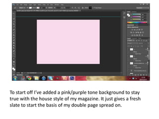
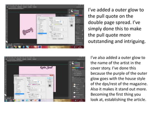
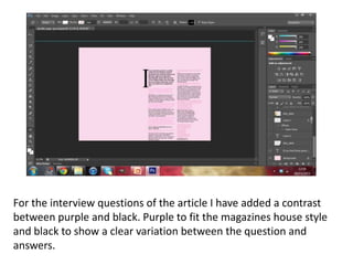
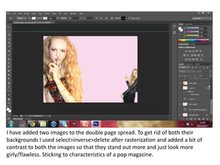
To start off I’ve added a pink/purple tone background to stay
true with the house style of my magazine. It just gives a fresh
slate to start the basis of my double page spread on.
I’ve added a outer glow to
the pull quote on the
double page spread. I’ve
simply done this to make
the pull quote more
outstanding and intriguing.


 I’ve also added a outer glow to
 the name of the artist in the
 cover story. I‘ve done this
 because the purple of the outer
 glow goes with the house style
 of the dps/rest of the magazine.
 Also it makes it stand out more.
 Becoming the first thing you
 look at, establishing the article.
For the interview questions of the article I have added a contrast
between purple and black. Purple to fit the magazines house style
and black to show a clear variation between the question and
answers.
I have added two images to the double page spread. To get rid of both their
backgrounds I used select>inverse>delete after rasterization and added a bit of
contrast to both the images so that they stand out more and just look more
girly/flawless. Sticking to characteristics of a pop magazine.

Skills development double page spread

  • 1.
    To start offI’ve added a pink/purple tone background to stay true with the house style of my magazine. It just gives a fresh slate to start the basis of my double page spread on.
  • 2.
    I’ve added aouter glow to the pull quote on the double page spread. I’ve simply done this to make the pull quote more outstanding and intriguing. I’ve also added a outer glow to the name of the artist in the cover story. I‘ve done this because the purple of the outer glow goes with the house style of the dps/rest of the magazine. Also it makes it stand out more. Becoming the first thing you look at, establishing the article.
  • 3.
    For the interviewquestions of the article I have added a contrast between purple and black. Purple to fit the magazines house style and black to show a clear variation between the question and answers.
  • 4.
    I have addedtwo images to the double page spread. To get rid of both their backgrounds I used select>inverse>delete after rasterization and added a bit of contrast to both the images so that they stand out more and just look more girly/flawless. Sticking to characteristics of a pop magazine.