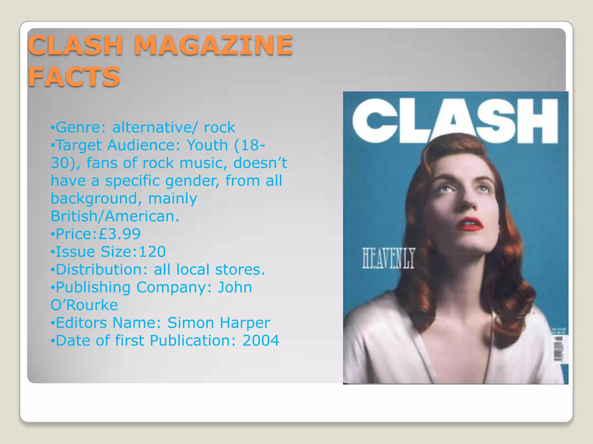
- Clash Magazine targets youth aged 18-30 who enjoy rock music, published in the UK and US.
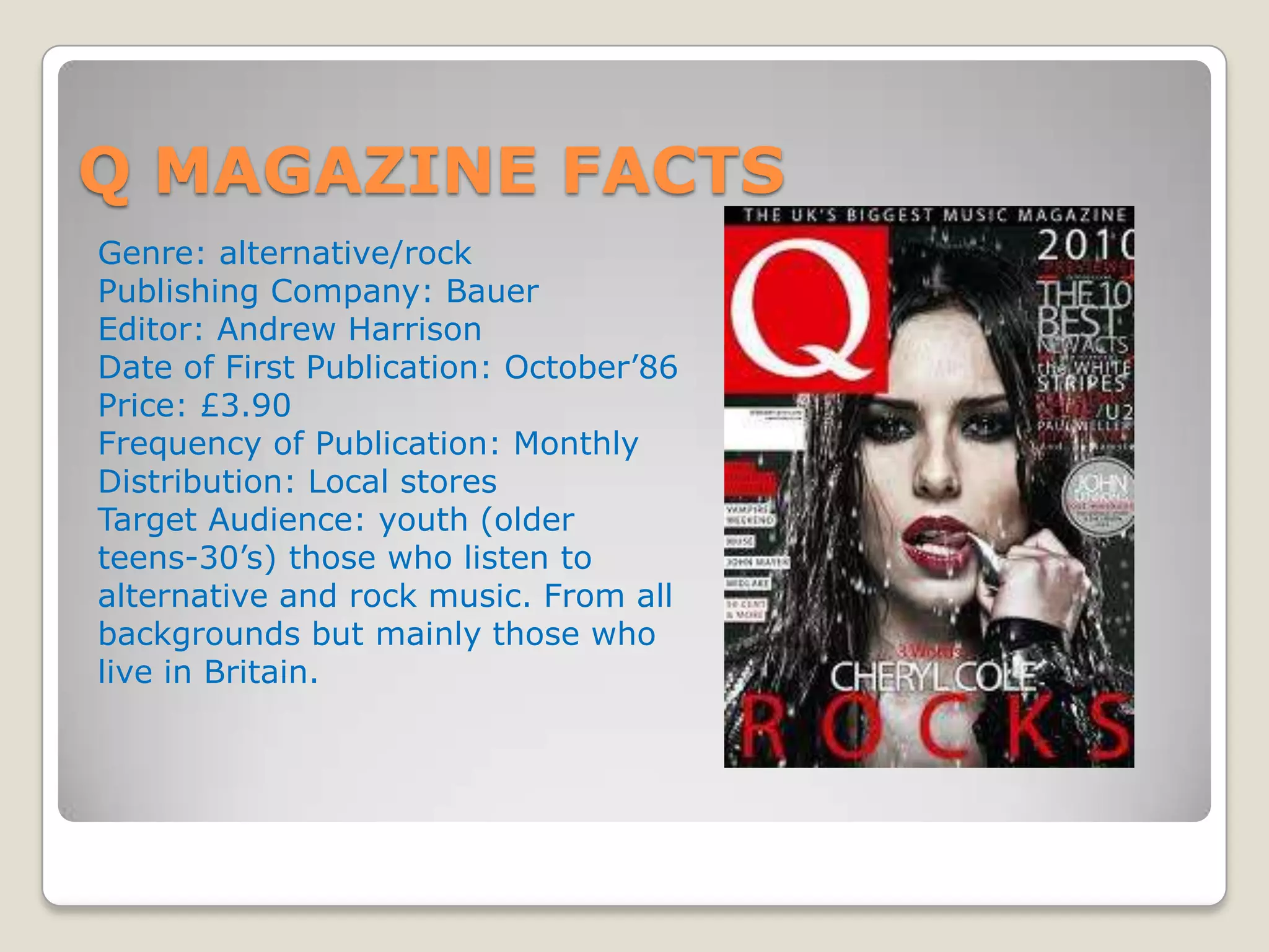
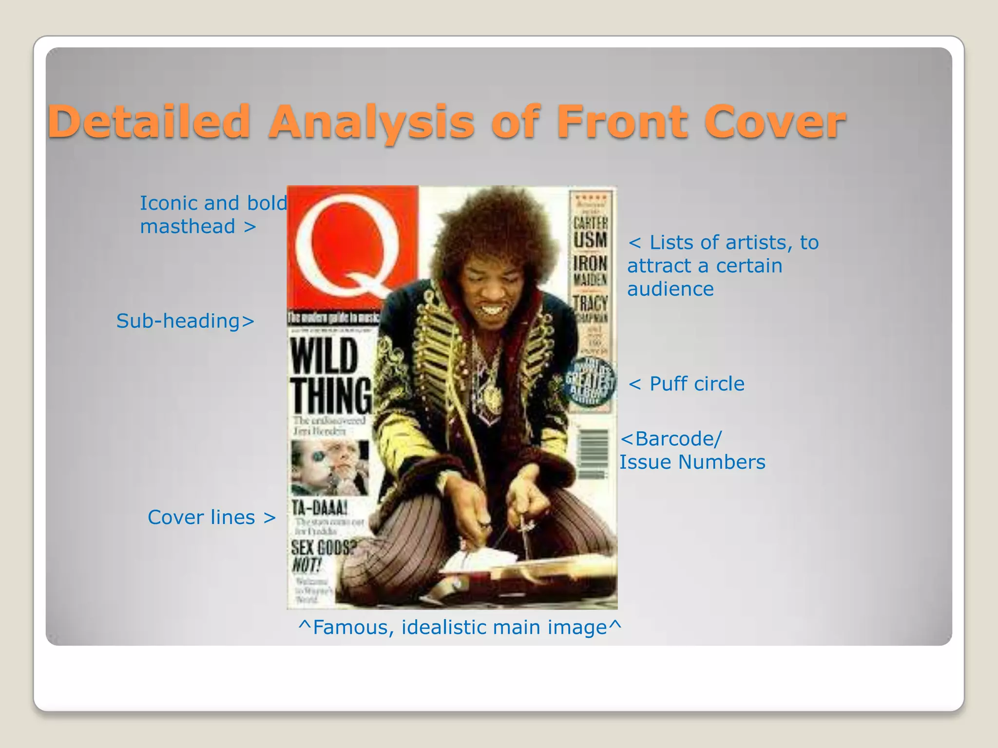
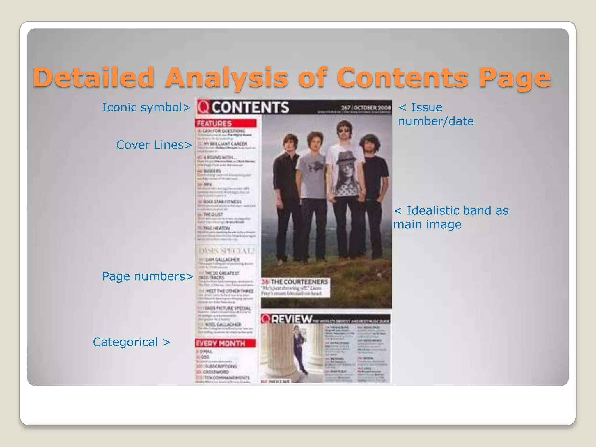
- Q Magazine targets a similar demographic and focuses on alternative and rock music.
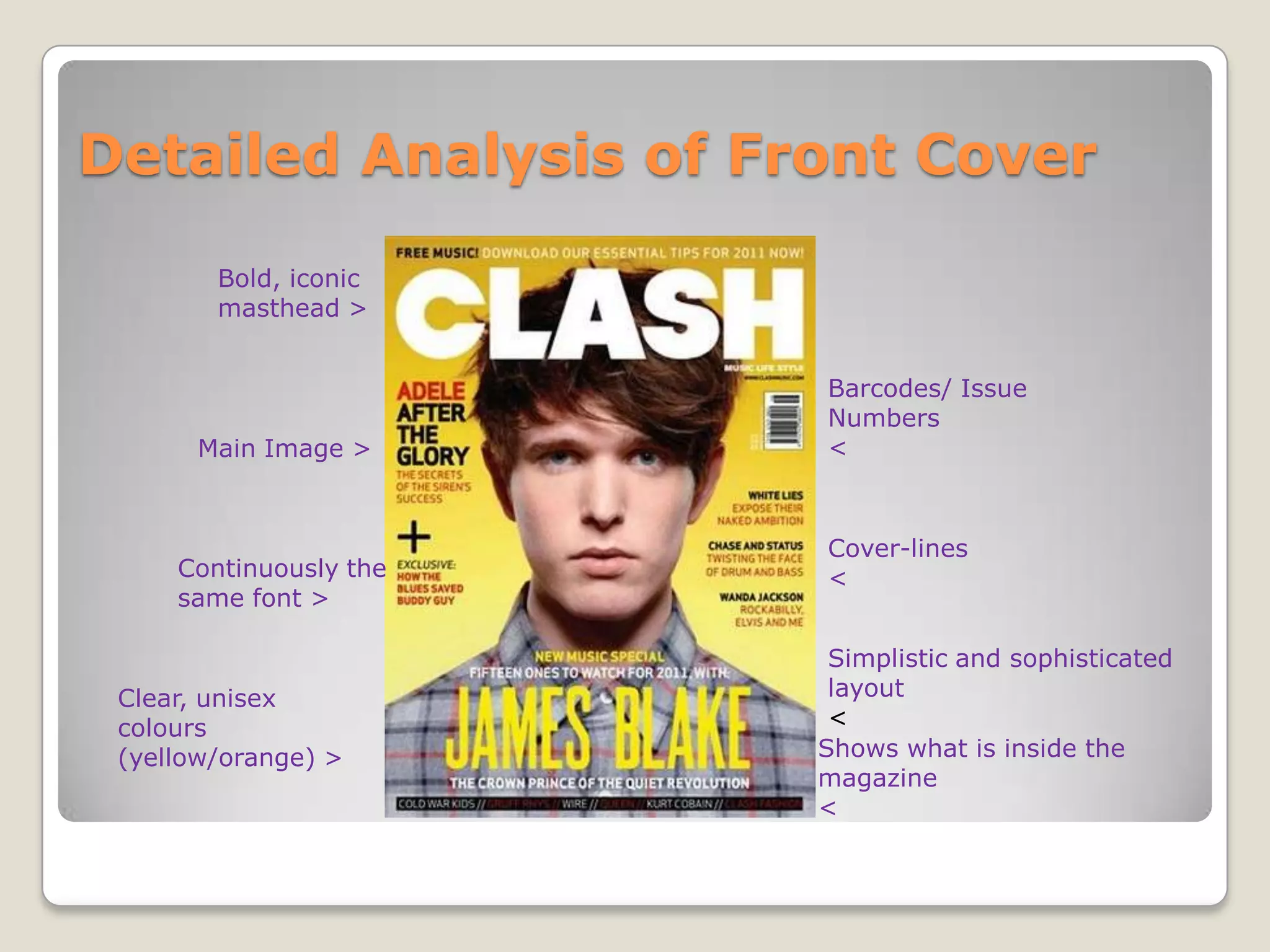
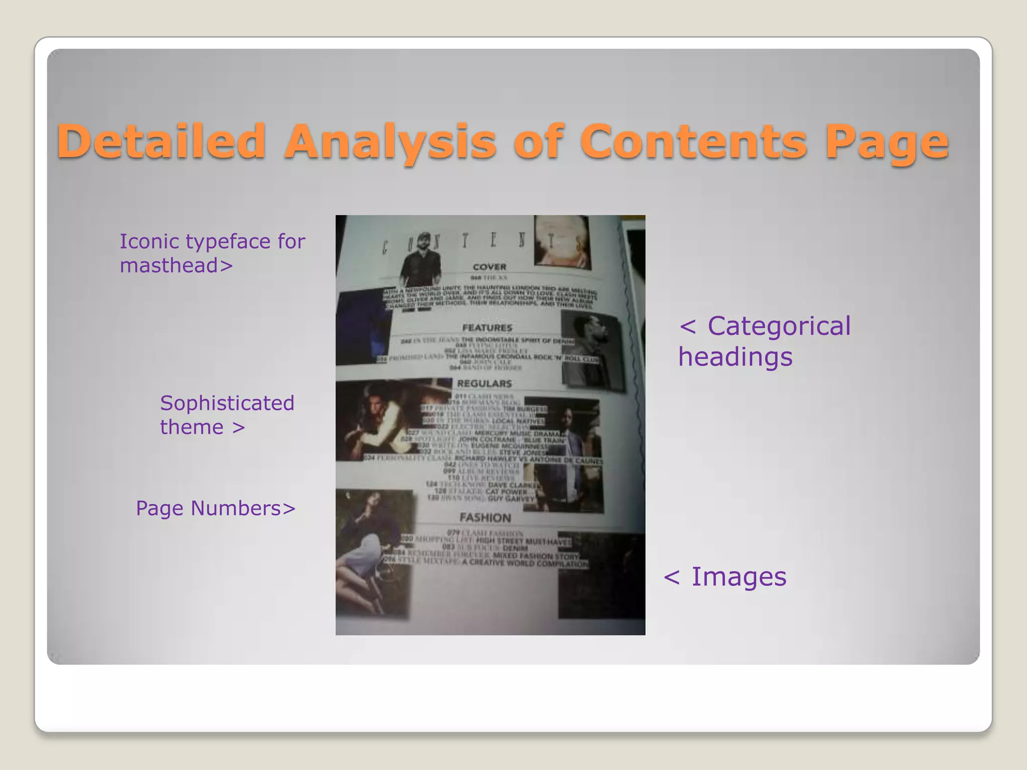
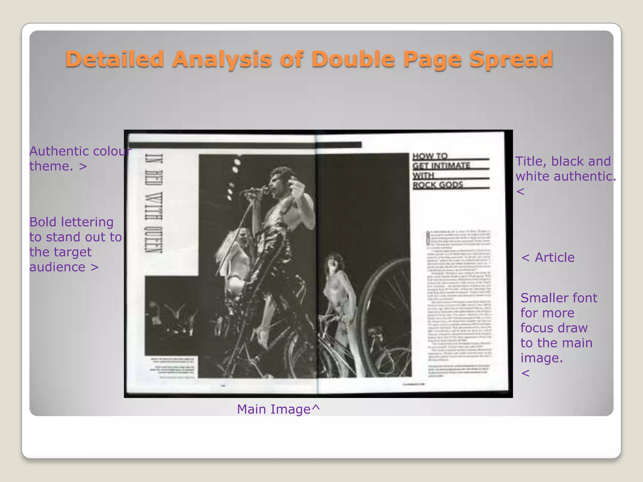
- For their magazine, the student aims to combine the sophistication of Clash Magazine's layout with the clear conventions seen in Q Magazine to effectively promote the content.