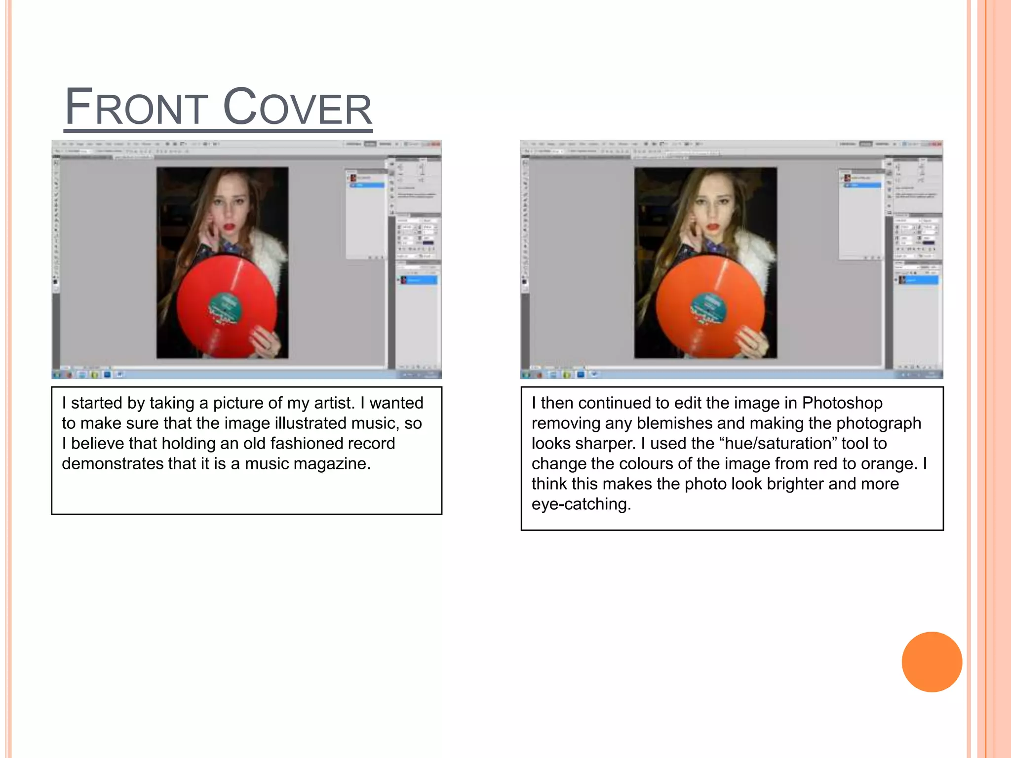
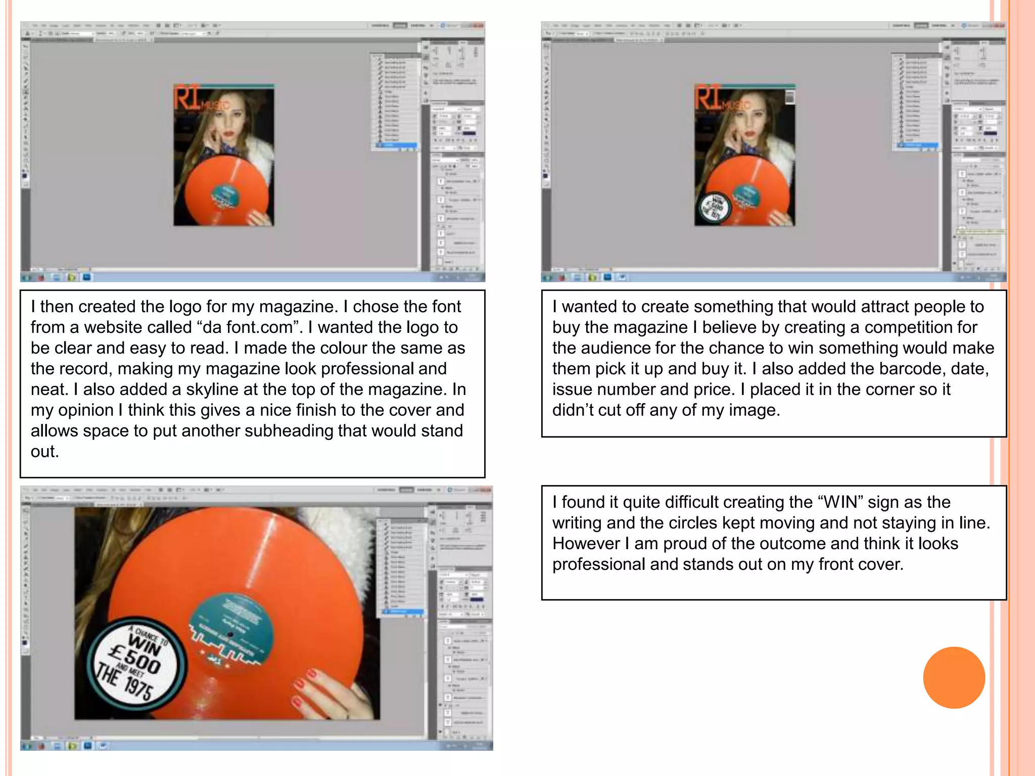
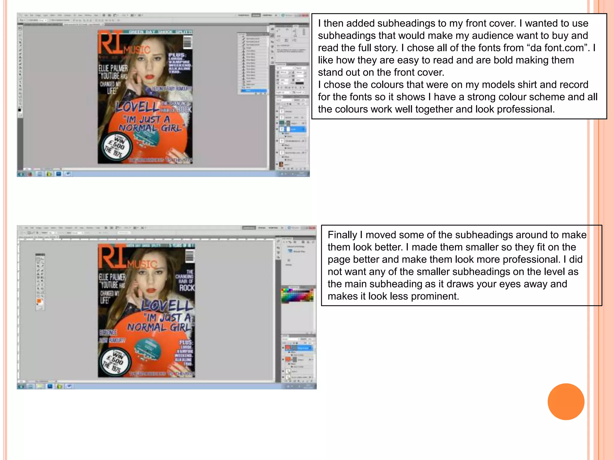
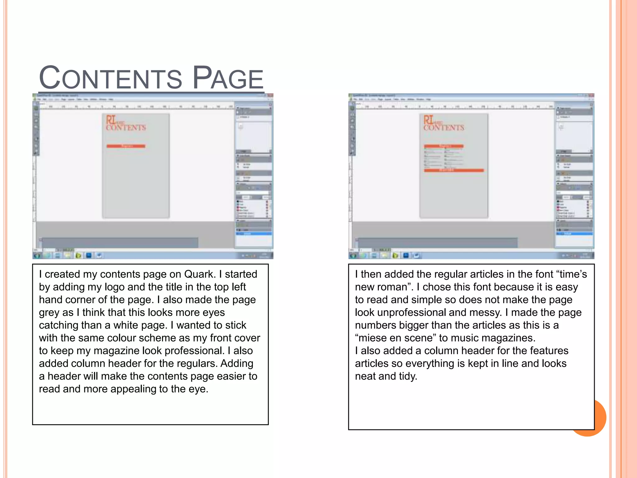
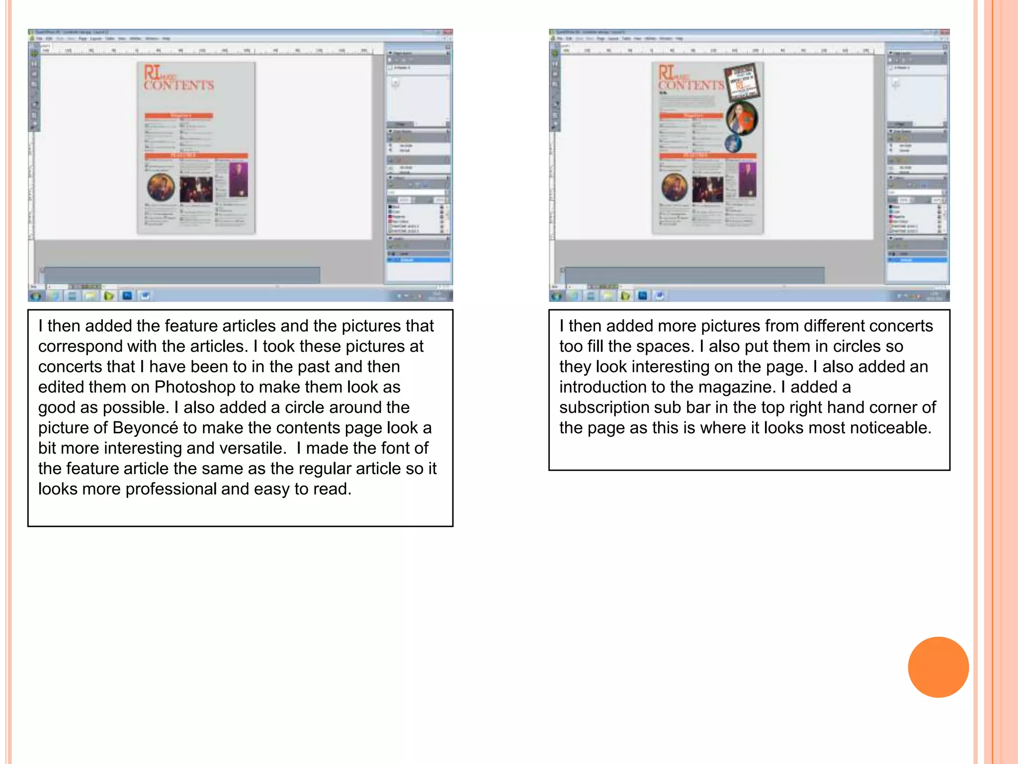
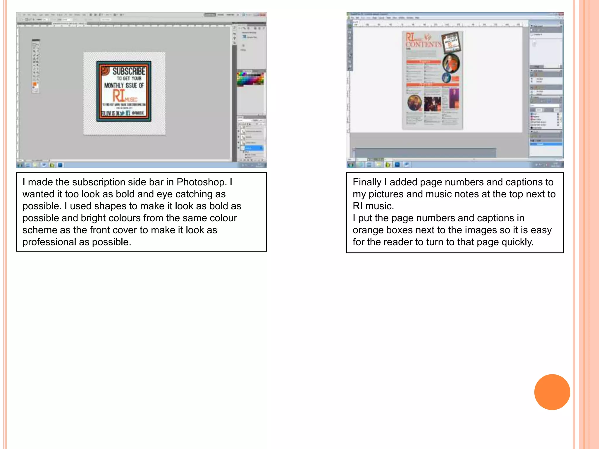
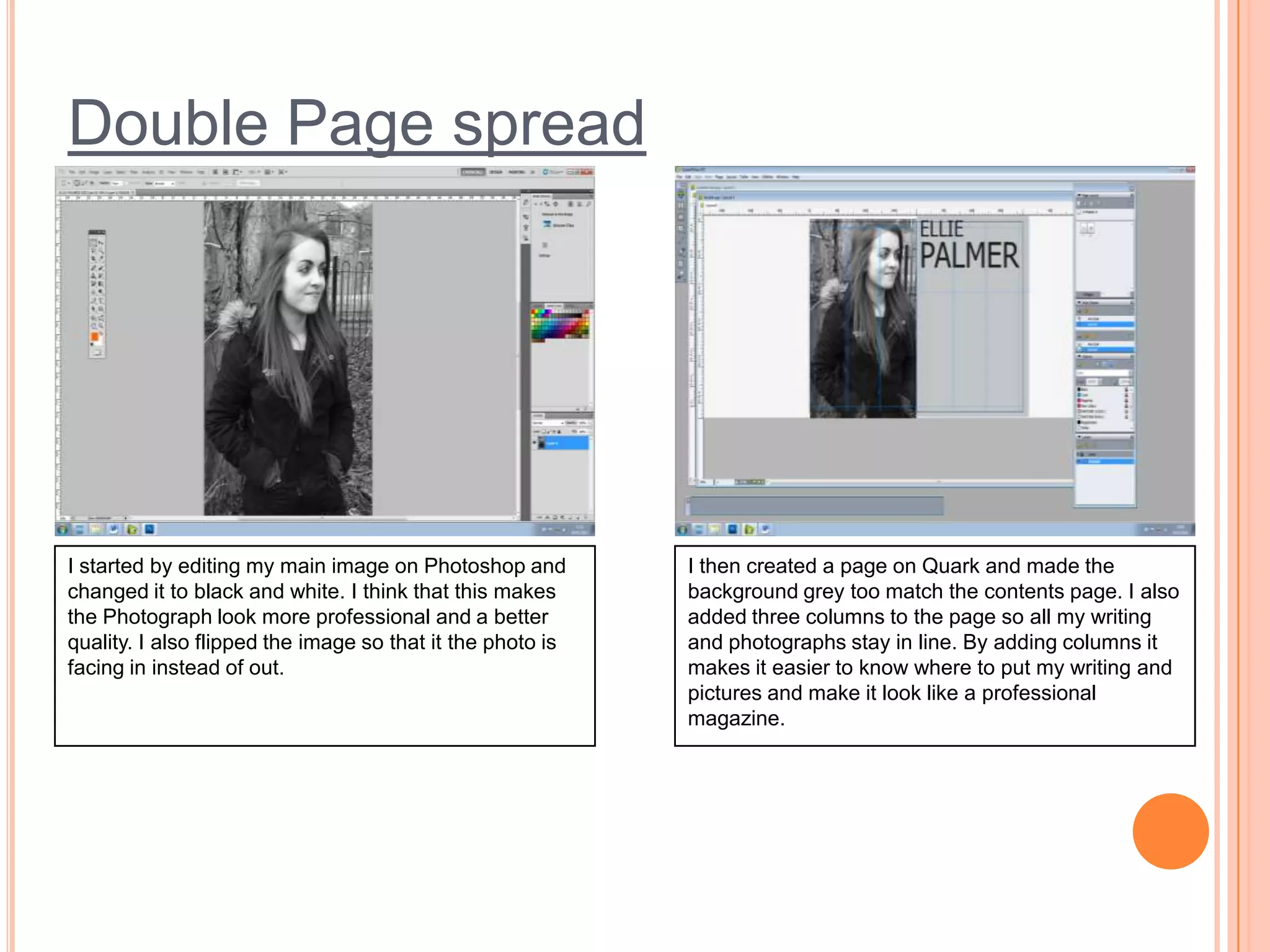
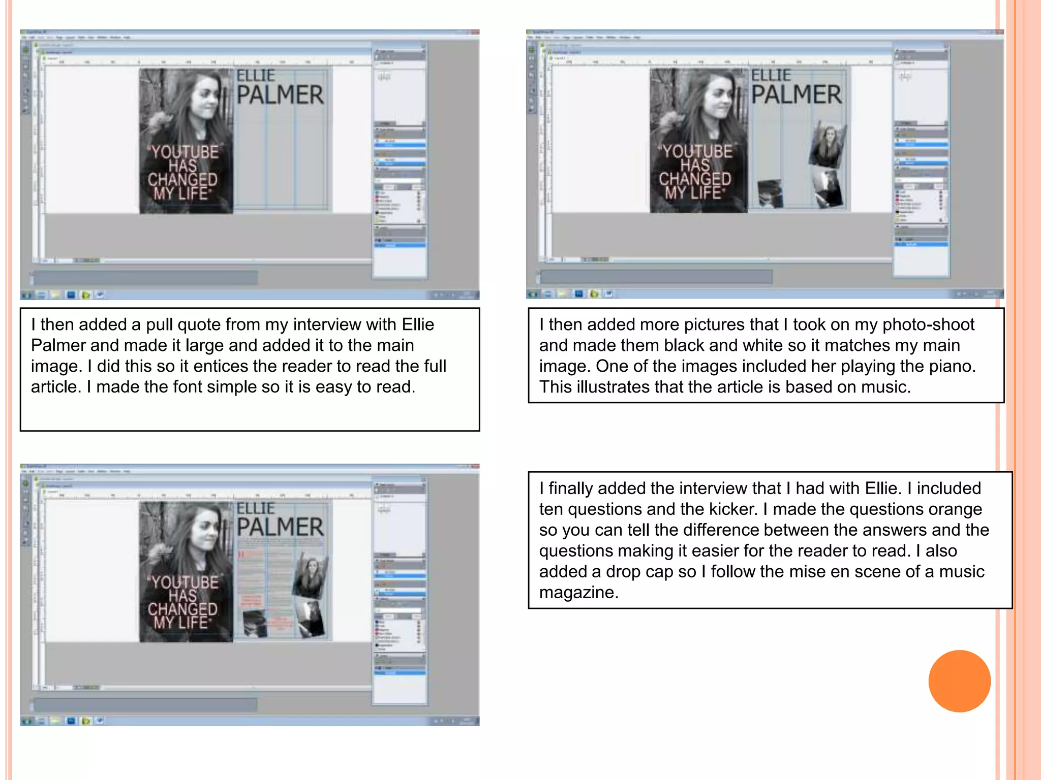
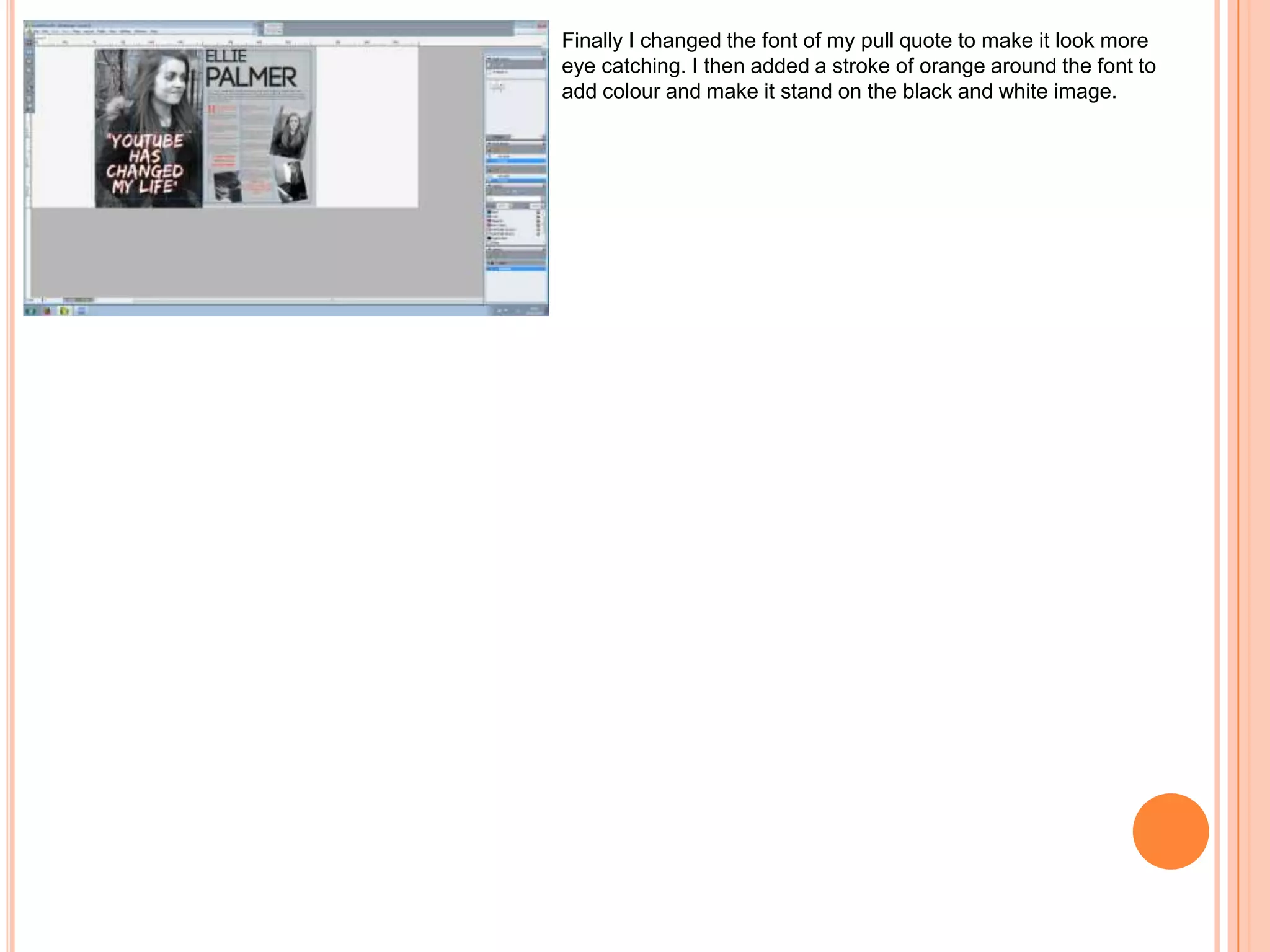
FINAL SCREENSHOTS
FRONT COVER

I started by taking a picture of my artist. I wanted
to make sure that the image illustrated music, so
I believe that holding an old fashioned record
demonstrates that it is a music magazine.

I then continued to edit the image in Photoshop
removing any blemishes and making the photograph
looks sharper. I used the “hue/saturation” tool to
change the colours of the image from red to orange. I
think this makes the photo look brighter and more
eye-catching.
I then created the logo for my magazine. I chose the font
from a website called “da font.com”. I wanted the logo to
be clear and easy to read. I made the colour the same as
the record, making my magazine look professional and
neat. I also added a skyline at the top of the magazine. In
my opinion I think this gives a nice finish to the cover and
allows space to put another subheading that would stand
out.

I wanted to create something that would attract people to
buy the magazine I believe by creating a competition for
the audience for the chance to win something would make
them pick it up and buy it. I also added the barcode, date,
issue number and price. I placed it in the corner so it
didn’t cut off any of my image.

I found it quite difficult creating the “WIN” sign as the
writing and the circles kept moving and not staying in line.
However I am proud of the outcome and think it looks
professional and stands out on my front cover.
I then added subheadings to my front cover. I wanted to use
subheadings that would make my audience want to buy and
read the full story. I chose all of the fonts from “da font.com”. I
like how they are easy to read and are bold making them
stand out on the front cover.
I chose the colours that were on my models shirt and record
for the fonts so it shows I have a strong colour scheme and all
the colours work well together and look professional.

Finally I moved some of the subheadings around to make
them look better. I made them smaller so they fit on the
page better and make them look more professional. I did
not want any of the smaller subheadings on the level as
the main subheading as it draws your eyes away and
makes it look less prominent.
CONTENTS PAGE

I created my contents page on Quark. I started
by adding my logo and the title in the top left
hand corner of the page. I also made the page
grey as I think that this looks more eyes
catching than a white page. I wanted to stick
with the same colour scheme as my front cover
to keep my magazine look professional. I also
added column header for the regulars. Adding
a header will make the contents page easier to
read and more appealing to the eye.

I then added the regular articles in the font “time’s
new roman”. I chose this font because it is easy
to read and simple so does not make the page
look unprofessional and messy. I made the page
numbers bigger than the articles as this is a
“miese en scene” to music magazines.
I also added a column header for the features
articles so everything is kept in line and looks
neat and tidy.
I then added the feature articles and the pictures that
correspond with the articles. I took these pictures at
concerts that I have been to in the past and then
edited them on Photoshop to make them look as
good as possible. I also added a circle around the
picture of Beyoncé to make the contents page look a
bit more interesting and versatile. I made the font of
the feature article the same as the regular article so it
looks more professional and easy to read.

I then added more pictures from different concerts
too fill the spaces. I also put them in circles so
they look interesting on the page. I also added an
introduction to the magazine. I added a
subscription sub bar in the top right hand corner of
the page as this is where it looks most noticeable.
I made the subscription side bar in Photoshop. I
wanted it too look as bold and eye catching as
possible. I used shapes to make it look as bold as
possible and bright colours from the same colour
scheme as the front cover to make it look as
professional as possible.

Finally I added page numbers and captions to
my pictures and music notes at the top next to
RI music.
I put the page numbers and captions in
orange boxes next to the images so it is easy
for the reader to turn to that page quickly.
Double Page spread

I started by editing my main image on Photoshop and
changed it to black and white. I think that this makes
the Photograph look more professional and a better
quality. I also flipped the image so that it the photo is
facing in instead of out.

I then created a page on Quark and made the
background grey too match the contents page. I also
added three columns to the page so all my writing
and photographs stay in line. By adding columns it
makes it easier to know where to put my writing and
pictures and make it look like a professional
magazine.
I then added a pull quote from my interview with Ellie
Palmer and made it large and added it to the main
image. I did this so it entices the reader to read the full
article. I made the font simple so it is easy to read.

I then added more pictures that I took on my photo-shoot
and made them black and white so it matches my main
image. One of the images included her playing the piano.
This illustrates that the article is based on music.

I finally added the interview that I had with Ellie. I included
ten questions and the kicker. I made the questions orange
so you can tell the difference between the answers and the
questions making it easier for the reader to read. I also
added a drop cap so I follow the mise en scene of a music
magazine.
Finally I changed the font of my pull quote to make it look more
eye catching. I then added a stroke of orange around the font to
add colour and make it stand on the black and white image.

Final screenshots

  • 1.
  • 2.
    FRONT COVER I startedby taking a picture of my artist. I wanted to make sure that the image illustrated music, so I believe that holding an old fashioned record demonstrates that it is a music magazine. I then continued to edit the image in Photoshop removing any blemishes and making the photograph looks sharper. I used the “hue/saturation” tool to change the colours of the image from red to orange. I think this makes the photo look brighter and more eye-catching.
  • 3.
    I then createdthe logo for my magazine. I chose the font from a website called “da font.com”. I wanted the logo to be clear and easy to read. I made the colour the same as the record, making my magazine look professional and neat. I also added a skyline at the top of the magazine. In my opinion I think this gives a nice finish to the cover and allows space to put another subheading that would stand out. I wanted to create something that would attract people to buy the magazine I believe by creating a competition for the audience for the chance to win something would make them pick it up and buy it. I also added the barcode, date, issue number and price. I placed it in the corner so it didn’t cut off any of my image. I found it quite difficult creating the “WIN” sign as the writing and the circles kept moving and not staying in line. However I am proud of the outcome and think it looks professional and stands out on my front cover.
  • 4.
    I then addedsubheadings to my front cover. I wanted to use subheadings that would make my audience want to buy and read the full story. I chose all of the fonts from “da font.com”. I like how they are easy to read and are bold making them stand out on the front cover. I chose the colours that were on my models shirt and record for the fonts so it shows I have a strong colour scheme and all the colours work well together and look professional. Finally I moved some of the subheadings around to make them look better. I made them smaller so they fit on the page better and make them look more professional. I did not want any of the smaller subheadings on the level as the main subheading as it draws your eyes away and makes it look less prominent.
  • 5.
    CONTENTS PAGE I createdmy contents page on Quark. I started by adding my logo and the title in the top left hand corner of the page. I also made the page grey as I think that this looks more eyes catching than a white page. I wanted to stick with the same colour scheme as my front cover to keep my magazine look professional. I also added column header for the regulars. Adding a header will make the contents page easier to read and more appealing to the eye. I then added the regular articles in the font “time’s new roman”. I chose this font because it is easy to read and simple so does not make the page look unprofessional and messy. I made the page numbers bigger than the articles as this is a “miese en scene” to music magazines. I also added a column header for the features articles so everything is kept in line and looks neat and tidy.
  • 6.
    I then addedthe feature articles and the pictures that correspond with the articles. I took these pictures at concerts that I have been to in the past and then edited them on Photoshop to make them look as good as possible. I also added a circle around the picture of Beyoncé to make the contents page look a bit more interesting and versatile. I made the font of the feature article the same as the regular article so it looks more professional and easy to read. I then added more pictures from different concerts too fill the spaces. I also put them in circles so they look interesting on the page. I also added an introduction to the magazine. I added a subscription sub bar in the top right hand corner of the page as this is where it looks most noticeable.
  • 7.
    I made thesubscription side bar in Photoshop. I wanted it too look as bold and eye catching as possible. I used shapes to make it look as bold as possible and bright colours from the same colour scheme as the front cover to make it look as professional as possible. Finally I added page numbers and captions to my pictures and music notes at the top next to RI music. I put the page numbers and captions in orange boxes next to the images so it is easy for the reader to turn to that page quickly.
  • 8.
    Double Page spread Istarted by editing my main image on Photoshop and changed it to black and white. I think that this makes the Photograph look more professional and a better quality. I also flipped the image so that it the photo is facing in instead of out. I then created a page on Quark and made the background grey too match the contents page. I also added three columns to the page so all my writing and photographs stay in line. By adding columns it makes it easier to know where to put my writing and pictures and make it look like a professional magazine.
  • 9.
    I then addeda pull quote from my interview with Ellie Palmer and made it large and added it to the main image. I did this so it entices the reader to read the full article. I made the font simple so it is easy to read. I then added more pictures that I took on my photo-shoot and made them black and white so it matches my main image. One of the images included her playing the piano. This illustrates that the article is based on music. I finally added the interview that I had with Ellie. I included ten questions and the kicker. I made the questions orange so you can tell the difference between the answers and the questions making it easier for the reader to read. I also added a drop cap so I follow the mise en scene of a music magazine.
  • 10.
    Finally I changedthe font of my pull quote to make it look more eye catching. I then added a stroke of orange around the font to add colour and make it stand on the black and white image.