
Recommended
More Related Content
What's hot
What's hot (20)
Similar to Contents page analysis 2 edited
Similar to Contents page analysis 2 edited (20)
Recently uploaded
Recently uploaded (20)
Contents page analysis 2 edited
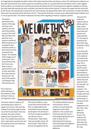
- 1. An image features alongside the editors letter of the editor herself and the main feature artists. This will draw the audience in as they will realise that the main article is genuine and will be accurate as it came directly from the feature artist. It also suggests that the editor is on friendly terms with the artist which will impress the TA. This also gives the magazine credibility as it shows that they really did interview the artist, and didn’t just take the article off the internet. It informs the reader that the article will be full of juicy, fresh gossip that is exclusive to this new interview. By signing off the letter with a script font, it makes the editors letter seem very personal, which will draw in the TA. They will also be drawn in by the casual, abbreviated mode of address such as ‘oh you get the idea’. This further emphasises the idea of the mag being a friend as it appears youthful. ‘We Love This’ The posters makes the advertised at the audience feel an bottom of the page affinity with the will draw in the mag, as they audience who will clearly share the want these posters same loves and to put on their wall. passions and We Love Pop in this understand the particular issue TA. This helps to features a variety of emphasise the different posters as if idea of the mag to appeal to each being like a friend and every reader as to the TA. their favourite artists Each of the pullare bound to be quotes will draw feature. The majority in the audience of the images are of and make them male artists. This is want to buy the due to the fact that mag. This is the TA are more because these likely to want a specific quotes poster of their crush are strange and on their wall rather entertaining so than their favourite the audience will female artist. The want to know the shots of the posters whole story and vary between long read the article. shot and close ups. For example, ‘we looked like The 5 covers to condoms’. This collect will draw in pull quote is very the audience as they strange and funny will have 5 times as so the audience much gossip to read. will be drawn in and want to find The mode of address is very The website address features The colour scheme is made up of out what casual and common of We Love at the bottom, which is contrasting colours which is a happened to The Pop. It is abbreviated and is common as it promotes the regular occurrence in We Love Pop. Sats. Also, ‘they presented the way a teenager magazines multi-media It allows the contents page to stand make me would speak. This will draw in platforms. This could be due out to the TA and make it more eye absolutely the TA as it makes it youthful. It to the fact that the TA are a catching. The colour scheme furious!’ the uses phrases such as technological generation so in appears more masculine in this audience will ‘Phowarsome’, ‘Style Steals’, order to keep the TA issue. This could be due to the fact want to know interested and to keep up that a male artist is on the cover and ‘Save your pocket money. 1D what does and aren’t pricey. These kinds of with technology the magazine the majority of the artists featured why so will buy a promoted on multiple phrases will appeal to the TA in this issue is male. the mag. platforms.
- 2. The use of the starburst ‘for your eyes only’ would make the audience feel special and as if the magazine is personal for them. It will draw them in as they want to know what content is top secret that it is just for them. It also uses direct address which will make the audience feel as if they are getting unknown knowledge The title of the contents page relates to the masthead of the magazine as it features the common ‘We Love’ that features throughout We Love Pop magazine. This draws in the reader as if the magazine they love to read is telling them how great the content is in this issue then they will be drawn to read on. Also, ‘We Love this...’ in capital letters draws in the audience as it is in the bold signature font and the first thing they see. This features at the top of all We Love Pop contents pages. It also maintains the brand identity. A common feature of We Love Pop is a Letter From the Editor. This features in every issue of We Love Pop. It is usually a summary of the main content in the issue and features an image of the editor and the main feature artist. It makes the TA feel special as the editor is taking their time to give them a clue into what gossip they have got this month. It gives the overall magazine a more personal feel. An image of the editor and the main feature artist around the letter is another common feature. Smaller images of the posters that feature are placed at the bottom of the contents page, which is a common layout feature in We Love Pop. This is a common feature of pop magazines as the target audience are teenage girls who are most likely to want to take out these posters and put them up on their bedroom wall. It also draws in the TA as they will want to buy the magazine and get these posters Smaller images feature down the left hand side of the page that relate to other articles that feature in this particular issue. The images are of popular pop stars that the target audience would want to read about. The use of images of Celebs such as Taylor Lautner and The Wanted will draw in the target audience would are ‘obsessed’ with them and make them want to read the article. The pull-quotes underneath the images, ‘I can’t believe I just said that!’, draw in the audience as it gives them a sneak peak of the articles ahead, and they will want to know what Taylor Lautner said. The page numbers at the bottom indicate to the reader what articles feature and where they can find them. By having the number bigger than the text allows he reader to quickly see what page to go. The numbers are in bold which makes them easy to read. In each of the images, the artists are presented in very casual costumes. This creates the idea of them being ‘normal’. This will appeal to the TA as they idolise to be like these artists and makes that seem possible. It also allows the TA to copy the fashion choices of these pop artists as they can get similar clothing on the high street. The facial expressions vary between smiling and pulling funny faces. This is a common feature of the images in We Love Pop as it emphasises the brand identity of the magazines as fun, upbeat and not too serious.