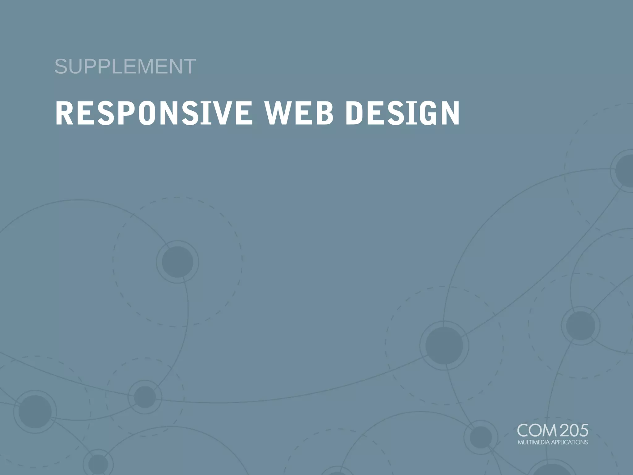
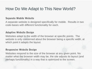
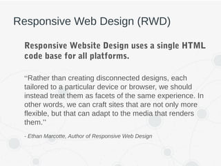
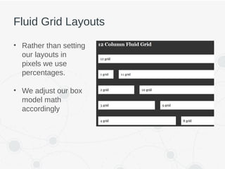
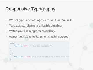
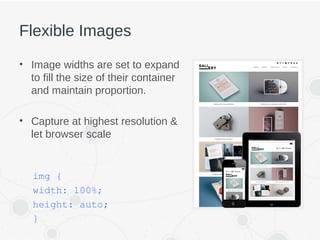
RESPONSIVE WEB DESIGN
SUPPLEMENT
THE MOBILE REVOLUTION
The Multi-Screen World
• Increasing number of devices we use per day
effects how we search and consume content.
– Phones
– Tablets
– Watches
– Desktops/Laptops
– TVs, DVD players
– Gaming Consoles
The New Multi-Screen World, Google 2012
How Do We Adapt to This New World?
Separate Mobile Website
A separate website is designed specifically for mobile. Results in two
code-bases with different functionality for each.
Adaptive Website Design
Websites adapt to the width of the browser at specific points. The
website is only concerned about the browser being a specific width, at
which point it adapts the layout.
Responsive Website Design
Websites respond to the size of the browser at any given point. No
matter what the browser width may be, the site adjusts its layout (and
perhaps functionality) in a way that is optimized to the screen.
Responsive Web Design (RWD)
Responsive Website Design uses a single HTML
code base for all platforms.
“Rather than creating disconnected designs, each
tailored to a particular device or browser, we should
instead treat them as facets of the same experience. In
other words, we can craft sites that are not only more
flexible, but that can adapt to the media that renders
them.”
- Ethan Marcotte, Author of Responsive Web Design
The Ingredients of RWD
1. Flexible/Fluid Layouts
2. Flexible Images and Media
3. Media Queries
FLEXIBLE LAYOUTS
Fluid Grid Layouts
• Rather than setting
our layouts in
pixels we use
percentages.
• We adjust our box
model math
accordingly
Responsive Typography
• We set type in percentages, em units, or rem units
• Type adjusts relative to a flexible baseline.
• Watch your line length for readability.
• Adjust font size to be larger on smaller screens
FLEXIBLE IMAGES AND MEDIA
Flexible Images
• Image widths are set to expand
to fill the size of their container
and maintain proportion.
• Capture at highest resolution &
let browser scale
img {
width: 100%;
height: auto;
}
Scalable Vector Graphics (SVGs)
• Vector based graphics rendered by the browser.
– Can scale up/down without loss of quality
– Low file sizes
– Can be modified via css to change size, color, etc...
• If you have a flat illustration,
An icon, a logo, just about
anything that can be
displayed as an SVG, then
SVG is the way to go.
What About High Resolution Screens?
• Some techniques use new HTML elements or attributes to
account for multiple versions of the image to fit the correct
resolution determined by the browser.
– <picture> element
– “srcset” attribute on <img> element
No agreed upon solution yet. Both techniques have their strengths/weaknesses and may
need additional javascripting or polyfills for true cross-browser support.
MEDIA QUERIES
What Are Media Queries?
• Media Queries are a CSS3 module allowing
content rendering to adapt to conditions such as
screen resolution (e.g. smartphone screen vs.
computer screen).
• It became a W3C recommended standard in
June 2012, and is a cornerstone technology of
Responsive web design.
• http://mediaqueri.es/
Common Media Queries
• max-width
• max-device-width
• min-width
• min-device-width
• vw (viewport width)
• vh (viewport height)
Responsive Web Design Kittens
Graceful Degradation vs Progressive Enhancement
THINGS TO CONSIDER
Test! Test! Test!
Keep In Mind
• Performance/Load times
• Accessibility
• Imagery
• Scripts
• Typography - web fonts, font stack fallbacks on
devices (standard desktop typefaces not
available on mobile)
A successful responsive design bends,
flexes, and breaks the right way to make the
best use of the available space.
- Jamie Neely, Typecast

S. Responsive Web Design

  • 1.
  • 2.
  • 3.
    The Multi-Screen World •Increasing number of devices we use per day effects how we search and consume content. – Phones – Tablets – Watches – Desktops/Laptops – TVs, DVD players – Gaming Consoles The New Multi-Screen World, Google 2012
  • 4.
    How Do WeAdapt to This New World? Separate Mobile Website A separate website is designed specifically for mobile. Results in two code-bases with different functionality for each. Adaptive Website Design Websites adapt to the width of the browser at specific points. The website is only concerned about the browser being a specific width, at which point it adapts the layout. Responsive Website Design Websites respond to the size of the browser at any given point. No matter what the browser width may be, the site adjusts its layout (and perhaps functionality) in a way that is optimized to the screen.
  • 5.
    Responsive Web Design(RWD) Responsive Website Design uses a single HTML code base for all platforms. “Rather than creating disconnected designs, each tailored to a particular device or browser, we should instead treat them as facets of the same experience. In other words, we can craft sites that are not only more flexible, but that can adapt to the media that renders them.” - Ethan Marcotte, Author of Responsive Web Design
  • 6.
    The Ingredients ofRWD 1. Flexible/Fluid Layouts 2. Flexible Images and Media 3. Media Queries
  • 7.
  • 8.
    Fluid Grid Layouts •Rather than setting our layouts in pixels we use percentages. • We adjust our box model math accordingly
  • 9.
    Responsive Typography • Weset type in percentages, em units, or rem units • Type adjusts relative to a flexible baseline. • Watch your line length for readability. • Adjust font size to be larger on smaller screens
  • 10.
  • 11.
    Flexible Images • Imagewidths are set to expand to fill the size of their container and maintain proportion. • Capture at highest resolution & let browser scale img { width: 100%; height: auto; }
  • 12.
    Scalable Vector Graphics(SVGs) • Vector based graphics rendered by the browser. – Can scale up/down without loss of quality – Low file sizes – Can be modified via css to change size, color, etc... • If you have a flat illustration, An icon, a logo, just about anything that can be displayed as an SVG, then SVG is the way to go.
  • 13.
    What About HighResolution Screens? • Some techniques use new HTML elements or attributes to account for multiple versions of the image to fit the correct resolution determined by the browser. – <picture> element – “srcset” attribute on <img> element No agreed upon solution yet. Both techniques have their strengths/weaknesses and may need additional javascripting or polyfills for true cross-browser support.
  • 14.
  • 15.
    What Are MediaQueries? • Media Queries are a CSS3 module allowing content rendering to adapt to conditions such as screen resolution (e.g. smartphone screen vs. computer screen). • It became a W3C recommended standard in June 2012, and is a cornerstone technology of Responsive web design. • http://mediaqueri.es/
  • 16.
    Common Media Queries •max-width • max-device-width • min-width • min-device-width • vw (viewport width) • vh (viewport height)
  • 17.
  • 18.
    Graceful Degradation vsProgressive Enhancement
  • 19.
  • 20.
  • 21.
    Keep In Mind •Performance/Load times • Accessibility • Imagery • Scripts • Typography - web fonts, font stack fallbacks on devices (standard desktop typefaces not available on mobile)
  • 22.
    A successful responsivedesign bends, flexes, and breaks the right way to make the best use of the available space. - Jamie Neely, Typecast

Editor's Notes

  • #4 In April 2015 Google search expanded its use of mobile-friendliness as a ranking signal.
  • #6 Based on concept of responsive architectural design, whereby a room or space automatically adjusts to the number and flow of people within it.
  • #16 Think of this as a way to test width, height and other attributes of browser
  • #23 It is best to add media queries at the point where the parts of the design start to break rather than stick to device sizes.