RollingSone Magazine Analysis
•Download as PPTX, PDF•
1 like•141 views
This document provides an analysis of the layout and design elements of Rolling Stone magazine. It notes that the magazine consistently uses a red masthead in a specific font across issues. It also discusses the placement of cover images, with the artist's head often obscuring part of the title. Interior pages use a "backwards F" layout with most text on the right column. Contents pages feature a split layout with pictures on the left and text on the right. Article pages utilize large close-up images and classic fonts to convey a sophisticated feel. Overall, the document examines the visual conventions and stylistic choices that give Rolling Stone its distinctive aesthetic.
Report
Share
Report
Share

Recommended
NME Magazine Analysis
This document provides a detailed analysis of the layout, design elements, and content of various pages within an issue of the music magazine NME. It examines aspects like the masthead, cover photo, fonts, page layout, advertisements, and band index. Key points made include that the cover is more subdued than usual due to its James Bond theme, different font sizes are used to denote importance of information, and the consistent page layout allows readers to easily navigate between sections.
Typography double page spread examplers
The document describes the layout and design elements of magazine pages. It notes the use of columns, fonts, images, and colors to engage the intended audience and convey information about the articles. Specifically, it discusses how large images and fonts are used to draw attention, and how colors, fonts and other stylistic choices help target demographics like women aged 15-30. The layout also includes conventional elements like page numbers, links, and section titles that organize the content and guide readers.
Magazine analysis 2
Forbes is an American business magazine founded in 1917 that is published weekly. It features articles on finance, industry, investing and marketing. The magazine is known for its listings of billionaires and rankings. The magazine cover shown analyzes the design elements including the magazine name in bold font at the top, a picture of a suited model to represent business, highlighted topics in round shapes, and condensed summaries of stories and publication details along the bottom.
College magazine research
This document summarizes the key design elements of four different magazine covers. The first magazine follows typical conventions with an attractive cover person, bold masthead, and relevant stories. The second magazine has a more formal design focused on architecture, with minimal text. The third magazine is tailored for sports fans, though the clashing colors do not work well together. The fourth magazine has a very feminine design in pinks and whites with three pictured stories and a college logo.
Front cover analysis
The document provides an in-depth visual analysis of the front cover of a magazine featuring Taylor Swift. It analyzes various design elements of the cover including the main image of Taylor Swift, the sell lines and headlines promoting articles, color scheme, and layout. The analysis suggests that Taylor Swift's modest and natural posing in the black and white main image portrays her as innocent and appealing to all ages. It also indicates her growth from a timid young lady into a confident pop star. The document dissects numerous other aspects of the cover design to understand the messages and emphasis on Taylor as the focus of the issue.
Double page spread
This double page spread features Harry Styles and Zayn Malik of the band One Direction. Large prominent images of each band member anchor each page with intriguing quotes below in large font to attract teenage girls. The article is divided into two columns describing each member. Font colors change from blue to green to hint at their personalities. Quotes and an arrow encourage readers to turn the page. Loyal readership is built through a direct address to connect with readers.
Media contents page analysis
The contents page of a music magazine focuses attention on Kanye West through its design. Kanye's large solo image takes up much of the first page, with no words covering him. The color scheme is mainly black, white, and grey except for a red heart near Kanye, hinting he will discuss love of music. Article descriptions are short and fonts inconsistent to prioritize the visuals of artists' images like Kanye's. Page numbers on images allow readers to easily find articles about their favorite musicians.
Main article analysis
The document discusses the layout and design of magazine articles. It analyzes several magazine pages and articles, noting features like main images, font sizes, color schemes, and placement of text and images. Key design elements highlighted include using large prominent images and text to draw the reader's eye, consistent color schemes, and column layouts and formatting that make the text easy to read.
Magazine anylsis (2)
The document summarizes the key design elements of several magazine covers:
- The covers all feature the main model/image prominently and use cover lines to describe the featured individuals.
- Typefaces, colors, and positioning of elements are consistent across issues to maintain brand identity.
- Imagery and styling aim to portray the featured celebrities in a mature light corresponding to their careers and upcoming projects.
- Common elements like mastheads, issue dates, and barcodes contain essential information while customized fonts, colors and layouts make each cover distinctive.
Jessica fletcher magazine analysing
The magazine cover follows conventions with the masthead in big bold letters at the top against a contrasting background. The main image overlaps parts of the masthead and cover lines. Other design elements include the lead article title, barcode in the corner, and price and date above the masthead. Various fonts, sizes, and colors are used throughout to draw attention to different elements and stories.
Jessica Fletcher Magazine Analysing
The magazine cover follows conventions with the masthead in big bold letters at the top against a contrasting background. The main image overlaps some of the text and covers most of the center space. Additional articles are listed around the edges in varying colors and fonts to draw attention. The barcode, date and price are located in the typical bottom right corner.
Question 1
This document provides a summary of the layout and content of a magazine cover and interior pages. On the cover, the magazine title is displayed prominently along with the name of the featured artist. The cover image shows the artist posing to attract fans. Inside, the featured stories are displayed on the right page with images. The main story takes up the full left page with image of the artist and the story text on the right. Additional content sections are advertised to entice readers.
magazine analysing
The document summarizes the layout and design elements of the front cover of an NME magazine issue. Key elements included are the masthead in red, main image overlapping the masthead, lead article title in red, cover lines in different areas, barcode in bottom right, and price and date above the masthead. Colors used are red, white, black and images are incorporated throughout to attract different audiences. Text sizes and fonts vary across headlines and captions.
Double spread-analysis
The document summarizes the layout and design elements of three magazine double spreads. It describes the typography, formatting, and use of images in the articles. For the first spread, it notes the large sans serif title, smaller standfirst, numbered recipes in columns, and anchoring image of dishes. For the second, it discusses the unconventional multi-line title, dramatic standfirst, two-column interview format, and large anchoring celebrity photo. For the third, it outlines the casual pink title font, varied article typography using different colors and fonts, and large opening color wheel image.
Magazine annotations
This document summarizes the key design features of two double page magazine spreads. The first spread uses techniques like pull quotes, bold text, large headline and images to draw attention to important information. Columns separate information neatly and drop caps highlight paragraph starts. The second spread also uses bold text, large images and colored text to emphasize certain elements. Photos across the top provide context and the layout aims to attract a young audience with fashionable representations.
Magazine contents
The contents page uses images, headings in different colors and styles, and brief descriptions to provide an overview of the articles in the magazine and entice the reader. Two images break up the text and add visual interest. Section headings clearly list the page numbers of articles and briefly describe their purpose. The monochromatic color scheme and curvy image contouring the text create a simple yet mature aesthetic. Numbers and outlines connect the images to their related articles. Advertisements and previews at the top promote future issues.
DPS 1
This document summarizes the design elements of a magazine article about the band Linkin Park. Key elements include a large headline across the page to draw readers in, columns to structure the text, and a dominant full-page blurry photo of the band. Color schemes and fonts are simple and straightforward to match the rock genre. Quotes from the band are included to involve readers and make them feel privy to exclusive information. Page numbers and the magazine name are included to reinforce the brand.
Content page-anylsis
The document summarizes the key elements and design features of magazine content pages. It describes the prominent display of the magazine name and issue date at the top. The main content sections are divided into categories with headings, subheadings, and page numbers to easily guide readers to articles. Additional visual elements like images, quotes, and color schemes are used throughout to attract readers and give them a sense of what's inside. The goal is to entice readers to purchase the magazine through an engaging layout that highlights major articles and sections.
Kerrang! magazine analysis
Here is my analysis of Kerrang! Magazine, it includes a few of the front covers, contents pages and double page spreads.
Contents Page Analysis
This document analyzes the contents pages of 5 different magazines. It discusses the layout, use of images, text formatting, color schemes and other design elements of each contents page. Overall, the document provides observations about magazine design conventions and which techniques are most effective at drawing readers' attention and making the contents easy to navigate.
Magazine cover analysis
This document analyzes the cover design of a music magazine. It discusses various design elements like the masthead, cover lines, explanatory text, use of color, fonts, and positioning of images. It notes some inconsistencies in how elements follow the typical eye flow pattern and use of all capitalized text. Overall, it critiques some positive aspects like the distinctive color scheme but suggests the design could be improved by better following principles of eye flow and using a less immature tone in the text.
Task 2 mojo
The document discusses the design elements of a magazine cover and interior page layout. Key elements analyzed include the masthead placement and font, cover lines and main image used to grab readers' attention, limited color palette for readability, and strategic positioning of items like the barcode and cover stories. Design choices like a single striking image, sans serif font, and direct address aim to appeal to the magazine's middle to low brow audience.
Contents 2
The document summarizes different elements of a magazine contents page layout. The masthead logo is small to emphasize the appealing artist images. Necessary information like the date and issue number are attached to the masthead, and page numbers are prominently displayed for key stories. Images of popular artists draw readers in and are organized by category. The contents text previews articles and uses direct address to entice readers. Linguistic features like rhetorical questions and an inclusive tone connect with the audience. The editor's note uses an image and informal language to seem approachable. Red, white, and black create a consistent colour scheme throughout.
FCD 2
The magazine cover uses bold colors and fonts to attract attention. The skyline features famous artists' names in white that stand out against the black background. The masthead is the largest red font that connotes awareness in a demanding tone. The main sell line below uses a specialized font and teases an exclusive opportunity to see the featured band of the issue. Overall the cover employs attention-grabbing design elements to appeal to its target audience of 16-24 year old females interested in new artists, concerts, and gossip.
Web page analysis
The document discusses the layout, design, and content of regional newspaper websites. It analyzes the layout of index pages, noting main stories, links, menus, and news tickers. It finds the Birmingham Mail's layout most professional. Font and color choices aim to match the print papers. Article pages mirror the index page layout. Content is similar or identical to print. The evaluator prefers the Birmingham Mail's aesthetic and thinks category menus could be improved.
Newspaper textual analysis
This document analyzes and compares the layouts of three different newspapers - a tabloid daily newspaper (Daily Mirror), a local broadsheet newspaper (Evening Telegraph), and a broadsheet sports newspaper (Non League). It describes the key elements of each newspaper's front page layout, including the masthead, headlines, pictures, advertisements, and stories. It also notes differences in writing styles, targeted audiences, and tones between the broadsheet and tabloid formats.
Front Covers
The cover has an indie/scrapbook feel with a black and white image of the band. The bright pink text for the lead article stands out against this backdrop. The typefaces used for the magazine name and additional text were designed to look handwritten, adding to the scrapbook aesthetic. While the overall color scheme is dark, using blacks, whites and reds, the pink text and white text in the skyline help draw the eye to the key information. The simple and recognizable masthead in white on red makes it easily visible among the other elements on the cover.
Double page spreads
The document discusses the layout and design of magazine spreads, analyzing aspects like photography, typography, color schemes, and how well various elements work together. Key points analyzed include the use of a full bleed image across a spread, simple yet striking typography that doesn't detract from photos, and how elements like titles, bylines and intro text are positioned in relation to images and each other. Overall impressions consider whether designs are cleverly composed or look tacky, neat or boring, and how effectively the visuals and text gel together.
GleeSeason1_Review
This review summarizes the first season of the TV show Glee. It discusses how the show follows a Spanish teacher, Will Schuester, who takes over the glee club at his former high school. The show became a surprise hit and cultural phenomenon. It uses music in creative ways and tackles issues like sexuality, religion, and self-identity. The show has an ensemble cast of characters that each overcome personal struggles through involvement in the glee club. It praises the cast's acting and chemistry, singling out Jane Lynch's performance as the standout.
Tsoc anexo 4. cuadro comparativo
Este documento explica cómo crear mapas conceptuales de forma sencilla utilizando la aplicación Cmap Tools. Los mapas conceptuales contienen tres elementos fundamentales: conceptos, proposiciones y palabras de enlace. Los conceptos más generales se ubican en la parte superior y los más específicos en la parte inferior, conectados por líneas y palabras de enlace que representan las relaciones entre ellos.
More Related Content
What's hot
Magazine anylsis (2)
The document summarizes the key design elements of several magazine covers:
- The covers all feature the main model/image prominently and use cover lines to describe the featured individuals.
- Typefaces, colors, and positioning of elements are consistent across issues to maintain brand identity.
- Imagery and styling aim to portray the featured celebrities in a mature light corresponding to their careers and upcoming projects.
- Common elements like mastheads, issue dates, and barcodes contain essential information while customized fonts, colors and layouts make each cover distinctive.
Jessica fletcher magazine analysing
The magazine cover follows conventions with the masthead in big bold letters at the top against a contrasting background. The main image overlaps parts of the masthead and cover lines. Other design elements include the lead article title, barcode in the corner, and price and date above the masthead. Various fonts, sizes, and colors are used throughout to draw attention to different elements and stories.
Jessica Fletcher Magazine Analysing
The magazine cover follows conventions with the masthead in big bold letters at the top against a contrasting background. The main image overlaps some of the text and covers most of the center space. Additional articles are listed around the edges in varying colors and fonts to draw attention. The barcode, date and price are located in the typical bottom right corner.
Question 1
This document provides a summary of the layout and content of a magazine cover and interior pages. On the cover, the magazine title is displayed prominently along with the name of the featured artist. The cover image shows the artist posing to attract fans. Inside, the featured stories are displayed on the right page with images. The main story takes up the full left page with image of the artist and the story text on the right. Additional content sections are advertised to entice readers.
magazine analysing
The document summarizes the layout and design elements of the front cover of an NME magazine issue. Key elements included are the masthead in red, main image overlapping the masthead, lead article title in red, cover lines in different areas, barcode in bottom right, and price and date above the masthead. Colors used are red, white, black and images are incorporated throughout to attract different audiences. Text sizes and fonts vary across headlines and captions.
Double spread-analysis
The document summarizes the layout and design elements of three magazine double spreads. It describes the typography, formatting, and use of images in the articles. For the first spread, it notes the large sans serif title, smaller standfirst, numbered recipes in columns, and anchoring image of dishes. For the second, it discusses the unconventional multi-line title, dramatic standfirst, two-column interview format, and large anchoring celebrity photo. For the third, it outlines the casual pink title font, varied article typography using different colors and fonts, and large opening color wheel image.
Magazine annotations
This document summarizes the key design features of two double page magazine spreads. The first spread uses techniques like pull quotes, bold text, large headline and images to draw attention to important information. Columns separate information neatly and drop caps highlight paragraph starts. The second spread also uses bold text, large images and colored text to emphasize certain elements. Photos across the top provide context and the layout aims to attract a young audience with fashionable representations.
Magazine contents
The contents page uses images, headings in different colors and styles, and brief descriptions to provide an overview of the articles in the magazine and entice the reader. Two images break up the text and add visual interest. Section headings clearly list the page numbers of articles and briefly describe their purpose. The monochromatic color scheme and curvy image contouring the text create a simple yet mature aesthetic. Numbers and outlines connect the images to their related articles. Advertisements and previews at the top promote future issues.
DPS 1
This document summarizes the design elements of a magazine article about the band Linkin Park. Key elements include a large headline across the page to draw readers in, columns to structure the text, and a dominant full-page blurry photo of the band. Color schemes and fonts are simple and straightforward to match the rock genre. Quotes from the band are included to involve readers and make them feel privy to exclusive information. Page numbers and the magazine name are included to reinforce the brand.
Content page-anylsis
The document summarizes the key elements and design features of magazine content pages. It describes the prominent display of the magazine name and issue date at the top. The main content sections are divided into categories with headings, subheadings, and page numbers to easily guide readers to articles. Additional visual elements like images, quotes, and color schemes are used throughout to attract readers and give them a sense of what's inside. The goal is to entice readers to purchase the magazine through an engaging layout that highlights major articles and sections.
Kerrang! magazine analysis
Here is my analysis of Kerrang! Magazine, it includes a few of the front covers, contents pages and double page spreads.
Contents Page Analysis
This document analyzes the contents pages of 5 different magazines. It discusses the layout, use of images, text formatting, color schemes and other design elements of each contents page. Overall, the document provides observations about magazine design conventions and which techniques are most effective at drawing readers' attention and making the contents easy to navigate.
Magazine cover analysis
This document analyzes the cover design of a music magazine. It discusses various design elements like the masthead, cover lines, explanatory text, use of color, fonts, and positioning of images. It notes some inconsistencies in how elements follow the typical eye flow pattern and use of all capitalized text. Overall, it critiques some positive aspects like the distinctive color scheme but suggests the design could be improved by better following principles of eye flow and using a less immature tone in the text.
Task 2 mojo
The document discusses the design elements of a magazine cover and interior page layout. Key elements analyzed include the masthead placement and font, cover lines and main image used to grab readers' attention, limited color palette for readability, and strategic positioning of items like the barcode and cover stories. Design choices like a single striking image, sans serif font, and direct address aim to appeal to the magazine's middle to low brow audience.
Contents 2
The document summarizes different elements of a magazine contents page layout. The masthead logo is small to emphasize the appealing artist images. Necessary information like the date and issue number are attached to the masthead, and page numbers are prominently displayed for key stories. Images of popular artists draw readers in and are organized by category. The contents text previews articles and uses direct address to entice readers. Linguistic features like rhetorical questions and an inclusive tone connect with the audience. The editor's note uses an image and informal language to seem approachable. Red, white, and black create a consistent colour scheme throughout.
FCD 2
The magazine cover uses bold colors and fonts to attract attention. The skyline features famous artists' names in white that stand out against the black background. The masthead is the largest red font that connotes awareness in a demanding tone. The main sell line below uses a specialized font and teases an exclusive opportunity to see the featured band of the issue. Overall the cover employs attention-grabbing design elements to appeal to its target audience of 16-24 year old females interested in new artists, concerts, and gossip.
Web page analysis
The document discusses the layout, design, and content of regional newspaper websites. It analyzes the layout of index pages, noting main stories, links, menus, and news tickers. It finds the Birmingham Mail's layout most professional. Font and color choices aim to match the print papers. Article pages mirror the index page layout. Content is similar or identical to print. The evaluator prefers the Birmingham Mail's aesthetic and thinks category menus could be improved.
Newspaper textual analysis
This document analyzes and compares the layouts of three different newspapers - a tabloid daily newspaper (Daily Mirror), a local broadsheet newspaper (Evening Telegraph), and a broadsheet sports newspaper (Non League). It describes the key elements of each newspaper's front page layout, including the masthead, headlines, pictures, advertisements, and stories. It also notes differences in writing styles, targeted audiences, and tones between the broadsheet and tabloid formats.
Front Covers
The cover has an indie/scrapbook feel with a black and white image of the band. The bright pink text for the lead article stands out against this backdrop. The typefaces used for the magazine name and additional text were designed to look handwritten, adding to the scrapbook aesthetic. While the overall color scheme is dark, using blacks, whites and reds, the pink text and white text in the skyline help draw the eye to the key information. The simple and recognizable masthead in white on red makes it easily visible among the other elements on the cover.
Double page spreads
The document discusses the layout and design of magazine spreads, analyzing aspects like photography, typography, color schemes, and how well various elements work together. Key points analyzed include the use of a full bleed image across a spread, simple yet striking typography that doesn't detract from photos, and how elements like titles, bylines and intro text are positioned in relation to images and each other. Overall impressions consider whether designs are cleverly composed or look tacky, neat or boring, and how effectively the visuals and text gel together.
What's hot (20)
Viewers also liked
GleeSeason1_Review
This review summarizes the first season of the TV show Glee. It discusses how the show follows a Spanish teacher, Will Schuester, who takes over the glee club at his former high school. The show became a surprise hit and cultural phenomenon. It uses music in creative ways and tackles issues like sexuality, religion, and self-identity. The show has an ensemble cast of characters that each overcome personal struggles through involvement in the glee club. It praises the cast's acting and chemistry, singling out Jane Lynch's performance as the standout.
Tsoc anexo 4. cuadro comparativo
Este documento explica cómo crear mapas conceptuales de forma sencilla utilizando la aplicación Cmap Tools. Los mapas conceptuales contienen tres elementos fundamentales: conceptos, proposiciones y palabras de enlace. Los conceptos más generales se ubican en la parte superior y los más específicos en la parte inferior, conectados por líneas y palabras de enlace que representan las relaciones entre ellos.
Tetanus
Tetanus is caused by a toxin produced by Clostridium tetani bacteria. The bacteria form spores that can enter the body through wounds and are resistant to heat and chemicals. Symptoms include painful muscle spasms and stiffness. It is diagnosed based on symptoms and treated with supportive care, as there is no cure once symptoms appear. Immunization through vaccines containing tetanus and diphtheria toxoids is the best prevention against tetanus.
Tsoc anexo 3. cuadro sinóptico
Este documento explica los pasos para elaborar cuadros sinópticos. Primero define un cuadro sinóptico como una representación gráfica que muestra temas o situaciones interrelacionadas de manera jerárquica para facilitar su comprensión. Luego, detalla dos formas de hacerlos, usando llaves o tablas, recomendando llaves para temas con muchas clasificaciones. Finalmente, enumera tres pasos clave: 1) identificar ideas centrales, 2) relacionar elementos esenciales, y 3) elaborar el esquema mostr
Tsoc autoevaluación 3
El documento instruye al lector a crear un cuadro sinóptico que resume las diferentes perspectivas de la teoría social cubiertas en la Unidad 2, incluyendo una portada, introducción, descripción de la actividad, conclusión personal y bibliografía. El cuadro sinóptico debe organizarse en un formato específico con márgenes y estilo de letra definidos.
Omkar Panat Resume
Omkar Panat is seeking a position as a Chemical Process/Manufacturing Engineer. He has a MS in Chemical Engineering from Michigan Technological University and a BS in Chemical Engineering from University of Mumbai. During his co-op at Koppers Performance Chemicals, he led projects to design a pilot batch reactor for a new cupric oxide manufacturing process and analyze a heat exchanger installation. His academic projects included modeling a hops drying system and converting cellulose to ethanol. Omkar has skills in lean manufacturing, CHEMCAD, MATLAB, Delta V operating systems, and programming languages. He also participates in community service, chess, and martial arts.
Institutions eval
Warner Bros. would be a good media company to distribute my film because they are a well-known producer and distributor of many genres, including action/adventure films like Harry Potter, The Dark Knight, and The Hangover, which would attract a large audience. As a subsidiary of Time Warner, the second largest media conglomerate, Warner Bros. could help advertise the film through Time Inc. magazines and play trailers before similar action films. They could also produce and distribute the soundtrack, release the film on DVD, and distribute it on streaming services like Netflix to generate further profits.
Tsoc autoevaluación 4
Este documento proporciona instrucciones para crear un mapa conceptual sobre la Unidad II del temario. Se pide conceptualizar 7 puntos clave: concepto, utilidad, conceptos fundamentales, división, fuentes, formación y desarrollo. También se especifican los requisitos de formato para la portada, introducción, reporte, conclusión y bibliografía.
Viewers also liked (8)
Similar to RollingSone Magazine Analysis
Magazine contents page deconstructions
The contents page uses a large white masthead at the top center to identify it as the contents section. Below this is a numerical contents list categorizing articles into sections with bold subheadings and normal text details. Page numbers are in red for easy visibility. Essential date and page number info is at the bottom in small text. Three images take up half the page, drawing the eye, with the central one largest but in low light so less attention grabbing potentially than the bright female image. Color scheme is consistent with the magazine using only three colors for a professional look.
Task 3 nme arctic monkeys
The double page spread features an interview with The Strokes. The headline "R U READY" is a play on one of their new song titles to pique reader interest. A full page image shows the band happily relaxing in LA, contrasting their usual moody style. The layout keeps the magazine's house style of white pages and black text with red accents for consistency of branding.
Annotations of contents pages
The document describes the layout, design elements, and color scheme used on the contents page of different magazines. It analyzes how the visual elements attract the target audiences and guide readers' eyes across the page to the most important information. The layout is tailored for each magazine's brand and genre of music coverage. Consistent house styles and placement of images, titles, and text help readers easily navigate and find articles of interest in each issue.
Magazine resarch powerp 2 final
The document provides an analysis of the front cover, contents page, and double page spread of a magazine.
The front cover summary includes: The color scheme complements the main image and text, pink background appeals to young females, largest font highlights main article subject, and cover lines advertise other stories.
The contents page summary includes: Varied typography appeals to all readers, crowded but informative layout, categories help readers find topics, and images relate to articles.
The double page spread summary includes: Font represents word meanings, small text looks professional, colors target females and relate to image, layout places image and columns strategically, and language inspires but remains understandable.
Magazine resarch powerp 2
The document provides an analysis of the front cover of a magazine. It summarizes that the cover uses pink, black and yellow colors which make it look feminine and welcoming. The main artist Katy Perry is prominently displayed with her name in the largest font to signal a major article about her. Additional cover lines advertise other stories to entice readers. The language aims for a young adult/teen audience.
The contents page analysis notes the use of varied fonts to appeal to different readers. Features are categorized to help navigation. Charts are included for consistency and interest. Images provide color and break up text.
The double page spread analysis discusses the use of bold fonts to represent the words in the headline. Colors target
Question 1
In what ways does your media product use, develop or challenge forms and conventions of real media products?
Task 3 - Music Magazine Analysis
The Rolling Stone magazine cover features a close-up photo of Adele looking directly at the camera. The photo gives the cover a personal feel and aims to attract readers by making Adele appear down-to-earth and relatable. Below the photo are taglines describing the contents of Adele's article inside the magazine. The lack of additional headlines or quotes indicates the magazine expects Adele's article alone will attract many readers.
Deconstructions
The document provides an analysis of the front covers and contents pages of three different magazines:
1) A regional football magazine called "The Mag" focusing on Newcastle United FC. The front cover features Newcastle player Yohan Cabaye and emphasizes the local identity.
2) A national football magazine called "FourFourTwo" aimed at a wide audience. The front cover images six players from different teams but looks unprofessional.
3) An alternative regional magazine called "The Crack" based in the northeast of England covering lifestyle and arts topics. The front cover has a bright, quirky design but some elements look unprofessional.
Media contents and dps analysis
Here I have analysed different Rock related contents pages and double page spread's so I could see how they were structured for the production of my own magazine.
Contents analysis
The contents page uses a distressed masthead font and bright colors to appeal to younger rock fans. Over half the page is taken up by a large photo of a band's lead singer, surrounded by smaller photos from inside articles. Columns are organized into sections with alternating red and black text, and a red star graphic behind page numbers relates to the magazine's heavy music genre. An editor's note gives a personal connection, and a black subscription offer contrasts the white background to stand out. Overall, the layout portrays a messy, scrapbook-style look fitting for its target teenage rock/metal audience.
Contents analysis
The contents page uses a distressed masthead font and bright colors to appeal to younger rock fans. Over half the page is covered by a large photo of a band's lead singer, surrounded by smaller photos from inside articles. Columns are organized into sections with alternating red and black text, and a red star graphic behind page numbers relates to the magazine's heavy music genre. An editor's note gives a personal connection, and a black subscription offer contrasts the white background to stand out. Overall, the layout portrays a messy, scrapbook-style look fitting the magazine's target teenage rock/metal audience.
Task 3
The document analyzes the layout and design of magazine covers and contents pages. Key points discussed include:
- Magazine covers use large, centered images and mastheads to draw attention to the main artist or topic. Fonts, colors and photographic styles are chosen to represent and appeal to the target audience.
- Contents pages categorize articles clearly and include images and page references to highlight featured artists or topics. Formats are designed for readability and to interest and inform readers.
- Analyses consider visual elements like fonts, positioning, sizing and color contrasts that impact branding and audience. Discussions provide insights into designing for different age groups and styles of music coverage.
Analysis of Magazines.
The document provides analysis of magazine front covers and contents pages. Key features highlighted include large celebrity images, catchy titles, use of bold fonts and colors to draw attention. Target audiences are identified based on themes, language and visual styles used that would appeal to different gender and age groups interested in genres like rock music. Layouts with columns and page numbers effectively convey magazine contents to readers.
Med
The document analyzes magazine covers and contents pages. It summarizes the key design elements used in different magazines, including photographs, color schemes, placement of images and text, and how these elements appeal to audiences and convey information. Elements like the rule of thirds, prominent images, and high contrast are discussed.
Tasks 1, 2 & 3 music magazine covers powerpoint
The document provides details on the layout and design elements of various magazine covers and interior pages. It describes the use of fonts, colors, images, and other graphical components and how they are implemented to attract readers, highlight key information, and reinforce the magazine's brand and target audience. Specific elements summarized include the masthead, cover lines, headers, pull quotes, photos, bar codes, and color schemes used across the fronts, contents pages, and articles.
Analysis of Music Magazines
The document analyzes the front covers, contents pages, and double page spreads of four different music magazines - Classic FM, Kerrang!, MOJO, and NME. It finds that the magazines generally use a limited color scheme, medium shot images of artists, and large initial letters or words to draw the eye to key elements. The layouts range from formal to informal depending on the magazine's intended audience, with NME having the most informal, gritty design.
Magazine resarch
The document analyzes the front cover, contents page, and a double page spread from a magazine.
The front cover analysis notes that the background color relates to the subject's clothing, the largest font is used for the artist's name to suggest they are the focus, and a long shot is used to show the whole body as the main subject.
The contents page analysis discusses the varied typography aimed at different readers, crowded but informative layout, categorization of sections, use of colors, images relating to articles, and informal language.
The double page spread analysis notes the bold font used for the headline word "fiercely", contrasting colors that stand out, a caption telling the topic, the large
Kerrang Magazine Deconstruction
The document analyzes and summarizes the contents page and a double page spread from the Kerrang! magazine. For the contents page, it notes the use of images and colors to highlight articles and attract readers. It also discusses the layout into columns and use of fonts. For the double page spread, it examines the large main image of artist Davey Havok, the bold title layout, and use of pink font to set a mood. It critiques the standard three-column text layout as uninteresting and offers ideas for more creative design.
Double page analysis q
The document analyzes the design elements of a magazine page profile on an artist named Labrinth. It discusses how various typographic and graphical elements are used to guide the reader's eye, convey information, and maintain a consistent style. These include the bold sans-serif masthead that stands out, different font styles used for the text and captions, a large central image of the artist on stage, and colors and layout consistent with the magazine's house style. The page employs techniques like the rule of thirds and Gutenberg design principle to create a balanced and readable layout.
Reasearch contents pages newest
This contents page uses many small pictures and one large central image to appeal to a younger audience aged 15-20. The layout is simple with images on the right and minimal text on the left. Bold fonts are used for the page numbers and titles to draw the eye. The masthead is positioned in the top right corner in a creative, multi-line style. Overall the style is elegant and simple with a focus on the large central image to seem sophisticated yet sexy.
Similar to RollingSone Magazine Analysis (20)
Recently uploaded
Ealing London Independent Photography meeting - June 2024
Photographs from trip to American Deep South
All the images mentioned in 'See What You're Missing'
We've gathered together all of the images mentioned in Will Gompertz's 'See What You're Missing'
Domino Express Storyboard - TV Adv Toys 30"
Storyboard for a tv commercial about a toy "Domino Express"
Dino Ranch Storyboard / Kids TV Advertising
Storyboard produced for the TV commercial of a toy from the children's show “Dino Ranch”
一比一原版美国加州大学圣地亚哥分校毕业证(ucsd毕业证书)如何办理
一模一样【微信:A575476】【美国加州大学圣地亚哥分校毕业证(ucsd毕业证书)成绩单Offer】【微信:A575476】(留信学历认证永久存档查询)采用学校原版纸张、特殊工艺完全按照原版一比一制作(包括:隐形水印,阴影底纹,钢印LOGO烫金烫银,LOGO烫金烫银复合重叠,文字图案浮雕,激光镭射,紫外荧光,温感,复印防伪)行业标杆!精益求精,诚心合作,真诚制作!多年品质 ,按需精细制作,24小时接单,全套进口原装设备,十五年致力于帮助留学生解决难题,业务范围有加拿大、英国、澳洲、韩国、美国、新加坡,新西兰等学历材料,包您满意。
【业务选择办理准则】
一、工作未确定,回国需先给父母、亲戚朋友看下文凭的情况,办理一份就读学校的毕业证【微信:A575476】文凭即可
二、回国进私企、外企、自己做生意的情况,这些单位是不查询毕业证真伪的,而且国内没有渠道去查询国外文凭的真假,也不需要提供真实教育部认证。鉴于此,办理一份毕业证【微信:A575476】即可
三、进国企,银行,事业单位,考公务员等等,这些单位是必需要提供真实教育部认证的,办理教育部认证所需资料众多且烦琐,所有材料您都必须提供原件,我们凭借丰富的经验,快捷的绿色通道帮您快速整合材料,让您少走弯路。
留信网认证的作用:
1:该专业认证可证明留学生真实身份
2:同时对留学生所学专业登记给予评定
3:国家专业人才认证中心颁发入库证书
4:这个认证书并且可以归档倒地方
5:凡事获得留信网入网的信息将会逐步更新到个人身份内,将在公安局网内查询个人身份证信息后,同步读取人才网入库信息
6:个人职称评审加20分
7:个人信誉贷款加10分
8:在国家人才网主办的国家网络招聘大会中纳入资料,供国家高端企业选择人才
→ 【关于价格问题(保证一手价格)
我们所定的价格是非常合理的,而且我们现在做得单子大多数都是代理和回头客户介绍的所以一般现在有新的单子 我给客户的都是第一手的代理价格,因为我想坦诚对待大家 不想跟大家在价格方面浪费时间
对于老客户或者被老客户介绍过来的朋友,我们都会适当给一些优惠。
选择实体注册公司办理,更放心,更安全!我们的承诺:可来公司面谈,可签订合同,会陪同客户一起到教育部认证窗口递交认证材料,客户在教育部官方认证查询网站查询到认证通过结果后付款,不成功不收费!
哪里购买美国乔治城大学毕业证硕士学位证书原版一模一样
原版一模一样【微信:741003700 】【美国乔治城大学毕业证硕士学位证书】【微信:741003700 】学位证,留信认证(真实可查,永久存档)offer、雅思、外壳等材料/诚信可靠,可直接看成品样本,帮您解决无法毕业带来的各种难题!外壳,原版制作,诚信可靠,可直接看成品样本。行业标杆!精益求精,诚心合作,真诚制作!多年品质 ,按需精细制作,24小时接单,全套进口原装设备。十五年致力于帮助留学生解决难题,包您满意。
本公司拥有海外各大学样板无数,能完美还原海外各大学 Bachelor Diploma degree, Master Degree Diploma
1:1完美还原海外各大学毕业材料上的工艺:水印,阴影底纹,钢印LOGO烫金烫银,LOGO烫金烫银复合重叠。文字图案浮雕、激光镭射、紫外荧光、温感、复印防伪等防伪工艺。材料咨询办理、认证咨询办理请加学历顾问Q/微741003700
留信网认证的作用:
1:该专业认证可证明留学生真实身份
2:同时对留学生所学专业登记给予评定
3:国家专业人才认证中心颁发入库证书
4:这个认证书并且可以归档倒地方
5:凡事获得留信网入网的信息将会逐步更新到个人身份内,将在公安局网内查询个人身份证信息后,同步读取人才网入库信息
6:个人职称评审加20分
7:个人信誉贷款加10分
8:在国家人才网主办的国家网络招聘大会中纳入资料,供国家高端企业选择人才
❼❷⓿❺❻❷❽❷❼❽ Dpboss Matka ! Fix Satta Matka ! Matka Result ! Matka Guessing ! ...
❼❷⓿❺❻❷❽❷❼❽ Dpboss Matka ! Fix Satta Matka ! Matka Result ! Matka Guessing ! ...❼❷⓿❺❻❷❽❷❼❽ Dpboss Kalyan Satta Matka Guessing Matka Result Main Bazar chart
❼❷⓿❺❻❷❽❷❼❽ Dpboss Matka ! Fix Satta Matka ! Matka Result ! Matka Guessing ! Final Matka ! Matka Result ! Dpboss Matka ! Matka Guessing ! Satta Matta Matka 143 ! Kalyan Matka ! Satta Matka Fast Result ! Kalyan Matka Guessing ! Dpboss Matka Guessing ! Satta 143 ! Kalyan Chart ! Kalyan final ! Satta guessing ! Matka tips ! Matka 143 ! India Matka ! Matka 420 ! matka Mumbai ! Satta chart ! Indian Satta ! Satta King ! Satta 143 ! Satta batta ! Satta मटका ! Satta chart ! Matka 143 ! Matka Satta ! India Matka ! Indian Satta Matka ! Final ank一比一原版美国亚利桑那大学毕业证(ua毕业证书)如何办理
一模一样【微信:A575476】【美国亚利桑那大学毕业证(ua毕业证书)成绩单Offer】【微信:A575476】(留信学历认证永久存档查询)采用学校原版纸张、特殊工艺完全按照原版一比一制作(包括:隐形水印,阴影底纹,钢印LOGO烫金烫银,LOGO烫金烫银复合重叠,文字图案浮雕,激光镭射,紫外荧光,温感,复印防伪)行业标杆!精益求精,诚心合作,真诚制作!多年品质 ,按需精细制作,24小时接单,全套进口原装设备,十五年致力于帮助留学生解决难题,业务范围有加拿大、英国、澳洲、韩国、美国、新加坡,新西兰等学历材料,包您满意。
【业务选择办理准则】
一、工作未确定,回国需先给父母、亲戚朋友看下文凭的情况,办理一份就读学校的毕业证【微信:A575476】文凭即可
二、回国进私企、外企、自己做生意的情况,这些单位是不查询毕业证真伪的,而且国内没有渠道去查询国外文凭的真假,也不需要提供真实教育部认证。鉴于此,办理一份毕业证【微信:A575476】即可
三、进国企,银行,事业单位,考公务员等等,这些单位是必需要提供真实教育部认证的,办理教育部认证所需资料众多且烦琐,所有材料您都必须提供原件,我们凭借丰富的经验,快捷的绿色通道帮您快速整合材料,让您少走弯路。
留信网认证的作用:
1:该专业认证可证明留学生真实身份
2:同时对留学生所学专业登记给予评定
3:国家专业人才认证中心颁发入库证书
4:这个认证书并且可以归档倒地方
5:凡事获得留信网入网的信息将会逐步更新到个人身份内,将在公安局网内查询个人身份证信息后,同步读取人才网入库信息
6:个人职称评审加20分
7:个人信誉贷款加10分
8:在国家人才网主办的国家网络招聘大会中纳入资料,供国家高端企业选择人才
→ 【关于价格问题(保证一手价格)
我们所定的价格是非常合理的,而且我们现在做得单子大多数都是代理和回头客户介绍的所以一般现在有新的单子 我给客户的都是第一手的代理价格,因为我想坦诚对待大家 不想跟大家在价格方面浪费时间
对于老客户或者被老客户介绍过来的朋友,我们都会适当给一些优惠。
选择实体注册公司办理,更放心,更安全!我们的承诺:可来公司面谈,可签订合同,会陪同客户一起到教育部认证窗口递交认证材料,客户在教育部官方认证查询网站查询到认证通过结果后付款,不成功不收费!
一比一原版(QUT毕业证)昆士兰科技大学毕业证成绩单如何办理
QUT毕业证【微信95270640】办理QUT毕业证【Q微信95270640】昆士兰科技大学毕业证书原版↑制作昆士兰科技大学学历认证文凭办理昆士兰科技大学留信网认证,留学回国办理毕业证成绩单文凭学历认证【Q微信95270640】专业为海外学子办理毕业证成绩单、文凭制作,学历仿制,回国人员证明、做文凭,研究生、本科、硕士学历认证、留信认证、结业证、学位证书样本、美国教育部认证百分百真实存档可查】
全套服务:昆士兰科技大学昆士兰科技大学毕业证offer真实回国人员证明 #真实教育部认证。让您回国发展信心十足#铸就十年品质!信誉!实体公司!可以视频看办公环境样板如需办理真实可查可以先到公司面谈勿轻信小中介黑作坊!
可以提供昆士兰科技大学钢印 #水印 #烫金 #激光防伪 #凹凸版 #最新版的毕业证 #百分之百让您绝对满意
印刷DHL快递毕业证 #成绩单7个工作日真实大使馆教育部认证1个月。为了达到高水准高效率
请您先以qq或微信的方式对我们的服务进行了解后如果有昆士兰科技大学昆士兰科技大学毕业证offer帮助再进行电话咨询。
国外毕业证学位证成绩单如何办理:
1客户提供办理信息:姓名生日专业学位毕业时间等(如信息不确定可以咨询顾问:我们有专业老师帮你查询);
2开始安排制作昆士兰科技大学毕业证成绩单电子图;
3毕业证成绩单电子版做好以后发送给您确认;
4毕业证成绩单电子版您确认信息无误之后安排制作成品;
5成品做好拍照或者视频给您确认;
6快递给客户(国内顺丰国外DHLUPS等快读邮寄)。望着父亲山娃反问道父亲听了并不回答只是吃吃地笑山娃很精神越逛越起劲父亲却越逛越疲倦望着父亲呵欠连天的样子山娃也说困了累了回家吧小屋闷罐一般头顶上的三叶扇彻夜呜呜作响搅得满屋热气腾腾也搅得山娃心烦意乱父亲一上床就呼呼大睡山娃却辗转反侧睡不着山娃一次又一次摸索着爬起来一遍又一遍地用暖乎乎的冷水擦身往水泥地板上一勺一勺的洒水也不知过了多久山娃竟迷迷糊糊地睡着了迷迷糊糊地又闻到了闹钟刺耳的铃声和哐咣的关和
一比一原版(BC毕业证)波士顿学院毕业证如何办理
BC毕业证学历书【微信95270640】办理波士顿学院毕业证成绩单(Q微信95270640)毕业证学历认证OFFER专卖国外文凭学历学位证书办理澳洲文凭|澳洲毕业证,澳洲学历认证,澳洲成绩单 澳洲offer,教育部学历认证及使馆认证永久可查 ,国外毕业证|国外学历认证,国外学历文凭证书 BC毕业证,BC毕业证,BC毕业证,BC毕业证,BC毕业证,BC毕业证,BC毕业证,专业为留学生办理毕业证、成绩单、使馆留学回国人员证明、教育部学历学位认证、录取通知书、Offer、
专业为留学生办理波士顿学院波士顿学院本科学位证成绩单【100%存档可查】留学全套申请材料办理。本公司承诺所有毕业证成绩单成品全部按照学校原版工艺对照一比一制作和学校一样的羊皮纸张保证您证书的质量!
如果你回国在学历认证方面有以下难题请联系我们我们将竭诚为你解决认证瓶颈
1所有材料真实但资料不全无法提供完全齐整的原件。【如:成绩单丶毕业证丶回国证明等材料中有遗失的。】
2获得真实的国外最终学历学位但国外本科学历就读经历存在问题或缺陷。【如:国外本科是教育部不承认的或者是联合办学项目教育部没有备案的或者外本科没有正常毕业的。】
3学分转移联合办学等情况复杂不知道怎么整理材料的。时间紧迫自己不清楚递交流程的。
如果你是以上情况之一请联系我们我们将在第一时间内给你免费咨询相关信息。我们将帮助你整理认证所需的各种材料.帮你解决国外学历认证难题。
国外波士顿学院波士顿学院本科学位证成绩单办理方法:
1客户提供办理信息:姓名生日专业学位毕业时间等(如信息不确定可以咨询顾问:我们有专业老师帮你查询波士顿学院波士顿学院本科学位证成绩单);
2开始安排制作波士顿学院毕业证成绩单电子图;
3波士顿学院毕业证成绩单电子版做好以后发送给您确认;
4波士顿学院毕业证成绩单电子版您确认信息无误之后安排制作成品;
5波士顿学院成品做好拍照或者视频给您确认;
6快递给客户(国内顺丰国外DHLUPS等快读邮寄)。疯一把山娃算了算这一次足足花了老爸元够他挣上半个月的山娃很不解一向节俭的父亲啥时变得如此阔绰大方大把大把掏钱时居然连眉头也不皱一下车票早买好了直达卧铺车得经过山娃老家门口山娃拒绝父亲送说往车上一躺就等着下车决无丢失的道理有手机在身联系也方便再说他都岁了还有大半车的小伙伴相伴他不怕在父亲千叮咛万嘱咐中山娃依依不舍地爬上车朝窗外不住地挥手别了父亲别了父亲的城别了我的暑假生活我的城市生活望着窗外挥舞的房
➒➌➎➏➑➐➋➑➐➐ Dpboss Matka Guessing Satta Matka Kalyan panel Chart Indian Matka ...
➒➌➎➏➑➐➋➑➐➐ Dpboss Matka Guessing Satta Matka Kalyan panel Chart Indian Matka ...➒➌➎➏➑➐➋➑➐➐Dpboss Matka Guessing Satta Matka Kalyan Chart Indian Matka
KALYAN MATKA | MATKA RESULT | KALYAN MATKA TIPS | SATTA MATKA | MATKA.COM | MATKA PANA JODI TODAY | BATTA SATKA | MATKA PATTI JODI NUMBER | MATKA RESULTS | MATKA CHART | MATKA JODI | SATTA COM | FULL RATE GAME | MATKA GAME | MATKA WAPKA | ALL MATKA RESULT LIVE ONLINE | MATKA RESULT | KALYAN MATKA RESULT | DPBOSS MATKA 143 | MAIN MATKAHeart Touching Romantic Love Shayari In English with Images
Explore our beautiful collection of Romantic Love Shayari in English to express your love. These heartfelt shayaris are perfect for sharing with your loved one. Get the best words to show your love and care.
2024 MATFORCE Youth Poster Contest Winners
This document announces the winners of the 2024 Youth Poster Contest organized by MATFORCE. It lists the grand prize and age category winners for grades K-6, 7-12, and individual age groups from 5 years old to 18 years old.
Fashionista Chic Couture Mazes and Coloring AdventureA
Fashionista Chic Couture Maze & Coloring Adventures is a coloring and activity book filled with many maze games and coloring activities designed to delight and engage young fashion enthusiasts. Each page offers a unique blend of fashion-themed mazes and stylish illustrations to color, inspiring creativity and problem-solving skills in children.
Recently uploaded (20)
Ealing London Independent Photography meeting - June 2024
Ealing London Independent Photography meeting - June 2024
All the images mentioned in 'See What You're Missing'
All the images mentioned in 'See What You're Missing'
❼❷⓿❺❻❷❽❷❼❽ Dpboss Matka ! Fix Satta Matka ! Matka Result ! Matka Guessing ! ...
❼❷⓿❺❻❷❽❷❼❽ Dpboss Matka ! Fix Satta Matka ! Matka Result ! Matka Guessing ! ...
➒➌➎➏➑➐➋➑➐➐ Dpboss Matka Guessing Satta Matka Kalyan panel Chart Indian Matka ...
➒➌➎➏➑➐➋➑➐➐ Dpboss Matka Guessing Satta Matka Kalyan panel Chart Indian Matka ...
Heart Touching Romantic Love Shayari In English with Images
Heart Touching Romantic Love Shayari In English with Images
Fashionista Chic Couture Mazes and Coloring AdventureA
Fashionista Chic Couture Mazes and Coloring AdventureA
RollingSone Magazine Analysis
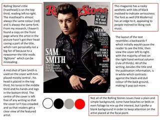
- 1. Rolling Stone’s title (masthead) is on the top third, reading left to right. The masthead is almost always the same colour (red) and is always the same font. From my research, I haven’t found a copy on the front page where the artist in the picture hasn’t got their head coving a part of the title, which I am personally not a big fan of because to a newcomer the title reads ‘RgStone’ which can be misleading. A mid shot of Sam Smith is used on the cover with him placed mostly central ; his head is placed in the top third, his torso in the middle third and his hands and legs in the bottom third. The centre of the cover is left free of any writing so that the cover isn’t too crowded and so that readers get a clear view of the featured artist. This magazine has a rocky aesthetic with lots of black involved to indicate seriousness. The font as well (FB Moderno) has an edge to it, appealing to people inclined to liking rock music. The layout of the text resembles a backwards F which initially would cause the reader to see the title, then view the cover left to right- with the majority of text on the right hand vertical column (rule of thirds). All of the writing, besides the title and the publication information, is in white which contrasts against the black and dull colour of the back ground, making it pop out more. Not all of the Rolling Stones issues have a plain and simple background, some have beaches or beds or even foliage to mix up the interest, but I prefer a blank background in order to keep attention on the artist placed at the focal point.
- 2. This contents page is laid out with pictures on the left and the writing on the right, forming a golden ratio- both the photos and the writing are split into 3 main sections with subtitles in red, and size of the photo corresponds to the size of the content information. None of the photos used have ill-fitting colours and none of the people in the photo are actually looking towards the camera which gives a spontaneous and un-cliché feel to this magazine. The contents page doesn’t have the page numbers in an ascending order which could be confusing to readers, however is split into sections with subheadings so the navigation isn’t made too hard. In addition, the contents page numbers are in red, as well as the subtitles and the headings for the pages are in bold, communicating to the reader that the information is important. The font on the contents page is the same which makes it seem mature and professional – also hinting that the target audience are of a 20-50 age range. A banner with the word ‘contents’ is placed as a wob at the top of the page. This contents page banner for the Rolling Stone magazine always stays the same and carries the red theme through the magazine pages.
- 3. There isn’t much of an article on this page, only a large paragraph which isn’t split into sections/columns which can be seen as a positive for the reader as there is effectively less to read. Adele’s close up takes up the majority of this double page spread, and she isn’t looking into the camera, suggesting that she will be sharing personal information in this article and making eye contact would have made her seem too confident. The title of this article takes up the first half of the recto when joined with the standfirst and byline which, due to its size, is very eye catching and seems to be of importance. The font used seems very classic and sophisticated which gives an immediate feel to how the article will be. The title, along with the dropcap ‘I’ is put in bold to singnify its importance in relation to the rest of the writing. The standfirst is written in italics to break it up from the rest of the page because it involves information about the article itself and is more of a side note written by the journalist than the actual story on Adele. I think the standfirst adds a nice touch to the page as it makes the reader aware of the middleman between us and the star. The colour scheme of this page is monotonous which creates a serious and classic feel to the artist as well as the article.