You may not be sure how Lord Varys collects information from his little birds, but in this talk you will hear how we can collect information from our little birds.
@kristw shares a behind-the-scenes view of his latest data visualization project, which shows how each #GameOfThrones episode was discussed on Twitter. Using data visualization, we can extract and reveal the stories of every episode from fans’ Tweets.
https://interactive.twitter.com/game-of-thrones
These slides are from a talk given at Bay Area d3 User Group meetup on June 9, 2016.
http://www.meetup.com/Bay-Area-d3-User-Group/events/231281298
This talk was prepared as a note to my future self when working on future projects. I reflect on the tasks commonly involved in crafting visualizations, point out the common things to expect, pitfalls and provide recommendations. Along the way I include examples of 3 different applications of information/data visualization and details on how each project was started and developed.
These slides were from my guest lecture in InfoVis class at
(1) InfoVis class at UC Berkeley iSchool on Feb 27, 2017. Thank you Prof. Marti Hearst for the invitation.
(2) DataVis class at GATech on Apr 5, 2017. Thank you Prof. Rahul C. Basole for the invitation.
Adventure in Data: A tour of visualization projects at TwitterKrist Wongsuphasawat
Guest lecture at Prof. David Gotz's UNC Chapel Hill INLS 690 Visual Analytics class (Given remotely) on Nov 10, 2015.
Many demos can also be accessed from interactive.twitter.com and kristw.yellowpigz.com
d3Kit is a set of tools to speed D3 related project development. It is a lightweight library to help you do the basic groundwork tasks you need when building visualization with d3.
Alberto Massidda - Images and words: mechanics of automated captioning with n...Codemotion
Image captioning is the process of generating textual description of an image. It uses both Natural Language Processing and Computer Vision to generate the captions. Like in the notorious “finger pointing to the moon”, automated image captioning requires the ability to discern what it’s really going on in a scene and generate a fluent description for the act taking place. In this talk we present the underlying mechanics to the object detection and language generation using Convolutional and Recurrent Neural Networks.
This talk was prepared as a note to my future self when working on future projects. I reflect on the tasks commonly involved in crafting visualizations, point out the common things to expect, pitfalls and provide recommendations. Along the way I include examples of different applications of information/data visualization and details on how each project was started and developed.
These slides were from my (remote) guest lecture in InfoVis class for UC Berkeley iSchool on Apr 8, 2020 during the COVID-19 shelter-in-place. Thank you Prof. Marti Hearst for the invitation.
This was given as a 1.5 hour lecture to the MDES students at CCA, removing the opening game play and the later exercise. It's better at 2-3 one hour lectures, plus game play.
This work is licensed under a Creative Commons Attribution-NonCommercial-ShareAlike 4.0 International License.
http://creativecommons.org/licenses/by-nc-sa/4.0/
Page 1 of 3 MATH233 Unit 1 Limits Individual Proje.docxalfred4lewis58146
Page 1 of 3
MATH233 Unit 1: Limits
Individual Project Assignment: Version 2A
IMPORTANT: Please see Part b of Problem 5 below for special directions. This is mandatory.
Note: All work must be shown and explained to receive full credit.
1. Using a graphing utility from the Internet or Excel, graph the following functions. Based on the
graphs, estimate the given limit. Make sure to include the graphs in your answer form, and
explain how you found your limit estimates.
a. lim𝑥 →0
100
50𝑥+1
b. lim𝑥 →∞
𝑥2+1
𝑥2
2. Find the limit (if it exists) of the following functions by completing the given tables. Round your
answers to the nearest ten-thousandths.
a. Let F(x) = x + 1. Find lim𝑥 →1F(𝑥).
x 0.9 0.99 0.999 1 1.001 1.01 1.1
F(x)
b. Let G(x) = 5
(𝑥 −2)2
. Find lim𝑥 →2G(𝑥).
x 1.9 1.99 1.999 2 2.001 2.01 2.1
G(x)
3. Answer the following questions thoroughly based on the given graph of f(x).
Page 2 of 3
a. Is f(x) continuous at x = −1?
b. Is f(x) continuous at x = 2?
c. Is f(x) continuous at x = 4?
4. Let 𝐴(𝑛) = (1 + 𝑛)
1
𝑛. The limit of this function as n approaches 0 is a value that is very
useful in some business applications.
a. Complete the table below by calculating A(n), using the given values of n. Round
your answer to the nearest ten-thousandths.
n -0.1 -0.01 -0.001 -0.0001 .0001 0.001 0.01 0.1
A(n)
b. Based on the table, estimate the following values:
i. lim𝑛→0−𝐴(𝑛)
ii. lim𝑛→0+𝐴(𝑛)
iii. lim𝑛→0 𝐴(𝑛)
5. The cost, C (in millions of dollars) for a software company to seize x% of an illegal version of
a gaming software that they developed is modeled by the following function:
𝐶(𝑥) = 𝑀𝑥
50−0.5𝑥
0 ≤ 𝑥 < 100
a. Choose a value of M between 20 and 120 for this function.
b. Important: By Wednesday night at midnight, submit a Word document stating
only your name and your chosen value for M in Part a. Submit this in the Unit 1
IP submissions area. This submitted Word document will be used to determine
the Last Day of Attendance for government reporting purposes.
c. Find the cost of seizing 50%, 60%, 70%, 80%, and 90% of the illegal software.
d. Find the lim𝑥→100−𝐶(𝑥). Explain briefly what this limit means in terms of the given
scenario.
6. A startup company invested $30,000 for the research and development of a new hardware
plus an additional $80 expense for each unit produced. The total cost is then modeled by the
function 𝐶(𝑥) = 80𝑥 + 30,000, where x is the number of units produced.
a. Find the average cost function, A(x), that models the average cost per unit of the
hardware. (Use the Internet to research the formula for the average cost function.)
b. Find the average cost per unit if 1,000 units, 10,000 units, and 100,000 units of the
hardware are produced.
Page 3 of 3
c. What is the limit of the average cost as the number of units produced increases?
7. Which intellipath L
“Which visualization library should I use?” Typically, making this decision is not about whether one library is “better” than another, but whether the specific library is more suitable for what the developer is trying to achieve.To answer this question thoroughly, we need to better understand the design space of visualization libraries. The talk will give a tour of many kinds of visualization libraries on the web across the design space, while explaining the framework and design philosophy that the audience can learn along the way. The audience will expand their horizon and be more aware of the wide universe of libraries. The next time they come across a new package, they can use this framework as a lens to analyze its own offerings and how it is different from or similar to the libraries that they already know.
Encodable: Configurable Grammar for Visualization ComponentsKrist Wongsuphasawat
There are so many libraries of visualization components nowadays with their APIs often different from one another. Could these components be more similar, both in terms of the APIs and common functionalities? For someone who is developing a new visualization component, how should the API look like? This work drew inspiration from visualization grammar, decoupled the grammar from its rendering engine and adapted it into a configurable grammar for individual components called Encodable. Encodable helps component authors define grammar for their components, and parse encoding specifications from users into utility functions for the implementation.
Slides from the VIS in practice panel "Increasing the Impact of Visualization Research" during IEEE VIS 2017 in Phoenix, AZ. http://www.visinpractice.rwth-aachen.de/panel.html
In this talk, I reflect on the tasks commonly involved in crafting visualizations and show examples of different applications of information/data visualization. Along this ride I will share my workflow, point out the common pitfalls and provide recommendations.
These slides were from my guest lecture in InfoVis class at UC Berkeley iSchool on Apr 11, 2016. Thank you Prof. Marti Hearst for inviting.
Using Visualizations to Monitor Changes and Harvest Insights from a Global-sc...Krist Wongsuphasawat
Slides from my talk at the IEEE Conference on Visual Analytics Science and Technology (VAST) 2014 in Paris, France.
ABSTRACT
Logging user activities is essential to data analysis for internet products and services.
Twitter has built a unified logging infrastructure that captures user activities across all clients it owns, making it one of the largest datasets in the organization.
This paper describes challenges and opportunities in applying information visualization to log analysis at this massive scale, and shows how various visualization techniques can be adapted to help data scientists extract insights.
In particular, we focus on two scenarios:\ (1) monitoring and exploring a large collection of log events, and (2) performing visual funnel analysis on log data with tens of thousands of event types.
Two interactive visualizations were developed for these purposes:
we discuss design choices and the implementation of these systems, along with case studies of how they are being used in day-to-day operations at Twitter.
More Related Content
Similar to 
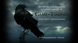
Reveal the talking points of every episode of Game of Thrones from fans' conversations
This talk was prepared as a note to my future self when working on future projects. I reflect on the tasks commonly involved in crafting visualizations, point out the common things to expect, pitfalls and provide recommendations. Along the way I include examples of different applications of information/data visualization and details on how each project was started and developed.
These slides were from my (remote) guest lecture in InfoVis class for UC Berkeley iSchool on Apr 8, 2020 during the COVID-19 shelter-in-place. Thank you Prof. Marti Hearst for the invitation.
This was given as a 1.5 hour lecture to the MDES students at CCA, removing the opening game play and the later exercise. It's better at 2-3 one hour lectures, plus game play.
This work is licensed under a Creative Commons Attribution-NonCommercial-ShareAlike 4.0 International License.
http://creativecommons.org/licenses/by-nc-sa/4.0/
Page 1 of 3 MATH233 Unit 1 Limits Individual Proje.docxalfred4lewis58146
Page 1 of 3
MATH233 Unit 1: Limits
Individual Project Assignment: Version 2A
IMPORTANT: Please see Part b of Problem 5 below for special directions. This is mandatory.
Note: All work must be shown and explained to receive full credit.
1. Using a graphing utility from the Internet or Excel, graph the following functions. Based on the
graphs, estimate the given limit. Make sure to include the graphs in your answer form, and
explain how you found your limit estimates.
a. lim𝑥 →0
100
50𝑥+1
b. lim𝑥 →∞
𝑥2+1
𝑥2
2. Find the limit (if it exists) of the following functions by completing the given tables. Round your
answers to the nearest ten-thousandths.
a. Let F(x) = x + 1. Find lim𝑥 →1F(𝑥).
x 0.9 0.99 0.999 1 1.001 1.01 1.1
F(x)
b. Let G(x) = 5
(𝑥 −2)2
. Find lim𝑥 →2G(𝑥).
x 1.9 1.99 1.999 2 2.001 2.01 2.1
G(x)
3. Answer the following questions thoroughly based on the given graph of f(x).
Page 2 of 3
a. Is f(x) continuous at x = −1?
b. Is f(x) continuous at x = 2?
c. Is f(x) continuous at x = 4?
4. Let 𝐴(𝑛) = (1 + 𝑛)
1
𝑛. The limit of this function as n approaches 0 is a value that is very
useful in some business applications.
a. Complete the table below by calculating A(n), using the given values of n. Round
your answer to the nearest ten-thousandths.
n -0.1 -0.01 -0.001 -0.0001 .0001 0.001 0.01 0.1
A(n)
b. Based on the table, estimate the following values:
i. lim𝑛→0−𝐴(𝑛)
ii. lim𝑛→0+𝐴(𝑛)
iii. lim𝑛→0 𝐴(𝑛)
5. The cost, C (in millions of dollars) for a software company to seize x% of an illegal version of
a gaming software that they developed is modeled by the following function:
𝐶(𝑥) = 𝑀𝑥
50−0.5𝑥
0 ≤ 𝑥 < 100
a. Choose a value of M between 20 and 120 for this function.
b. Important: By Wednesday night at midnight, submit a Word document stating
only your name and your chosen value for M in Part a. Submit this in the Unit 1
IP submissions area. This submitted Word document will be used to determine
the Last Day of Attendance for government reporting purposes.
c. Find the cost of seizing 50%, 60%, 70%, 80%, and 90% of the illegal software.
d. Find the lim𝑥→100−𝐶(𝑥). Explain briefly what this limit means in terms of the given
scenario.
6. A startup company invested $30,000 for the research and development of a new hardware
plus an additional $80 expense for each unit produced. The total cost is then modeled by the
function 𝐶(𝑥) = 80𝑥 + 30,000, where x is the number of units produced.
a. Find the average cost function, A(x), that models the average cost per unit of the
hardware. (Use the Internet to research the formula for the average cost function.)
b. Find the average cost per unit if 1,000 units, 10,000 units, and 100,000 units of the
hardware are produced.
Page 3 of 3
c. What is the limit of the average cost as the number of units produced increases?
7. Which intellipath L
“Which visualization library should I use?” Typically, making this decision is not about whether one library is “better” than another, but whether the specific library is more suitable for what the developer is trying to achieve.To answer this question thoroughly, we need to better understand the design space of visualization libraries. The talk will give a tour of many kinds of visualization libraries on the web across the design space, while explaining the framework and design philosophy that the audience can learn along the way. The audience will expand their horizon and be more aware of the wide universe of libraries. The next time they come across a new package, they can use this framework as a lens to analyze its own offerings and how it is different from or similar to the libraries that they already know.
Encodable: Configurable Grammar for Visualization ComponentsKrist Wongsuphasawat
There are so many libraries of visualization components nowadays with their APIs often different from one another. Could these components be more similar, both in terms of the APIs and common functionalities? For someone who is developing a new visualization component, how should the API look like? This work drew inspiration from visualization grammar, decoupled the grammar from its rendering engine and adapted it into a configurable grammar for individual components called Encodable. Encodable helps component authors define grammar for their components, and parse encoding specifications from users into utility functions for the implementation.
Slides from the VIS in practice panel "Increasing the Impact of Visualization Research" during IEEE VIS 2017 in Phoenix, AZ. http://www.visinpractice.rwth-aachen.de/panel.html
In this talk, I reflect on the tasks commonly involved in crafting visualizations and show examples of different applications of information/data visualization. Along this ride I will share my workflow, point out the common pitfalls and provide recommendations.
These slides were from my guest lecture in InfoVis class at UC Berkeley iSchool on Apr 11, 2016. Thank you Prof. Marti Hearst for inviting.
Using Visualizations to Monitor Changes and Harvest Insights from a Global-sc...Krist Wongsuphasawat
Slides from my talk at the IEEE Conference on Visual Analytics Science and Technology (VAST) 2014 in Paris, France.
ABSTRACT
Logging user activities is essential to data analysis for internet products and services.
Twitter has built a unified logging infrastructure that captures user activities across all clients it owns, making it one of the largest datasets in the organization.
This paper describes challenges and opportunities in applying information visualization to log analysis at this massive scale, and shows how various visualization techniques can be adapted to help data scientists extract insights.
In particular, we focus on two scenarios:\ (1) monitoring and exploring a large collection of log events, and (2) performing visual funnel analysis on log data with tens of thousands of event types.
Two interactive visualizations were developed for these purposes:
we discuss design choices and the implementation of these systems, along with case studies of how they are being used in day-to-day operations at Twitter.
Making Sense of Millions of Thoughts: Finding Patterns in the TweetsKrist Wongsuphasawat
I gave this presentation at Workshop on Interactive Language Learning, Visualization, and Interfaces / ACL 2014 in Baltimore, MD on June 27, 2014.
http://nlp.stanford.edu/events/illvi2014/index.html
ABSTRACT
Everyday on Twitter, there are millions of thoughts that are captured and shared to the world in the form of 140-character messages, or Tweets. There are many things we could learn from these thoughts if we could figure out a way to digest this gigantic dataset. Visualization is one of the many ways to extract information from these Tweets. In this presentation, I will talk about several visualizations based on Tweets, as well as share experiences and challenges from working with Tweet data.
A talk at Data Visualization Summit 2014 in Santa Clara, CA
ABSTRACT: What is the thought process that transforms data into visualizations? In this presentation, I will talk about guidelines that will help you when starting with raw data, walk through standard techniques, and also discuss things to keep in mind when making design decisions.
My talk at the Data Visualization Summit in San Francisco April 11, 2013
http://theinnovationenterprise.com/summits/data-visualization-sf
----------------
Abstract
----------------
Many aspects of our lives can be captured and described as series of events, or event sequences. These event sequences can be keys to understanding many things: medical services, logistics, sports, user behavior, etc. In this presentation, I will talk about techniques for visualizing event sequences, from simple to advance, and also show examples that demonstrate the power of visualizations in exploring and understanding event sequences.
Outflow: Exploring Flow, Factors and Outcome of Temporal Event SequencesKrist Wongsuphasawat
My presentation at IEEE VisWeek 2012 in Seattle, WA
//// Abstract:
Event sequence data is common in many domains, ranging from electronic medical records (EMRs) to sports events. Moreover, such sequences often result in measurable outcomes (e.g., life or death, win or loss). Collections of event sequences can be aggregated together to form event progression pathways. These pathways can then be connected with outcomes to model how alternative chains of events may lead to different results. This paper describes the Outflow visualization technique, designed to (1) aggregate multiple event sequences, (2) display the aggregate pathways through different event states with timing and cardinality, (3) summarize the pathways’ corresponding outcomes, and (4) allow users to explore external factors that correlate with specific pathway state transitions. Results from a user study with twelve participants show that users were able to learn how to use Outflow easily with limited training and perform a range of tasks both accurately and rapidly.
Data Centers - Striving Within A Narrow Range - Research Report - MCG - May 2...pchutichetpong
M Capital Group (“MCG”) expects to see demand and the changing evolution of supply, facilitated through institutional investment rotation out of offices and into work from home (“WFH”), while the ever-expanding need for data storage as global internet usage expands, with experts predicting 5.3 billion users by 2023. These market factors will be underpinned by technological changes, such as progressing cloud services and edge sites, allowing the industry to see strong expected annual growth of 13% over the next 4 years.
Whilst competitive headwinds remain, represented through the recent second bankruptcy filing of Sungard, which blames “COVID-19 and other macroeconomic trends including delayed customer spending decisions, insourcing and reductions in IT spending, energy inflation and reduction in demand for certain services”, the industry has seen key adjustments, where MCG believes that engineering cost management and technological innovation will be paramount to success.
MCG reports that the more favorable market conditions expected over the next few years, helped by the winding down of pandemic restrictions and a hybrid working environment will be driving market momentum forward. The continuous injection of capital by alternative investment firms, as well as the growing infrastructural investment from cloud service providers and social media companies, whose revenues are expected to grow over 3.6x larger by value in 2026, will likely help propel center provision and innovation. These factors paint a promising picture for the industry players that offset rising input costs and adapt to new technologies.
According to M Capital Group: “Specifically, the long-term cost-saving opportunities available from the rise of remote managing will likely aid value growth for the industry. Through margin optimization and further availability of capital for reinvestment, strong players will maintain their competitive foothold, while weaker players exit the market to balance supply and demand.”
Levelwise PageRank with Loop-Based Dead End Handling Strategy : SHORT REPORT ...Subhajit Sahu
Abstract — Levelwise PageRank is an alternative method of PageRank computation which decomposes the input graph into a directed acyclic block-graph of strongly connected components, and processes them in topological order, one level at a time. This enables calculation for ranks in a distributed fashion without per-iteration communication, unlike the standard method where all vertices are processed in each iteration. It however comes with a precondition of the absence of dead ends in the input graph. Here, the native non-distributed performance of Levelwise PageRank was compared against Monolithic PageRank on a CPU as well as a GPU. To ensure a fair comparison, Monolithic PageRank was also performed on a graph where vertices were split by components. Results indicate that Levelwise PageRank is about as fast as Monolithic PageRank on the CPU, but quite a bit slower on the GPU. Slowdown on the GPU is likely caused by a large submission of small workloads, and expected to be non-issue when the computation is performed on massive graphs.
06-04-2024 - NYC Tech Week - Discussion on Vector Databases, Unstructured Data and AI
Discussion on Vector Databases, Unstructured Data and AI
https://www.meetup.com/unstructured-data-meetup-new-york/
This meetup is for people working in unstructured data. Speakers will come present about related topics such as vector databases, LLMs, and managing data at scale. The intended audience of this group includes roles like machine learning engineers, data scientists, data engineers, software engineers, and PMs.This meetup was formerly Milvus Meetup, and is sponsored by Zilliz maintainers of Milvus.
Adjusting OpenMP PageRank : SHORT REPORT / NOTESSubhajit Sahu
For massive graphs that fit in RAM, but not in GPU memory, it is possible to take
advantage of a shared memory system with multiple CPUs, each with multiple cores, to
accelerate pagerank computation. If the NUMA architecture of the system is properly taken
into account with good vertex partitioning, the speedup can be significant. To take steps in
this direction, experiments are conducted to implement pagerank in OpenMP using two
different approaches, uniform and hybrid. The uniform approach runs all primitives required
for pagerank in OpenMP mode (with multiple threads). On the other hand, the hybrid
approach runs certain primitives in sequential mode (i.e., sumAt, multiply).
Chatty Kathy - UNC Bootcamp Final Project Presentation - Final Version - 5.23...John Andrews
SlideShare Description for "Chatty Kathy - UNC Bootcamp Final Project Presentation"
Title: Chatty Kathy: Enhancing Physical Activity Among Older Adults
Description:
Discover how Chatty Kathy, an innovative project developed at the UNC Bootcamp, aims to tackle the challenge of low physical activity among older adults. Our AI-driven solution uses peer interaction to boost and sustain exercise levels, significantly improving health outcomes. This presentation covers our problem statement, the rationale behind Chatty Kathy, synthetic data and persona creation, model performance metrics, a visual demonstration of the project, and potential future developments. Join us for an insightful Q&A session to explore the potential of this groundbreaking project.
Project Team: Jay Requarth, Jana Avery, John Andrews, Dr. Dick Davis II, Nee Buntoum, Nam Yeongjin & Mat Nicholas
The Building Blocks of QuestDB, a Time Series Databasejavier ramirez
Talk Delivered at Valencia Codes Meetup 2024-06.
Traditionally, databases have treated timestamps just as another data type. However, when performing real-time analytics, timestamps should be first class citizens and we need rich time semantics to get the most out of our data. We also need to deal with ever growing datasets while keeping performant, which is as fun as it sounds.
It is no wonder time-series databases are now more popular than ever before. Join me in this session to learn about the internal architecture and building blocks of QuestDB, an open source time-series database designed for speed. We will also review a history of some of the changes we have gone over the past two years to deal with late and unordered data, non-blocking writes, read-replicas, or faster batch ingestion.
Techniques to optimize the pagerank algorithm usually fall in two categories. One is to try reducing the work per iteration, and the other is to try reducing the number of iterations. These goals are often at odds with one another. Skipping computation on vertices which have already converged has the potential to save iteration time. Skipping in-identical vertices, with the same in-links, helps reduce duplicate computations and thus could help reduce iteration time. Road networks often have chains which can be short-circuited before pagerank computation to improve performance. Final ranks of chain nodes can be easily calculated. This could reduce both the iteration time, and the number of iterations. If a graph has no dangling nodes, pagerank of each strongly connected component can be computed in topological order. This could help reduce the iteration time, no. of iterations, and also enable multi-iteration concurrency in pagerank computation. The combination of all of the above methods is the STICD algorithm. [sticd] For dynamic graphs, unchanged components whose ranks are unaffected can be skipped altogether.
2. Computer Engineer
Bangkok, Thailand
PhD in Computer Science
Information Visualization
Univ. of Maryland
IBM
Microsoft
Data Visualization Scientist
Twitter
Krist Wongsuphasawat / @kristw
14. On another continent,
there is a princess who was supposed to be
rightful heir to the throne.
The dead king mentioned earlier,
overthrew her father
and killed her entire family.
She escaped.
Now she is finding her way back
and she has dragons.
15. While humans are busy killing each other,
ice zombies “White walkers” are invading from the North.
The only group who seems to care about this
is neutral group called the Night’s Watch.
16. HBO’s Game of Thrones
Based on a book series “A Song of Ice and Fire”
Medieval Fantasy. Knights, magic and dragons.
Many characters.
Anybody can die.
6 seasons (57 episodes) so far
Multiple storylines in each episode
25. Sample data
Character Count
Hodor 10000
Jon Snow 5000
Daenerys 4000
Bran Stark 3000
… …
*These numbers are made up for presentation, not real data.
26. When you play the game of vis,
you iterate or you die.
CHAPTER III
28. + episodes
The Guardian & Google Trends
http://www.theguardian.com/news/datablog/ng-interactive/2016/apr/22/game-of-thrones-the-most-googled-characters-episode-by-episode
34. Sample data
Character Count
Jon Snow+Sansa 1000
Tormund+Brienne 500
Bran Stark+Hodor 300
… …
Character Count
Hodor 10000
Jon Snow 5000
Daenerys 4000
… …
INDIVIDUALS CONNECTIONS
+ top emojis + top emojis
*These numbers are made up for presentation, not real data.
35. Graph
NODES LINKS
+ top emojis + top emojis
Character Count
Jon Snow+Sansa 1000
Tormund+Brienne 500
Bran Stark+Hodor 300
… …
Character Count
Hodor 1000
Jon Snow 500
Daenerys 400
… …
*These numbers are made up for presentation, not real data.
54. Must work for every episode
Too many nodes & edges
nodes = nodes.filter(n => n.count > 100)
links = links.filter(l => l.count > 100)
Is 100 a good number for every episode?
61. A$er switching episode
1. Store old positions for existing objects.
2. Assign new initial positions.*
3. Run simulation without updating <svg> for n rounds
4. Animate objects from old to new positions.
5. Resume simulation and update <svg> every tick.
68. Colors
Default: d3.category10()
Distinct but nothing about the context
Custom palette
Colors related to the groups/houses.
Black = Night’s Watch
Blue = North
Red = Daenerys
Gold = Lannister
…
90. Summary
Problem first, not solution backwards
Prototype, Iterate, Scale & Adapt
Identify characters from Tweets + Network visualization
Vis is important, but there are other parts.
Feedback
Understand the pros & cons
Rooms for improvement
kristw.yellowpigz.com
Krist Wongsuphasawat / @kristw
91. Robert Harris, Miguel Rios, Elaine Filadelfo
and many colleagues at Twitter;
Elijah Meeks for his network vis tutorial;
Mike Bostock for D3 and examples
Lastly, to my wife for taking care of our baby, so I had time to prepare these slides.
Acknowledgement
92. Resources
Quora: How would you explain the plot of Game of Thrones in Brief from the beginning?
https://www.quora.com/How-would-you-explain-the-plot-of-Game-of-Thrones-in-brief-from-the-beginning
Convex Hull
https://en.wikipedia.org/wiki/Convex_hull
Images
Aemon - http://tinyurl.com/zqdzc2a
Cersei - http://tinyurl.com/gumcs7g
Crow - http://tinyurl.com/ju6up5g
Eddard - http://tinyurl.com/jc23mel
Feast - http://tinyurl.com/zcms4lq
Hammer - http://tinyurl.com/hz8emrp
Hodor - http://tinyurl.com/j748jfr
House sigils - http://tinyurl.com/jywgcjx
House Stark - http://tinyurl.com/jtdtrdy
Jon Snow - http://tinyurl.com/h4hofe8
Tyrion - http://tinyurl.com/z7z2uow
Tyrion - http://tinyurl.com/hvw4u89
Tyrion - http://tinyurl.com/jkrvqtb
Watercolor Map by Stamen Design