Responsive Design: Let's get Responsive!
•
44 likes•14,370 views

Slide-deck covers what is responsive web design, why use it and a walk-through of The Department of Labor's Ride Safe New York website going responsive.

Recommended
Recommended
More Related Content
What's hot
What's hot (20)
Similar to Responsive Design: Let's get Responsive!
Similar to Responsive Design: Let's get Responsive! (20)
Recently uploaded
Recently uploaded (20)
Responsive Design: Let's get Responsive!
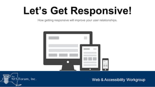
- 1. Let’s Get Responsive! How getting responsive will improve your user relationships.
- 2. Courtney Jordan New York State ITS Health & Human Services Cluster ● Front-End Designer ● Graphic Artist ● Typographer ● Photographer Twitter: @court_jordan GitHub: courtney-jordan ● Minecraft Enthusiast
- 3. Career Center Locator http://labor.ny.gov/career-center-locator/ Department of Labor’s next upcoming Responsive Website that went live in January 2014. Desktop Mobile
- 4. Ride Safe New York http://www.labor.ny.gov/ridesafeny/ Department of Labor’s first Responsive Website went live in November of 2013. Desktop Mobile
- 6. When a website responds to the device it’s loaded on. http://insights.iddigital.com.au/wp-content/uploads/2013/04/responsive-templates.jpg
- 7. Includes but Not Limited Too... • • • • • Television Computers Tablets Mobile Phone Gaming Consoles
- 9. “It’s not like people will use their mobile device to view our website...”
- 11. 61% of people have a better opinion of brands when they offer a good mobile experience. - Latitude Research http://files.latd.com/Latitude-Next-Gen-Retail-Study.pdf
- 12. “Day by day, the number of devices, platforms, and browsers that need to work with your site grows. Responsive web design represents a fundamental shift in how we’ll build websites for the decade to come.” -Jeffrey Veen, CEO and Founder of TypeKit
- 13. “ Going forward, every project to create or redesign a public facing New York State website must implement a responsive web design.” - Kishor Bagul NYS Chief Technology Officer GTC, September 19, 2013
- 14. It’s happening. More than 20 live/in-progress RWD Projects!
- 16. Ride Safe New York Responsive Redesign Project
- 17. Homepage Created in early 2000s with current trends at the time. Selected as a candidate to test out responsive
- 18. Parents Page that included safety tips for parents to follow with children while attending theme parks.
- 19. Kids Page that included safety tips for children to follow while attending theme parks and enjoying park rides.
- 20. Regulations/ Rules Page that included regulations, records and other information surrounding park safety.
- 22. Step One: Content Analysis Analytics Analytics used to view overall page traffic. This process helped in assistance with keeping/removing pages.
- 23. Step One: Content Analysis Page Inventory Review ● Editing ● Updating ● Removal of Stale Content/Pages
- 24. Multiple listings for one page 2 1 Titles not descriptive enough 3 Content, Images, Fonts and Color have busy appearance low page visits
- 26. Step Two: Content Layout Starting from the “Mobile” perspective and working up to the desktop perspective. ● ● ● ● ● Content Navigation Images Interaction Styles - Typography, White Space and Color
- 27. Step Two: Content Layout Content Establish the Content first! You’ll need to ask yourself ● How will the content flow on mobile? ● How will the content flow on desktop?
- 28. Step Two: Content Layout Navigation Navigation should be responsive across all devices. There are many solutions that handle navigation responsively. ● Top Nav ● Toggle ● Off-Canvas Flyout http://foundation.zurb.com
- 29. Step Two: Content Layout Navigation: Top Nav ● Easy to implement ● No Css ● No Javascript http://www.abookapart.com/
- 30. Step Two: Content Layout Navigation: Toggle ● Menu slides opens in the header ● Easy to implement ● Easy to scale from mobile to desktop http://www.starbucks.com/
- 31. Step Two: Content Layout Navigation: Off-Canvas Flyout ● Reveals a column of navigation that can be as long as the page itself. ● Lots of breathing room ● Add many navigation items http://nys-its.github.io/go-responsive
- 32. Step Two: Content Layout Images As content should be responsive, so should the images. There are many solutions that handle images responsively. ● ● ● Picture Element Adaptive Images Max-Width http://responsiveimages.org
- 33. Step Two: Content Layout Images: Picture Element ● A markup pattern that allows developers to declare multiple sources for an image. ● Media queries control how images are presented to users. http://responsiveimages.org
- 34. Step Two: Content Layout Images: Adaptive Images ● Detects images through serverside that creates, caches and delivers resized images per screen size. ● No additional markup needed ● Reduces page load http://adaptive-images.com
- 35. Step Two: Content Layout Images: Max-Width ● Setting max-width to 100% will scale the image within its container ● It works but it’s not optimal
- 36. Step Two: Content Layout Interactions Interactions change from mobile to desktop. ● ● Touch vs Mouse Components change to fit device http://www.uxbooth.com/articles/designing-for-mobile-part-2-interaction-design/
- 37. Step Two: Content Layout Touch vs Mouse ● Tap instead of Click ● Finger is the cursor ● Finger Friendly http://windows.microsoft.com/enus/windows-8/touch-swipe-tapbeyond
- 38. Step Two: Content Layout Touch vs Mouse: Finger Friendly Donate and Adopt buttons have larger target sizes at mobile level. http://worldwildlife.org
- 39. Step Two: Content Layout Touch vs Mouse: Finger Friendly Touch Targets very small, difficult to navigate. http://www.apple.com
- 40. Step Two: Content Layout Components change to fit device ● Landscape and Portrait ● Content shouldn’t be removed, only reflowed
- 41. Step Two: Content Layout Styles After Content and Navigation have been established it’s time to style the page. Style should be the last factor when creating a website. ● ● ● Typography White Space Color Arial
- 42. Step Two: Content Layout Styles: Typography http://cloudfront6.ia.net/wpcontent/uploads/2012/05/responsive-typography-typesizes.png ● Line Height ● Line Length ● Resizable/Readable Typeface
- 43. Step Two: Content Layout Styles: Typography Line Height An equal amount of space above and below a line of text. http://smad.jmu.edu/shen/webtype/lineheight.html
- 44. Step Two: Content Layout Styles: Typography Line Length Line Length is the length of characters used on a line of text. http://smad.jmu.edu/shen/webtype/linelength.ht ml
- 45. Step Two: Content Layout Styles: Typography Resizable/Readable Typeface ● Type should be resized and readable across multiple devices when responsive. ● Ems http://www.joomlacreator.com/sites/default/files/web_fonts.gif
- 46. Step Two: Content Layout Typography - Proxima Nova This font is readable and scales nicely to lower resolutions. https://typekit.com/fonts/proxima-nova https://typekit.com/fonts
- 47. Step Two: Content Layout Typography - Reenie Beanie This font looks nice but doesn’t scale well on lower resolutions. As you can see at becomes smaller very hard to read and lead to eyestrain. https://typekit.com/fonts/reenie-beanie
- 48. Step Two: Content Layout Styles: White Space Empty Space between and around elements on a website White Space helps content to be more legible http://owltastic.com
- 49. Step Two: Content Layout Effective Styles: Color Contrast Not as Effective Choose appropriate color hues, lightness & darkness to prevent eye strain and help users with visions impairments. Effective Color contrasts vary across devices. A white background on mobile can cause eye strain because it’s too bright. Not as Effective
- 50. Step Two: Content Layout Styles: Layout Consistency Branding, Color and Typography within the layout should remain consistent across all devices. Content shouldn’t change however type and images can be re-sized to better fit devices accordingly. http://www.microsoft.com/en-us/default.aspx
- 54. Step Three ... Building the Website
- 55. Step Three: Building the Website Putting it all together After establishing the look/feel of the site it’s time to start building! ● ● ● Download Framework Write HTML/CSS/JS Tweak and Fine Tuned
- 56. Step Three: Building the Website Framework ● Excelsior Web Framework (EWF) ○ Features ○ Easy to Use
- 57. Step Three: Building the Website large-6 HTML Set up content within responsive grid using columns that respond to different device screen resolutions. <div class="small-12 large-6 columns"> small-12 uses the whole grid to shows image on mobile displays large-6 uses half of the grid to shows image on larger displays small-12
- 58. Step Three: Building the Website CSS ● ● CSS Media Queries ○ default (mobile) ○ 48em = 768px (tablet) ○ 56em = 869px (tablet) ○ 80em = 1280px (desktop)
- 59. Step Three: Building the Website Tweak and Fine Tuned After testing we made adjustments until satisfaction was met.
- 62. Responsive Framework: Foundation ● Loads of documentation ● Easy to customize ● Offers on-site training http://foundation.zurb.com/
- 63. Responsive Framework: Bootstrap ● Popular on Github ● Easy to customize ● IE8 Friendly http://getbootstrap.com/
- 64. Other Responsive Frameworks http://semantic-ui.com/ http://jalxob.com/cool-kitten/ ● Parallax scrolling ● Semantic HTML ● Lightweight ● Growing on Github
- 65. Responsive Web Design by Ethan Marcotte http://www.abookapart.com/products/responsive-web-design
- 66. CODEPEN Great tool for responsive demos. Real-Time Results! Example:http://codepen.io/CourtneyJordan/pen/mBvug http://codepen.io/
- 67. Font Resources Free ● http://www.fontsquirrel.com/ ● https://www.google.com/fonts Purchase ● http://www.fonts.com/ ● https://typekit.com/ Check to see if fonts are commercial free to avoid legal woes!
- 68. Responsive Patterns by Brad Frost Offers a collection of responsive patterns It’s also responsive! http://bradfrost.github.io/this-is-responsive/patterns.html
- 69. Responsive Navigation Patterns by Brad Frost Offers a collection of responsive navigation patterns http://bradfrostweb.com/blog/web/responsive-nav-patterns Which is also responsive!
- 70. PXtoEM by Brian Cray Convert your pixels to ems with ease! http://pxtoem.com/
- 71. Thank You!