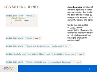
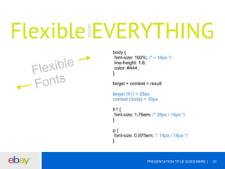
Responsive Web Design 
@sengopal 
October 15, 2012
WHO ARE WE? 
Senthil Gopal - @sengopal Mahendar Madhavan - @mmahendar 
PRESENTATION TITLE GOES HERE 2
AGENDA 
 EVOLUTION 
 DEVELOP 
 HOW TO GET STARTED 
 NEEDS 
 BLEEDING EDGE
EVOLUTION 
PRESENTATION TITLE GOES HERE4
WHAT IS RESPONSIVE WEB DESIGN 
PRESENTATION TITLE GOES HERE 5
PRESENTATION TITLE GOES HERE 6 
WHAT IS RESPONSIVE DESIGN 
A website that responds to the device 
that accesses it and delivers the 
appropriate output for it uses responsive 
design. Rather than designing multiple 
sites for different-sized devices, this 
approach designs one site but specifies 
how it should appear on varied devices. 
- Stanford University
PRESENTATION TITLE GOES HERE 7 
simple html demo
CSS MEDIA TYPES 
http://www.w3.org/TR/CSS2/media.html 
http://www.w3schools.com/tags/att_link_media.asp
EVOLUTION 
PRESENTATION TITLE GOES HERE 9
CSS MEDIA TYPES
PRESENTATION TITLE GOES HERE 11 
media type demo
WHY IS RWD POPULAR 
 MOBILE DEVELOPMENT 
 INCREASE IN REACH 
 ANALYTICS AND REPORTING 
 SEARCH ENGINES 
 SINGULAR CODE BASE 
 FASTER DEPLOYMENT 
 FUTURE-PROOFED
DRAWBACKS
DRAWBACKS 
PRESENTATION TITLE GOES HERE 14 
 H/w features 
 Page size 
 Native experience 
 Legacy browser 
 Longer development time
PRESENTATION TITLE GOES HERE 15 
ADDRESSING THEM 
Harry: But I'm not allowed a broom. 
Professor Moody: You're allowed a wand...
ADDRESSING THEM 
DRAWBACK MITIGATION 
H/W FEATURES Geolocation, Audio, Media HTML5 API 
PAGE SIZE Optimization / JS Frameworks 
NATIVE EXPERIENCE Mobile CSS frameworks 
LEGACY BROWSER Polyfills / Progressive Enhancement 
PRESENTATION TITLE GOES HERE 16 
LONGER DEVELOPMENT TIME -
FACEBOOK STORY VS. SENCHA 
PRESENTATION TITLE GOES HERE 17 
http://vimeo.com/55486684 
"The biggest 
mistake we made as 
a company was 
betting too much on 
HTML5 as opposed 
to native," 
Zuckerberg said in 
an interview at 
TechCrunch Disrupt. 
"It just wasn't 
ready," he added.
FACEBOOK STORY VS. SENCHA 
PRESENTATION TITLE GOES HERE 18
PRESENTATION TITLE GOES HERE 19 
RWD vs. NATIVE APP
PRESENTATION TITLE GOES HERE 20 
RWD vs. NATIVE APP in eBay 
 Api Requirements 
 Information Security 
 Multiple Device Releases
DEVELOP
CSS MEDIA QUERIES A media query consists of 
a media type and at least 
one expression that limits 
the style sheets' scope by 
using media features, such 
as width, height, and color. 
Media queries, added 
in CSS3, let the 
presentation of content be 
tailored to a specific range 
of output devices without 
having to change the 
content itself. 
@media (max-width: 600px) { 
.facet_sidebar { 
display: none; 
} 
} 
@media (min-width: 700px) { ... } 
@media (min-width: 700px) and (orientation: landscape) { ... } 
@media handheld and (min-width: 700px) and (orientation: landscape) { ... } 
@media (min-width: 700px), handheld and (orientation: landscape) { ... }
PRESENTATION TITLE GOES HERE 23 
demo – media query
Great power great responsibility 
PRESENTATION TITLE GOES HERE 24
BAD DESIGN 
PRESENTATION TITLE GOES HERE 25
HOW TO GET STARTED ?
PRESENTATION TITLE GOES HERE 27
THE MANTRA 
target / context = result 
PRESENTATION TITLE GOES HERE 28
PRESENTATION TITLE GOES HERE 29
PRESENTATION TITLE GOES HERE 30
PRESENTATION TITLE GOES HERE 31
PRESENTATION TITLE GOES HERE 32
PRESENTATION TITLE GOES HERE 33
PRESENTATION TITLE GOES HERE 34
FINAL THOUGHTS 
PRESENTATION TITLE GOES HERE 35 
 Start with the Grid – Make it Flexible 
 Make Images flexible 
 Set breakpoints wherever you need them – make choices based on 
the design rather than the device. 
 Don’t assume that mobile users want “less” content 
 Mobile-first design. 
 Then focus on the details.
PRESENTATION TITLE GOES HERE 36
TOOLS 
PRESENTATION TITLE GOES HER3E7
PRESENTATION TITLE GOES HERE 38 
FRAMEWORKS
PRESENTATION TITLE GOES HERE 39 
GRIDS
PRESENTATION TITLE GOES HERE 40 
PRACTICES 
http://smacss.com/ http://bem.info/
PRESENTATION TITLE GOES HERE 41 
PRE-PROCESSORS
PRESENTATION TITLE GOES HERE 42 
PURECSS.IO
PRESENTATION TITLE GOES HERE 43 
POLYFILLS - IE
PRESENTATION TITLE GOES HERE 44 
POLYFILLS 
https://github.com/Modernizr/Modernizr/wiki/HTML5-Cross-Browser-Polyfills 
A polyfill, or polyfiller, 
is a piece of code (or 
plugin) that provides 
the technology that 
you, the developer, 
expect the browser 
to provide natively. 
Flattening the API 
landscape if you will.
DEVELOPER TOOLS 
PRESENTATION TITLE GOES HERE 45
PRESENTATION TITLE GOES HERE 46 
RAPTOR COMPONENTS 
<r:includeBootstrap/>
NEEDS
PROJECTS 
EXISTING BRAND NEW
PRESENTATION TITLE GOES HERE 49 
UED 
 Mocks For All Aspect Ratios 
 1-1 Page Mapping 
 Specifications 
 Adobe Reflow 
 Images Delivery 
 Component Re-use 
 Iterations
PRESENTATION TITLE GOES HERE 50 
DS3 COMPONENT ISSUE
PRESENTATION TITLE GOES HERE 51 
BEST PRACTICES 
Browser Specification 
Iterate Mocks - Thoroughly 
Architecting Css 
Pre-processors 
Use Fwks Only If Needed 
Ems / Percentages 
Minimize Media Query Usage 
Override Only If Necessary
PRESENTATION TITLE GOES HERE 52 
TESTING 
Ui Testing 
Side-by-side Comparison 
Interactive Resizers 
Bookmarklets 
Mobile Device Testing 
Accessibility 
Performance
PRESENTATION TITLE GOES HERE 53 
TESTING
NEXT – PROGRESSIVE ENHANCEMENT 
Progressive Enhancement is 
a powerful methodology that 
allows Web developers to 
concentrate on building the best 
possible websites while 
balancing the issues inherent in 
those websites being accessed 
by multiple unknown user-agents. 
PRESENTATION TITLE GOES HERE 54
PRESENTATION TITLE GOES HERE 55
KEEP YOURSELF UPDATED 
PRESENTATION TITLE GOES HERE 56 
@boagworl 
@zeldman 
@alistapart 
@smashingmag 
@snookca 
@beep 
@paul_irish 
@addyosmani 
@chriscoyier 
@csswizardry 
@codepo8
PRESENTATION TITLE GOES HER5E7
APPENDIX – I 
1) Ethan Marcotte coined the term responsive web design (RWD) in a May 2010 article in A List Apart. 
2) http://alistapart.com/article/responsive-web-design 
PRESENTATION TITLE GOES HERE 58 
FRAMEWORKS 
1) http://getbootstrap.com/2.3.2/ 
2) http://lessframework.com/ 
3) http://www.getskeleton.com/ 
4) http://foundation.zurb.com/ 
5) http://fluidbaselinegrid.com/ 
6) http://gumbyframework.com/ 
7) http://matthewhartman.github.io/base/ 
8) http://semantic.gs/ 
9) http://responsive.gs/ 
10)http://www.columnal.com/ 
11)http://fluidbaselinegrid.com/ 
12)http://www.profoundgrid.com/ 
13)http://thatcoolguy.github.io/gridless-boilerplate/ 
14)http://goldilocksapproach.com/ 
15)http://inuitcss.com/ 
16)http://www.blueprintcss.org/ 
GRIDS 
1) http://purecss.io/ 
2) http://neat.bourbon.io/ 
3) http://imperavi.com/kube/ 
4) http://rwdgrid.com/ 
5) http://thisisdallas.github.io/Simple-Grid/
APPENDIX – III (TESTING TOOLS) 
PRESENTATION TITLE GOES HERE 59 
UI Testing 
http://dfcb.github.io/Responsivator/ 
http://lab.maltewassermann.com/viewport-resizer/ 
http://responsivetest.net/ 
http://designmodo.com/responsive-test/ 
http://quirktools.com/screenfly/ 
http://beta.screenqueri.es/ 
http://ami.responsivedesign.is/ 
http://deviceponsive.com/ 
http://responsive.is/typecast.com 
Bookmarklets 
http://lab.maltewassermann.com/viewport-resizer 
http://codebomber.com/jquery/resizer 
http://responsive.victorcoazulon.fr/ 
Interactive resizers 
http://responsive.is 
http://screenqueri.es 
http://bradfrostweb.com/demo/ish 
http://designmodo.com/responsive-test 
http://cybercrab.com/screencheck 
http://responsivepx.com 
Side-by-side comparison 
http://mattkersley.com/responsive 
http://www.studiopress.com/responsive 
http://responsive.pixeltuner.de 
http://ami.responsivedesign.is/
APPENDIX – III – Images used are copyrighted 
1) http://dilbert.com/strips/comic/2010-02-22/ 
2) http://www.waysandmeanstechnology.com/BlogImages/Advantages-of-HTML5-in-App-Development.png 
3) http://theeastwing.s3.amazonaws.com/wp-content/uploads/2012/06/ethan-cover.png 
4) http://www.alphabetix.net/images/b_images2008/webdesign_cartoon.png 
5) http://www.dvdbeaver.com/film2/DVDReviews49/spider-man_blu-ray/large/large_spider-man_blu-ray4s.jpg 
6) http://1.bp.blogspot.com/_O4qgpChbarw/TJmWsUdQsYI/AAAAAAAABLk/Tuh7tvkHMWI/s400/tearing-hair-out.gif 
7) http://www.mdgadvertising.com/blog/wp-content/uploads/2013/06/should-you-build-a-mobile-app-or-mobile-website.png 
8) http://31.media.tumblr.com/05ac3cb897737072d77a37d29d3cf7bb/tumblr_mpa92h2AId1sxr185o1_500.gif 
9) http://i0.kym-cdn.com/photos/images/original/000/346/560/157.jpg 
10) http://cdn.impressivewebs.com/2011-12/html5-4.jpg 
11) http://cdn.memegenerator.net/instances/400x/36448402.jpg 
12) http://076dd0a50e0c1255009e-bd4b8aabaca29897bc751dfaf75b290c.r40.cf1.rackcdn.com/images/files/000/273/792/original/original.jpg 
13) https://blog.twitter.com/sites/all/themes/gazebo/img/twitter-bird-white-on-blue.png 
14) http://dogbert.zymichost.com/resource/dilbert/dilbert2003081524509.gif 
15) http://www.firstfoundation.ca/images/made/uploads/featuredImages/Any_Questions_438_292.jpg 
16) http://www.techrepublic.com/blog/web-designer/responsive-web-design-vs-mobile-app-development/ 
17) http://img-cache.cdn.gaiaonline.com/40b26308e61df26ddd895ce46d0c890c/http://i632.photobucket.com/albums/uu45/TwiliteLuvr/Harry%20Potter/devonmurray.jpg 
18) http://i0.kym-cdn.com/photos/images/original/000/344/852/300.jpg 
19) http://3.bp.blogspot.com/_QUC0Qp8XAR8/TPgG4ICdQUI/AAAAAAAAAyc/qkOkmMBdYGI/s400/homer-slap-forehead.jpg 
PRESENTATION TITLE GOES HERE 60

Responsive web design

  • 1.
    Responsive Web Design @sengopal October 15, 2012
  • 2.
    WHO ARE WE? Senthil Gopal - @sengopal Mahendar Madhavan - @mmahendar PRESENTATION TITLE GOES HERE 2
  • 3.
    AGENDA  EVOLUTION  DEVELOP  HOW TO GET STARTED  NEEDS  BLEEDING EDGE
  • 4.
  • 5.
    WHAT IS RESPONSIVEWEB DESIGN PRESENTATION TITLE GOES HERE 5
  • 6.
    PRESENTATION TITLE GOESHERE 6 WHAT IS RESPONSIVE DESIGN A website that responds to the device that accesses it and delivers the appropriate output for it uses responsive design. Rather than designing multiple sites for different-sized devices, this approach designs one site but specifies how it should appear on varied devices. - Stanford University
  • 7.
    PRESENTATION TITLE GOESHERE 7 simple html demo
  • 8.
    CSS MEDIA TYPES http://www.w3.org/TR/CSS2/media.html http://www.w3schools.com/tags/att_link_media.asp
  • 9.
  • 10.
  • 11.
    PRESENTATION TITLE GOESHERE 11 media type demo
  • 12.
    WHY IS RWDPOPULAR  MOBILE DEVELOPMENT  INCREASE IN REACH  ANALYTICS AND REPORTING  SEARCH ENGINES  SINGULAR CODE BASE  FASTER DEPLOYMENT  FUTURE-PROOFED
  • 13.
  • 14.
    DRAWBACKS PRESENTATION TITLEGOES HERE 14  H/w features  Page size  Native experience  Legacy browser  Longer development time
  • 15.
    PRESENTATION TITLE GOESHERE 15 ADDRESSING THEM Harry: But I'm not allowed a broom. Professor Moody: You're allowed a wand...
  • 16.
    ADDRESSING THEM DRAWBACKMITIGATION H/W FEATURES Geolocation, Audio, Media HTML5 API PAGE SIZE Optimization / JS Frameworks NATIVE EXPERIENCE Mobile CSS frameworks LEGACY BROWSER Polyfills / Progressive Enhancement PRESENTATION TITLE GOES HERE 16 LONGER DEVELOPMENT TIME -
  • 17.
    FACEBOOK STORY VS.SENCHA PRESENTATION TITLE GOES HERE 17 http://vimeo.com/55486684 "The biggest mistake we made as a company was betting too much on HTML5 as opposed to native," Zuckerberg said in an interview at TechCrunch Disrupt. "It just wasn't ready," he added.
  • 18.
    FACEBOOK STORY VS.SENCHA PRESENTATION TITLE GOES HERE 18
  • 19.
    PRESENTATION TITLE GOESHERE 19 RWD vs. NATIVE APP
  • 20.
    PRESENTATION TITLE GOESHERE 20 RWD vs. NATIVE APP in eBay  Api Requirements  Information Security  Multiple Device Releases
  • 21.
  • 22.
    CSS MEDIA QUERIESA media query consists of a media type and at least one expression that limits the style sheets' scope by using media features, such as width, height, and color. Media queries, added in CSS3, let the presentation of content be tailored to a specific range of output devices without having to change the content itself. @media (max-width: 600px) { .facet_sidebar { display: none; } } @media (min-width: 700px) { ... } @media (min-width: 700px) and (orientation: landscape) { ... } @media handheld and (min-width: 700px) and (orientation: landscape) { ... } @media (min-width: 700px), handheld and (orientation: landscape) { ... }
  • 23.
    PRESENTATION TITLE GOESHERE 23 demo – media query
  • 24.
    Great power greatresponsibility PRESENTATION TITLE GOES HERE 24
  • 25.
    BAD DESIGN PRESENTATIONTITLE GOES HERE 25
  • 26.
    HOW TO GETSTARTED ?
  • 27.
  • 28.
    THE MANTRA target/ context = result PRESENTATION TITLE GOES HERE 28
  • 29.
  • 30.
  • 31.
  • 32.
  • 33.
  • 34.
  • 35.
    FINAL THOUGHTS PRESENTATIONTITLE GOES HERE 35  Start with the Grid – Make it Flexible  Make Images flexible  Set breakpoints wherever you need them – make choices based on the design rather than the device.  Don’t assume that mobile users want “less” content  Mobile-first design.  Then focus on the details.
  • 36.
  • 37.
  • 38.
    PRESENTATION TITLE GOESHERE 38 FRAMEWORKS
  • 39.
  • 40.
    PRESENTATION TITLE GOESHERE 40 PRACTICES http://smacss.com/ http://bem.info/
  • 41.
    PRESENTATION TITLE GOESHERE 41 PRE-PROCESSORS
  • 42.
    PRESENTATION TITLE GOESHERE 42 PURECSS.IO
  • 43.
    PRESENTATION TITLE GOESHERE 43 POLYFILLS - IE
  • 44.
    PRESENTATION TITLE GOESHERE 44 POLYFILLS https://github.com/Modernizr/Modernizr/wiki/HTML5-Cross-Browser-Polyfills A polyfill, or polyfiller, is a piece of code (or plugin) that provides the technology that you, the developer, expect the browser to provide natively. Flattening the API landscape if you will.
  • 45.
    DEVELOPER TOOLS PRESENTATIONTITLE GOES HERE 45
  • 46.
    PRESENTATION TITLE GOESHERE 46 RAPTOR COMPONENTS <r:includeBootstrap/>
  • 47.
  • 48.
  • 49.
    PRESENTATION TITLE GOESHERE 49 UED  Mocks For All Aspect Ratios  1-1 Page Mapping  Specifications  Adobe Reflow  Images Delivery  Component Re-use  Iterations
  • 50.
    PRESENTATION TITLE GOESHERE 50 DS3 COMPONENT ISSUE
  • 51.
    PRESENTATION TITLE GOESHERE 51 BEST PRACTICES Browser Specification Iterate Mocks - Thoroughly Architecting Css Pre-processors Use Fwks Only If Needed Ems / Percentages Minimize Media Query Usage Override Only If Necessary
  • 52.
    PRESENTATION TITLE GOESHERE 52 TESTING Ui Testing Side-by-side Comparison Interactive Resizers Bookmarklets Mobile Device Testing Accessibility Performance
  • 53.
    PRESENTATION TITLE GOESHERE 53 TESTING
  • 54.
    NEXT – PROGRESSIVEENHANCEMENT Progressive Enhancement is a powerful methodology that allows Web developers to concentrate on building the best possible websites while balancing the issues inherent in those websites being accessed by multiple unknown user-agents. PRESENTATION TITLE GOES HERE 54
  • 55.
  • 56.
    KEEP YOURSELF UPDATED PRESENTATION TITLE GOES HERE 56 @boagworl @zeldman @alistapart @smashingmag @snookca @beep @paul_irish @addyosmani @chriscoyier @csswizardry @codepo8
  • 57.
  • 58.
    APPENDIX – I 1) Ethan Marcotte coined the term responsive web design (RWD) in a May 2010 article in A List Apart. 2) http://alistapart.com/article/responsive-web-design PRESENTATION TITLE GOES HERE 58 FRAMEWORKS 1) http://getbootstrap.com/2.3.2/ 2) http://lessframework.com/ 3) http://www.getskeleton.com/ 4) http://foundation.zurb.com/ 5) http://fluidbaselinegrid.com/ 6) http://gumbyframework.com/ 7) http://matthewhartman.github.io/base/ 8) http://semantic.gs/ 9) http://responsive.gs/ 10)http://www.columnal.com/ 11)http://fluidbaselinegrid.com/ 12)http://www.profoundgrid.com/ 13)http://thatcoolguy.github.io/gridless-boilerplate/ 14)http://goldilocksapproach.com/ 15)http://inuitcss.com/ 16)http://www.blueprintcss.org/ GRIDS 1) http://purecss.io/ 2) http://neat.bourbon.io/ 3) http://imperavi.com/kube/ 4) http://rwdgrid.com/ 5) http://thisisdallas.github.io/Simple-Grid/
  • 59.
    APPENDIX – III(TESTING TOOLS) PRESENTATION TITLE GOES HERE 59 UI Testing http://dfcb.github.io/Responsivator/ http://lab.maltewassermann.com/viewport-resizer/ http://responsivetest.net/ http://designmodo.com/responsive-test/ http://quirktools.com/screenfly/ http://beta.screenqueri.es/ http://ami.responsivedesign.is/ http://deviceponsive.com/ http://responsive.is/typecast.com Bookmarklets http://lab.maltewassermann.com/viewport-resizer http://codebomber.com/jquery/resizer http://responsive.victorcoazulon.fr/ Interactive resizers http://responsive.is http://screenqueri.es http://bradfrostweb.com/demo/ish http://designmodo.com/responsive-test http://cybercrab.com/screencheck http://responsivepx.com Side-by-side comparison http://mattkersley.com/responsive http://www.studiopress.com/responsive http://responsive.pixeltuner.de http://ami.responsivedesign.is/
  • 60.
    APPENDIX – III– Images used are copyrighted 1) http://dilbert.com/strips/comic/2010-02-22/ 2) http://www.waysandmeanstechnology.com/BlogImages/Advantages-of-HTML5-in-App-Development.png 3) http://theeastwing.s3.amazonaws.com/wp-content/uploads/2012/06/ethan-cover.png 4) http://www.alphabetix.net/images/b_images2008/webdesign_cartoon.png 5) http://www.dvdbeaver.com/film2/DVDReviews49/spider-man_blu-ray/large/large_spider-man_blu-ray4s.jpg 6) http://1.bp.blogspot.com/_O4qgpChbarw/TJmWsUdQsYI/AAAAAAAABLk/Tuh7tvkHMWI/s400/tearing-hair-out.gif 7) http://www.mdgadvertising.com/blog/wp-content/uploads/2013/06/should-you-build-a-mobile-app-or-mobile-website.png 8) http://31.media.tumblr.com/05ac3cb897737072d77a37d29d3cf7bb/tumblr_mpa92h2AId1sxr185o1_500.gif 9) http://i0.kym-cdn.com/photos/images/original/000/346/560/157.jpg 10) http://cdn.impressivewebs.com/2011-12/html5-4.jpg 11) http://cdn.memegenerator.net/instances/400x/36448402.jpg 12) http://076dd0a50e0c1255009e-bd4b8aabaca29897bc751dfaf75b290c.r40.cf1.rackcdn.com/images/files/000/273/792/original/original.jpg 13) https://blog.twitter.com/sites/all/themes/gazebo/img/twitter-bird-white-on-blue.png 14) http://dogbert.zymichost.com/resource/dilbert/dilbert2003081524509.gif 15) http://www.firstfoundation.ca/images/made/uploads/featuredImages/Any_Questions_438_292.jpg 16) http://www.techrepublic.com/blog/web-designer/responsive-web-design-vs-mobile-app-development/ 17) http://img-cache.cdn.gaiaonline.com/40b26308e61df26ddd895ce46d0c890c/http://i632.photobucket.com/albums/uu45/TwiliteLuvr/Harry%20Potter/devonmurray.jpg 18) http://i0.kym-cdn.com/photos/images/original/000/344/852/300.jpg 19) http://3.bp.blogspot.com/_QUC0Qp8XAR8/TPgG4ICdQUI/AAAAAAAAAyc/qkOkmMBdYGI/s400/homer-slap-forehead.jpg PRESENTATION TITLE GOES HERE 60

Editor's Notes

  • #6 Simple HTML demo
  • #10 CSS 3 Semantics Performance Offline & Storage Multimedia Device Access Connectivity Graphics & 3D
  • #26 PLAN. PLAN. PLAN OVERRIDE ONLY WHEN NEEDED %/EM INSTEAD OF PX MINIMIZE MEDIA QUERY USAGE
  • #49 Existing Migration New
  • #55 http://alistapart.com/article/understandingprogressiveenhancement