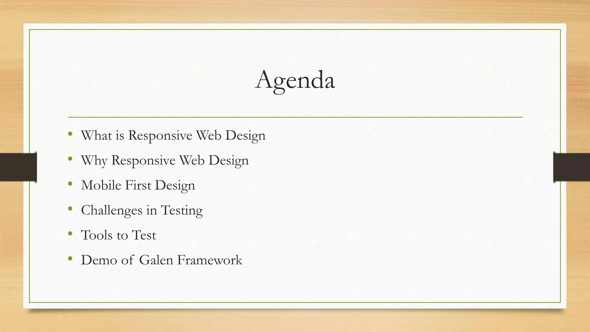
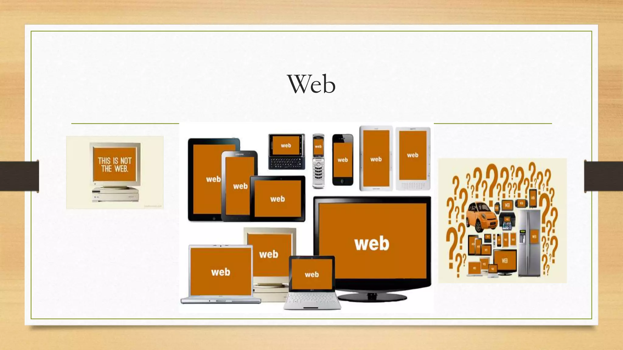
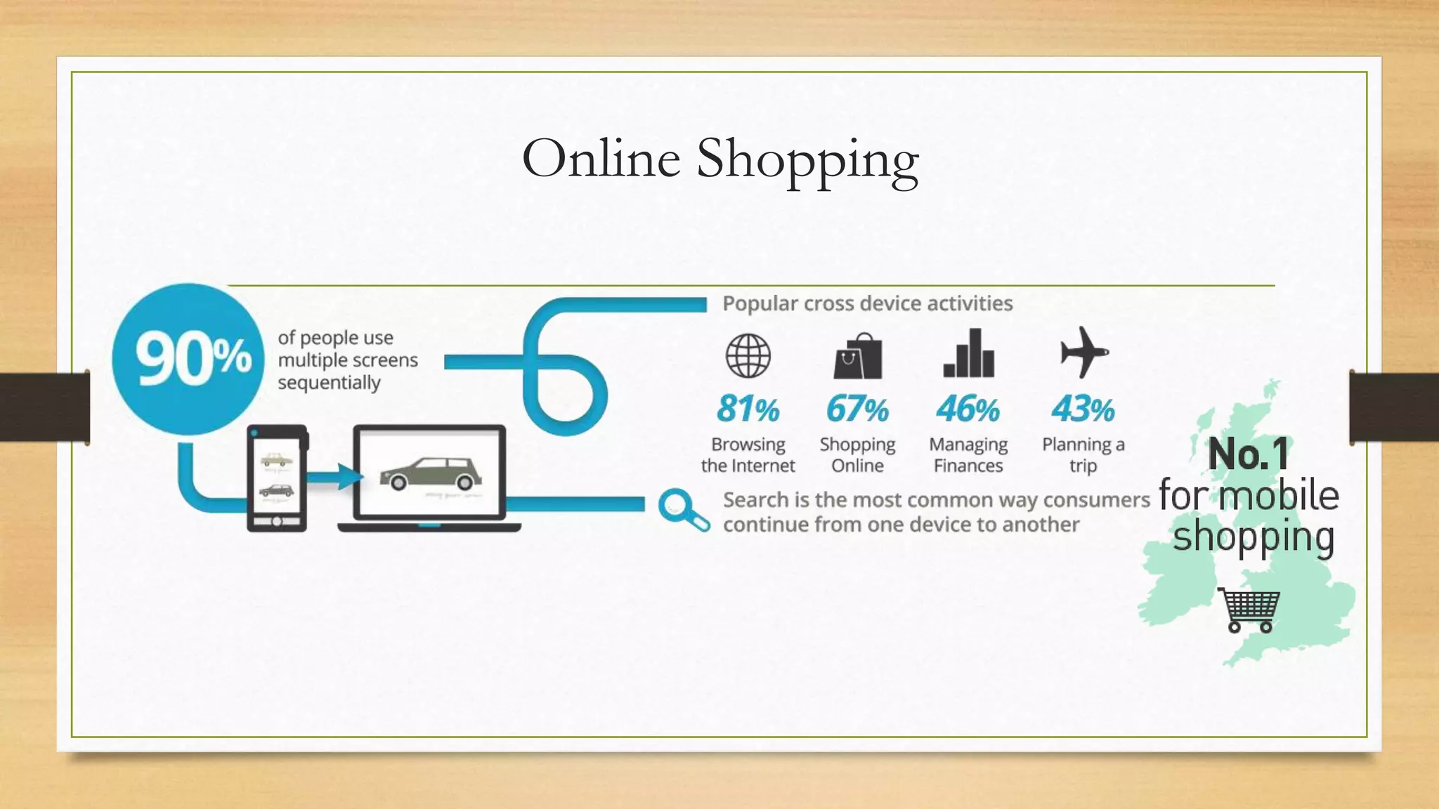
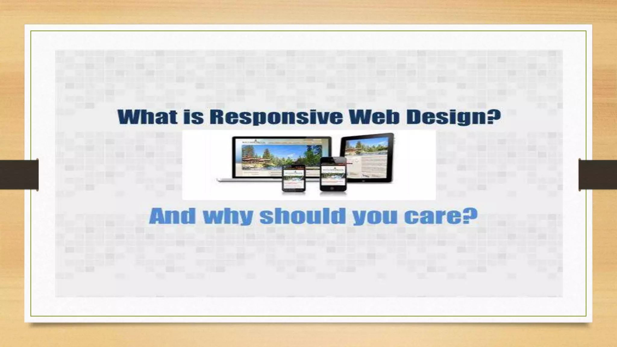
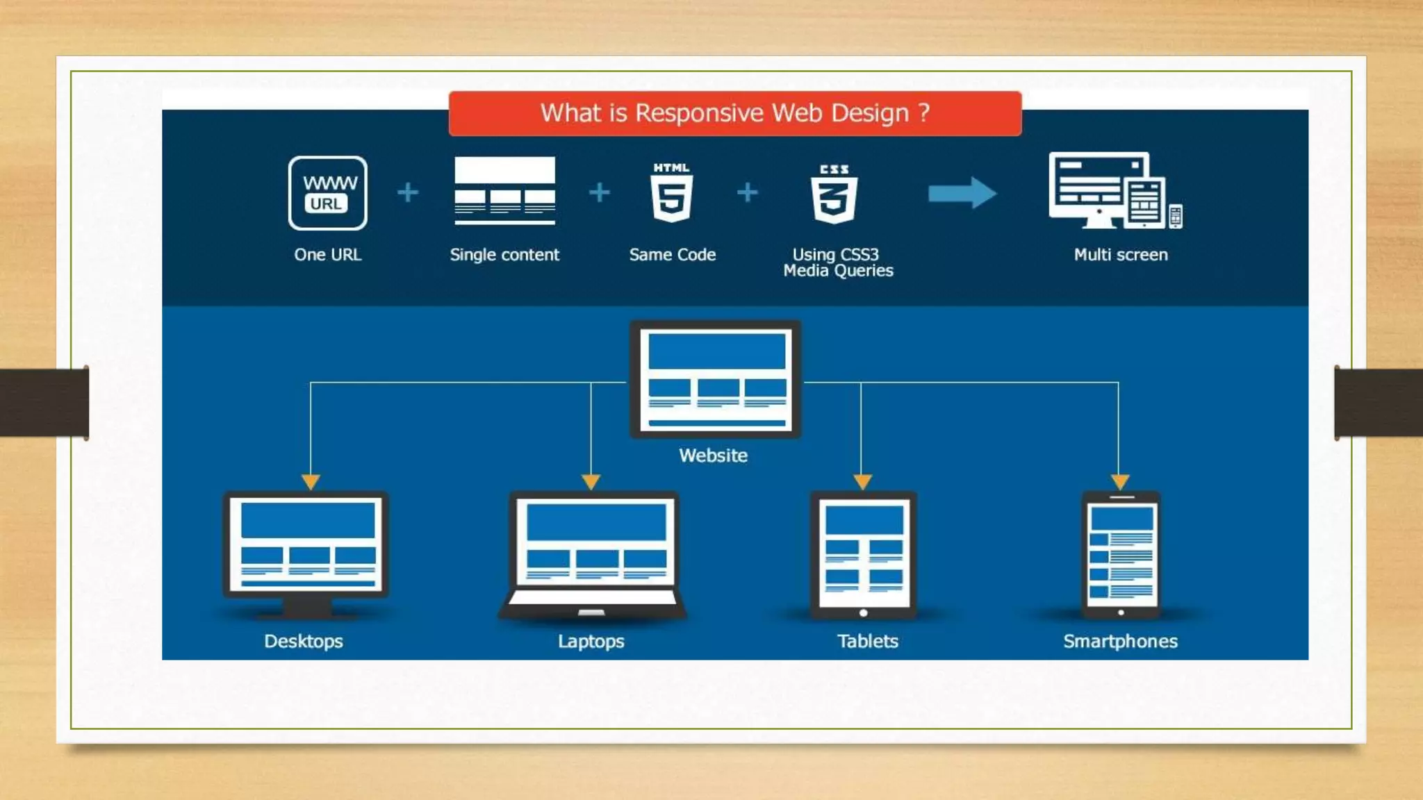
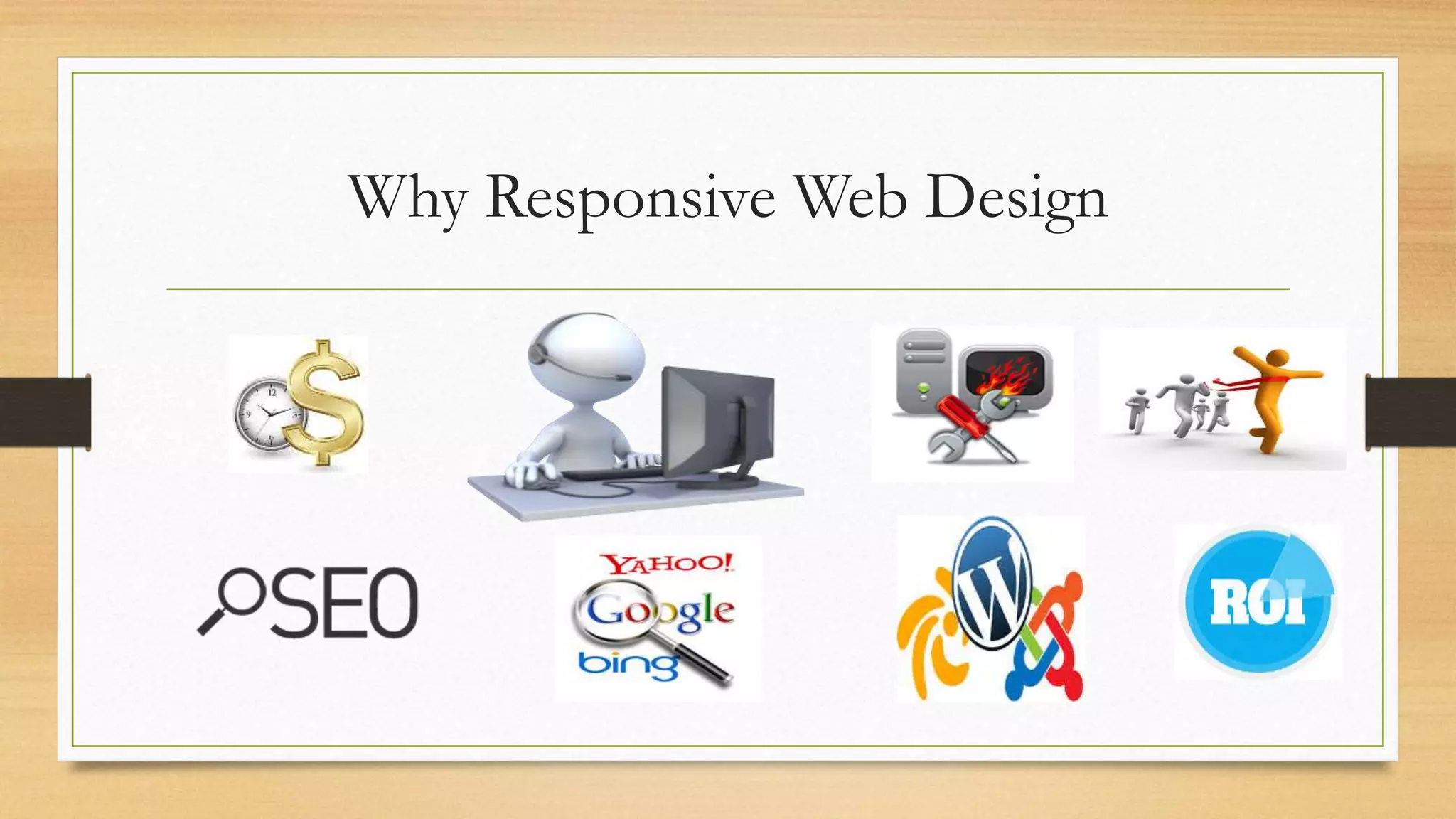
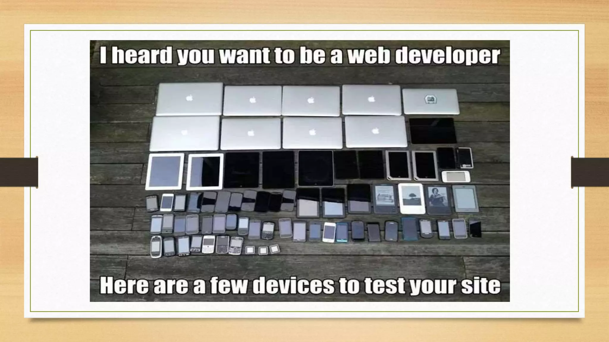
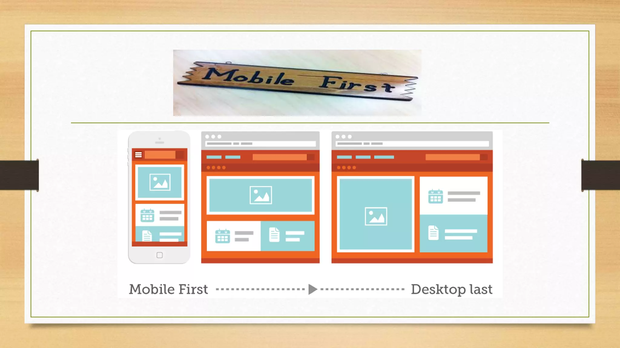
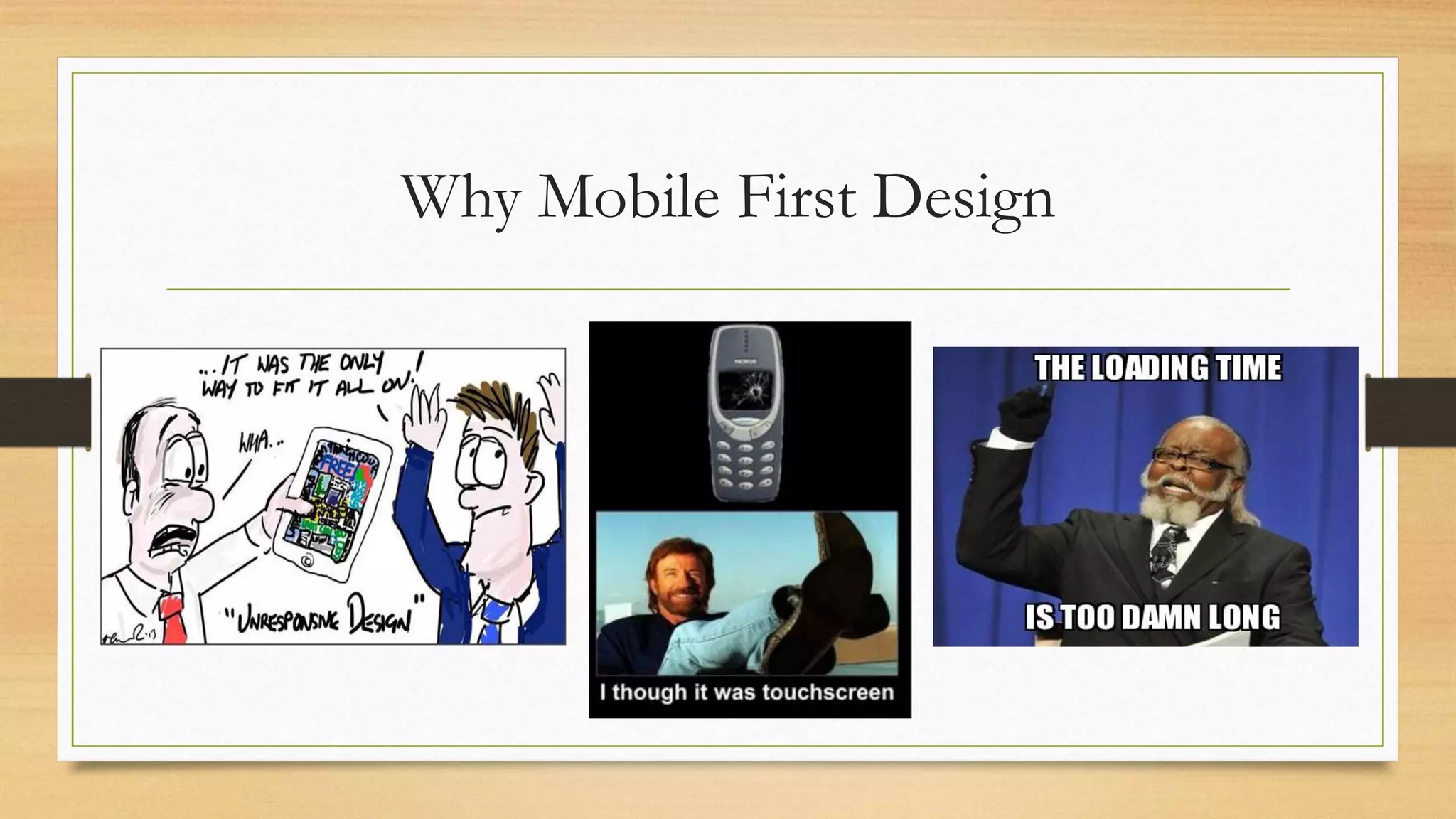
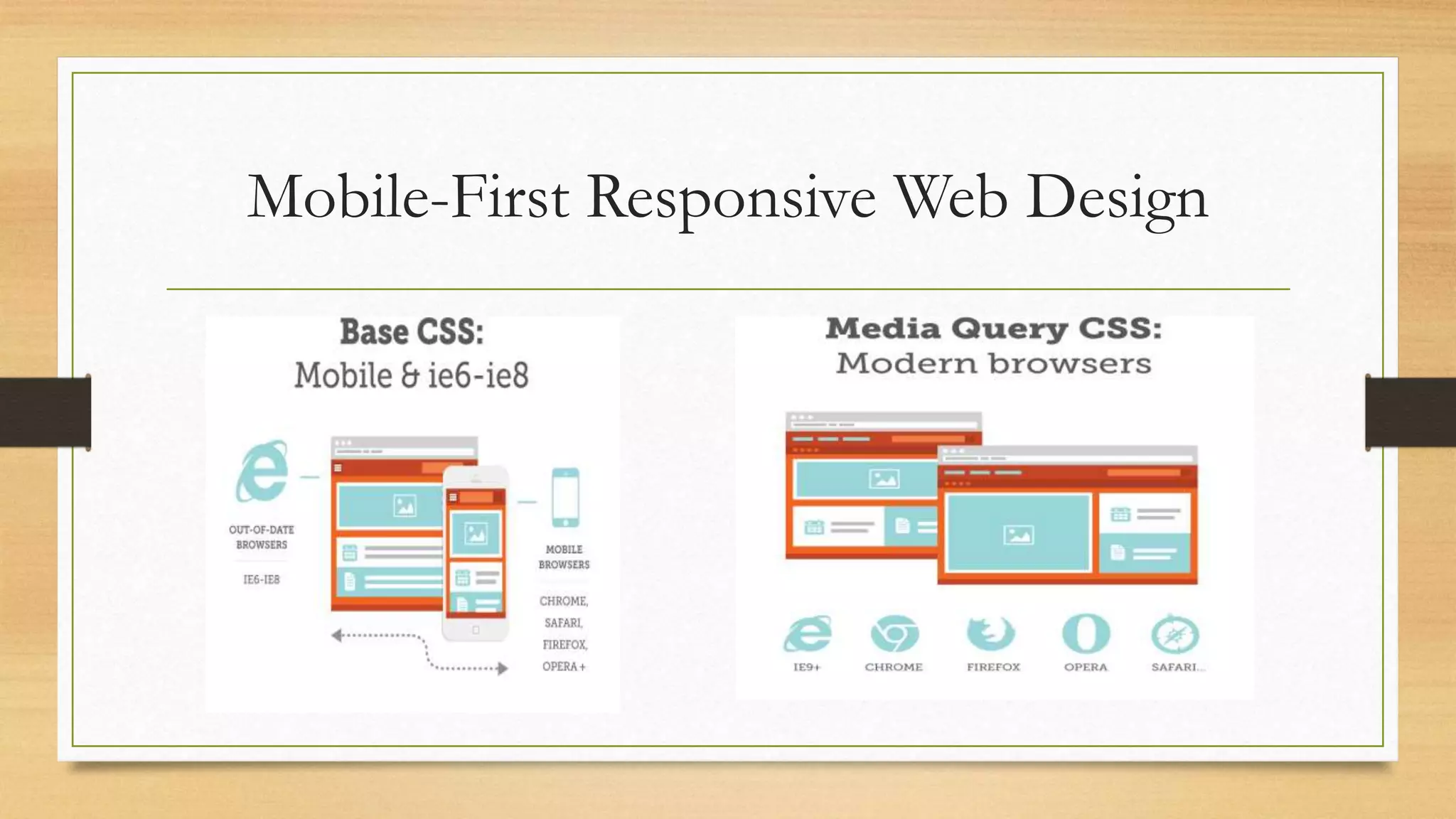
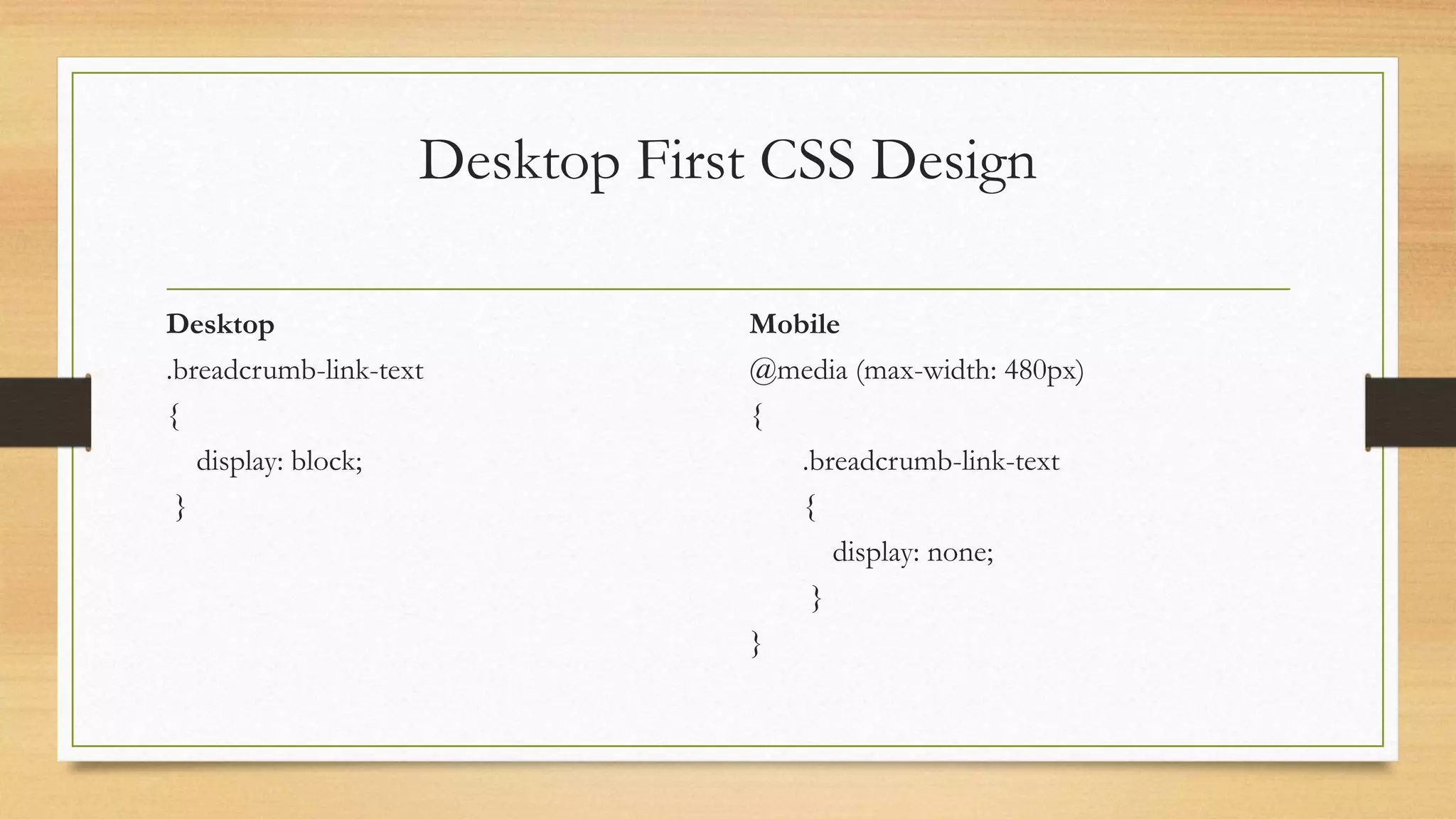
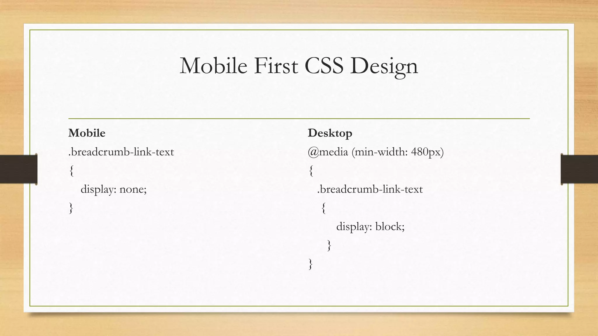
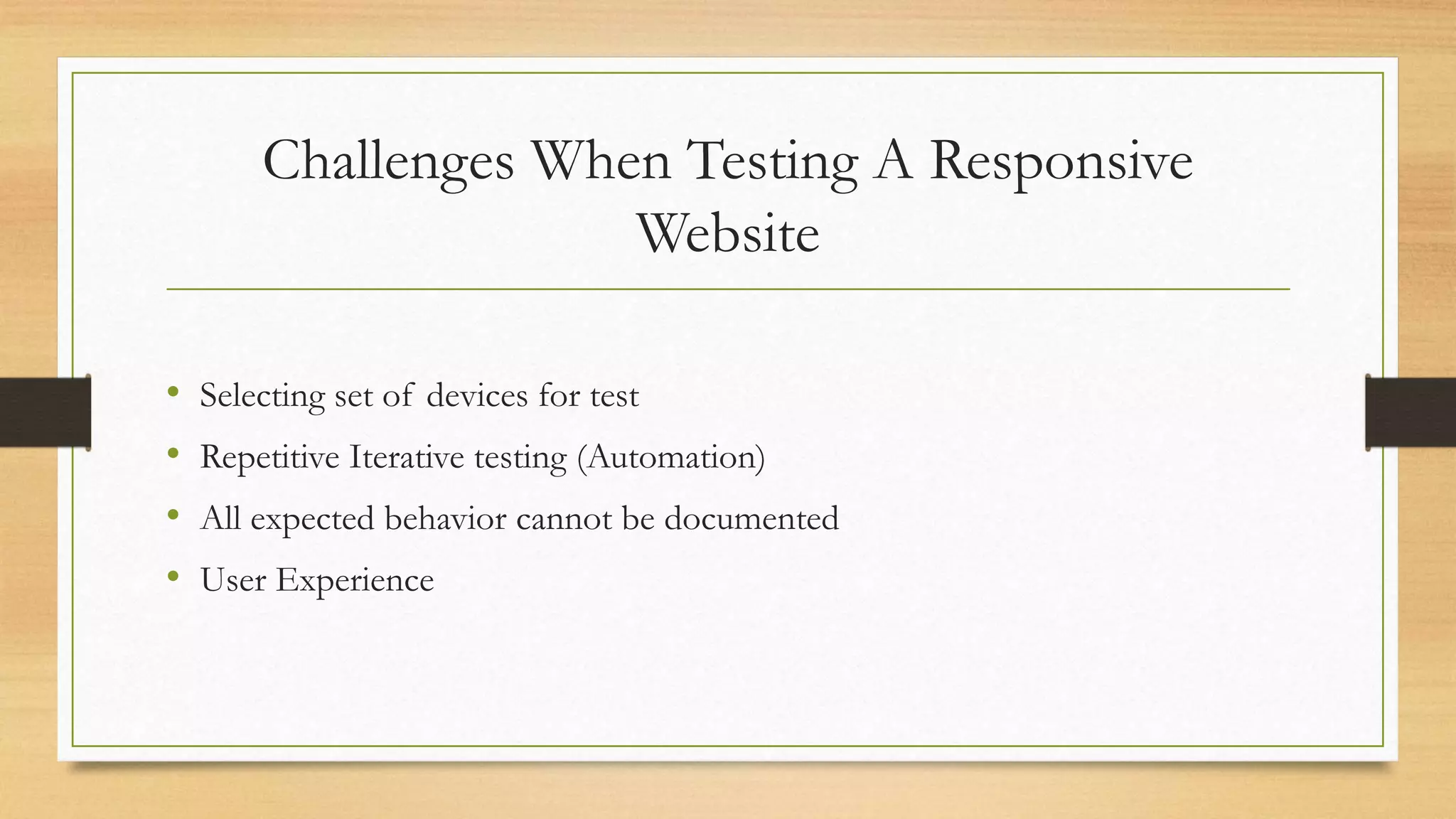
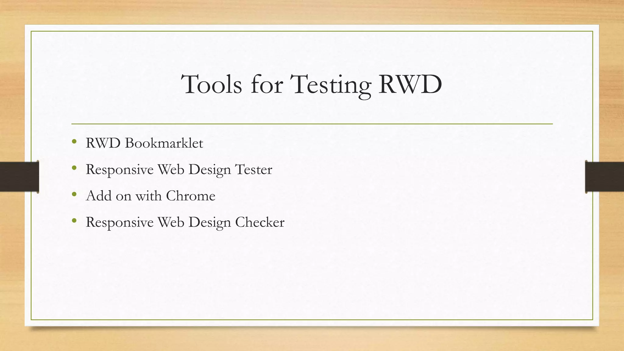
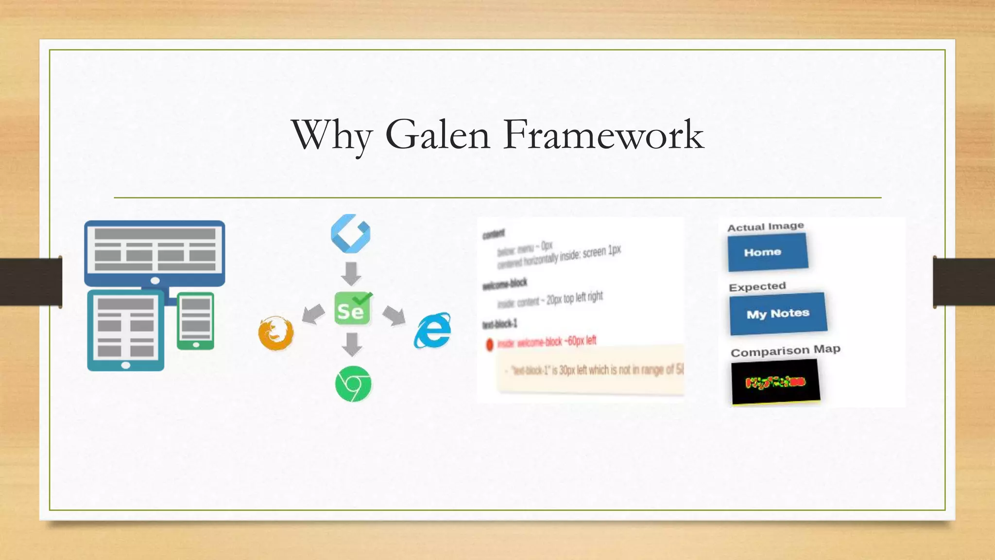
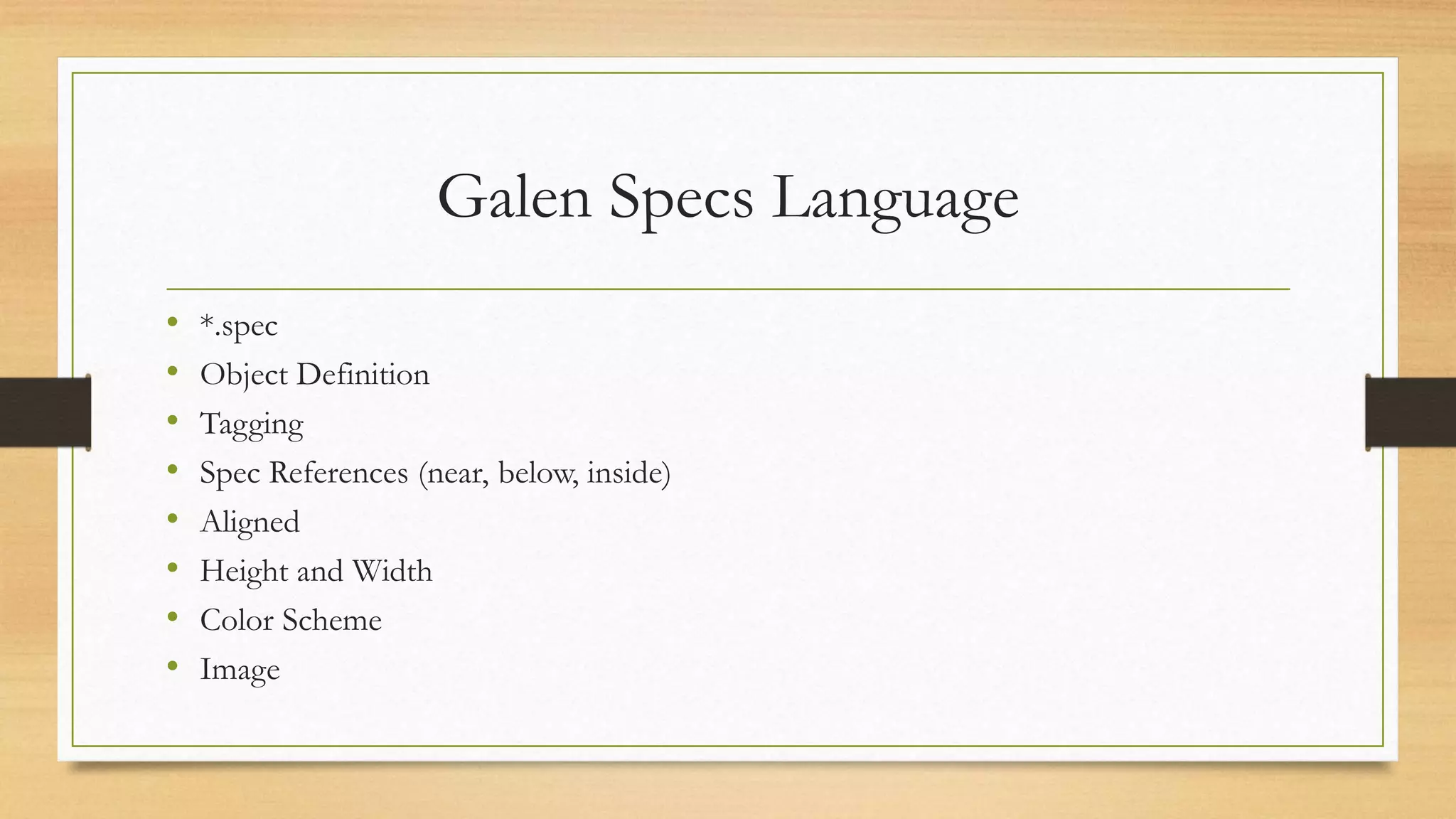
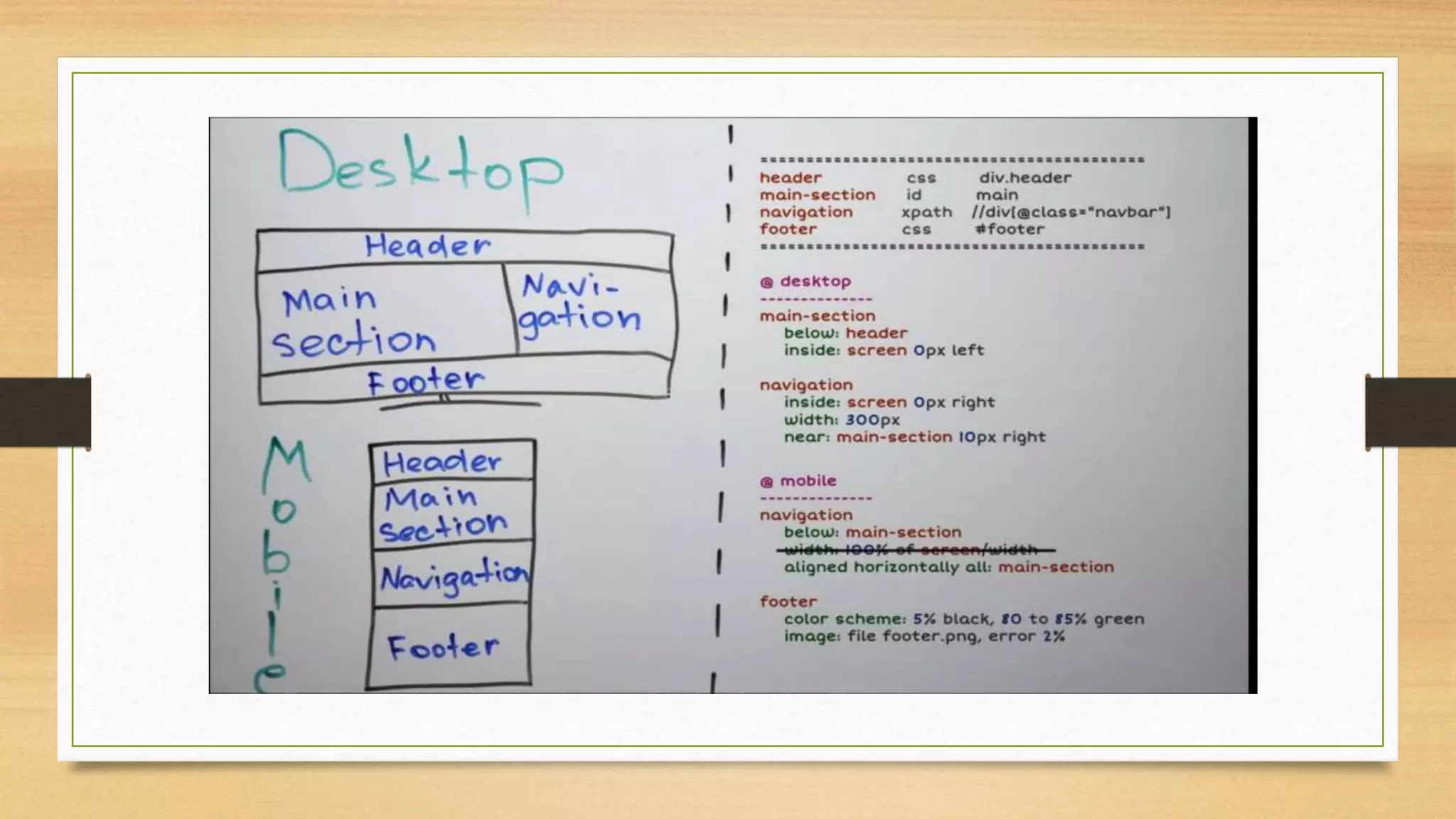
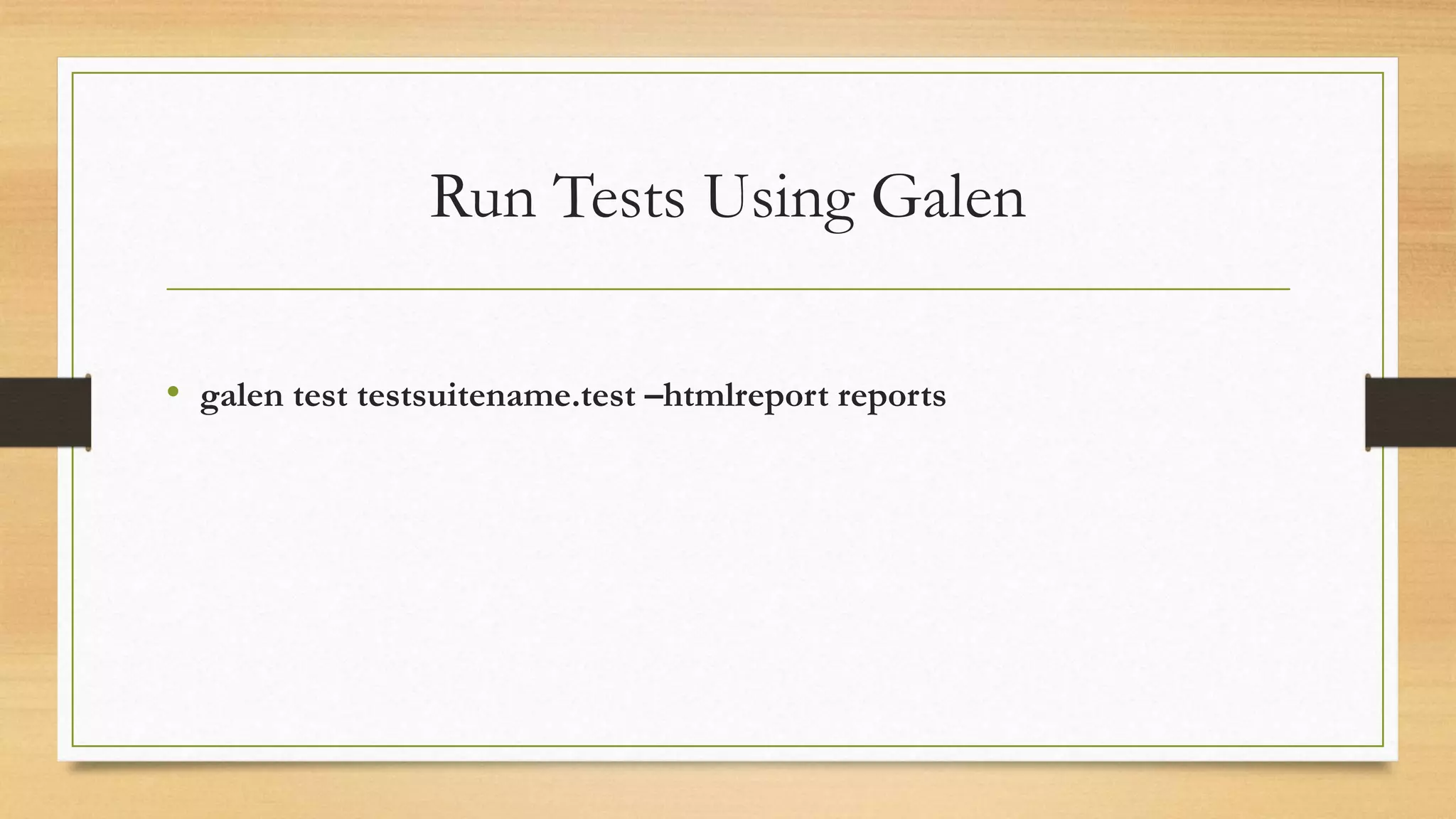
Responsive Web Design 
Date : 15/11/2014
Agenda 
• What is Responsive Web Design 
• Why Responsive Web Design 
• Mobile First Design 
• Challenges in Testing 
• Tools to Test 
• Demo of Galen Framework
Web
Online Shopping
What is Responsive Web Design
Why Responsive Web Design
Mobile First Design
Why Mobile First Design
Mobile-First Responsive Web Design
Desktop First CSS Design 
Desktop 
.breadcrumb-link-text 
{ 
display: block; 
} 
Mobile 
@media (max-width: 480px) 
{ 
.breadcrumb-link-text 
{ 
display: none; 
} 
}
Mobile First CSS Design 
Mobile 
.breadcrumb-link-text 
{ 
display: none; 
} 
Desktop 
@media (min-width: 480px) 
{ 
.breadcrumb-link-text 
{ 
display: block; 
} 
}
Challenges When Testing A Responsive 
Website 
• Selecting set of devices for test 
• Repetitive Iterative testing (Automation) 
• All expected behavior cannot be documented 
• User Experience
Tools for Testing RWD 
• RWD Bookmarklet 
• Responsive Web Design Tester 
• Add on with Chrome 
• Responsive Web Design Checker
Why Galen Framework
Galen Specs Language 
• *.spec 
• Object Definition 
• Tagging 
• Spec References (near, below, inside) 
• Aligned 
• Height and Width 
• Color Scheme 
• Image
Run Tests Using Galen 
• galen test testsuitename.test –htmlreport reports
Responsive Web Design and Testing

Responsive Web Design and Testing

Editor's Notes

  • #2 Responsive design is not about mobile. It's not about tablets. It's not about desktops. It's about The Web. Good Morning Everyone!! Hope u had a good tea break.. My name is Varuna. I here with my colleague KK will demonstrate through Responsive Web Design in Today’s Session.. Let’s have a quick Glance of agenda
  • #3 Responsive design is not about mobile. It's not about tablets. It's not about desktops. It's about The Web.
  • #4 How many of you believe that web is only desktop computers.. No naa Then wat is web..
  • #5 How many of you love shopping online.. Saving items in your cart from your desktop.. Then deciding after comparing different sites  So finally once you decide and you make your mind to buy that product and your lazy to open system.. you have mobile in your hand and you will expect same site in your cell phone.. Now u figured out that website is not available in cellphone.. if by any chance it is available you have different URL.. Quite frustrating by this time late at night and u dropped the idea of  buying product..  So in place of being a customer of the product from site you landed up as a visitor of the site.. So in today's talk we will make sure u get ur favorite selected product happily.. without ur patience been tested.. So Let’s figure out how we can convert visitors into customers.
  • #6 Background ::::::::RWD : Before smart phones and tablets came into market web designer were mostly focused on designing which gives an optimal performance  on different browser and operating system.. Same was with testing of website QA's were mostly focused on the performance  on different browser and operating system.. the test automation focus also lies in this area whether to use css selectors or an xpath for running against an IE... However now interacting with websites on smart phones and tables is not the same as desktop computer.. Click is moved to Touch Screen size , Factors such as Click versus Touch, Screen-size, Pixel-resolution, support for Adobe’s Flash technology, optimized markup and many more have become crucial while creating websites with Responsive Design 
  • #7  Responsive Web Design (RWD) is an approach of laying-out and designing a website such that it website provides an optimal viewing experience — ease of reading and navigation with a minimum of resizing, panning, and scrolling — across a wide range of devices (from desktop computer monitors to mobile phones). One url +Single Content +One Code + CSS3
  • #8 Save Time and Money : UX :::: Visitors to Customers Ahead with Competitors Low Maintanence Cost SEO Search Engine Preferes CMS ROI
  • #9 Now we know what RWD is and what it’s need is.. What would be approach to design rwd…
  • #10 mobile-first responsive web design comes down to using Progressive Enhancement as a foundation for web strategy and design. Designing with progressive enhancement involves smartly adding layers of enhancements to a strong foundation in order to deliver an accessible (and hopefully optimized) experience to all. Fluid grids that ebb and flow with a devices’ screen size Flexible images and media that keep content intact on any resolution Media queries allowing designs to adapt by establishing dimension breakpoints
  • #11 Content Focused Performance Loading Time
  • #12 Out Of Date Legacy Browser/Devices.. Progressive Enhancement.. CSS1 and CSS2 Media Query CSS How many of you want to support the user who are still using Nokia Mobiles
  • #13 DisAdvantages : Battery/CPU consumption because of more work. Show first, then hide.
  • #14 Advantages: We're doing more work, but we're doing it on powerful desktops/laptops etc.
  • #15 3….. How many of you look tickets in mobile when u just reach the airport!!
  • #16 Bookmark in Chrome RWD tester F12 http://responsivedesignchecker.com/
  • #17 Supports both Layout and Functional Testing Layout testing seemed always a complex task. Galen Framework offers a simple solution: test location of objects relatively to each other on page
  • #18 1.Galen Framework is designed with responsiveness in mind. It is easy to set up a test for different browser sizes. Galen just opens a browser, resizes it to a defined size and then tests the page according to specifications 2. Galen Framework runs well in Selenium Grid. You can set up your tests to run in a cloud like Sauce Labs or BrowserStackso that you can even test your responsive websites on different mobile devices. Galen can run multiple tests in parallel which is also a nice time saver. 3, Detailed HTML Report 4. Image Comparison Last but not least execute tests in Basic Syntax, Java Script Tests, JAVA API
  • #20 The first thing we do is to find the object locator!!! As you see here we have header with css locator Main-section with id and navigation with xpath Once your done with Object Locators … you can start writing your objects Color Scheme : To verify color distribution on object area. Galen takes a picture and then calculates the objects area color spectrum so later you can verify the usage for specific colors.