Download as PDF, PPTX


![CSS Selectors
Element selector – div, p
Class selector - .className
ID selector – #id
Attribute selectors – input[type=“text”]
Pseudo-selectors - :valid, :checked
Quiz!
8](https://image.slidesharecdn.com/html5css3-160616041617/85/Introduction-to-HTML5-and-CSS3-8-320.jpg)
![Display and visibility
div {
display: inline; /* default, takes content width, no line breaks*/
display: inline-block; /* Characteristics of block, but sits on a line */
display: block; /* full width, line break before and after*/
display: none; /* Hide */ [visibility: hidden]
}
Others : Run-in, table, flex
10](https://image.slidesharecdn.com/html5css3-160616041617/85/Introduction-to-HTML5-and-CSS3-10-320.jpg)
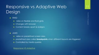


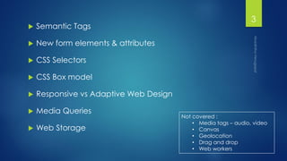
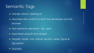
HTML5 and CSS3 provide semantic tags, new form elements, and CSS selectors for better interaction and styling. Key concepts covered include semantic tags like header and nav; new form elements like date and email; the CSS box model; responsive versus adaptive web design using media queries; and web storage using localStorage and sessionStorage. The document provides examples and definitions but does not cover media elements, canvas, geolocation, drag and drop, or web workers.


