
Recommended
Recommended
More Related Content
What's hot
What's hot (20)
Similar to Responsive web design
Similar to Responsive web design (20)
Recently uploaded
Recently uploaded (20)
Responsive web design
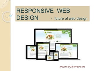
- 1. RESPONSIVE WEB DESIGN - future of web design www.tech2morrow.com
- 2. Definition of Responsive The actual meaning of responsive is to be reactive, receptive, amenable and flexible. The purpose of a responsive web design is to make your web page look good on all devices (ex: desktops, tablets, and phones). www.tech2morrow.com
- 3. Purpose of a Responsive Web Design A responsive website is one that adapts to the screen size of the device where the website is being served. Whenever the page resizes, the layout adjusts according to the fit of the screen. www.tech2morrow.com
- 4. Purpose of a Responsive Web Design Responsive Web Design is about using CSS and HTML to resize, hide, shrink, enlarge, or move the content to make it look good on any screen A web page should look good, and be easy to use, regardless of the device! www.tech2morrow.com
- 5. A responsive website outlook in a desktop and in mobile device Responsive design is made possible with the use of three functions: Adaptive layout Fluid grid –a responsive design uses a fluid grid. Flexible media or images www.tech2morrow.com
- 6. Wrong and right format of a mobile friendly website www.tech2morrow.com
- 8. Resolution break points Breakpoints are the point a which your sites content will respond to provide the user with the best possible layout to consume the information.
- 9. An overview of Responsive design Responsive Design, as the underlying base of a websites deployment, uses flexible or fluid grids, fluid images, and CSS3 Media Queries to adapt to the viewers different device widths and resolutions. Responsive Design may have started as a trend, but it has quickly become an evolutionary step in web development and design that has greatly affected design and technology.
- 10. Adaptive versus Responsive Adaptive ~(multiple fixed width layouts) Responsive ~(multiple fluid grid layouts) Responsive web designs and Adaptive web designs are not the same Adaptive web design = distinct templates are used and optimised for all devices Responsive web design = single template are used for all devices www.tech2morrow.com
- 11. Adaptive versus Responsive sites www.tech2morrow.com
- 12. Advantages of a responsive design • Better user experience • Single site management • Single view analysis • Easy viewing of socially shared sites • keep on connected to the latest trend. www.tech2morrow.com
- 13. Disadvantages of a responsive design •Could prolong development time and costs upfront. •Content has to be equally available on all platforms and operating systems. •Visitors don’t necessarily want the same basic experience everywhere, on every device www.tech2morrow.com
- 14. Responsive design provides a consistent user experience One responsive site is usually cheaper to build and maintain than two (or more) non-responsive sites. A multiple device strategy is now a must , so performing a responsive design is a better option Content focussed-device focused elements becomes secondary Easy to manage-content editing through a single CMS Cost effective-less need for stand alone sites and app Future proof-design that is fluid to adapt to new technology SEO friendly-links are cleaner and used across platforms Cross platform-responds to audience device and consumption habits www.tech2morrow.com