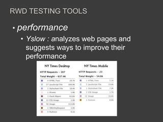
TESTING RESPONSIVE WEB DESIGN 
ONE SITE FOR EVERY SCREEN 
Baiju Joseph 
Director QE & RE , Yahoo! 
baiju@yahoo-inc.com 
18 May 2013
AGENDA 
• Ever growing Mobile 
• Why Responsive Web Design 
• Responsive Web Design - RWD 
• RWD Testing 
• RWD Testing Tools 
• RWD Testing Challenges 
• Tools Demo 
Disclaimer: The opinions expressed herein are my own personal opinions and do not represent my employer's view in anyway.
EVER GROWING MOBILE 
Source : Morgan Stanley Research
EVER GROWING MOBILE 
People are using different devices depending on the time of the day 
(Weekday: December 10, 2012) 
rule our 
evenings 
© comScore, Inc. Proprietary. 15 Source: comScore Device Essential December 10, 2012 
Source : comScore 
Smartphones 
Tablets 
PCs 
rule our 
workdays 
rule our 
mornings 
12:00 am 8:00 am 6:00 pm
WHY RESPONSIVE WEB DESIGN 
“Day by day, the number of devices, 
platforms, and browsers that need to work with 
your site grows. Responsive web design 
represents a fundamental shift in how we’ll build 
websites for the decade to come.” 
~ Jeffrey Veen
WHY RESPONSIVE WEB DESIGN 
• accessible on many devices – just need a 
browser and internet connection 
• one code for many screens 
• easy to develop and maintain 
• cost effective 
• better SEO
RESPONSIVE WEB DESIGN - RWD 
• a design approach 
• for providing optimal viewing experience 
• easy reading and navigation 
• with a minimum of resizing, panning, and 
scrolling 
• across a wide range of devices (pc , tablet 
, phones…) 
Source : Wikipedia
RESPONSIVE WEB DESIGN - RWD 
• fluid , proportion based grids 
• flexible images 
• Media queries 
• Selectively serving style sheets based on 
device 
• Server-Side Components (RESS)
RWD TESTING 
• compare functionality on devices 
• rendering 
• performance 
• real device testing 
• Mobile cloud 
• automate once – run on multi devices 
• testability hooks (?mobile , ?tablet)
RWD TESTING TOOLS 
•Mobile emulators (chrome) 
• Tries to mimic behavior of real device 
• Browser based user agent simulators
RWD TESTING TOOLS 
•Mobile emulators (opera ) 
• Tries to mimic behavior of real device 
• Native application on your desktop
RWD TESTING TOOLS 
• iOS Simulator 
• Closest to working of real device 
• Part of Xcode tools with iOS SDK 
• Android Emulator 
• mimics all of the hardware and software 
features of a typical mobile device 
• With Android SDK
RWD TESTING TOOLS 
• performance 
• Yslow : analyzes web pages and 
suggests ways to improve their 
performance
RWD TESTING CHALLENGES 
• Mobile Testing skill 
• Mobile , RWD technology 
knowledge 
• Too many device combinations 
• Lack of real devices 
• Testability hooks in architecture
Testing – responsive web design

Testing – responsive web design

  • 1.
    TESTING RESPONSIVE WEBDESIGN ONE SITE FOR EVERY SCREEN Baiju Joseph Director QE & RE , Yahoo! baiju@yahoo-inc.com 18 May 2013
  • 2.
    AGENDA • Evergrowing Mobile • Why Responsive Web Design • Responsive Web Design - RWD • RWD Testing • RWD Testing Tools • RWD Testing Challenges • Tools Demo Disclaimer: The opinions expressed herein are my own personal opinions and do not represent my employer's view in anyway.
  • 3.
    EVER GROWING MOBILE Source : Morgan Stanley Research
  • 4.
    EVER GROWING MOBILE People are using different devices depending on the time of the day (Weekday: December 10, 2012) rule our evenings © comScore, Inc. Proprietary. 15 Source: comScore Device Essential December 10, 2012 Source : comScore Smartphones Tablets PCs rule our workdays rule our mornings 12:00 am 8:00 am 6:00 pm
  • 5.
    WHY RESPONSIVE WEBDESIGN “Day by day, the number of devices, platforms, and browsers that need to work with your site grows. Responsive web design represents a fundamental shift in how we’ll build websites for the decade to come.” ~ Jeffrey Veen
  • 6.
    WHY RESPONSIVE WEBDESIGN • accessible on many devices – just need a browser and internet connection • one code for many screens • easy to develop and maintain • cost effective • better SEO
  • 7.
    RESPONSIVE WEB DESIGN- RWD • a design approach • for providing optimal viewing experience • easy reading and navigation • with a minimum of resizing, panning, and scrolling • across a wide range of devices (pc , tablet , phones…) Source : Wikipedia
  • 8.
    RESPONSIVE WEB DESIGN- RWD • fluid , proportion based grids • flexible images • Media queries • Selectively serving style sheets based on device • Server-Side Components (RESS)
  • 9.
    RWD TESTING •compare functionality on devices • rendering • performance • real device testing • Mobile cloud • automate once – run on multi devices • testability hooks (?mobile , ?tablet)
  • 10.
    RWD TESTING TOOLS •Mobile emulators (chrome) • Tries to mimic behavior of real device • Browser based user agent simulators
  • 11.
    RWD TESTING TOOLS •Mobile emulators (opera ) • Tries to mimic behavior of real device • Native application on your desktop
  • 12.
    RWD TESTING TOOLS • iOS Simulator • Closest to working of real device • Part of Xcode tools with iOS SDK • Android Emulator • mimics all of the hardware and software features of a typical mobile device • With Android SDK
  • 13.
    RWD TESTING TOOLS • performance • Yslow : analyzes web pages and suggests ways to improve their performance
  • 14.
    RWD TESTING CHALLENGES • Mobile Testing skill • Mobile , RWD technology knowledge • Too many device combinations • Lack of real devices • Testability hooks in architecture

Editor's Notes

  • #9 The fluid grid concept calls for page element sizing to be in relative units like percentages, rather than absolute units like pixels or points. Flexible images are also sized in relative units, so as to prevent them from displaying outside their containing element. Media queries allow the page to use different CSS style rules based on characteristics of the device the site is being displayed on, most commonly the width of the browser.
  • #11 The DevTools support for device emulation includes native User Agent and dimension overriding. This allows developers to debug mobile browsers on different devices and operating systems via the Overrides menu. - https://developers.google.com/chrome-developer-tools/docs/mobile-emulation
  • #12 Our Opera Mobile Emulator for Windows, Linux and Mac makes things a whole lot easier. It’s a small, native application that’s easy to install on your desktop machine and runs exactly the same code as its mobile phone version — that way, you can be assured that what you’re seeing on your test environment is practically identical to the experience your end users will get.
  • #13 https://developer.apple.com/library/ios/#documentation/IDEs/Conceptual/iOS_Simulator_Guide/Introduction/Introduction.html http://developer.android.com/tools/devices/emulator.html