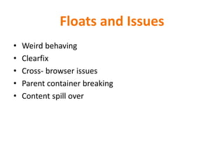
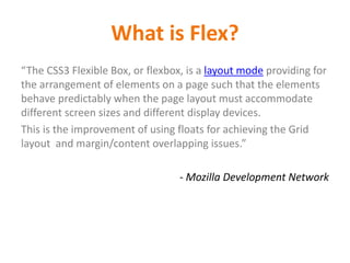
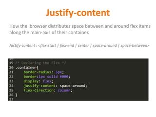
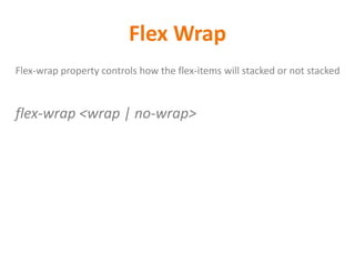
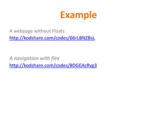
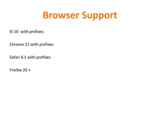
CSS3 Flexbox
BY - Neha Sharma (nehha255@gmail.com)
Follow @ https://twitter.com/nehadesigner
Flexible Layout
AGENDA
Part One – Introduction
• What is Flex
• Why we need Flex
Part Two – Syntax
• Flex
• Order
• align-items
• Justify-content
• Flex-wrap
• Flex-grow
• Flex-shrink
Part Three – Examples
We love Floats
It’s a question not a statement.
Floats and Issues
• Weird behaving
• Clearfix
• Cross- browser issues
• Parent container breaking
• Content spill over
What you want to change?
Flexible parent container, No floats Hack, no clear fix, adjustable
child container,
Why Flexbox?
What is Flex?
• Flexbox or Flexible box is the css3 property
• Flexbox is the layout mode
• Improvement over the Floats
• It helps in displaying the elements on the page as per
the device size and screen size , available space
• It helps in achieving the grid layout
What is Flex?
“The CSS3 Flexible Box, or flexbox, is a layout mode providing for
the arrangement of elements on a page such that the elements
behave predictably when the page layout must accommodate
different screen sizes and different display devices.
This is the improvement of using floats for achieving the Grid
layout and margin/content overlapping issues.”
- Mozilla Development Network
Let’s Meet the Flex
Flex Vocabulary
Flex
To make the any container behave like Flexible layout . You
have to declare it flex. By default flex is block level element.
display : <flex | flex-inline>
Flex Items
Elements within in the flex containers are the flex items.
They can be arranged across the main or cross axis
Flex Axis
Every flex model have 2 axes - Main and Cross . Main axis is the
horizontal axis and the cross axis is the axis perpendicular to the
main.
There are 3 properties with the axis:
- Justify-content
- Align-items
- Align-self
Justify-content
How the browser distributes space between and around flex items
along the main-axis of their container.
Justify-content : <flex-start | flex-end | center | space-around | space-between>
align-items
Align the current flex items just like the justify-content but across
the cross axis.
Align-items : <flex-start | flex-end | center | baseline | stretch >
align-self
It will override the current flex items and align itself across the
cross axis
Align-items : <flex-start | flex-end | center | baseline | stretch >
flex-direction
Flex direction defines the flow of the flex items across the
main/cross axis.
Flex-direction: <row | column | row-reverse | column-reverse>
order
Defines the way flex-items will display on the web-page. By
default they come as define on the page.
Order takes the integer value .Negatives are not allowed and in
ascending order they will come on the page
order: <integer>
order
Flex Lines
Flex-items can be appear single line or multiple line along the cross axis .
Flex Wrap
Flex-wrap property controls how the flex-items will stacked or not stacked
flex-wrap <wrap | no-wrap>
Flex Dimensions
Flex-items can be appear single line or multiple line along the
cross axis. Flex-wrap property controls how the flex-items will
stacked or not stacked
There are 3 properties:
- flex-basis
- flex-grow
- flex-shrink
Flex Basis
It defines the initial flex basis which is the initial size of the
flex item
Flex-basis : <width | auto >
Flex Grow
It defines the initial value of the flex item to grow
Flex-grow : <integer | 0 >
Flex Shrink
It defines the initial value of the flex item to shrink
Flex-shrink : <integer | 1>
Example
A webpage without Floats
http://kodshare.com/codes/66rLBNZBsL
A navigation with flex
http://kodshare.com/codes/8DGEAcRvg3
Browser Support
IE 10 with prefixes
Chrome 21 with prefixes
Safari 6.1 with prefixes
Firefox 20 +
Questions and Feedbacks
References
o https://developer.mozilla.org/en-US/docs/Web/Guide/CSS/Flexible_boxes
o http://www.w3schools.com/cssref/css3_pr_flex.asp

CSS3 Flex Layout

  • 1.
    CSS3 Flexbox BY -Neha Sharma (nehha255@gmail.com) Follow @ https://twitter.com/nehadesigner Flexible Layout
  • 2.
    AGENDA Part One –Introduction • What is Flex • Why we need Flex Part Two – Syntax • Flex • Order • align-items • Justify-content • Flex-wrap • Flex-grow • Flex-shrink Part Three – Examples
  • 3.
    We love Floats It’sa question not a statement.
  • 4.
    Floats and Issues •Weird behaving • Clearfix • Cross- browser issues • Parent container breaking • Content spill over
  • 5.
    What you wantto change? Flexible parent container, No floats Hack, no clear fix, adjustable child container,
  • 6.
  • 7.
    What is Flex? •Flexbox or Flexible box is the css3 property • Flexbox is the layout mode • Improvement over the Floats • It helps in displaying the elements on the page as per the device size and screen size , available space • It helps in achieving the grid layout
  • 8.
    What is Flex? “TheCSS3 Flexible Box, or flexbox, is a layout mode providing for the arrangement of elements on a page such that the elements behave predictably when the page layout must accommodate different screen sizes and different display devices. This is the improvement of using floats for achieving the Grid layout and margin/content overlapping issues.” - Mozilla Development Network
  • 9.
  • 10.
  • 11.
    Flex To make theany container behave like Flexible layout . You have to declare it flex. By default flex is block level element. display : <flex | flex-inline>
  • 12.
    Flex Items Elements withinin the flex containers are the flex items. They can be arranged across the main or cross axis
  • 13.
    Flex Axis Every flexmodel have 2 axes - Main and Cross . Main axis is the horizontal axis and the cross axis is the axis perpendicular to the main. There are 3 properties with the axis: - Justify-content - Align-items - Align-self
  • 14.
    Justify-content How the browserdistributes space between and around flex items along the main-axis of their container. Justify-content : <flex-start | flex-end | center | space-around | space-between>
  • 15.
    align-items Align the currentflex items just like the justify-content but across the cross axis. Align-items : <flex-start | flex-end | center | baseline | stretch >
  • 16.
    align-self It will overridethe current flex items and align itself across the cross axis Align-items : <flex-start | flex-end | center | baseline | stretch >
  • 17.
    flex-direction Flex direction definesthe flow of the flex items across the main/cross axis. Flex-direction: <row | column | row-reverse | column-reverse>
  • 18.
    order Defines the wayflex-items will display on the web-page. By default they come as define on the page. Order takes the integer value .Negatives are not allowed and in ascending order they will come on the page order: <integer>
  • 19.
  • 20.
    Flex Lines Flex-items canbe appear single line or multiple line along the cross axis .
  • 21.
    Flex Wrap Flex-wrap propertycontrols how the flex-items will stacked or not stacked flex-wrap <wrap | no-wrap>
  • 22.
    Flex Dimensions Flex-items canbe appear single line or multiple line along the cross axis. Flex-wrap property controls how the flex-items will stacked or not stacked There are 3 properties: - flex-basis - flex-grow - flex-shrink
  • 23.
    Flex Basis It definesthe initial flex basis which is the initial size of the flex item Flex-basis : <width | auto >
  • 24.
    Flex Grow It definesthe initial value of the flex item to grow Flex-grow : <integer | 0 >
  • 25.
    Flex Shrink It definesthe initial value of the flex item to shrink Flex-shrink : <integer | 1>
  • 26.
    Example A webpage withoutFloats http://kodshare.com/codes/66rLBNZBsL A navigation with flex http://kodshare.com/codes/8DGEAcRvg3
  • 27.
    Browser Support IE 10with prefixes Chrome 21 with prefixes Safari 6.1 with prefixes Firefox 20 +
  • 28.
  • 29.