Download as PDF, PPTX


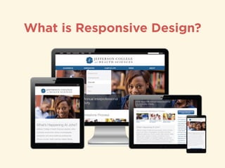
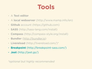
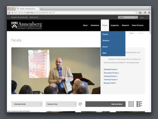
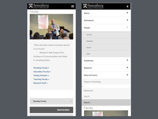
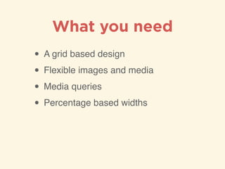

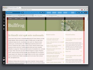

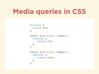
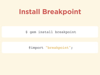


This document discusses responsive web design and the tools needed to implement it. It recommends using a grid-based design, flexible images and media, media queries, and percentage-based widths to create a responsive site. It also recommends specific tools like SASS, Compass, Breakpoint and Jeet to help with responsive design and provides code examples for how to use media queries and breakpoints.


![[Cordova] Empezando con Ionic](https://cdn.slidesharecdn.com/ss_thumbnails/cordovaempezandoconionic-160713033101-thumbnail.jpg?width=640&height=640&fit=bounds)


