Downloaded 321 times


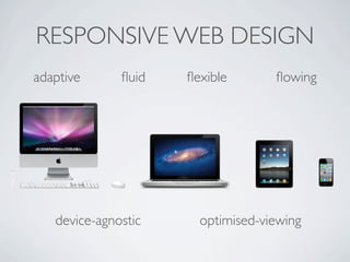
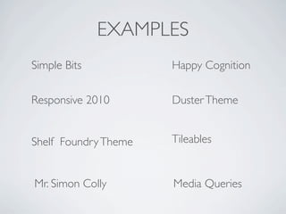

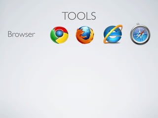


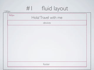
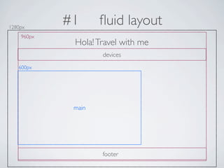

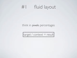
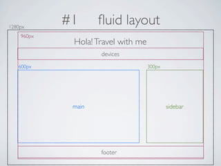
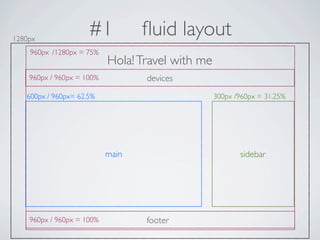


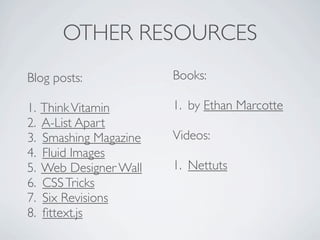


The document discusses responsive web design. It defines responsive design as being adaptive, fluid, flexible and flowing across devices. It recommends using fluid layouts with percentages instead of pixels, media queries to target different screen sizes, and flexible media like images that scale based on the viewport width. It provides examples of responsive websites and tools used like browsers, text editors, simulators and coding. It outlines the key aspects of responsive design including fluid layouts, media queries, and flexible media. It also lists additional resources like blogs, books and videos for learning more about responsive design.


![[DCTPE2011] 7) Mobile Drupal(英/中雙語)](https://cdn.slidesharecdn.com/ss_thumbnails/mobile-drupal-110709035619-phpapp02-110814094115-phpapp02-thumbnail.jpg?width=640&height=640&fit=bounds)