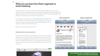
Download to read offline


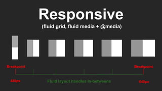

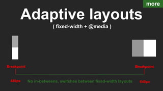


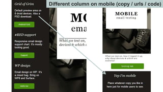


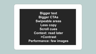


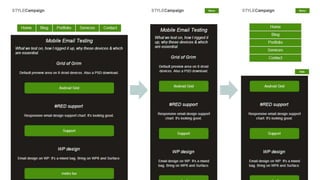


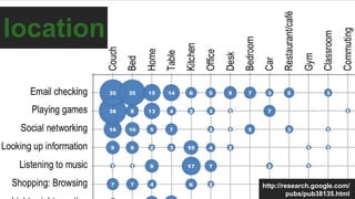


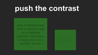


This document discusses responsive email design and strategies for optimizing emails for multiple screen sizes. It addresses issues like fluid grids, breakpoints, media queries, and progressive enhancement. It provides tips for retrofitting existing desktop-oriented emails to be responsive, including prioritizing mobile, increasing font size and spacing, and simplifying navigation and images. The document also notes usage trends like the rise in mobile email opens and short attention spans, to emphasize the importance of responsive design.