SlideShare a Scribd company logo
1 of 3
Good Practice Guide for Mobile Internet Sites

Your URL                                                      Remember your users don’t have a mouse, so
                                                               :hover and onClick are useless
   Choose a short, easily remembered URL
    (xxx.ac.uk/mobile, m.xxx.ac.uk, or xxx.mobi)
   Stick to the conventions!


Mark-up
   Code in well formed, valid XHMTL-MP (Mobile
    Profile)
   Validate all pages. Bad mark-up can easily crash a
    mobile device, or simply cause nothing to render
    at all.
   Keep the pages below 30k where possible, so
    they load reasonably quickly. Bloated pages hurt
    users.
   Avoid tables, reliance on plug-ins (e.g. Flash),
    pop-ups, client side redirects and auto-refreshes;
    auto-refreshes will incur extra download times and
    data charges.
   Separate content and presentation with CSS.
    External, inline and embedded CSS are all OK.
   Avoid @import to reference external CSS files.
   All phone numbers should be selectable links.
   Avoid floats for layout.


Navigation
   Remember that users are struggling with a variety
    of “difficult” input devices (stylus, finger touch,
    control pad, keyboard, or joystick) – so keep
    navigation simple.
   Sort navigation elements by popularity – most
    popular at the top.
   Allow users to see all navigation at once.
   Stick to a maximum of 10 links on any page.
   Code each link as an ‘access key’ numbered 0-9;
    use 0 for home. This allows users to navigate your
    links using their phone’s numeric keypad ensuring
    compatibility with older devices.
   Let people find things with as few clicks as
    possible - limit your navigation to a max drill-down
    of 5 levels (users get disorientated by more).
   Use well-labelled navigation categories.
   Provide escape links from every page, either to
    the next section, to the parent section, to the home
    page, or all of the above. Note: Breadcrumbing
    your navigation can be very effective.

                                                                                                   Page 1 of 3
Images                                                         and “customise my home page” settings are even
                                                               more critical to mobile than PC sites.
   Aim to keep logos and images small so that they
                                                              Label your form fields.
    fit within the recommended screen size limitation:
    200 pixels wide x 250 pixels height. (Images wider        Use heading styles H1, H2, H3, H4.
    than the screen size limitation should only be used
    if there is no better way to represent the                Use minimally sized margins and padding
    information.)                                              (remember your screen real estate is already
                                                               small).


                                                           Design
                                                              Switch your thinking to portrait mode where the
                                                               page is taller than it is wide.
                                                              Design to the limitations of the expected screen
                                                               sizes - 200 pixels wide x 250 pixels height.
                                                              Use colour banding for navigation categories, to
                                                               give a sense of where you are.


   When sizing your image to fit the screen
    resolution, don’t forget about the browser furniture
    which is going to take up some screen real estate,
    the scrollbar etc, so your image needs to be
    slightly smaller.
   Go for bold, high contrast, reduced colour palette
    images (subtle hues and shading will be lost on
    the more basic mobiles).
   Put ALT tags on all images some users may not
    be able to see images on the website (or will
    choose to disable them!)


Content
   Make it useful - think about your audience and
    what they really need, especially when they’re on
    the go.
   Mobile users have a shorter attention span –
    provide content in small, snack-sized pieces.
   Provide one content item per page.
   Keep text to the very minimum on each page.
   Use short, direct sentences.                           Test. Test. TEST!
   Minimise scrolling.                                           Test on as many emulators as possible.
   Have a meaningful but short title bar.                        Test on as many phones as possible.
   Have your institution’s phone number in the footer            Get your user community to help you test.
    of every page.
   Don’t expect people to fill out long forms.
   Lots of video, animation or large image files slow
    down your site – if you must have them, keep
    them to a minimum.
   Remember the user’s details. Remembering
    preferences and behaviour helps you speed up
    their access to information. Pre-completed forms
                                                                                                       Page 2 of 3
Get Found
   Make sure your desktop site contains a link to your
    mobile site and vice versa. The recommended link
    wordings are: ‘Mobile Site’ and ‘Full Site’.
   Make sure your mobile site is picked up by all the
    main search engines (e.g. send Google a mobile
    sitemap.)


And lastly…
…Think about the MOBILE DEVICE
Recognize its limitations (small screen, no mouse) but
also think about its extra capabilities (phone, camera,
GPS, SMS, MMS, Bluetooth, QR reader, MP3 player
etc). Too many mobile websites needlessly limit
functionality, offering a bare bones experience that
leaves the user wanting more. Mobile devices can do
many things – use them in new ways to add real value.


Happy mobile-webbing! 


                        Sharon Steeples, IWMW 2009


                                                          Page 3 of 3

More Related Content

Similar to Mobile Site Guide - Optimize Websites for Mobile Devices

Responsive Web Design: Tips and Tricks
Responsive Web Design: Tips and TricksResponsive Web Design: Tips and Tricks
Responsive Web Design: Tips and TricksGautam Krishnan
 
Responsive Web Design for Drupal, CMS Expo
Responsive Web Design for Drupal, CMS ExpoResponsive Web Design for Drupal, CMS Expo
Responsive Web Design for Drupal, CMS ExpoEmma Jane Hogbin Westby
 
Responsive Web Designed for your communication and marketing needs
Responsive Web Designed for your communication and marketing needsResponsive Web Designed for your communication and marketing needs
Responsive Web Designed for your communication and marketing needsSEGIC
 
Responsive Web Designs
Responsive Web DesignsResponsive Web Designs
Responsive Web DesignsNusrat Khanom
 
Responsive Web Design (done right)
Responsive Web Design (done right)Responsive Web Design (done right)
Responsive Web Design (done right)Sandro Paganotti
 
Mobile Best Practices
Mobile Best PracticesMobile Best Practices
Mobile Best Practicesmintersam
 
Breaking the Box: Pushing the Boundaries of UX with Drupal
Breaking the Box: Pushing the Boundaries of UX with DrupalBreaking the Box: Pushing the Boundaries of UX with Drupal
Breaking the Box: Pushing the Boundaries of UX with DrupalAcquia
 
Responsive Web Design
Responsive Web Design Responsive Web Design
Responsive Web Design CLEVER°FRANKE
 
An Introduction to Responsive Design
An Introduction to Responsive DesignAn Introduction to Responsive Design
An Introduction to Responsive DesignValtech UK
 
Spectrum 16 pmc 16 - preparing legacy projects for responsive design
Spectrum 16   pmc 16 - preparing legacy projects for responsive designSpectrum 16   pmc 16 - preparing legacy projects for responsive design
Spectrum 16 pmc 16 - preparing legacy projects for responsive designNeil Perlin
 
Responsive Web Design
Responsive Web DesignResponsive Web Design
Responsive Web DesignJulia Vi
 
Current Design Trends
Current Design TrendsCurrent Design Trends
Current Design Trendswhipplehill
 
Stc 2015 preparing legacy projects for responsive design - design issues
Stc 2015   preparing legacy projects for responsive design - design issuesStc 2015   preparing legacy projects for responsive design - design issues
Stc 2015 preparing legacy projects for responsive design - design issuesNeil Perlin
 
Responsive web design
Responsive web designResponsive web design
Responsive web designBen MacNeill
 
Using Responsive Web Design To Make Your Web Work Everywhere
Using Responsive Web Design To Make Your Web Work EverywhereUsing Responsive Web Design To Make Your Web Work Everywhere
Using Responsive Web Design To Make Your Web Work EverywhereChris Love
 
Design Best Practices for WordPress
Design Best Practices for WordPressDesign Best Practices for WordPress
Design Best Practices for WordPressSuzette Franck
 

Similar to Mobile Site Guide - Optimize Websites for Mobile Devices (20)

Responsive Web Design: Tips and Tricks
Responsive Web Design: Tips and TricksResponsive Web Design: Tips and Tricks
Responsive Web Design: Tips and Tricks
 
Responsive Web Design
Responsive Web DesignResponsive Web Design
Responsive Web Design
 
Responsive Web Design for Drupal, CMS Expo
Responsive Web Design for Drupal, CMS ExpoResponsive Web Design for Drupal, CMS Expo
Responsive Web Design for Drupal, CMS Expo
 
Responsive Web Designed for your communication and marketing needs
Responsive Web Designed for your communication and marketing needsResponsive Web Designed for your communication and marketing needs
Responsive Web Designed for your communication and marketing needs
 
Responsive Web Designs
Responsive Web DesignsResponsive Web Designs
Responsive Web Designs
 
Responsive Web Design (done right)
Responsive Web Design (done right)Responsive Web Design (done right)
Responsive Web Design (done right)
 
Mobile Best Practices
Mobile Best PracticesMobile Best Practices
Mobile Best Practices
 
Breaking the Box: Pushing the Boundaries of UX with Drupal
Breaking the Box: Pushing the Boundaries of UX with DrupalBreaking the Box: Pushing the Boundaries of UX with Drupal
Breaking the Box: Pushing the Boundaries of UX with Drupal
 
Responsive Web Design
Responsive Web Design Responsive Web Design
Responsive Web Design
 
An Introduction to Responsive Design
An Introduction to Responsive DesignAn Introduction to Responsive Design
An Introduction to Responsive Design
 
Spectrum 16 pmc 16 - preparing legacy projects for responsive design
Spectrum 16   pmc 16 - preparing legacy projects for responsive designSpectrum 16   pmc 16 - preparing legacy projects for responsive design
Spectrum 16 pmc 16 - preparing legacy projects for responsive design
 
Responsive Web Design
Responsive Web DesignResponsive Web Design
Responsive Web Design
 
Current Design Trends
Current Design TrendsCurrent Design Trends
Current Design Trends
 
Stc 2015 preparing legacy projects for responsive design - design issues
Stc 2015   preparing legacy projects for responsive design - design issuesStc 2015   preparing legacy projects for responsive design - design issues
Stc 2015 preparing legacy projects for responsive design - design issues
 
Responsive web design
Responsive web designResponsive web design
Responsive web design
 
Using Responsive Web Design To Make Your Web Work Everywhere
Using Responsive Web Design To Make Your Web Work EverywhereUsing Responsive Web Design To Make Your Web Work Everywhere
Using Responsive Web Design To Make Your Web Work Everywhere
 
Adobe 30iun2011
Adobe 30iun2011Adobe 30iun2011
Adobe 30iun2011
 
Design Best Practices for WordPress
Design Best Practices for WordPressDesign Best Practices for WordPress
Design Best Practices for WordPress
 
Mobile ux sot a and challenges
Mobile ux sot a and challengesMobile ux sot a and challenges
Mobile ux sot a and challenges
 
Mobile UX Challenges
Mobile UX ChallengesMobile UX Challenges
Mobile UX Challenges
 

Recently uploaded

Transforming Data Streams with Kafka Connect: An Introduction to Single Messa...
Transforming Data Streams with Kafka Connect: An Introduction to Single Messa...Transforming Data Streams with Kafka Connect: An Introduction to Single Messa...
Transforming Data Streams with Kafka Connect: An Introduction to Single Messa...HostedbyConfluent
 
CloudStudio User manual (basic edition):
CloudStudio User manual (basic edition):CloudStudio User manual (basic edition):
CloudStudio User manual (basic edition):comworks
 
Unblocking The Main Thread Solving ANRs and Frozen Frames
Unblocking The Main Thread Solving ANRs and Frozen FramesUnblocking The Main Thread Solving ANRs and Frozen Frames
Unblocking The Main Thread Solving ANRs and Frozen FramesSinan KOZAK
 
Next-generation AAM aircraft unveiled by Supernal, S-A2
Next-generation AAM aircraft unveiled by Supernal, S-A2Next-generation AAM aircraft unveiled by Supernal, S-A2
Next-generation AAM aircraft unveiled by Supernal, S-A2Hyundai Motor Group
 
Beyond Boundaries: Leveraging No-Code Solutions for Industry Innovation
Beyond Boundaries: Leveraging No-Code Solutions for Industry InnovationBeyond Boundaries: Leveraging No-Code Solutions for Industry Innovation
Beyond Boundaries: Leveraging No-Code Solutions for Industry InnovationSafe Software
 
Enhancing Worker Digital Experience: A Hands-on Workshop for Partners
Enhancing Worker Digital Experience: A Hands-on Workshop for PartnersEnhancing Worker Digital Experience: A Hands-on Workshop for Partners
Enhancing Worker Digital Experience: A Hands-on Workshop for PartnersThousandEyes
 
Pigging Solutions Piggable Sweeping Elbows
Pigging Solutions Piggable Sweeping ElbowsPigging Solutions Piggable Sweeping Elbows
Pigging Solutions Piggable Sweeping ElbowsPigging Solutions
 
GenCyber Cyber Security Day Presentation
GenCyber Cyber Security Day PresentationGenCyber Cyber Security Day Presentation
GenCyber Cyber Security Day PresentationMichael W. Hawkins
 
How to convert PDF to text with Nanonets
How to convert PDF to text with NanonetsHow to convert PDF to text with Nanonets
How to convert PDF to text with Nanonetsnaman860154
 
How to Remove Document Management Hurdles with X-Docs?
How to Remove Document Management Hurdles with X-Docs?How to Remove Document Management Hurdles with X-Docs?
How to Remove Document Management Hurdles with X-Docs?XfilesPro
 
Azure Monitor & Application Insight to monitor Infrastructure & Application
Azure Monitor & Application Insight to monitor Infrastructure & ApplicationAzure Monitor & Application Insight to monitor Infrastructure & Application
Azure Monitor & Application Insight to monitor Infrastructure & ApplicationAndikSusilo4
 
My Hashitalk Indonesia April 2024 Presentation
My Hashitalk Indonesia April 2024 PresentationMy Hashitalk Indonesia April 2024 Presentation
My Hashitalk Indonesia April 2024 PresentationRidwan Fadjar
 
Automating Business Process via MuleSoft Composer | Bangalore MuleSoft Meetup...
Automating Business Process via MuleSoft Composer | Bangalore MuleSoft Meetup...Automating Business Process via MuleSoft Composer | Bangalore MuleSoft Meetup...
Automating Business Process via MuleSoft Composer | Bangalore MuleSoft Meetup...shyamraj55
 
WhatsApp 9892124323 ✓Call Girls In Kalyan ( Mumbai ) secure service
WhatsApp 9892124323 ✓Call Girls In Kalyan ( Mumbai ) secure serviceWhatsApp 9892124323 ✓Call Girls In Kalyan ( Mumbai ) secure service
WhatsApp 9892124323 ✓Call Girls In Kalyan ( Mumbai ) secure servicePooja Nehwal
 
Presentation on how to chat with PDF using ChatGPT code interpreter
Presentation on how to chat with PDF using ChatGPT code interpreterPresentation on how to chat with PDF using ChatGPT code interpreter
Presentation on how to chat with PDF using ChatGPT code interpreternaman860154
 
Slack Application Development 101 Slides
Slack Application Development 101 SlidesSlack Application Development 101 Slides
Slack Application Development 101 Slidespraypatel2
 
The Codex of Business Writing Software for Real-World Solutions 2.pptx
The Codex of Business Writing Software for Real-World Solutions 2.pptxThe Codex of Business Writing Software for Real-World Solutions 2.pptx
The Codex of Business Writing Software for Real-World Solutions 2.pptxMalak Abu Hammad
 
Kotlin Multiplatform & Compose Multiplatform - Starter kit for pragmatics
Kotlin Multiplatform & Compose Multiplatform - Starter kit for pragmaticsKotlin Multiplatform & Compose Multiplatform - Starter kit for pragmatics
Kotlin Multiplatform & Compose Multiplatform - Starter kit for pragmaticscarlostorres15106
 
Neo4j - How KGs are shaping the future of Generative AI at AWS Summit London ...
Neo4j - How KGs are shaping the future of Generative AI at AWS Summit London ...Neo4j - How KGs are shaping the future of Generative AI at AWS Summit London ...
Neo4j - How KGs are shaping the future of Generative AI at AWS Summit London ...Neo4j
 

Recently uploaded (20)

Transforming Data Streams with Kafka Connect: An Introduction to Single Messa...
Transforming Data Streams with Kafka Connect: An Introduction to Single Messa...Transforming Data Streams with Kafka Connect: An Introduction to Single Messa...
Transforming Data Streams with Kafka Connect: An Introduction to Single Messa...
 
CloudStudio User manual (basic edition):
CloudStudio User manual (basic edition):CloudStudio User manual (basic edition):
CloudStudio User manual (basic edition):
 
Unblocking The Main Thread Solving ANRs and Frozen Frames
Unblocking The Main Thread Solving ANRs and Frozen FramesUnblocking The Main Thread Solving ANRs and Frozen Frames
Unblocking The Main Thread Solving ANRs and Frozen Frames
 
Next-generation AAM aircraft unveiled by Supernal, S-A2
Next-generation AAM aircraft unveiled by Supernal, S-A2Next-generation AAM aircraft unveiled by Supernal, S-A2
Next-generation AAM aircraft unveiled by Supernal, S-A2
 
Beyond Boundaries: Leveraging No-Code Solutions for Industry Innovation
Beyond Boundaries: Leveraging No-Code Solutions for Industry InnovationBeyond Boundaries: Leveraging No-Code Solutions for Industry Innovation
Beyond Boundaries: Leveraging No-Code Solutions for Industry Innovation
 
Enhancing Worker Digital Experience: A Hands-on Workshop for Partners
Enhancing Worker Digital Experience: A Hands-on Workshop for PartnersEnhancing Worker Digital Experience: A Hands-on Workshop for Partners
Enhancing Worker Digital Experience: A Hands-on Workshop for Partners
 
Pigging Solutions Piggable Sweeping Elbows
Pigging Solutions Piggable Sweeping ElbowsPigging Solutions Piggable Sweeping Elbows
Pigging Solutions Piggable Sweeping Elbows
 
GenCyber Cyber Security Day Presentation
GenCyber Cyber Security Day PresentationGenCyber Cyber Security Day Presentation
GenCyber Cyber Security Day Presentation
 
The transition to renewables in India.pdf
The transition to renewables in India.pdfThe transition to renewables in India.pdf
The transition to renewables in India.pdf
 
How to convert PDF to text with Nanonets
How to convert PDF to text with NanonetsHow to convert PDF to text with Nanonets
How to convert PDF to text with Nanonets
 
How to Remove Document Management Hurdles with X-Docs?
How to Remove Document Management Hurdles with X-Docs?How to Remove Document Management Hurdles with X-Docs?
How to Remove Document Management Hurdles with X-Docs?
 
Azure Monitor & Application Insight to monitor Infrastructure & Application
Azure Monitor & Application Insight to monitor Infrastructure & ApplicationAzure Monitor & Application Insight to monitor Infrastructure & Application
Azure Monitor & Application Insight to monitor Infrastructure & Application
 
My Hashitalk Indonesia April 2024 Presentation
My Hashitalk Indonesia April 2024 PresentationMy Hashitalk Indonesia April 2024 Presentation
My Hashitalk Indonesia April 2024 Presentation
 
Automating Business Process via MuleSoft Composer | Bangalore MuleSoft Meetup...
Automating Business Process via MuleSoft Composer | Bangalore MuleSoft Meetup...Automating Business Process via MuleSoft Composer | Bangalore MuleSoft Meetup...
Automating Business Process via MuleSoft Composer | Bangalore MuleSoft Meetup...
 
WhatsApp 9892124323 ✓Call Girls In Kalyan ( Mumbai ) secure service
WhatsApp 9892124323 ✓Call Girls In Kalyan ( Mumbai ) secure serviceWhatsApp 9892124323 ✓Call Girls In Kalyan ( Mumbai ) secure service
WhatsApp 9892124323 ✓Call Girls In Kalyan ( Mumbai ) secure service
 
Presentation on how to chat with PDF using ChatGPT code interpreter
Presentation on how to chat with PDF using ChatGPT code interpreterPresentation on how to chat with PDF using ChatGPT code interpreter
Presentation on how to chat with PDF using ChatGPT code interpreter
 
Slack Application Development 101 Slides
Slack Application Development 101 SlidesSlack Application Development 101 Slides
Slack Application Development 101 Slides
 
The Codex of Business Writing Software for Real-World Solutions 2.pptx
The Codex of Business Writing Software for Real-World Solutions 2.pptxThe Codex of Business Writing Software for Real-World Solutions 2.pptx
The Codex of Business Writing Software for Real-World Solutions 2.pptx
 
Kotlin Multiplatform & Compose Multiplatform - Starter kit for pragmatics
Kotlin Multiplatform & Compose Multiplatform - Starter kit for pragmaticsKotlin Multiplatform & Compose Multiplatform - Starter kit for pragmatics
Kotlin Multiplatform & Compose Multiplatform - Starter kit for pragmatics
 
Neo4j - How KGs are shaping the future of Generative AI at AWS Summit London ...
Neo4j - How KGs are shaping the future of Generative AI at AWS Summit London ...Neo4j - How KGs are shaping the future of Generative AI at AWS Summit London ...
Neo4j - How KGs are shaping the future of Generative AI at AWS Summit London ...
 

Mobile Site Guide - Optimize Websites for Mobile Devices

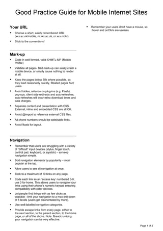
  • 1. Good Practice Guide for Mobile Internet Sites Your URL  Remember your users don’t have a mouse, so :hover and onClick are useless  Choose a short, easily remembered URL (xxx.ac.uk/mobile, m.xxx.ac.uk, or xxx.mobi)  Stick to the conventions! Mark-up  Code in well formed, valid XHMTL-MP (Mobile Profile)  Validate all pages. Bad mark-up can easily crash a mobile device, or simply cause nothing to render at all.  Keep the pages below 30k where possible, so they load reasonably quickly. Bloated pages hurt users.  Avoid tables, reliance on plug-ins (e.g. Flash), pop-ups, client side redirects and auto-refreshes; auto-refreshes will incur extra download times and data charges.  Separate content and presentation with CSS. External, inline and embedded CSS are all OK.  Avoid @import to reference external CSS files.  All phone numbers should be selectable links.  Avoid floats for layout. Navigation  Remember that users are struggling with a variety of “difficult” input devices (stylus, finger touch, control pad, keyboard, or joystick) – so keep navigation simple.  Sort navigation elements by popularity – most popular at the top.  Allow users to see all navigation at once.  Stick to a maximum of 10 links on any page.  Code each link as an ‘access key’ numbered 0-9; use 0 for home. This allows users to navigate your links using their phone’s numeric keypad ensuring compatibility with older devices.  Let people find things with as few clicks as possible - limit your navigation to a max drill-down of 5 levels (users get disorientated by more).  Use well-labelled navigation categories.  Provide escape links from every page, either to the next section, to the parent section, to the home page, or all of the above. Note: Breadcrumbing your navigation can be very effective. Page 1 of 3
  • 2. Images and “customise my home page” settings are even more critical to mobile than PC sites.  Aim to keep logos and images small so that they  Label your form fields. fit within the recommended screen size limitation: 200 pixels wide x 250 pixels height. (Images wider  Use heading styles H1, H2, H3, H4. than the screen size limitation should only be used if there is no better way to represent the  Use minimally sized margins and padding information.) (remember your screen real estate is already small). Design  Switch your thinking to portrait mode where the page is taller than it is wide.  Design to the limitations of the expected screen sizes - 200 pixels wide x 250 pixels height.  Use colour banding for navigation categories, to give a sense of where you are.  When sizing your image to fit the screen resolution, don’t forget about the browser furniture which is going to take up some screen real estate, the scrollbar etc, so your image needs to be slightly smaller.  Go for bold, high contrast, reduced colour palette images (subtle hues and shading will be lost on the more basic mobiles).  Put ALT tags on all images some users may not be able to see images on the website (or will choose to disable them!) Content  Make it useful - think about your audience and what they really need, especially when they’re on the go.  Mobile users have a shorter attention span – provide content in small, snack-sized pieces.  Provide one content item per page.  Keep text to the very minimum on each page.  Use short, direct sentences. Test. Test. TEST!  Minimise scrolling.  Test on as many emulators as possible.  Have a meaningful but short title bar.  Test on as many phones as possible.  Have your institution’s phone number in the footer  Get your user community to help you test. of every page.  Don’t expect people to fill out long forms.  Lots of video, animation or large image files slow down your site – if you must have them, keep them to a minimum.  Remember the user’s details. Remembering preferences and behaviour helps you speed up their access to information. Pre-completed forms Page 2 of 3
  • 3. Get Found  Make sure your desktop site contains a link to your mobile site and vice versa. The recommended link wordings are: ‘Mobile Site’ and ‘Full Site’.  Make sure your mobile site is picked up by all the main search engines (e.g. send Google a mobile sitemap.) And lastly… …Think about the MOBILE DEVICE Recognize its limitations (small screen, no mouse) but also think about its extra capabilities (phone, camera, GPS, SMS, MMS, Bluetooth, QR reader, MP3 player etc). Too many mobile websites needlessly limit functionality, offering a bare bones experience that leaves the user wanting more. Mobile devices can do many things – use them in new ways to add real value. Happy mobile-webbing!  Sharon Steeples, IWMW 2009 Page 3 of 3