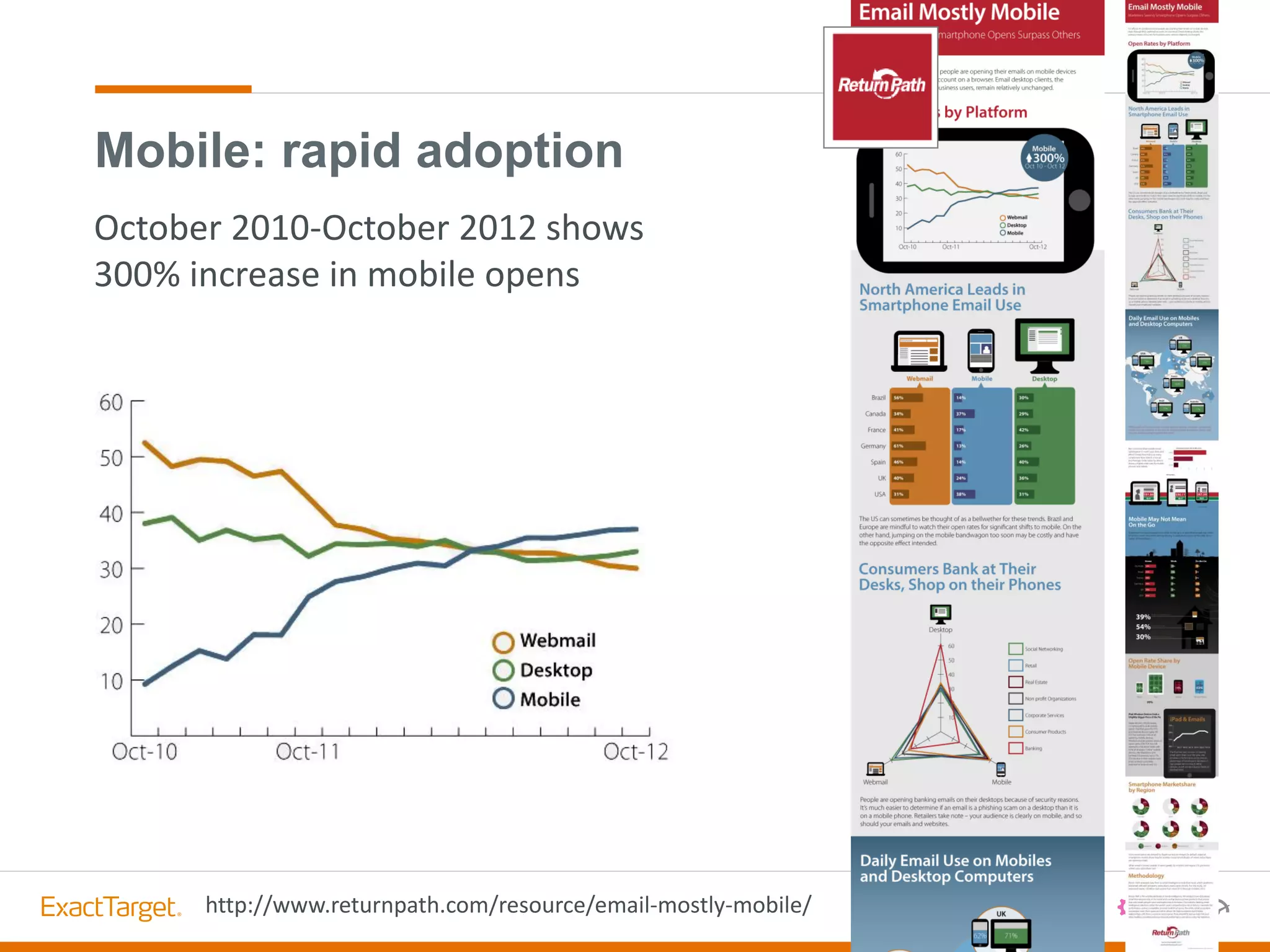
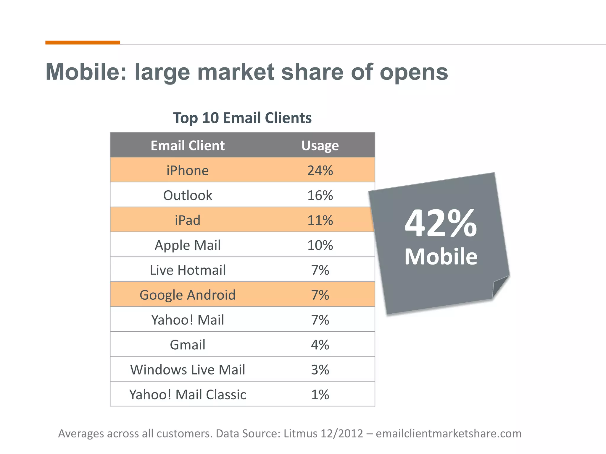
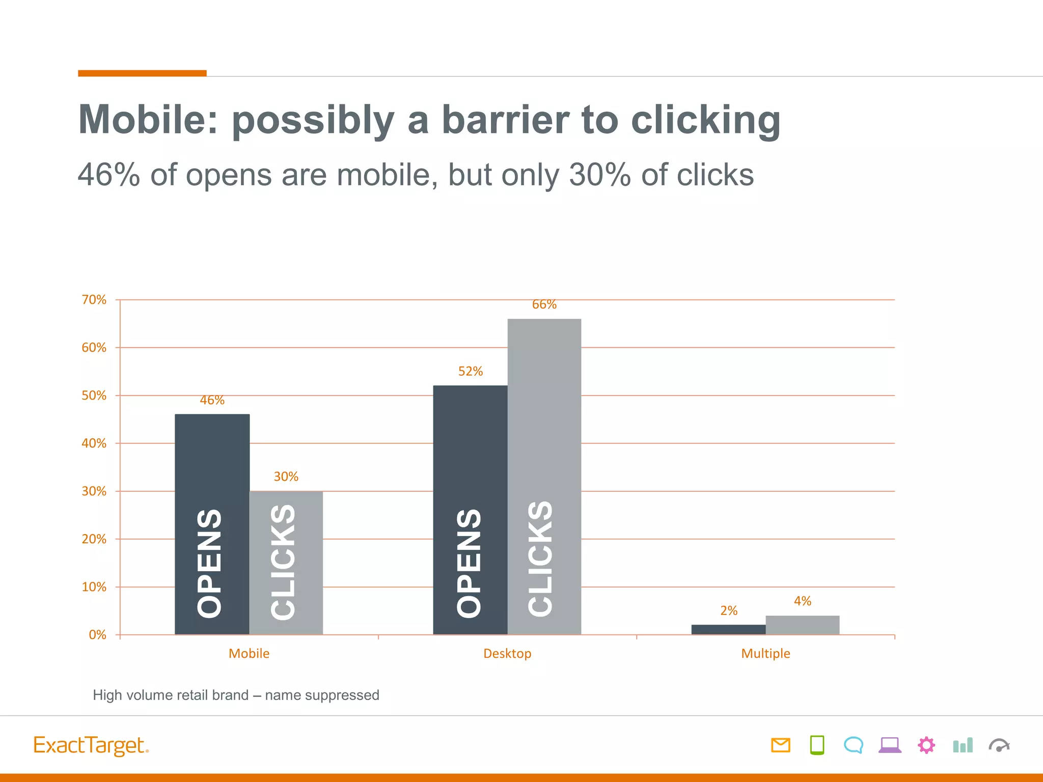
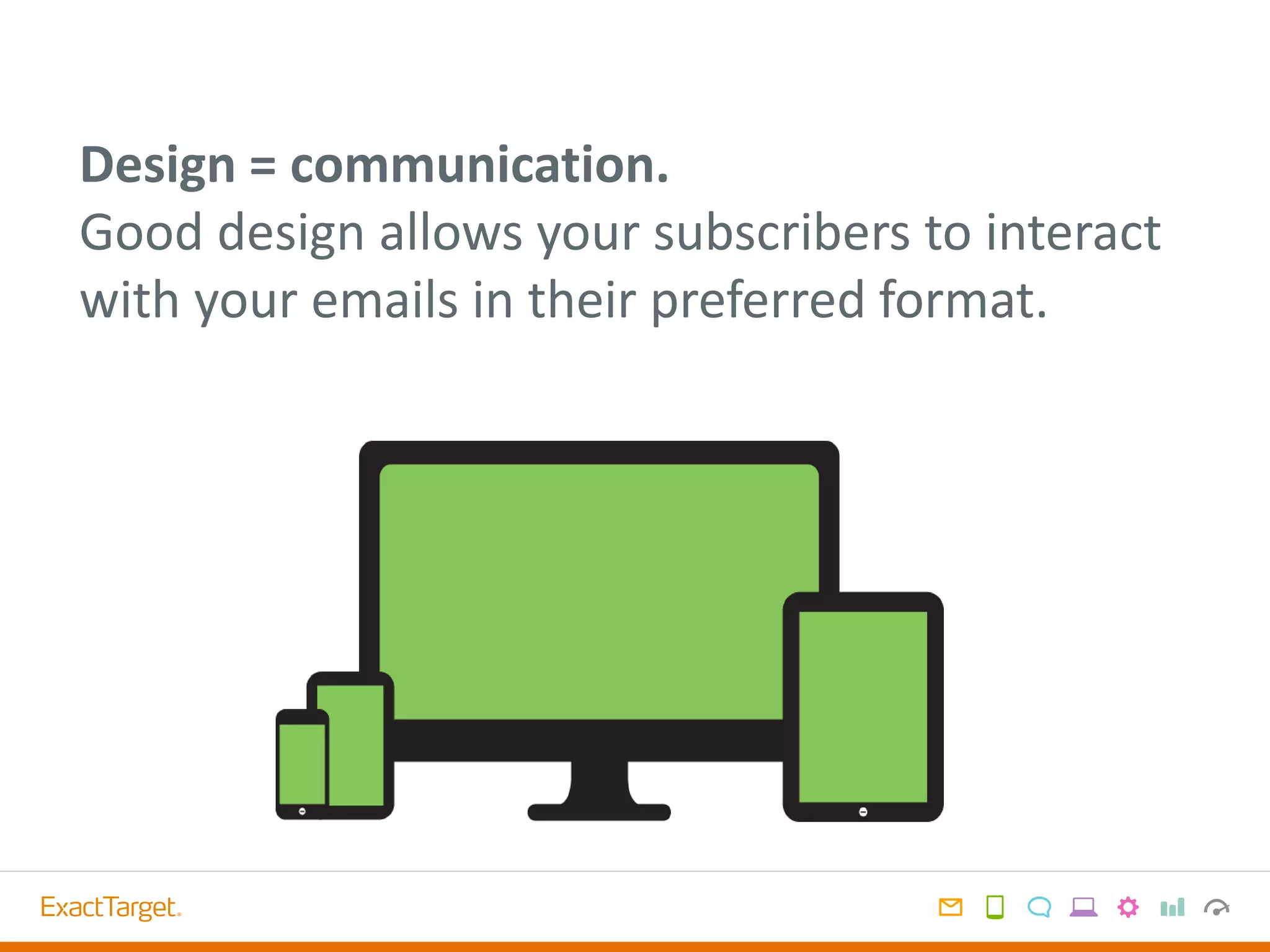
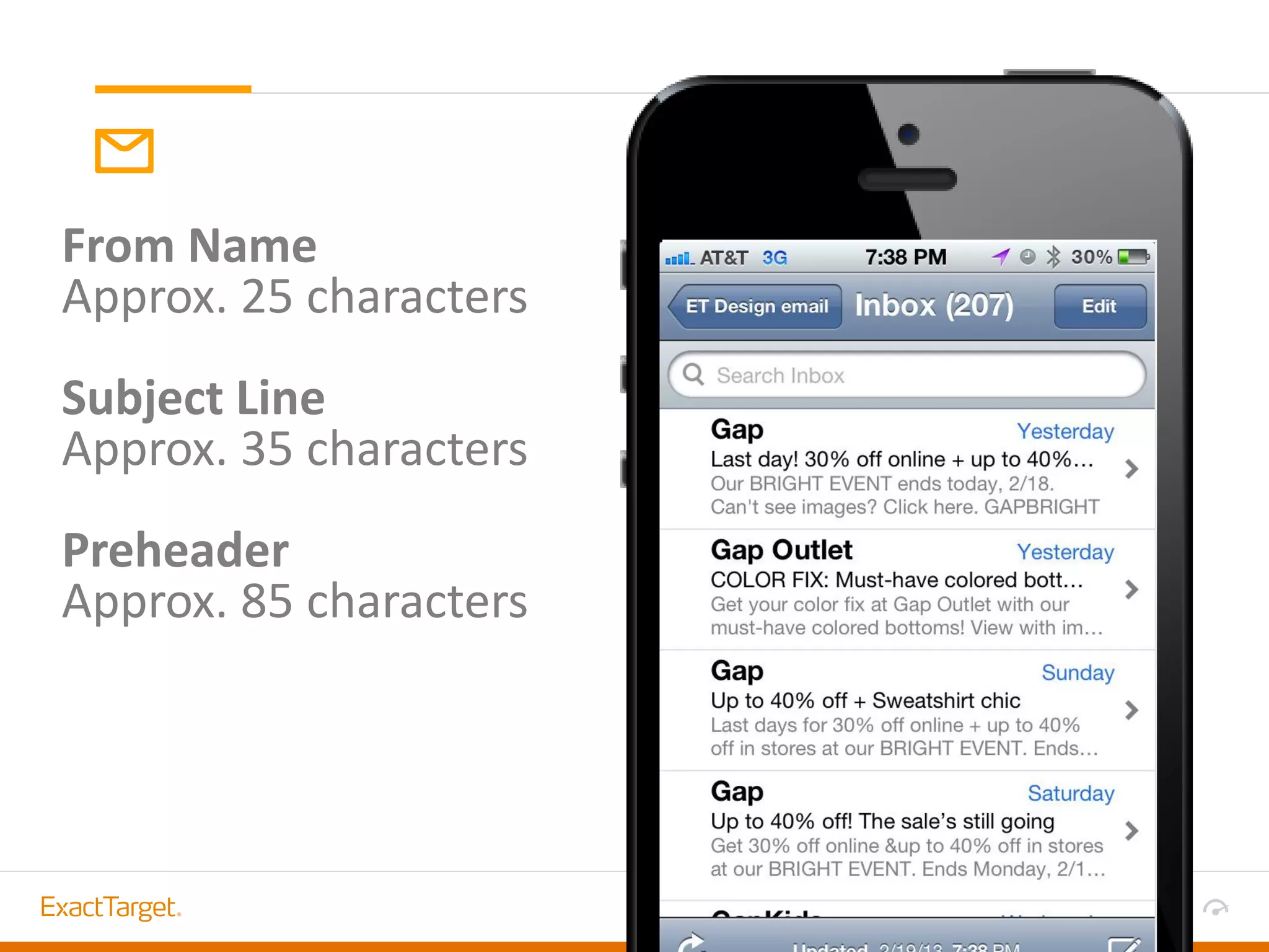
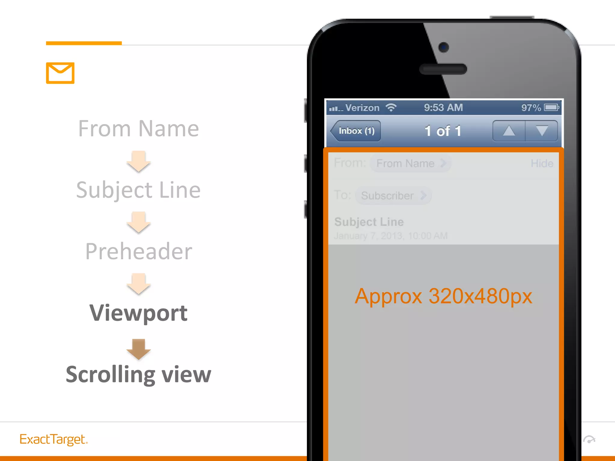
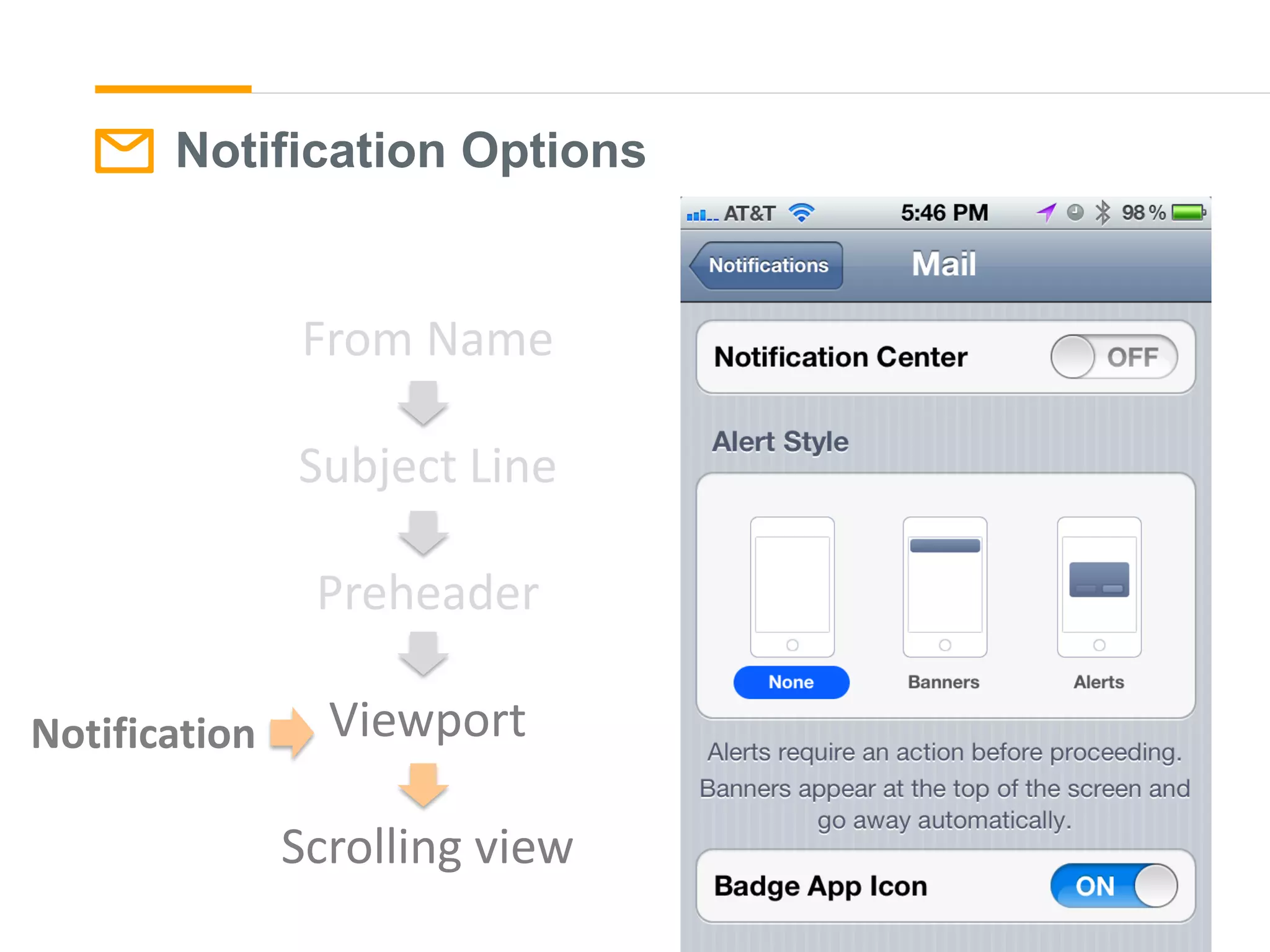
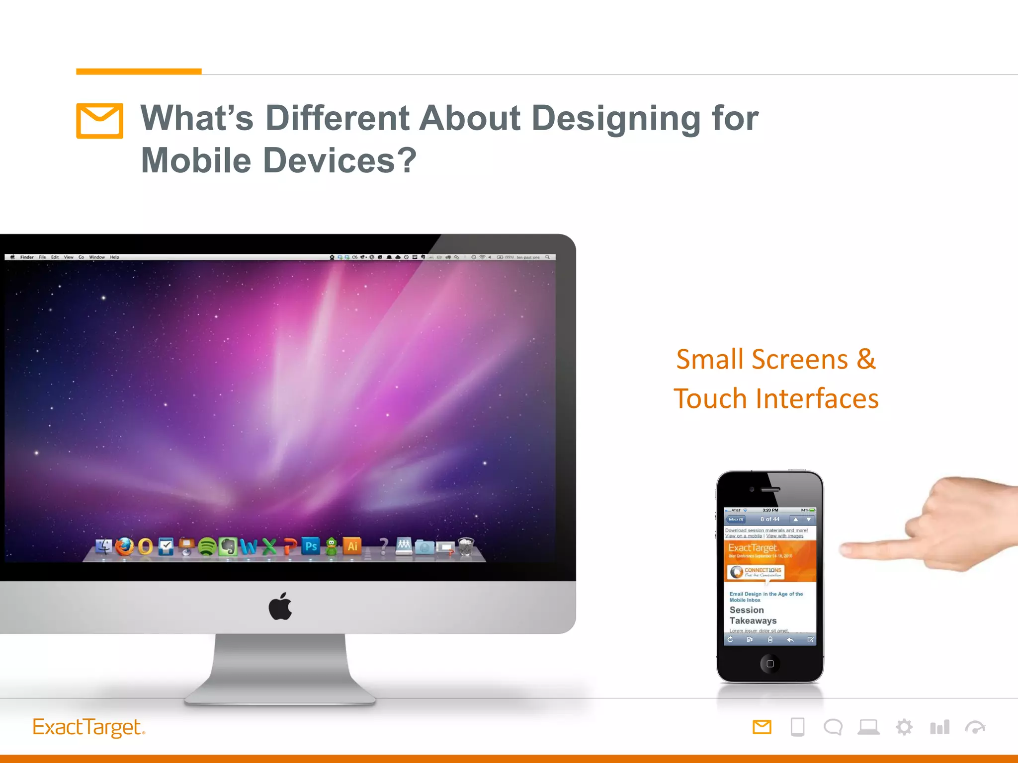
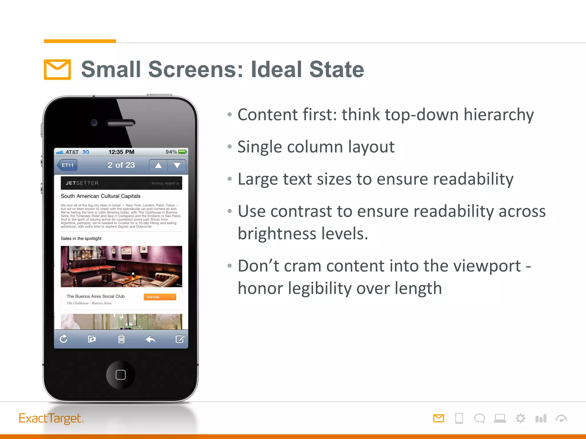
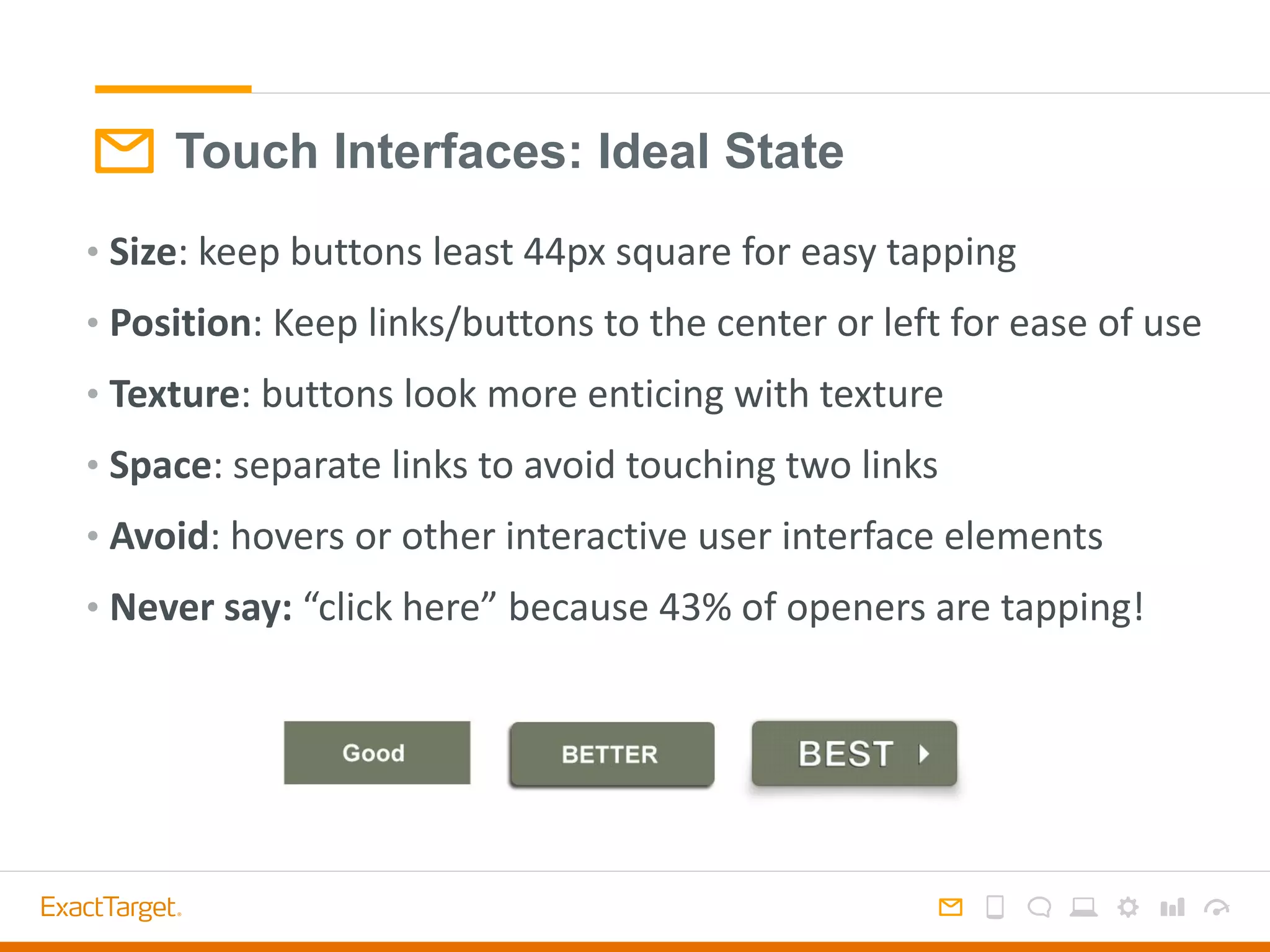
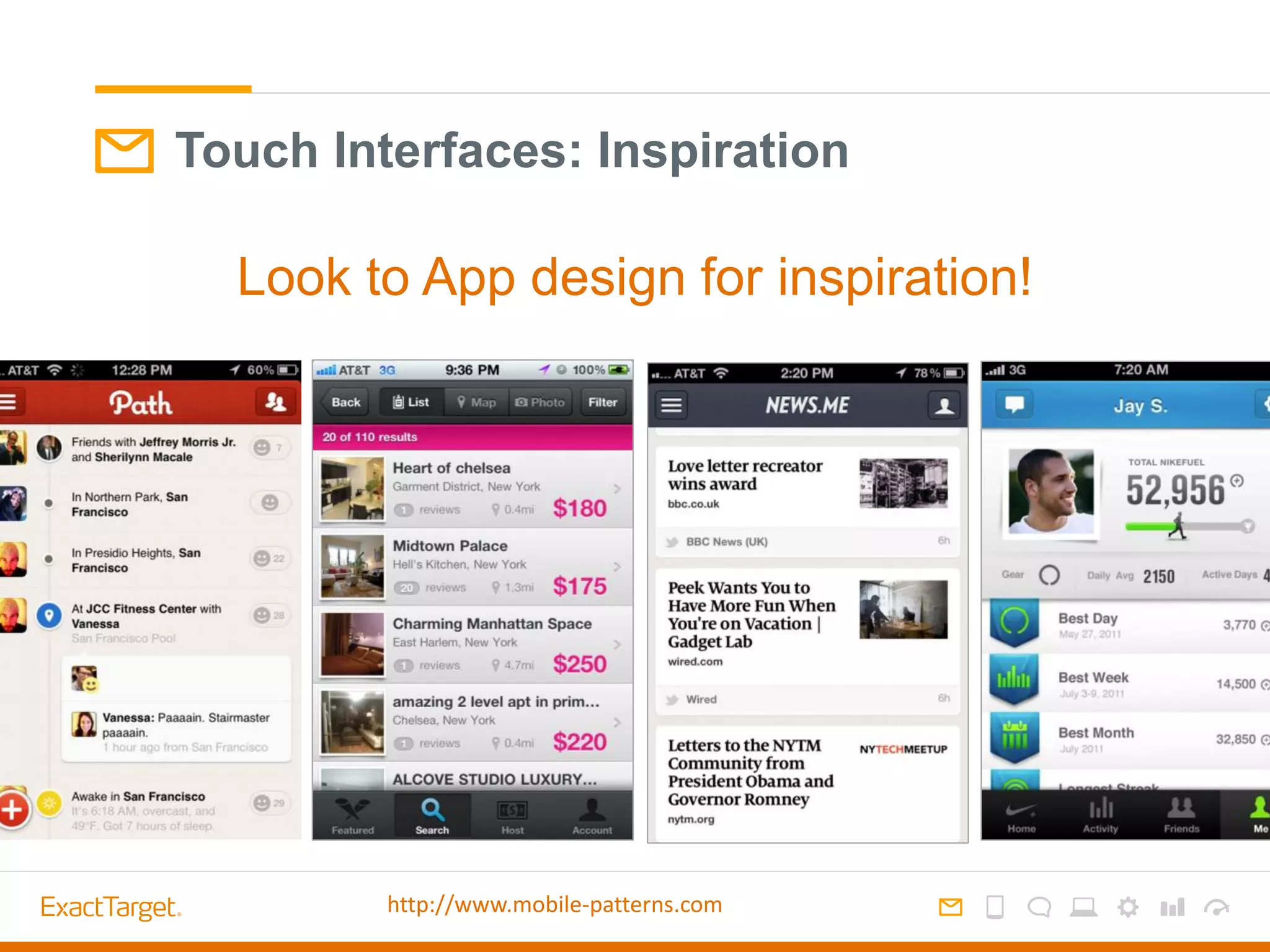
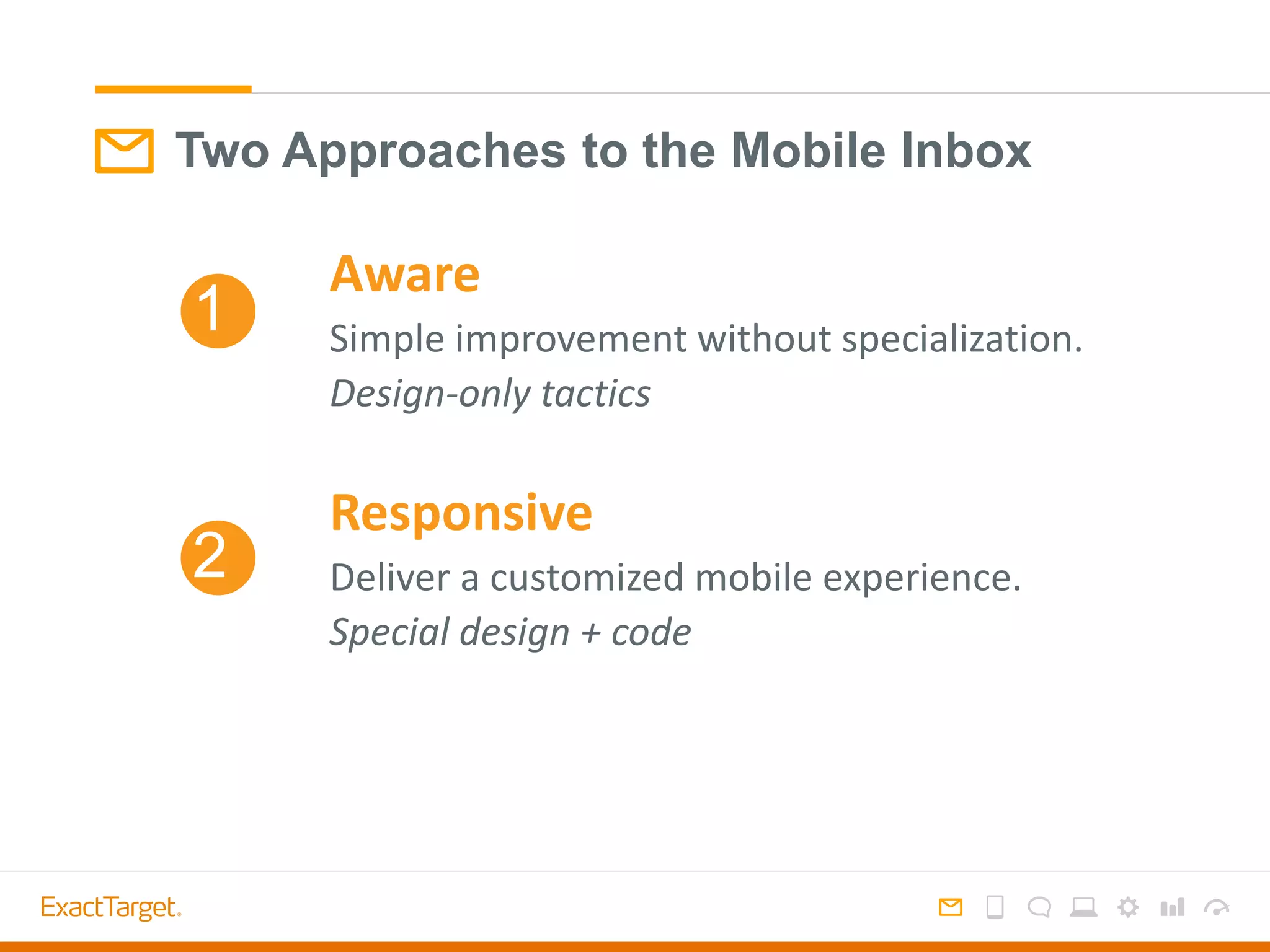
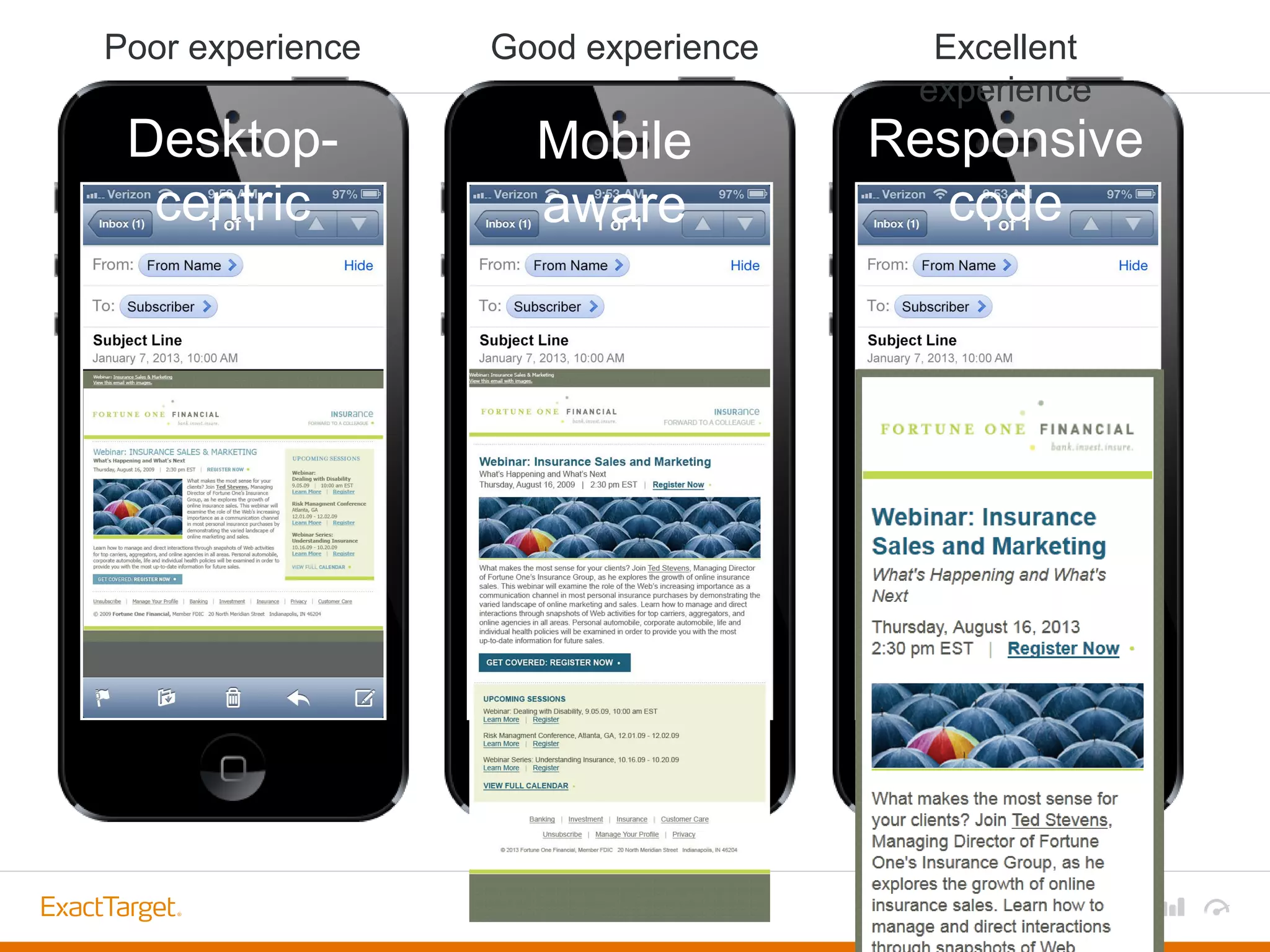
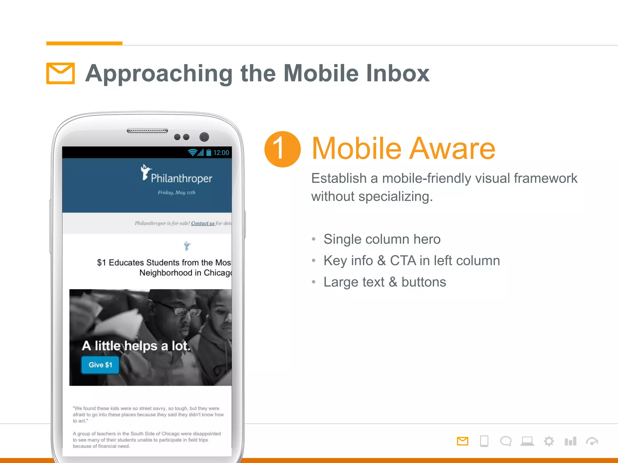
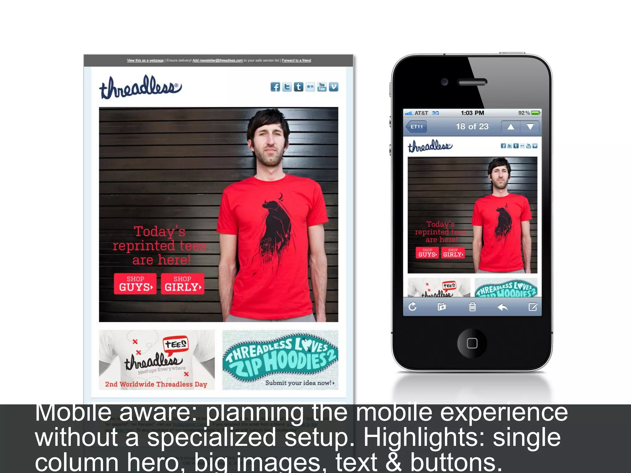
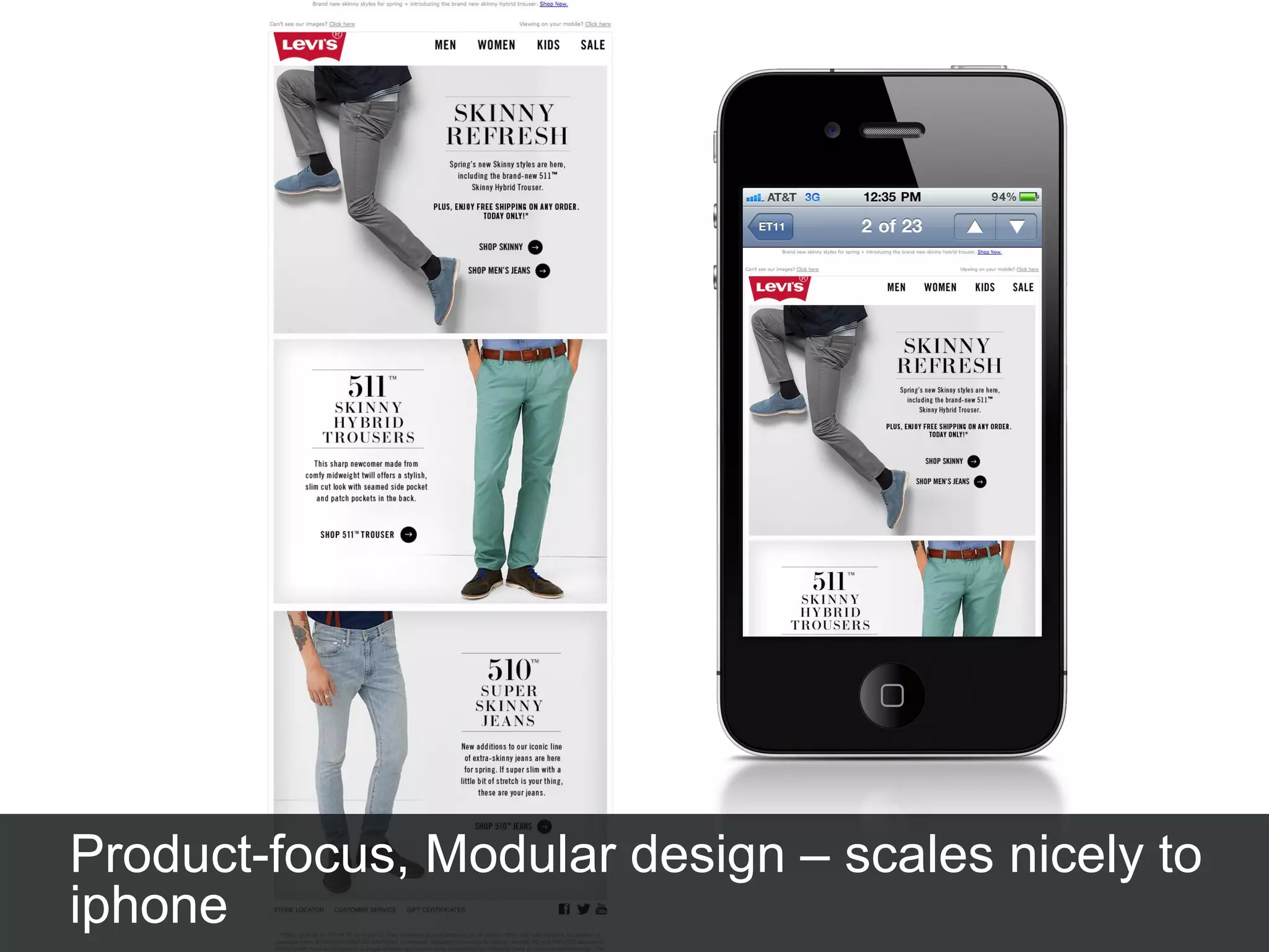
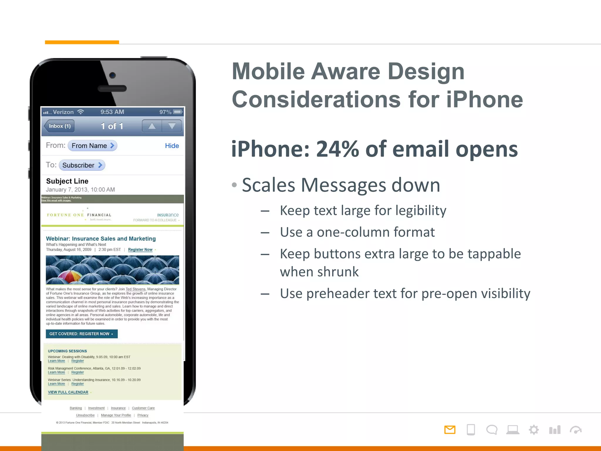
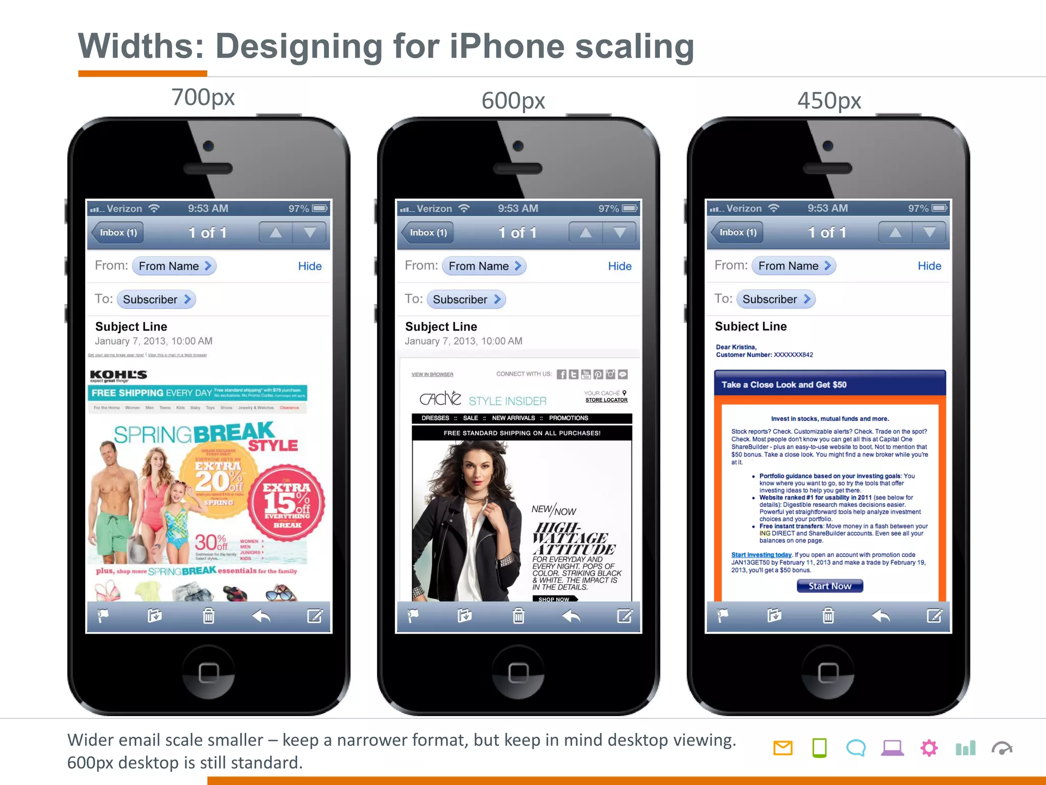
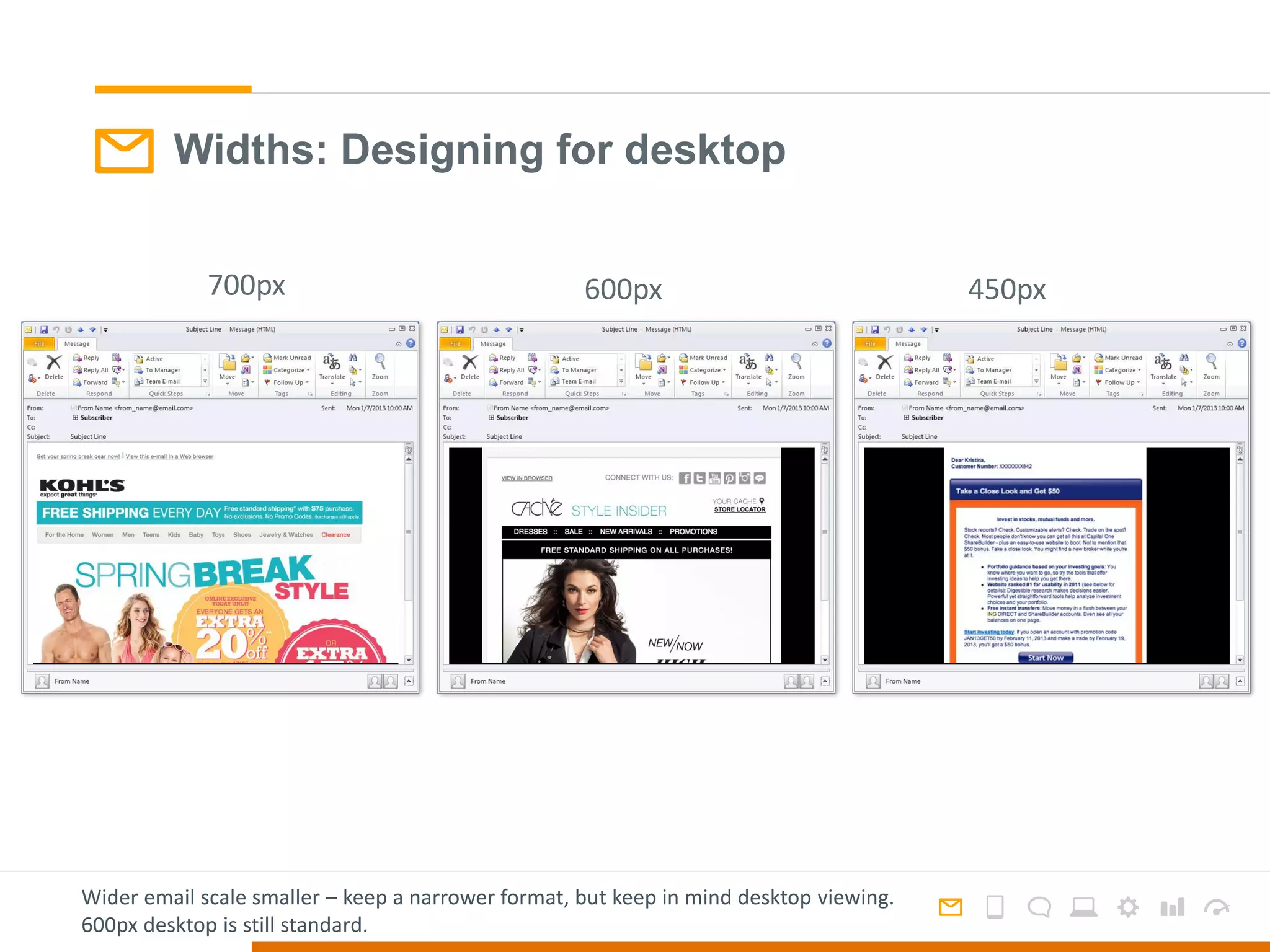
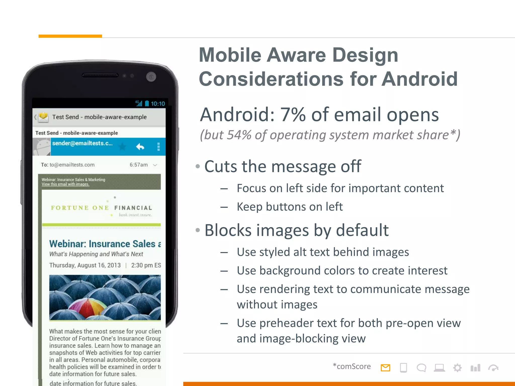
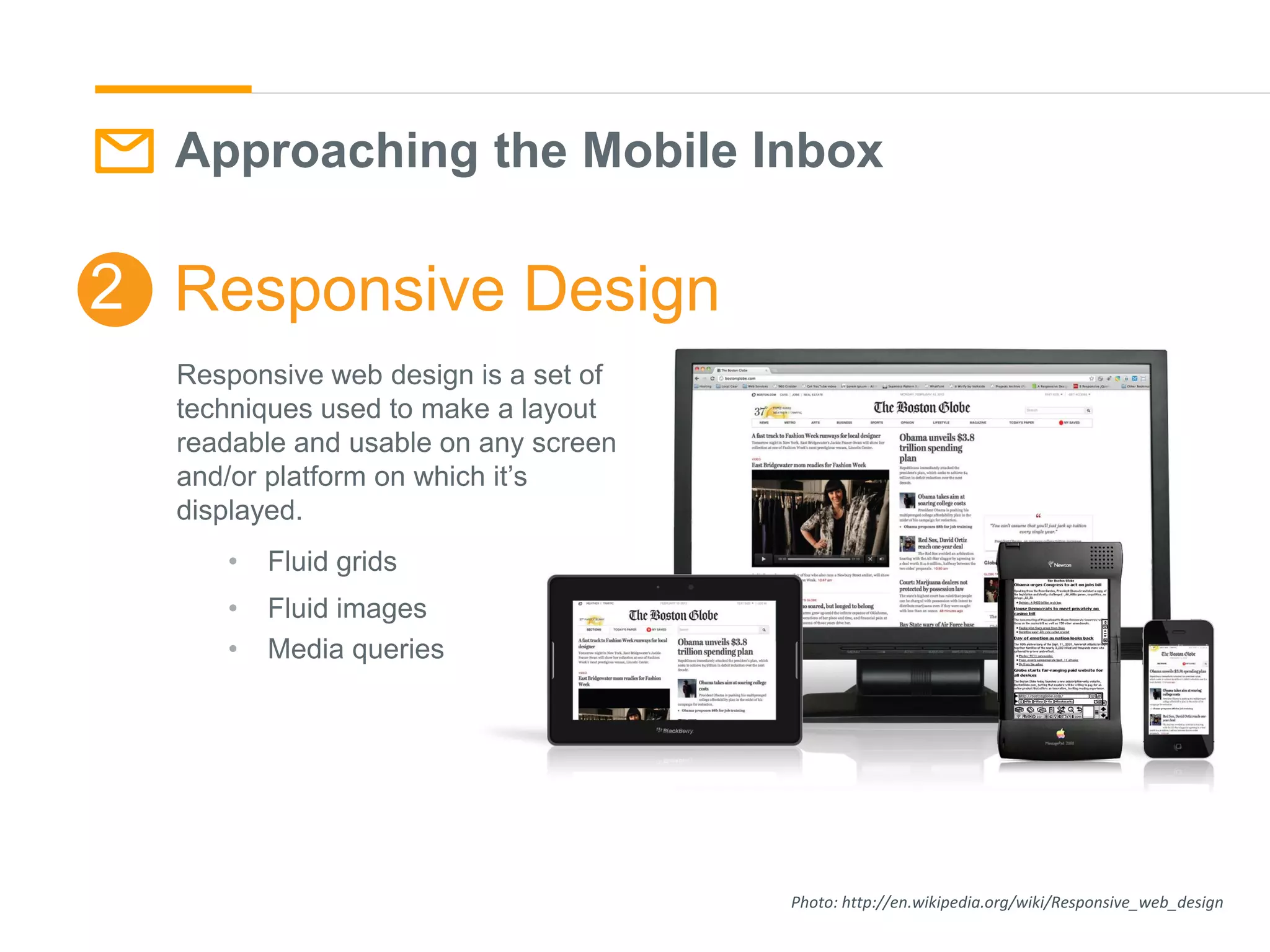
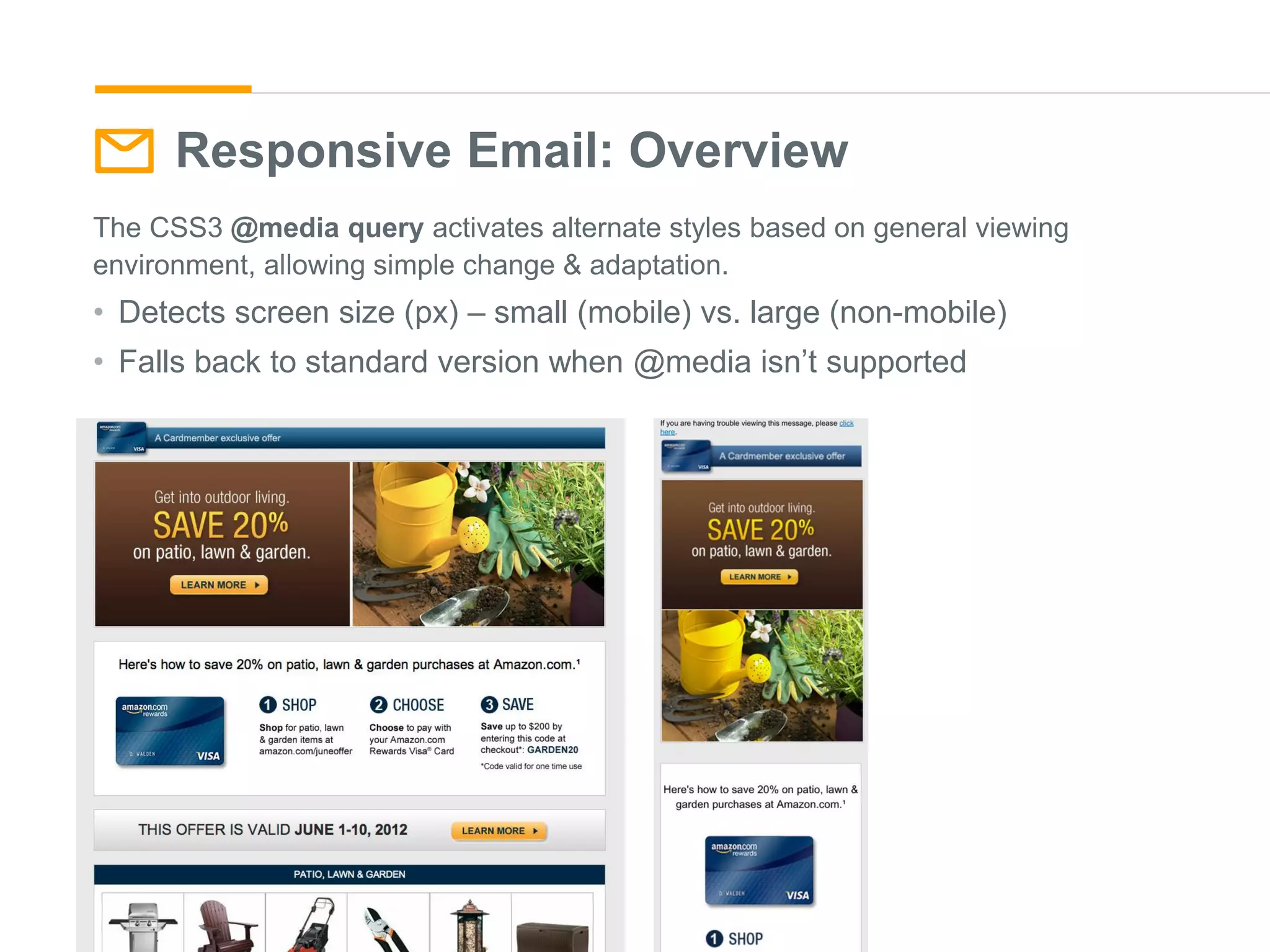
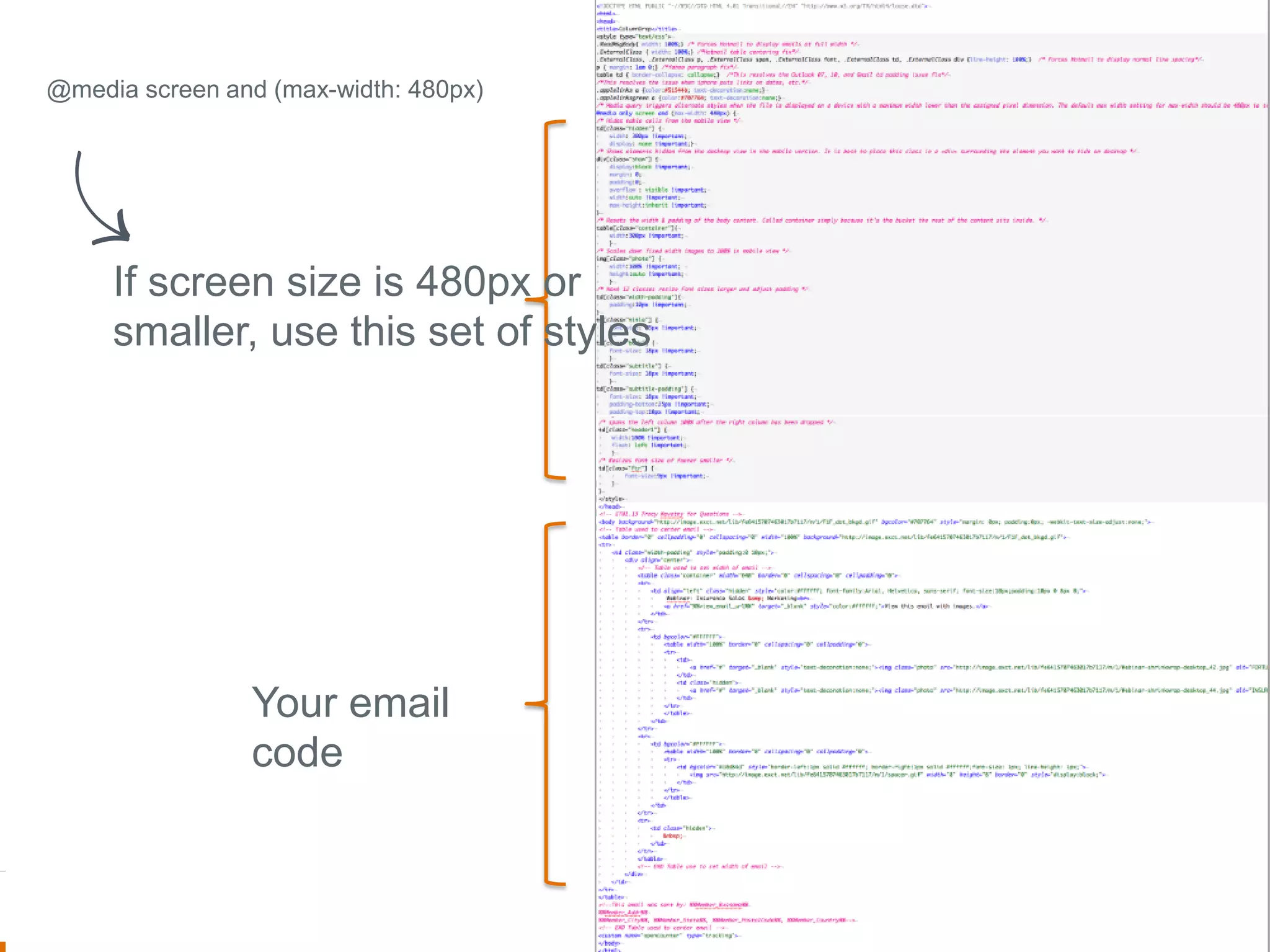
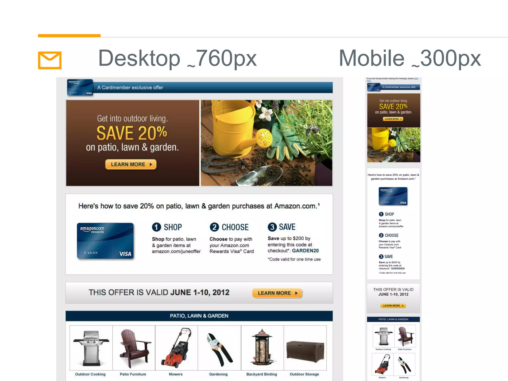
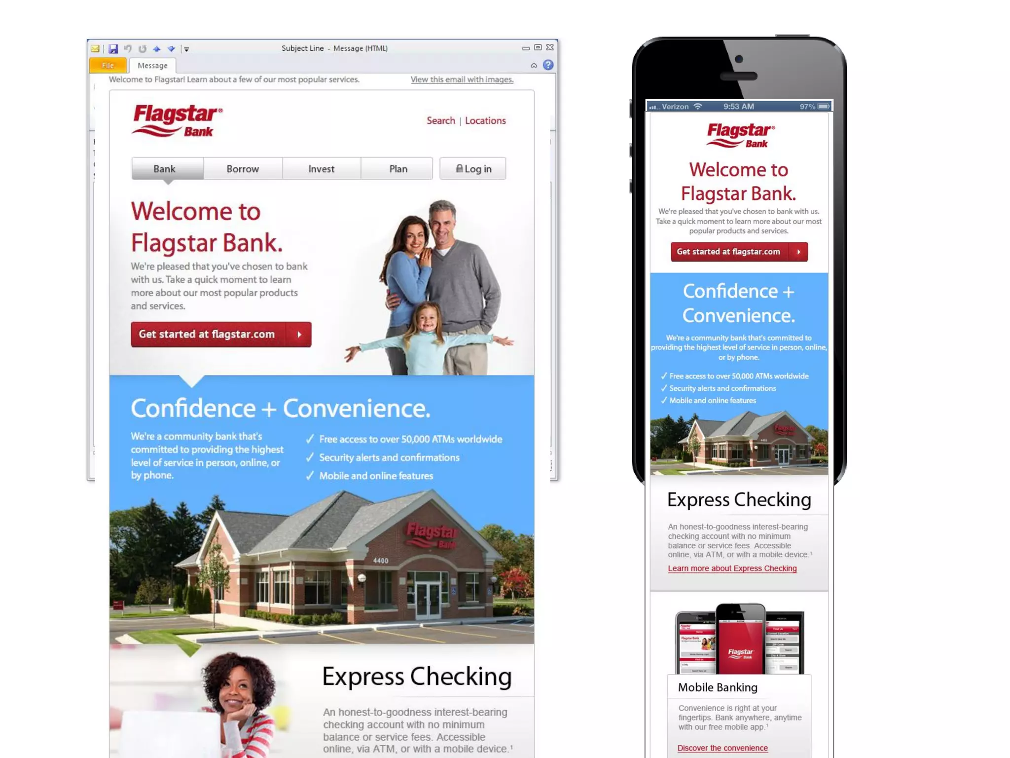
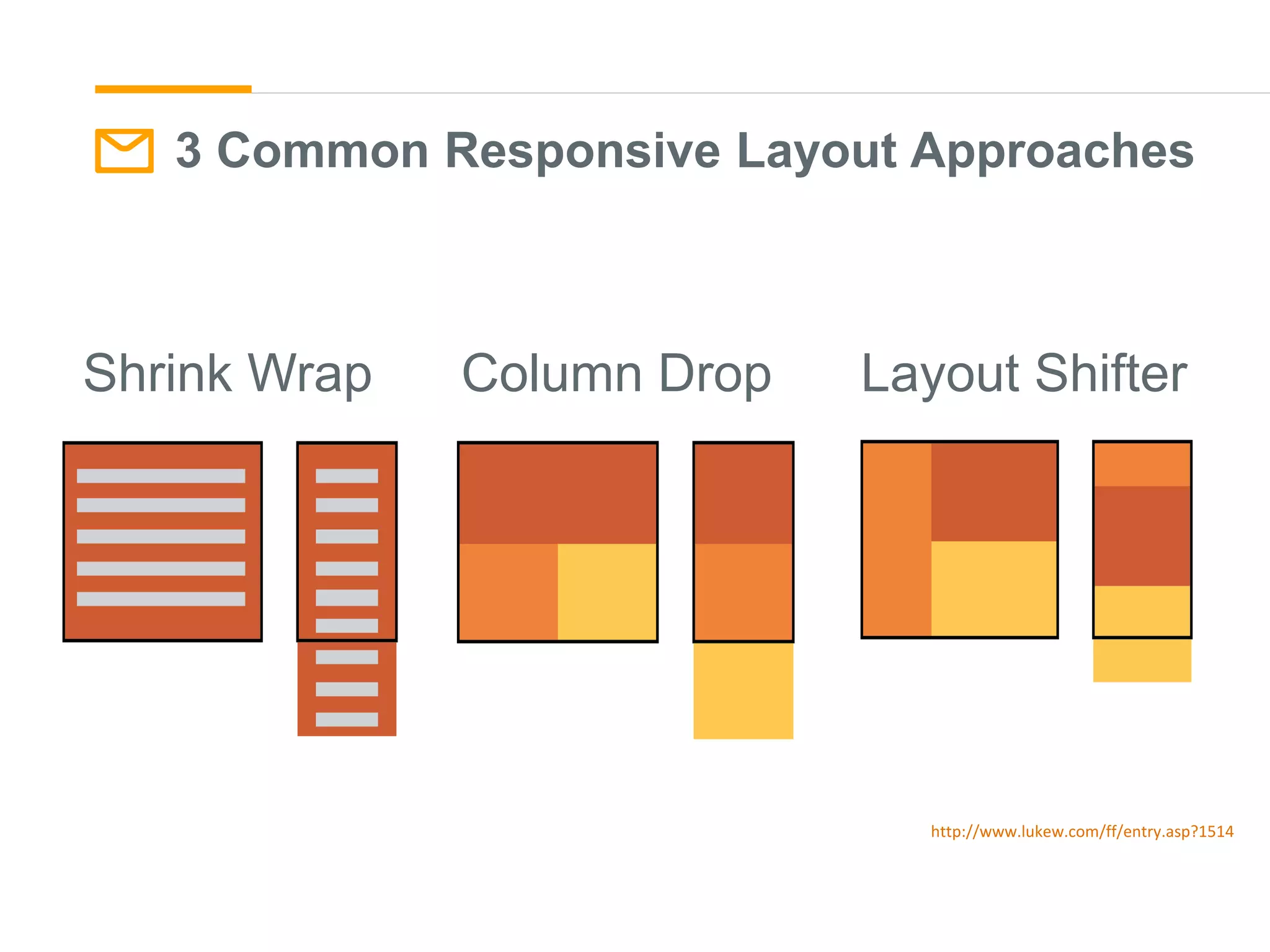
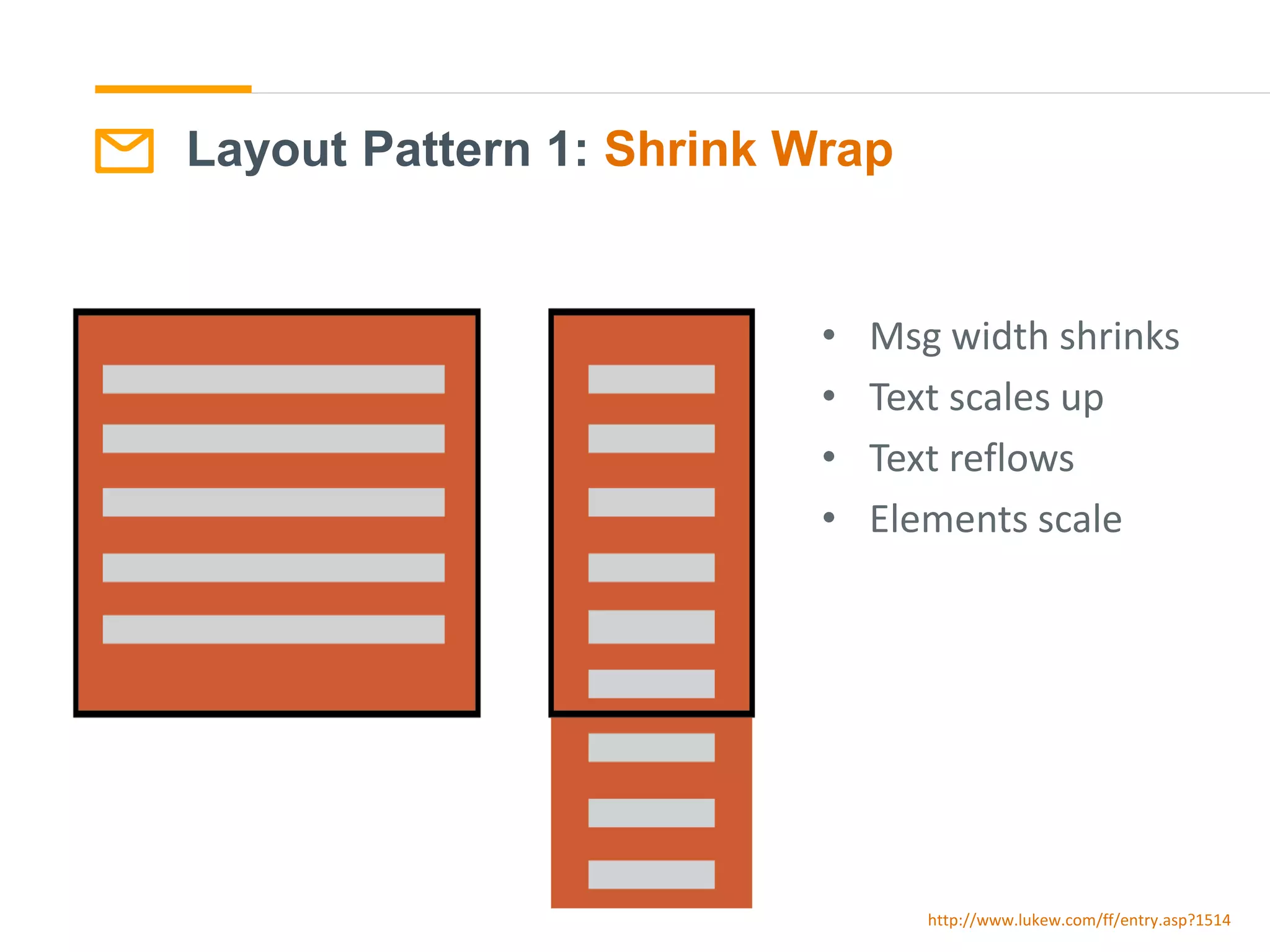
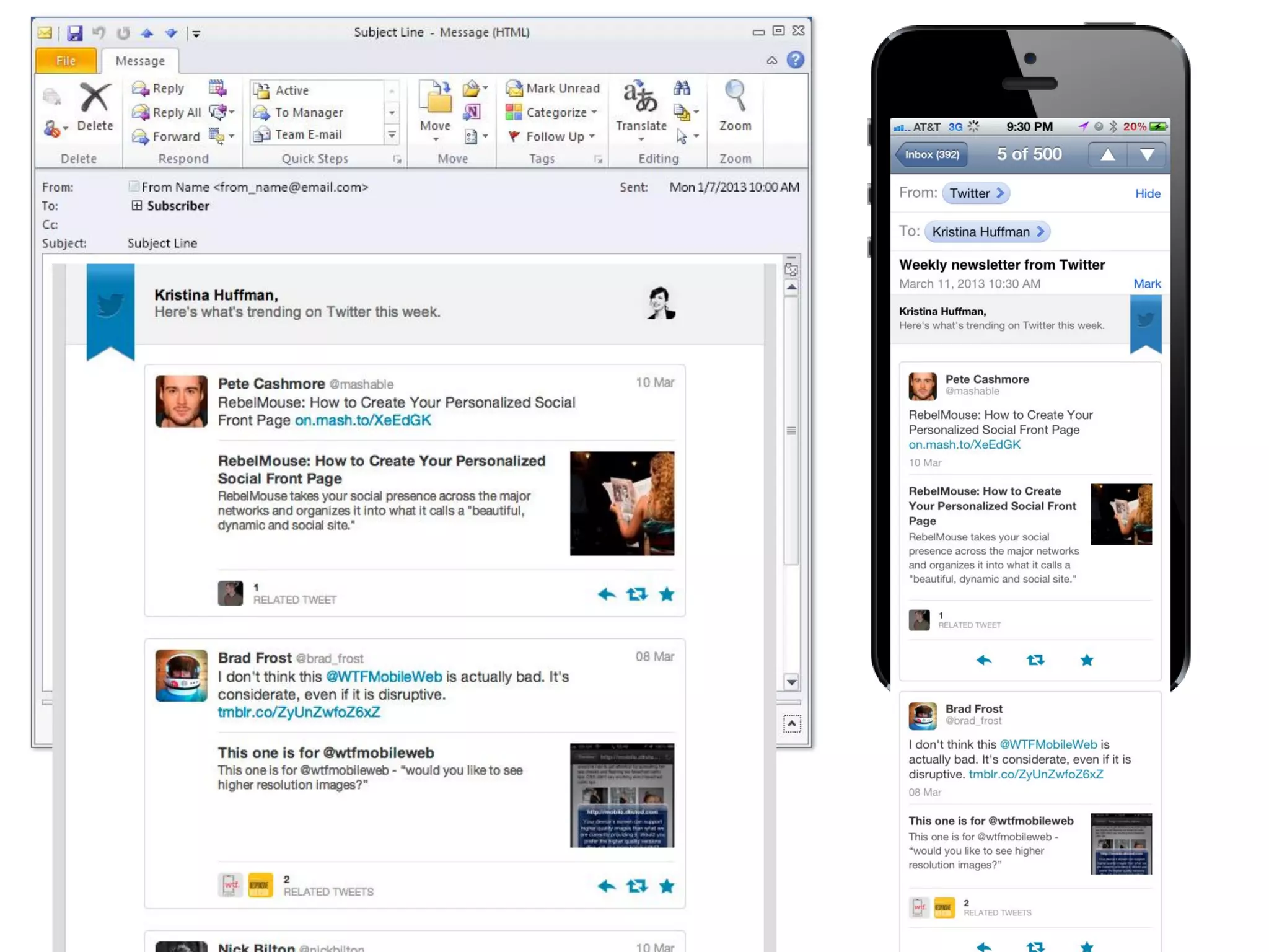
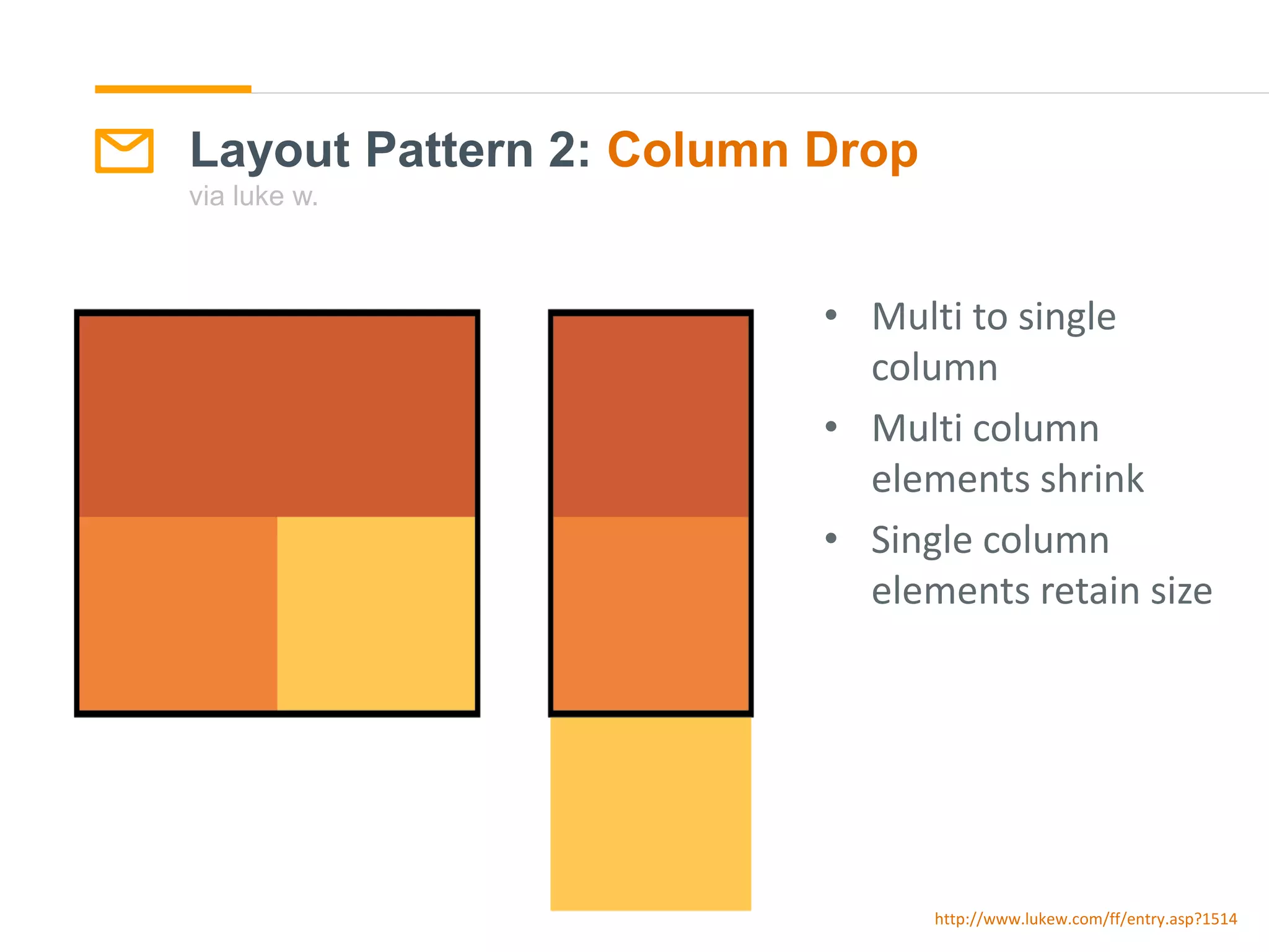
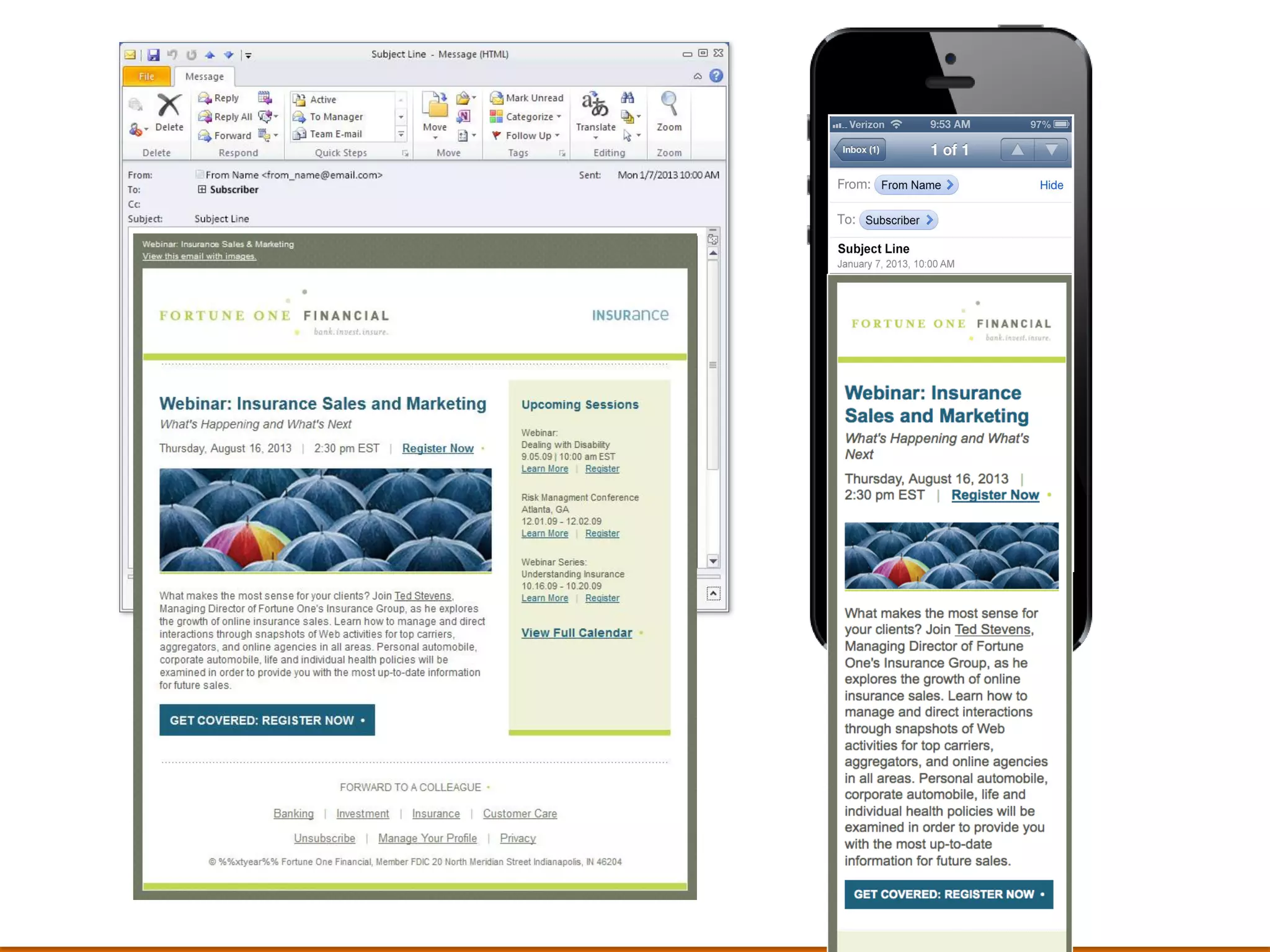
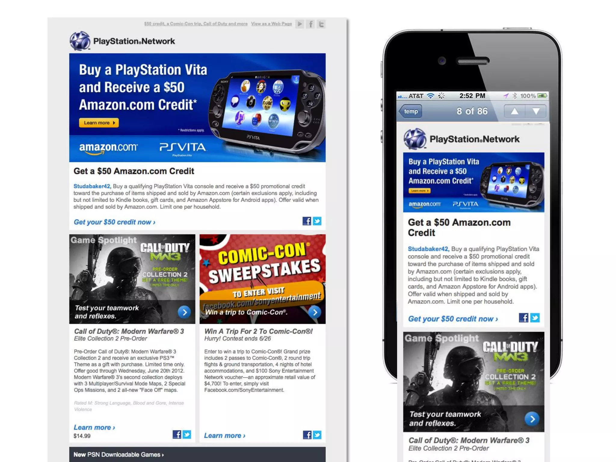
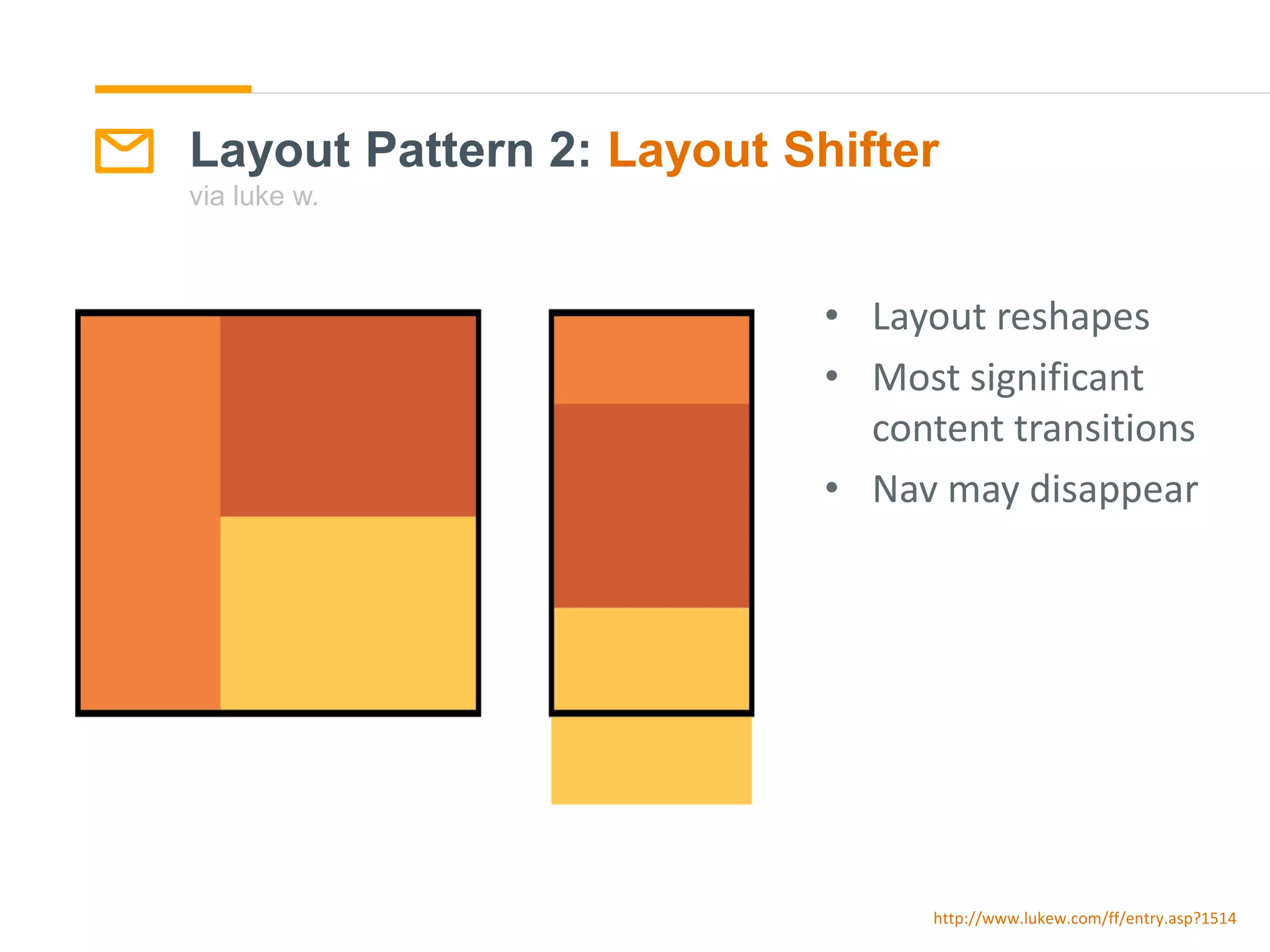
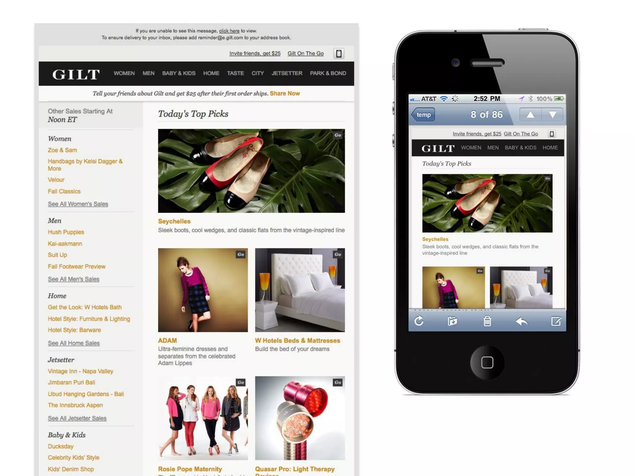
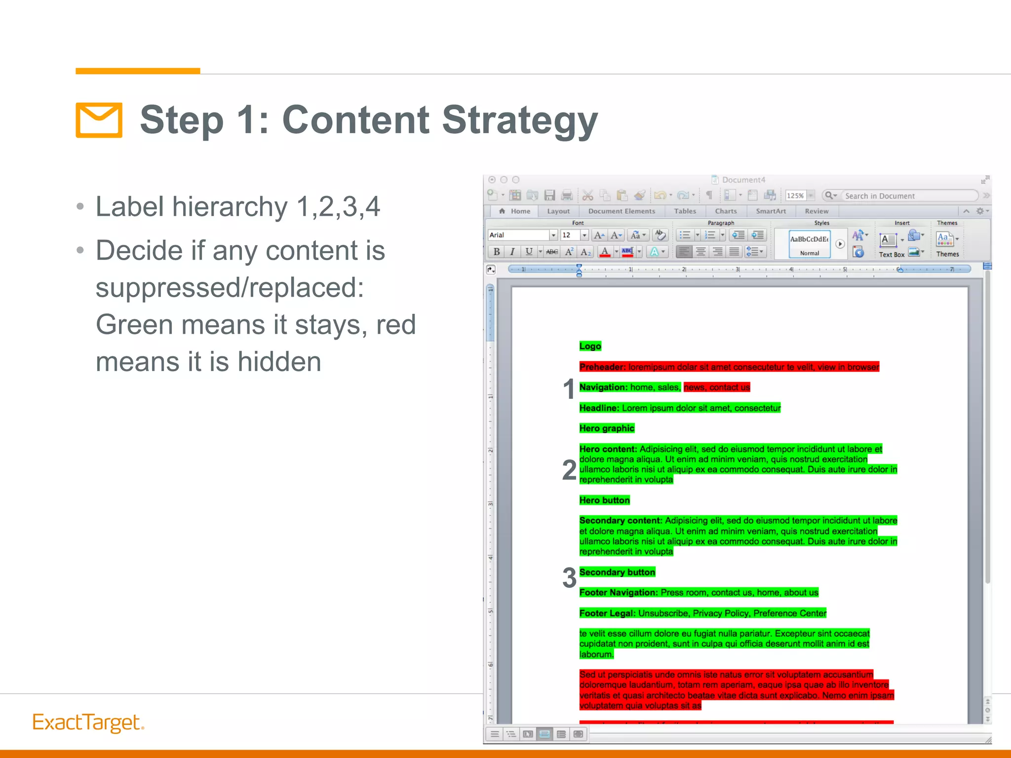
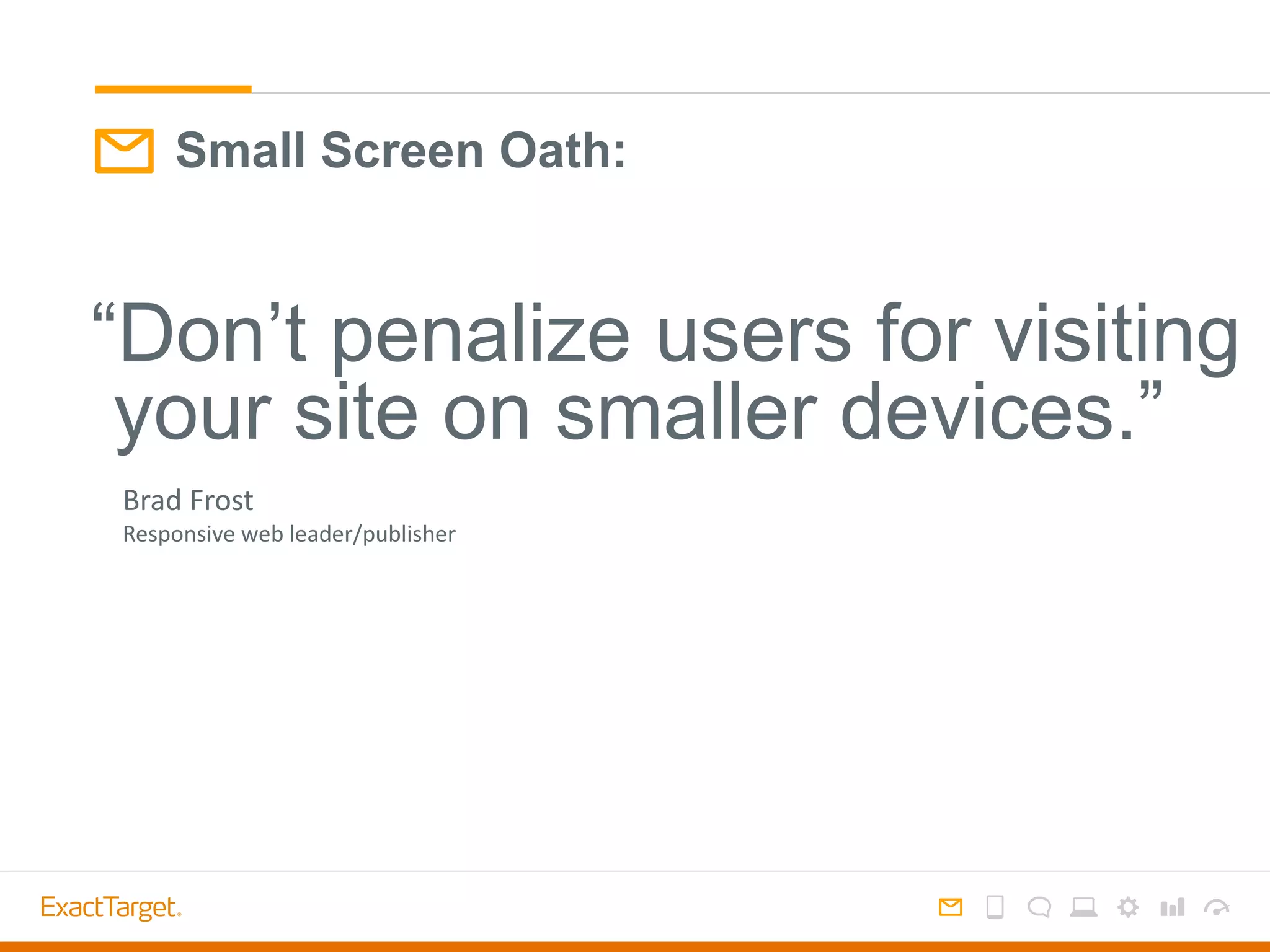
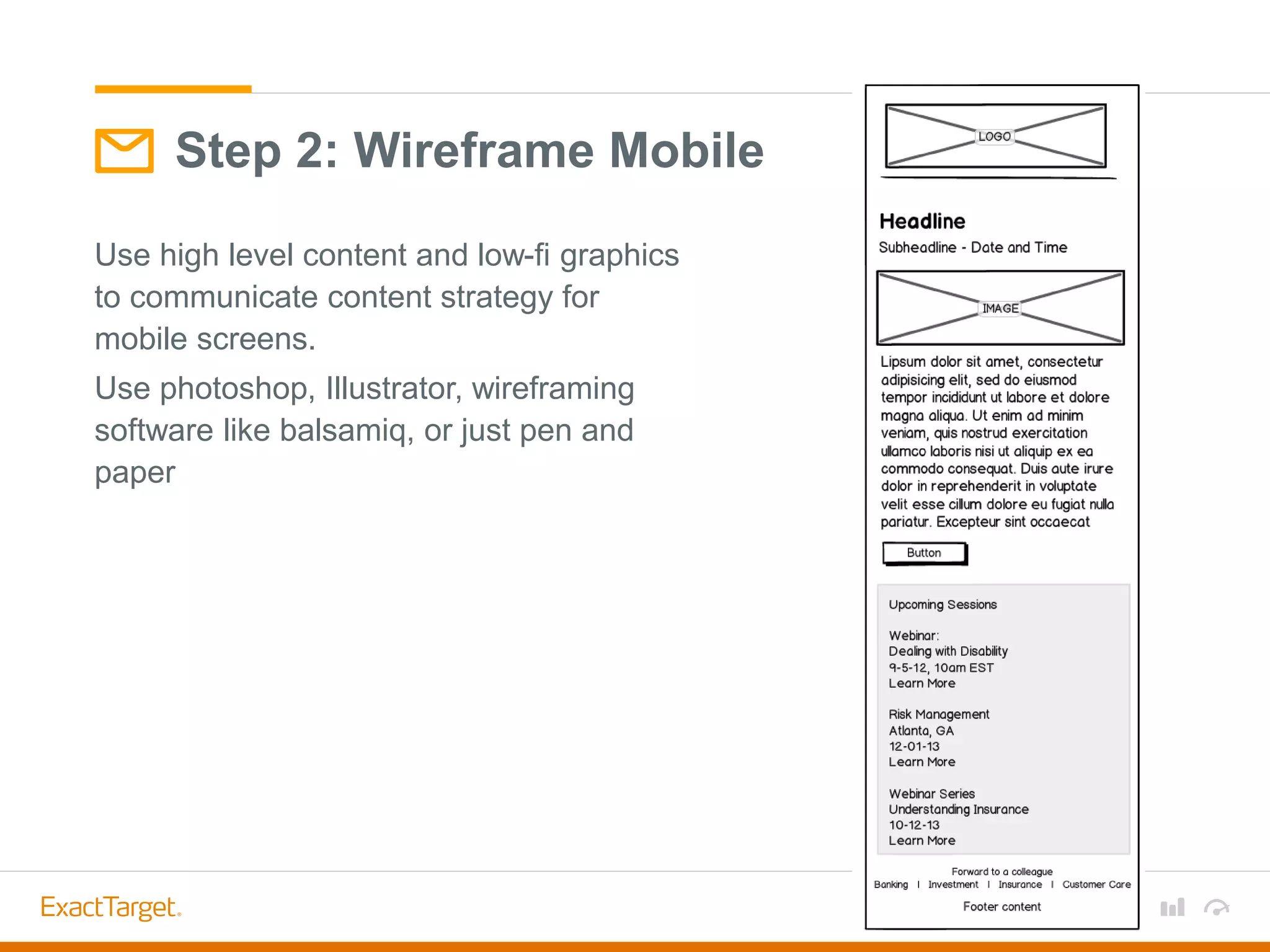
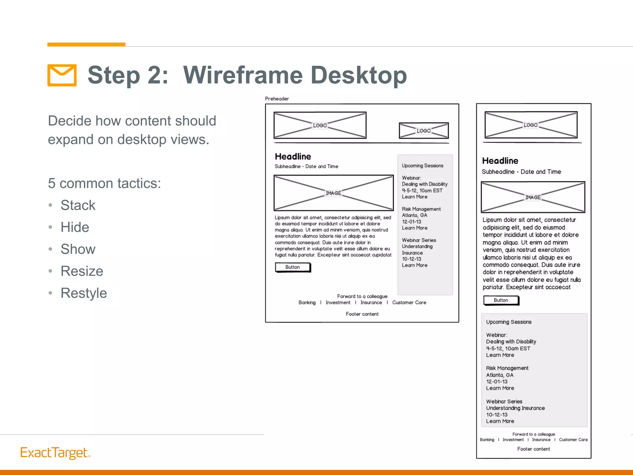
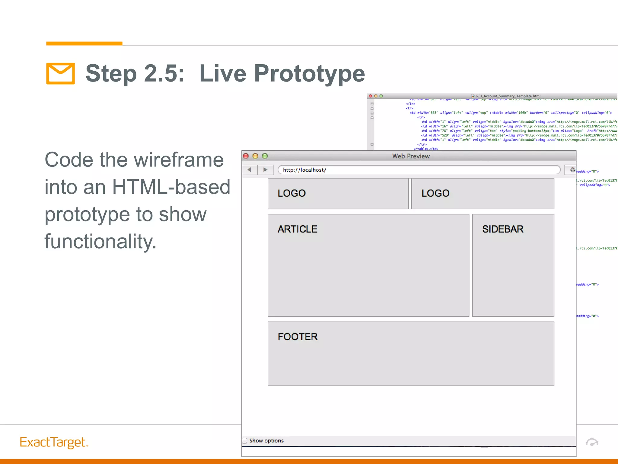
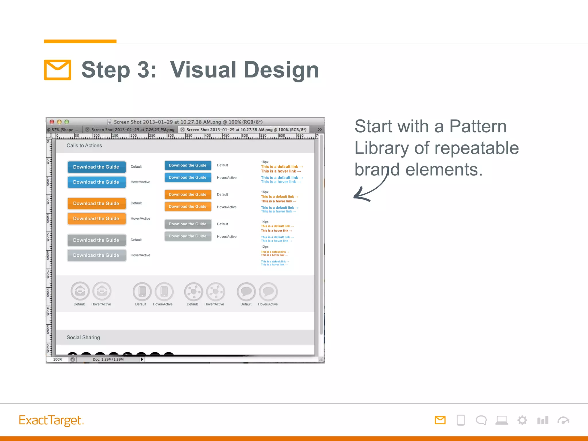
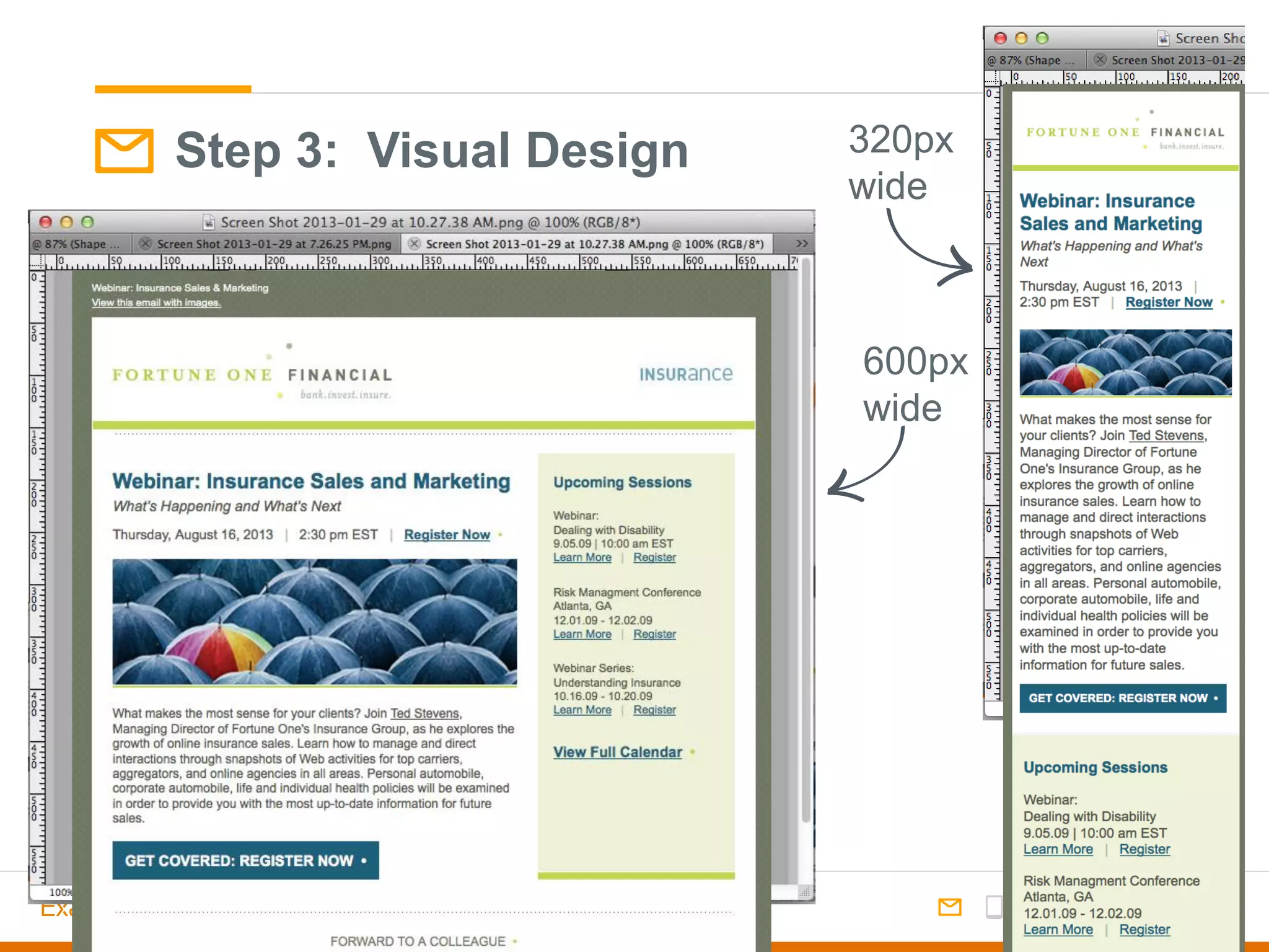
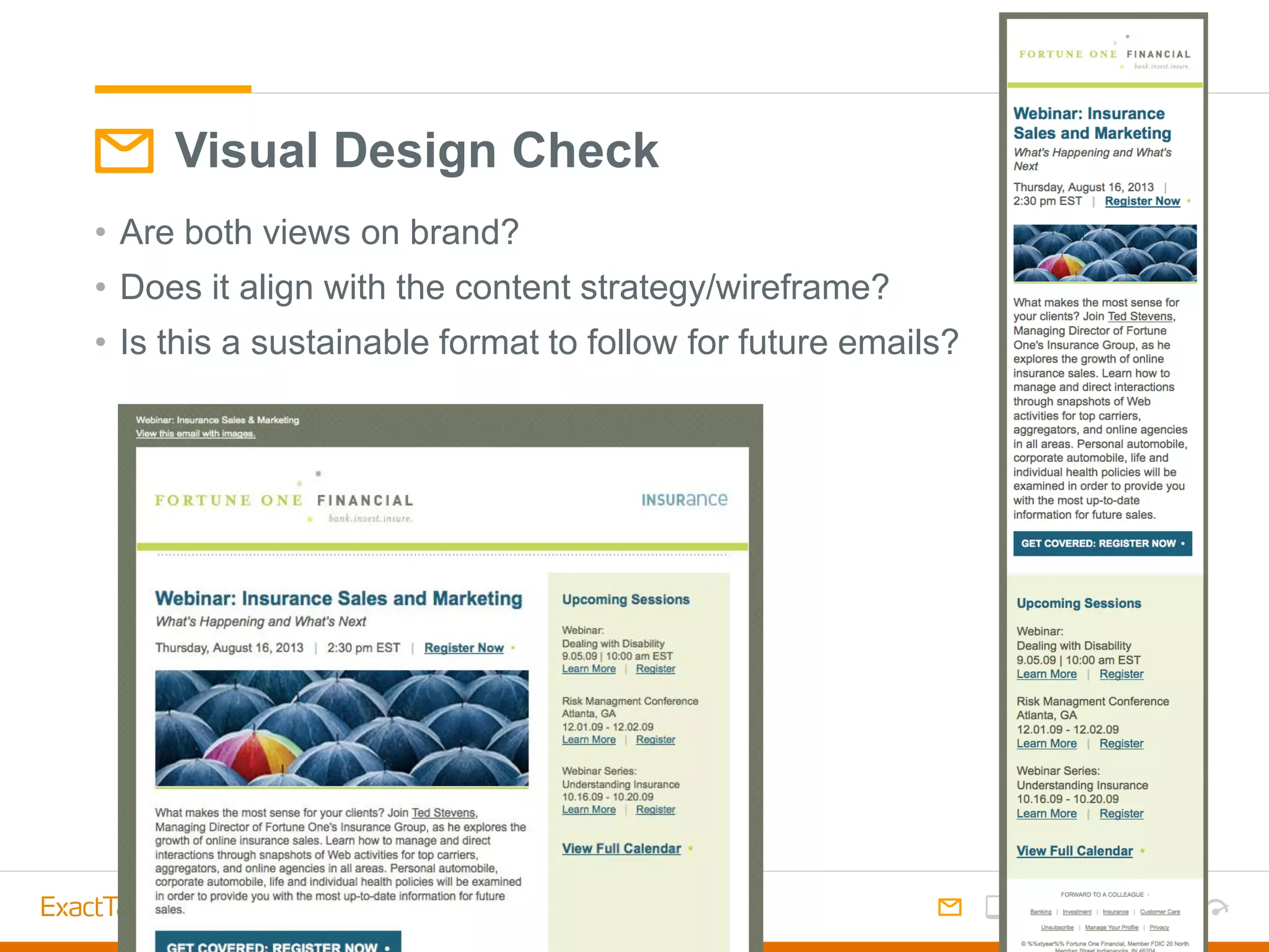
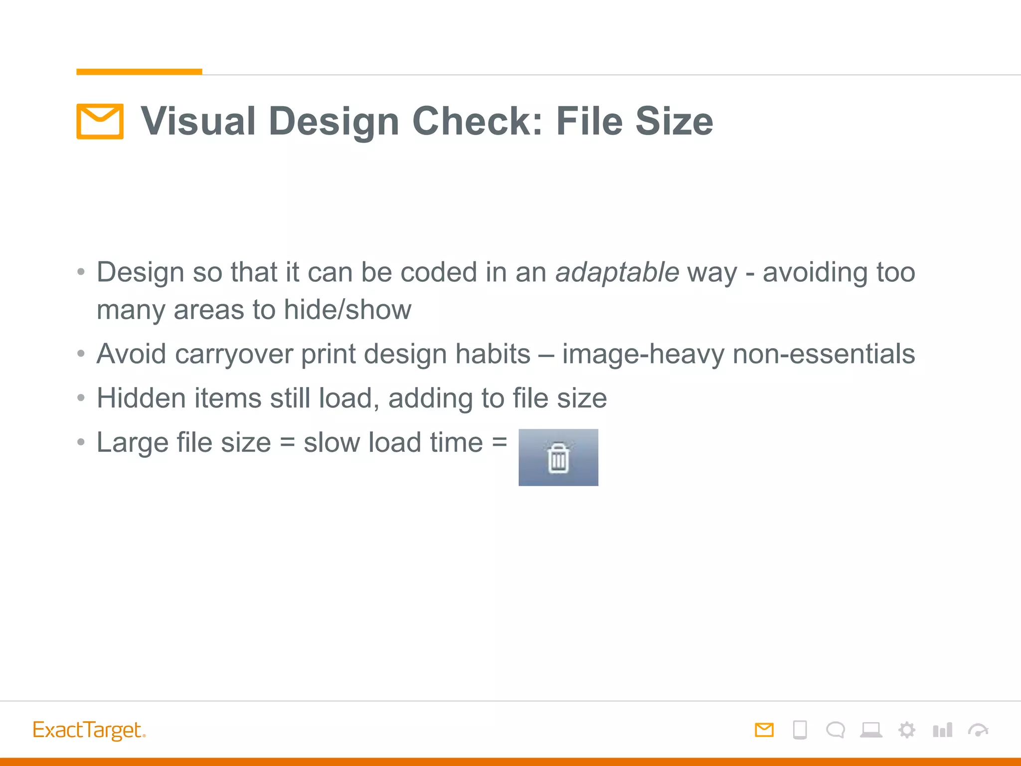
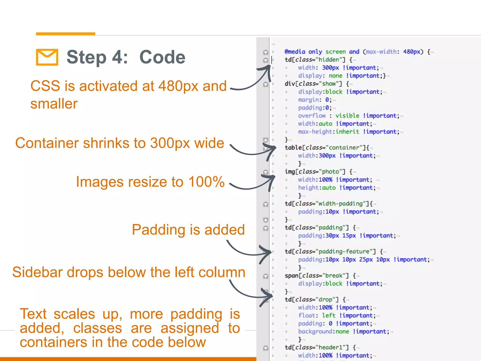
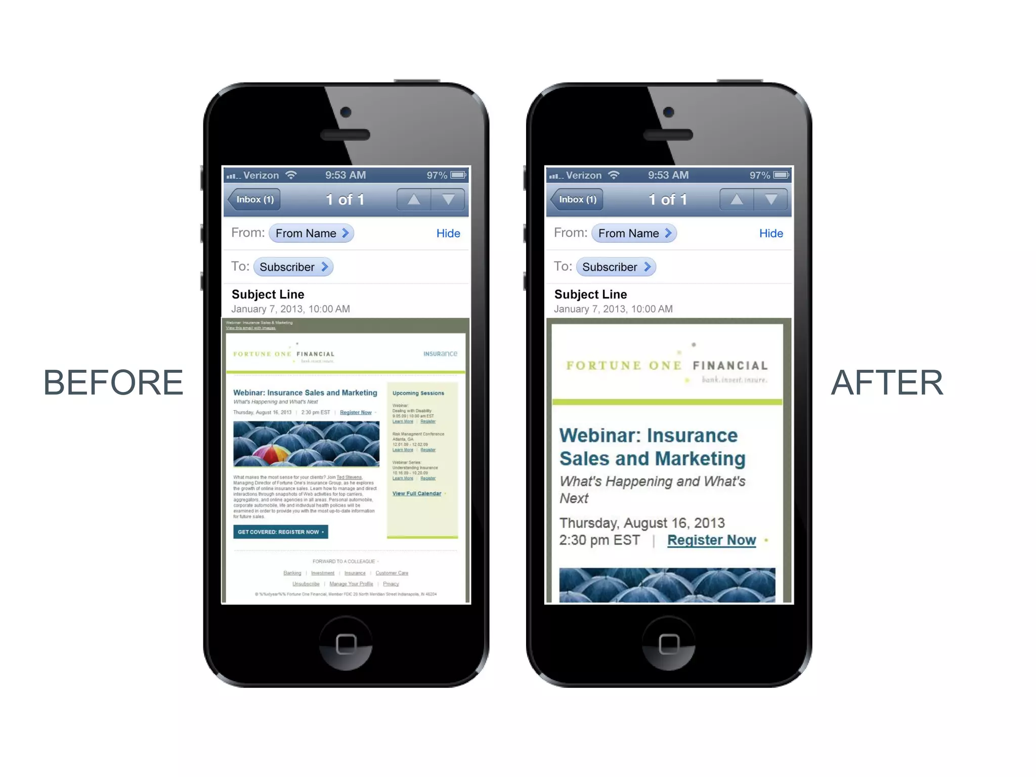
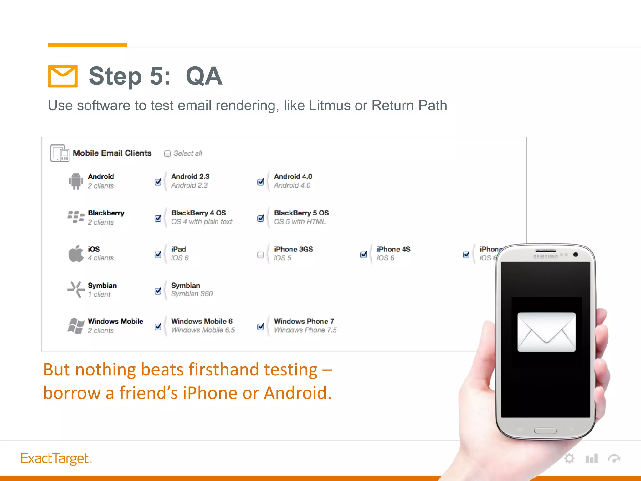
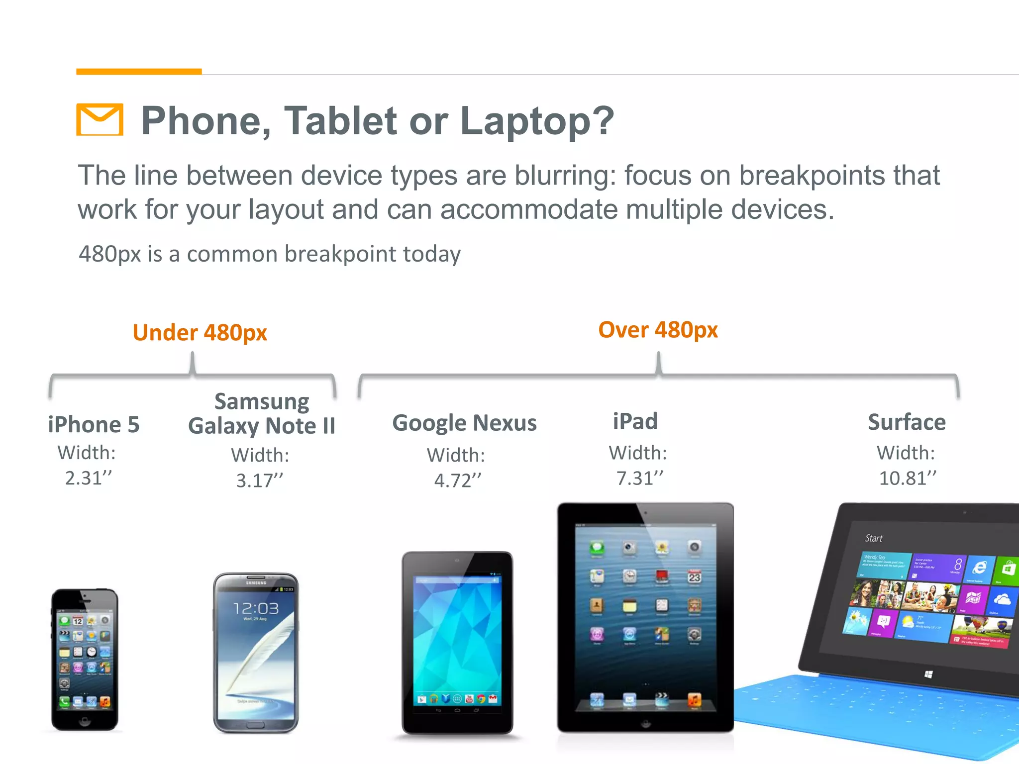
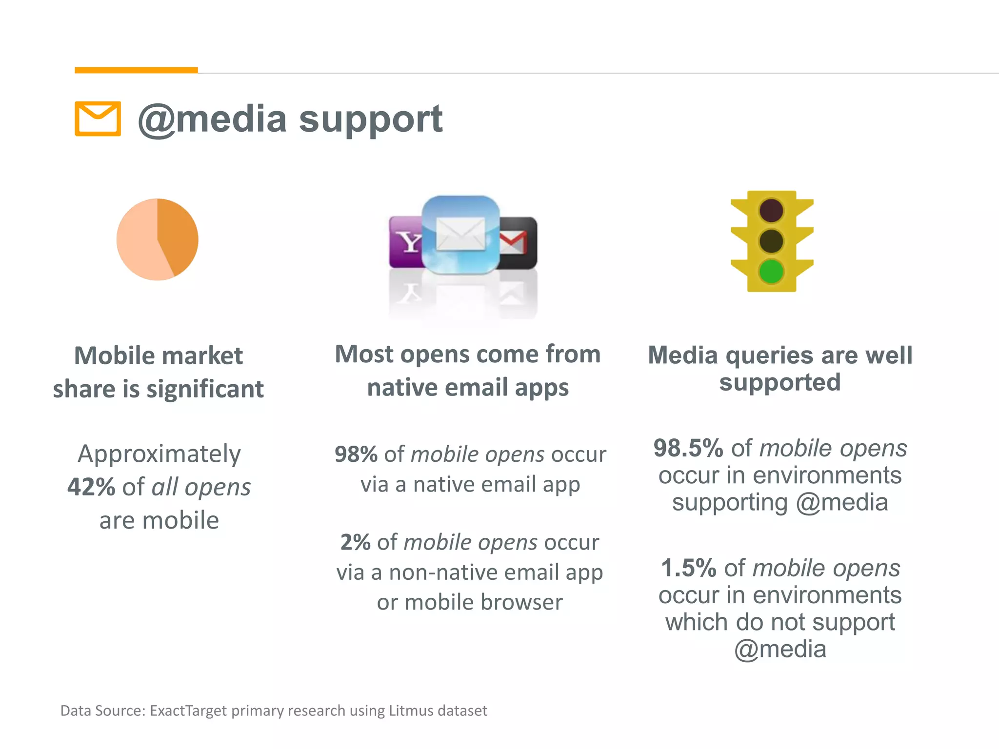
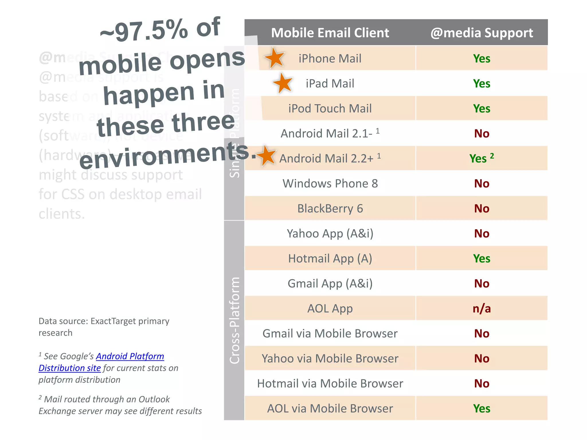
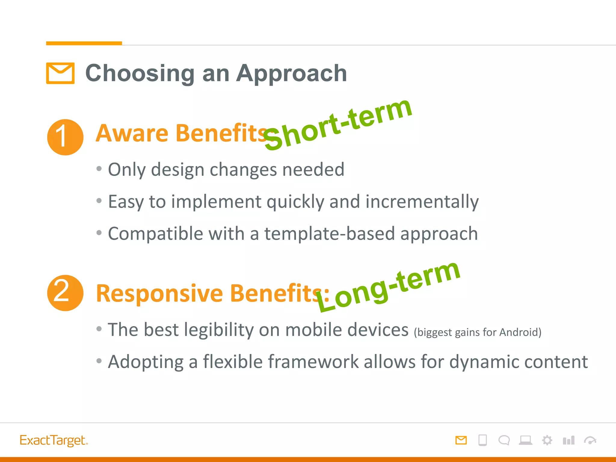
Designing and coding
for the mobile inbox
eCommerce Toronto Meet Up
June 2013
Mobile: rapid adoption
http://www.returnpath.com/resource/email-mostly-mobile/
October 2010-October 2012 shows
300% increase in mobile opens
Averages across all customers. Data Source: Litmus 12/2012 – emailclientmarketshare.com
Mobile: large market share of opens
Email Client Usage
iPhone 24%
Outlook 16%
iPad 11%
Apple Mail 10%
Live Hotmail 7%
Google Android 7%
Yahoo! Mail 7%
Gmail 4%
Windows Live Mail 3%
Yahoo! Mail Classic 1%
Top 10 Email Clients
42%
Mobile
Mobile: possibly a barrier to clicking
46%
52%
2%
30%
66%
4%
0%
10%
20%
30%
40%
50%
60%
70%
Mobile Desktop Multiple
OPENS
OPENS
CLICKS
CLICKS
46% of opens are mobile, but only 30% of clicks
High volume retail brand – name suppressed
Mobile User Experience
Design = communication.
Good design allows your subscribers to interact
with your emails in their preferred format.
How do customers use mobile devices?
The Mobile Subscriber
Is she:
Listening to music
Texting
Using Skype
Watching a movie
On a phone call
Checking email
Browsing a website
Tweeting
Watching TV
All media
consumption through
one device - high
expectations are set
for email viewing.
The mobile experience is interactive.
Emails are viewed in stages.
From Name
Subject Line
Preheader
Viewport
Scrolling view
From Name
Subject Line
Preheader
Viewport
Scrolling view
From Name
Approx. 25 characters
Subject Line
Approx. 35 characters
Preheader
Approx. 85 characters
From Name
Subject Line
Preheader
Viewport
Scrolling view
Approx 320x480px
Notification Options
From Name
Subject Line
Preheader
Viewport
Scrolling view
Notification
DESIGNING FOR
MOBILE DEVICES
What’s Different About Designing for
Mobile Devices?
Small Screens &
Touch Interfaces
Small Screens: Ideal State
• Content first: think top-down hierarchy
• Single column layout
• Large text sizes to ensure readability
• Use contrast to ensure readability across
brightness levels.
• Don’t cram content into the viewport -
honor legibility over length
Touch Interfaces: Ideal State
• Size: keep buttons least 44px square for easy tapping
• Position: Keep links/buttons to the center or left for ease of use
• Texture: buttons look more enticing with texture
• Space: separate links to avoid touching two links
• Avoid: hovers or other interactive user interface elements
• Never say: “click here” because 43% of openers are tapping!
Touch Interfaces: Inspiration
Look to App design for inspiration!
http://www.mobile-patterns.com
Solutions
Two Approaches to the Mobile Inbox
Aware
Simple improvement without specialization.
Design-only tactics
Responsive
Deliver a customized mobile experience.
Special design + code
1
2
Desktop-
centric
Mobile
aware
Responsive
code
Poor experience Good experience Excellent
experience
Approaching the Mobile Inbox
Establish a mobile-friendly visual framework
without specializing.
• Single column hero
• Key info & CTA in left column
• Large text & buttons
Mobile Aware1
Mobile aware: planning the mobile experience
without a specialized setup. Highlights: single
column hero, big images, text & buttons.
Product-focus, Modular design – scales nicely to
iphone
Mobile Aware Design
Considerations for iPhone
• Scales Messages down
– Keep text large for legibility
– Use a one-column format
– Keep buttons extra large to be tappable
when shrunk
– Use preheader text for pre-open visibility
iPhone: 24% of email opens
Widths: Designing for iPhone scaling
Wider email scale smaller – keep a narrower format, but keep in mind desktop viewing.
600px desktop is still standard.
450px600px700px
Widths: Designing for desktop
450px600px700px
Wider email scale smaller – keep a narrower format, but keep in mind desktop viewing.
600px desktop is still standard.
Mobile Aware Design
Considerations for Android
• Cuts the message off
– Focus on left side for important content
– Keep buttons on left
• Blocks images by default
– Use styled alt text behind images
– Use background colors to create interest
– Use rendering text to communicate message
without images
– Use preheader text for both pre-open view
and image-blocking view
Android: 7% of email opens
(but 54% of operating system market share*)
*comScore
Approaching the Mobile Inbox
Photo: http://en.wikipedia.org/wiki/Responsive_web_design
Responsive Design2
Responsive web design is a set of
techniques used to make a layout
readable and usable on any screen
and/or platform on which it’s
displayed.
• Fluid grids
• Fluid images
• Media queries
Responsive Email: Overview
The CSS3 @media query activates alternate styles based on general viewing
environment, allowing simple change & adaptation.
• Detects screen size (px) – small (mobile) vs. large (non-mobile)
• Falls back to standard version when @media isn’t supported
If screen size is 480px or
smaller, use this set of styles
Your email
code
@media screen and (max-width: 480px)
Desktop ~760px Mobile ~300px
Shrink Wrap Column Drop Layout Shifter
http://www.lukew.com/ff/entry.asp?1514
3 Common Responsive Layout Approaches
Layout Pattern 1: Shrink Wrap
http://www.lukew.com/ff/entry.asp?1514
• Msg width shrinks
• Text scales up
• Text reflows
• Elements scale
Layout Pattern 2: Column Drop
via luke w.
• Multi to single
column
• Multi column
elements shrink
• Single column
elements retain size
http://www.lukew.com/ff/entry.asp?1514
• Layout reshapes
• Most significant
content transitions
• Nav may disappear
http://www.lukew.com/ff/entry.asp?1514
Layout Pattern 2: Layout Shifter
via luke w.
A RESPONSIVE
WORKFLOW
• Label hierarchy 1,2,3,4
• Decide if any content is
suppressed/replaced:
Green means it stays, red
means it is hidden
Step 1: Content Strategy
1
2
3
Small Screen Oath:
Brad Frost
Responsive web leader/publisher
“Don’t penalize users for visiting
your site on smaller devices.”
Use high level content and low-fi graphics
to communicate content strategy for
mobile screens.
Use photoshop, Illustrator, wireframing
software like balsamiq, or just pen and
paper
Step 2: Wireframe Mobile
Decide how content should
expand on desktop views.
5 common tactics:
• Stack
• Hide
• Show
• Resize
• Restyle
Step 2: Wireframe Desktop
Code the wireframe
into an HTML-based
prototype to show
functionality.
Step 2.5: Live Prototype
Step 3: Visual Design
Start with a Pattern
Library of repeatable
brand elements.
600px
wide
320px
wide
Step 3: Visual Design
• Are both views on brand?
• Does it align with the content strategy/wireframe?
• Is this a sustainable format to follow for future emails?
Visual Design Check
• Design so that it can be coded in an adaptable way - avoiding too
many areas to hide/show
• Avoid carryover print design habits – image-heavy non-essentials
• Hidden items still load, adding to file size
• Large file size = slow load time =
Visual Design Check: File Size
Step 4: Code
CSS is activated at 480px and
smaller
Sidebar drops below the left column
Container shrinks to 300px wide
Padding is added
Images resize to 100%
Text scales up, more padding is
added, classes are assigned to
containers in the code below
BEFORE AFTER
Step 5: QA
Use software to test email rendering, like Litmus or Return Path
But nothing beats firsthand testing –
borrow a friend’s iPhone or Android.
Phone, Tablet or Laptop?
The line between device types are blurring: focus on breakpoints that
work for your layout and can accommodate multiple devices.
Samsung
Galaxy Note II
Width:
3.17’’
Width:
2.31’’
iPhone 5
Width:
4.72’’
Google Nexus
Width:
7.31’’
iPad
Width:
10.81’’
Surface
Under 480px Over 480px
480px is a common breakpoint today
SUPPORT
@media support
Media queries are well
supported
98.5% of mobile opens
occur in environments
supporting @media
1.5% of mobile opens
occur in environments
which do not support
@media
Data Source: ExactTarget primary research using Litmus dataset
Approximately
42% of all opens
are mobile
98% of mobile opens occur
via a native email app
2% of mobile opens occur
via a non-native email app
or mobile browser
Mobile market
share is significant
Most opens come from
native email apps
@MEDIA SUPPORT
Mobile Email Client @media Support
iPhone Mail Yes
iPad Mail Yes
iPod Touch Mail Yes
Android Mail 2.1- 1 No
Android Mail 2.2+ 1 Yes 2
Windows Phone 8 No
BlackBerry 6 No
Yahoo App (A&i) No
Hotmail App (A) Yes
Gmail App (A&i) No
AOL App n/a
Gmail via Mobile Browser No
Yahoo via Mobile Browser No
Hotmail via Mobile Browser No
AOL via Mobile Browser Yes
Data source: ExactTarget primary
research
1 See Google’s Android Platform
Distribution site for current stats on
platform distribution
2 Mail routed through an Outlook
Exchange server may see different results
@media Support Chart
@media support is
based on operating
system and application
(software), not device
(hardware)—just as we
might discuss support
for CSS on desktop email
clients.
SinglePlatformCross-Platform
Choosing an Approach
Aware Benefits:
• Only design changes needed
• Easy to implement quickly and incrementally
• Compatible with a template-based approach
Responsive Benefits:
• The best legibility on mobile devices (biggest gains for Android)
• Adopting a flexible framework allows for dynamic content
1
2

The Mobile Experience Through Email

  • 1.
    Designing and coding forthe mobile inbox eCommerce Toronto Meet Up June 2013
  • 2.
  • 3.
    Averages across allcustomers. Data Source: Litmus 12/2012 – emailclientmarketshare.com Mobile: large market share of opens Email Client Usage iPhone 24% Outlook 16% iPad 11% Apple Mail 10% Live Hotmail 7% Google Android 7% Yahoo! Mail 7% Gmail 4% Windows Live Mail 3% Yahoo! Mail Classic 1% Top 10 Email Clients 42% Mobile
  • 4.
    Mobile: possibly abarrier to clicking 46% 52% 2% 30% 66% 4% 0% 10% 20% 30% 40% 50% 60% 70% Mobile Desktop Multiple OPENS OPENS CLICKS CLICKS 46% of opens are mobile, but only 30% of clicks High volume retail brand – name suppressed
  • 5.
  • 6.
    Design = communication. Gooddesign allows your subscribers to interact with your emails in their preferred format.
  • 7.
    How do customersuse mobile devices?
  • 8.
    The Mobile Subscriber Isshe: Listening to music Texting Using Skype Watching a movie On a phone call Checking email Browsing a website Tweeting Watching TV All media consumption through one device - high expectations are set for email viewing.
  • 9.
    The mobile experienceis interactive. Emails are viewed in stages. From Name Subject Line Preheader Viewport Scrolling view
  • 10.
  • 11.
    From Name Approx. 25characters Subject Line Approx. 35 characters Preheader Approx. 85 characters
  • 12.
  • 13.
    Notification Options From Name SubjectLine Preheader Viewport Scrolling view Notification
  • 14.
  • 15.
    What’s Different AboutDesigning for Mobile Devices? Small Screens & Touch Interfaces
  • 16.
    Small Screens: IdealState • Content first: think top-down hierarchy • Single column layout • Large text sizes to ensure readability • Use contrast to ensure readability across brightness levels. • Don’t cram content into the viewport - honor legibility over length
  • 17.
    Touch Interfaces: IdealState • Size: keep buttons least 44px square for easy tapping • Position: Keep links/buttons to the center or left for ease of use • Texture: buttons look more enticing with texture • Space: separate links to avoid touching two links • Avoid: hovers or other interactive user interface elements • Never say: “click here” because 43% of openers are tapping!
  • 18.
    Touch Interfaces: Inspiration Lookto App design for inspiration! http://www.mobile-patterns.com
  • 19.
  • 20.
    Two Approaches tothe Mobile Inbox Aware Simple improvement without specialization. Design-only tactics Responsive Deliver a customized mobile experience. Special design + code 1 2
  • 21.
  • 22.
    Approaching the MobileInbox Establish a mobile-friendly visual framework without specializing. • Single column hero • Key info & CTA in left column • Large text & buttons Mobile Aware1
  • 23.
    Mobile aware: planningthe mobile experience without a specialized setup. Highlights: single column hero, big images, text & buttons.
  • 24.
    Product-focus, Modular design– scales nicely to iphone
  • 25.
    Mobile Aware Design Considerationsfor iPhone • Scales Messages down – Keep text large for legibility – Use a one-column format – Keep buttons extra large to be tappable when shrunk – Use preheader text for pre-open visibility iPhone: 24% of email opens
  • 26.
    Widths: Designing foriPhone scaling Wider email scale smaller – keep a narrower format, but keep in mind desktop viewing. 600px desktop is still standard. 450px600px700px
  • 27.
    Widths: Designing fordesktop 450px600px700px Wider email scale smaller – keep a narrower format, but keep in mind desktop viewing. 600px desktop is still standard.
  • 28.
    Mobile Aware Design Considerationsfor Android • Cuts the message off – Focus on left side for important content – Keep buttons on left • Blocks images by default – Use styled alt text behind images – Use background colors to create interest – Use rendering text to communicate message without images – Use preheader text for both pre-open view and image-blocking view Android: 7% of email opens (but 54% of operating system market share*) *comScore
  • 29.
    Approaching the MobileInbox Photo: http://en.wikipedia.org/wiki/Responsive_web_design Responsive Design2 Responsive web design is a set of techniques used to make a layout readable and usable on any screen and/or platform on which it’s displayed. • Fluid grids • Fluid images • Media queries
  • 30.
    Responsive Email: Overview TheCSS3 @media query activates alternate styles based on general viewing environment, allowing simple change & adaptation. • Detects screen size (px) – small (mobile) vs. large (non-mobile) • Falls back to standard version when @media isn’t supported
  • 31.
    If screen sizeis 480px or smaller, use this set of styles Your email code @media screen and (max-width: 480px)
  • 32.
  • 34.
    Shrink Wrap ColumnDrop Layout Shifter http://www.lukew.com/ff/entry.asp?1514 3 Common Responsive Layout Approaches
  • 35.
    Layout Pattern 1:Shrink Wrap http://www.lukew.com/ff/entry.asp?1514 • Msg width shrinks • Text scales up • Text reflows • Elements scale
  • 37.
    Layout Pattern 2:Column Drop via luke w. • Multi to single column • Multi column elements shrink • Single column elements retain size http://www.lukew.com/ff/entry.asp?1514
  • 40.
    • Layout reshapes •Most significant content transitions • Nav may disappear http://www.lukew.com/ff/entry.asp?1514 Layout Pattern 2: Layout Shifter via luke w.
  • 42.
  • 43.
    • Label hierarchy1,2,3,4 • Decide if any content is suppressed/replaced: Green means it stays, red means it is hidden Step 1: Content Strategy 1 2 3
  • 44.
    Small Screen Oath: BradFrost Responsive web leader/publisher “Don’t penalize users for visiting your site on smaller devices.”
  • 45.
    Use high levelcontent and low-fi graphics to communicate content strategy for mobile screens. Use photoshop, Illustrator, wireframing software like balsamiq, or just pen and paper Step 2: Wireframe Mobile
  • 46.
    Decide how contentshould expand on desktop views. 5 common tactics: • Stack • Hide • Show • Resize • Restyle Step 2: Wireframe Desktop
  • 47.
    Code the wireframe intoan HTML-based prototype to show functionality. Step 2.5: Live Prototype
  • 48.
    Step 3: VisualDesign Start with a Pattern Library of repeatable brand elements.
  • 49.
  • 50.
    • Are bothviews on brand? • Does it align with the content strategy/wireframe? • Is this a sustainable format to follow for future emails? Visual Design Check
  • 51.
    • Design sothat it can be coded in an adaptable way - avoiding too many areas to hide/show • Avoid carryover print design habits – image-heavy non-essentials • Hidden items still load, adding to file size • Large file size = slow load time = Visual Design Check: File Size
  • 52.
    Step 4: Code CSSis activated at 480px and smaller Sidebar drops below the left column Container shrinks to 300px wide Padding is added Images resize to 100% Text scales up, more padding is added, classes are assigned to containers in the code below
  • 53.
  • 54.
    Step 5: QA Usesoftware to test email rendering, like Litmus or Return Path But nothing beats firsthand testing – borrow a friend’s iPhone or Android.
  • 55.
    Phone, Tablet orLaptop? The line between device types are blurring: focus on breakpoints that work for your layout and can accommodate multiple devices. Samsung Galaxy Note II Width: 3.17’’ Width: 2.31’’ iPhone 5 Width: 4.72’’ Google Nexus Width: 7.31’’ iPad Width: 10.81’’ Surface Under 480px Over 480px 480px is a common breakpoint today
  • 56.
  • 57.
    @media support Media queriesare well supported 98.5% of mobile opens occur in environments supporting @media 1.5% of mobile opens occur in environments which do not support @media Data Source: ExactTarget primary research using Litmus dataset Approximately 42% of all opens are mobile 98% of mobile opens occur via a native email app 2% of mobile opens occur via a non-native email app or mobile browser Mobile market share is significant Most opens come from native email apps
  • 58.
    @MEDIA SUPPORT Mobile EmailClient @media Support iPhone Mail Yes iPad Mail Yes iPod Touch Mail Yes Android Mail 2.1- 1 No Android Mail 2.2+ 1 Yes 2 Windows Phone 8 No BlackBerry 6 No Yahoo App (A&i) No Hotmail App (A) Yes Gmail App (A&i) No AOL App n/a Gmail via Mobile Browser No Yahoo via Mobile Browser No Hotmail via Mobile Browser No AOL via Mobile Browser Yes Data source: ExactTarget primary research 1 See Google’s Android Platform Distribution site for current stats on platform distribution 2 Mail routed through an Outlook Exchange server may see different results @media Support Chart @media support is based on operating system and application (software), not device (hardware)—just as we might discuss support for CSS on desktop email clients. SinglePlatformCross-Platform
  • 59.
    Choosing an Approach AwareBenefits: • Only design changes needed • Easy to implement quickly and incrementally • Compatible with a template-based approach Responsive Benefits: • The best legibility on mobile devices (biggest gains for Android) • Adopting a flexible framework allows for dynamic content 1 2