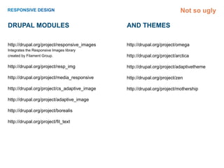
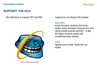
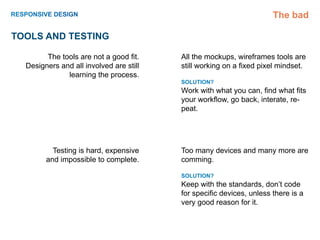
João Belchior ( Jolidog )

ISCTE Junho 2012
João Belchior ( Jolidog )


FULL TIME                           Freelance
music
                           legos

reading                                                  community

                      João Belchior ( Jolidog )
friends                                                    movies


                                                                     design


          KID                  Wife                        dog
                                              podcasts


                sleeping
SO...
The good

Seeds

                                              2000          ...   2010
             The control which designers know
          in the print medium, and often desire
                                                                  An event apart
        in the web medium, is simply a function
            of the limitation of the printed page.
                                                                  Ethan Marcotte
           We should embrace the fact that the
         web doesn’t have the same constraints,
                     and design for this flexibility.             Responsive Webdesign
         But first, we must “accept the ebb and
                                   flow of things.”
                    - John Allsopp, “A Dao of Web Design”


                  http://www.alistapart.com/articles/dao/         http://www.alistapart.com/articles/responsive-web-design/
The good

RESPONSIVE
     Design and development that responds to
     the behavior of the user and the context
     (screen size, platform and orientation).

     Join layout, flexible grids, fluid images and
     CSS3 media queries.
The good

WHY
      Mobiles and tablets will outnumber
      desktops very quickly.

      More people are connecting to the web ex-
      clusively on these devices.

      Avoid a new development phase every time
      a new device is launched.

      Mobile users are not on the go.

      Mobile devices don’t have limited connec-
      tions.
The good

how
      RETHINK YOUR CONTENTS
      Adopt a mobile first approach, clean up the cluter.

      GRIDS

       FIXED
       http://lessframework.com/

       FLUIDS
       http://www.alistapart.com/articles/responsive-web-design/


      IMAGES AND VIDEOS
      max-width: 100%;
      http://www.alistapart.com/articles/fluid-images/


      MEDIA QUERIES
      CSS3 Module


      JAVASCRIPT
      http://code.google.com/p/css3-mediaqueries-js/
      https://github.com/scottjehl/Respond
The good

FIXED GRIDS EXAMPLES

                    http://hicksdesign.co.uk/


        http://www.informationarchitects.jp/


                   http://thinkvitamin.com/


                       http://css-tricks.com/


                         http://fidibiko.com/


    shameless plug
The good

FLEXIBLE EXAMPLE
          http://www.bostonglobe.com/
The good


Core is slow... but contrib is fast!
Not so ugly

Drupal Modules                                And themes

http://drupal.org/project/responsive_images   http://drupal.org/project/omega
Integrates the Responsive Images library
created by Filament Group.                    http://drupal.org/project/arctica

http://drupal.org/project/resp_img            http://drupal.org/project/adaptivetheme

http://drupal.org/project/media_responsive    http://drupal.org/project/zen

http://drupal.org/project/cs_adaptive_image   http://drupal.org/project/mothership

http://drupal.org/project/adaptive_image

http://drupal.org/project/borealis

http://drupal.org/project/fit_text
The good

Other Resources

RESPONSIVE WEB DESIGN BY ETHAN MAR-
COTTE
http://www.abookapart.com/products/responsive-web-
design


HARDBOILED WEB DESIGN BY ANDY CLARKE
http://hardboiledwebdesign.com
The bad

Support the old

 We still have to support IE7 and IE8              respond.js not always the answer

                                                   SOLUTION?
                                                   every browser receives the base
                                                   styles, every browser receives the rest
                                                   using media queries and IE7 - 8 get
                                                   the large screens styles with
                                                   conditional style sheets.

                                                   CONS:
                                                   repeat some code, fractured css
                                                   styles.


               IE9 is actually a good browser...
The bad

When to DELIVER

       Finding out when to load   There is a race condition for the first
                 bigger images    page load, you want to query the de-
                                  vice size but the dom is loading and
                                  images downloading.

                                  Browsers are preloading pages before
                                  cookies are set.

                                  What to do when there is no js

                                  SOLUTION?
                                  https://github.com/tubalmartin/riloadr

                                  CONS:
                                  Browsers without js get a <noscript>
                                  tag with the smallest image size.
                                  Mobile first approach
The bad

TOOLS and TESTING

        The tools are not a good fit.    All the mockups, wireframes tools are
  Designers and all involved are still   still working on a fixed pixel mindset.
              learning the process.
                                         SOLUTION?
                                         Work with what you can, find what fits
                                         your workflow, go back, interate, re-
                                         peat.


          Testing is hard, expensive     Too many devices and many more are
        and impossible to complete.      comming.

                                         SOLUTION?
                                         Keep with the standards, don’t code
                                         for specific devices, unless there is a
                                         very good reason for it.
Let’s look at some code...
But first some context!
Like an AP or Reuters, but with
                  community of locals on the ground
                  instead of staffers.

                  Based on the principles of freedom of
                  speech and freedom of information.

                  Clients all over the world.

                  We don’t keep the copyright and devide
                  our sales 50/50 with our contributors.
www.demotix.com
Tech team as 4 backend developers.   1.5 million page views

One frontend developer.              30.000+ Registered users

Very tight deadlines.                6.000+ Active contributors

Working on Drupal 6.                 1200 images a day from every country
                                     recognized by the UN and a few more

                                     Almost 1.200.000 nodes
Not so ugly

The Actual process


 Wireframes    Design    Prototype   Move into drupal


                                           Test
               Iterate


                                         Release
Not so ugly


ok, ok, the code...
Thank you!
                                Questions?

                                João Belchior ( Jolidog )
not the dog
 in jolidog                     d.o user/347132
                                jbelchior@fidibiko.com
                                http:// fidibiko.com


              www.demotix.com

Responsive Design - ISCTE

  • 1.
    João Belchior (Jolidog ) ISCTE Junho 2012
  • 2.
    João Belchior (Jolidog ) FULL TIME Freelance
  • 3.
    music legos reading community João Belchior ( Jolidog ) friends movies design KID Wife dog podcasts sleeping
  • 4.
  • 5.
    The good Seeds 2000 ... 2010 The control which designers know in the print medium, and often desire An event apart in the web medium, is simply a function of the limitation of the printed page. Ethan Marcotte We should embrace the fact that the web doesn’t have the same constraints, and design for this flexibility. Responsive Webdesign But first, we must “accept the ebb and flow of things.” - John Allsopp, “A Dao of Web Design” http://www.alistapart.com/articles/dao/ http://www.alistapart.com/articles/responsive-web-design/
  • 6.
    The good RESPONSIVE Design and development that responds to the behavior of the user and the context (screen size, platform and orientation). Join layout, flexible grids, fluid images and CSS3 media queries.
  • 7.
    The good WHY Mobiles and tablets will outnumber desktops very quickly. More people are connecting to the web ex- clusively on these devices. Avoid a new development phase every time a new device is launched. Mobile users are not on the go. Mobile devices don’t have limited connec- tions.
  • 8.
    The good how RETHINK YOUR CONTENTS Adopt a mobile first approach, clean up the cluter. GRIDS FIXED http://lessframework.com/ FLUIDS http://www.alistapart.com/articles/responsive-web-design/ IMAGES AND VIDEOS max-width: 100%; http://www.alistapart.com/articles/fluid-images/ MEDIA QUERIES CSS3 Module JAVASCRIPT http://code.google.com/p/css3-mediaqueries-js/ https://github.com/scottjehl/Respond
  • 9.
    The good FIXED GRIDSEXAMPLES http://hicksdesign.co.uk/ http://www.informationarchitects.jp/ http://thinkvitamin.com/ http://css-tricks.com/ http://fidibiko.com/ shameless plug
  • 10.
    The good FLEXIBLE EXAMPLE http://www.bostonglobe.com/
  • 11.
    The good Core isslow... but contrib is fast!
  • 12.
    Not so ugly DrupalModules And themes http://drupal.org/project/responsive_images http://drupal.org/project/omega Integrates the Responsive Images library created by Filament Group. http://drupal.org/project/arctica http://drupal.org/project/resp_img http://drupal.org/project/adaptivetheme http://drupal.org/project/media_responsive http://drupal.org/project/zen http://drupal.org/project/cs_adaptive_image http://drupal.org/project/mothership http://drupal.org/project/adaptive_image http://drupal.org/project/borealis http://drupal.org/project/fit_text
  • 13.
    The good Other Resources RESPONSIVEWEB DESIGN BY ETHAN MAR- COTTE http://www.abookapart.com/products/responsive-web- design HARDBOILED WEB DESIGN BY ANDY CLARKE http://hardboiledwebdesign.com
  • 14.
    The bad Support theold We still have to support IE7 and IE8 respond.js not always the answer SOLUTION? every browser receives the base styles, every browser receives the rest using media queries and IE7 - 8 get the large screens styles with conditional style sheets. CONS: repeat some code, fractured css styles. IE9 is actually a good browser...
  • 15.
    The bad When toDELIVER Finding out when to load There is a race condition for the first bigger images page load, you want to query the de- vice size but the dom is loading and images downloading. Browsers are preloading pages before cookies are set. What to do when there is no js SOLUTION? https://github.com/tubalmartin/riloadr CONS: Browsers without js get a <noscript> tag with the smallest image size. Mobile first approach
  • 16.
    The bad TOOLS andTESTING The tools are not a good fit. All the mockups, wireframes tools are Designers and all involved are still still working on a fixed pixel mindset. learning the process. SOLUTION? Work with what you can, find what fits your workflow, go back, interate, re- peat. Testing is hard, expensive Too many devices and many more are and impossible to complete. comming. SOLUTION? Keep with the standards, don’t code for specific devices, unless there is a very good reason for it.
  • 17.
    Let’s look atsome code...
  • 18.
  • 19.
    Like an APor Reuters, but with community of locals on the ground instead of staffers. Based on the principles of freedom of speech and freedom of information. Clients all over the world. We don’t keep the copyright and devide our sales 50/50 with our contributors. www.demotix.com
  • 20.
    Tech team as4 backend developers. 1.5 million page views One frontend developer. 30.000+ Registered users Very tight deadlines. 6.000+ Active contributors Working on Drupal 6. 1200 images a day from every country recognized by the UN and a few more Almost 1.200.000 nodes
  • 21.
    Not so ugly TheActual process Wireframes Design Prototype Move into drupal Test Iterate Release
  • 22.
    Not so ugly ok,ok, the code...
  • 23.
    Thank you! Questions? João Belchior ( Jolidog ) not the dog in jolidog d.o user/347132 jbelchior@fidibiko.com http:// fidibiko.com www.demotix.com