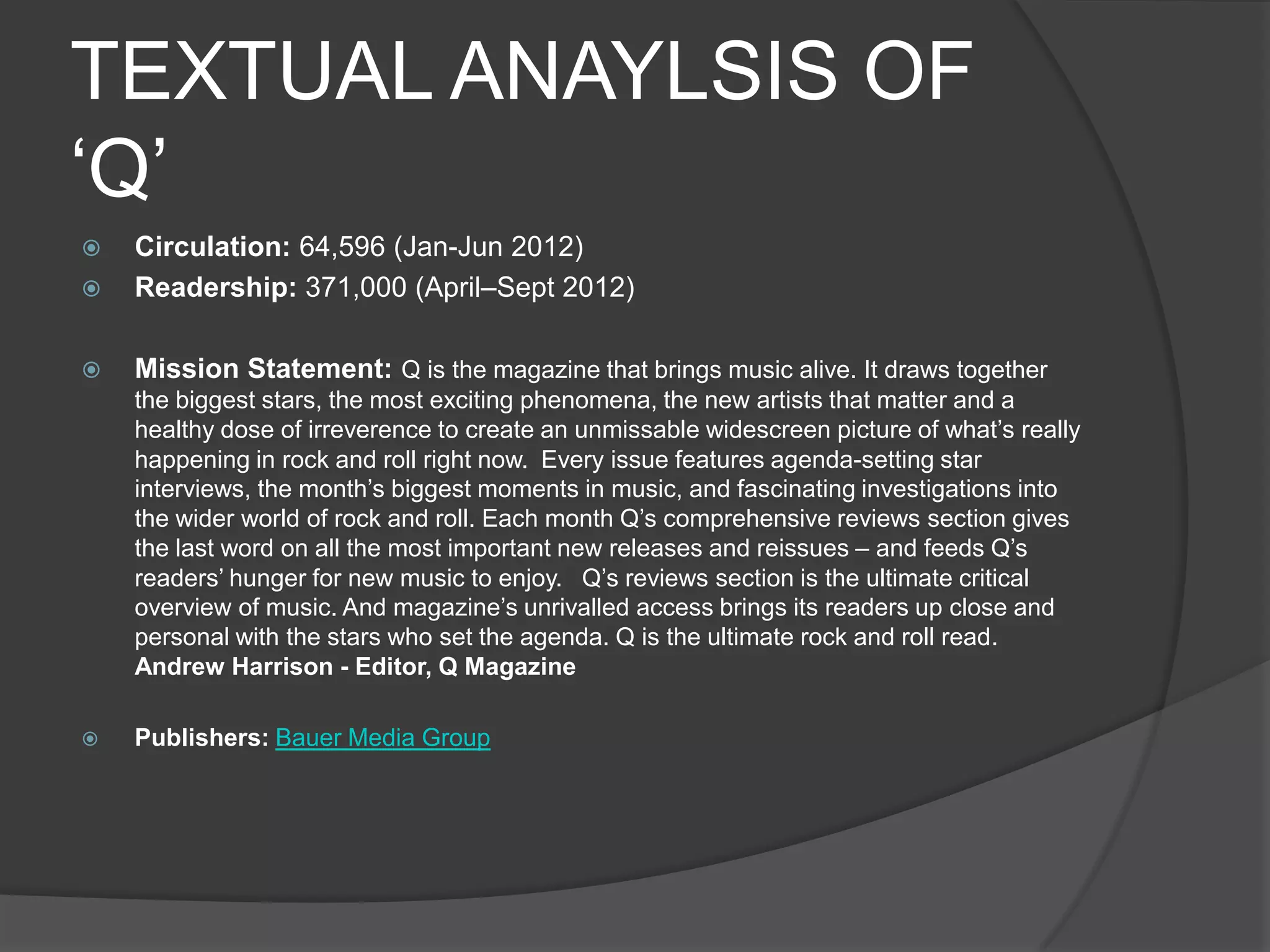
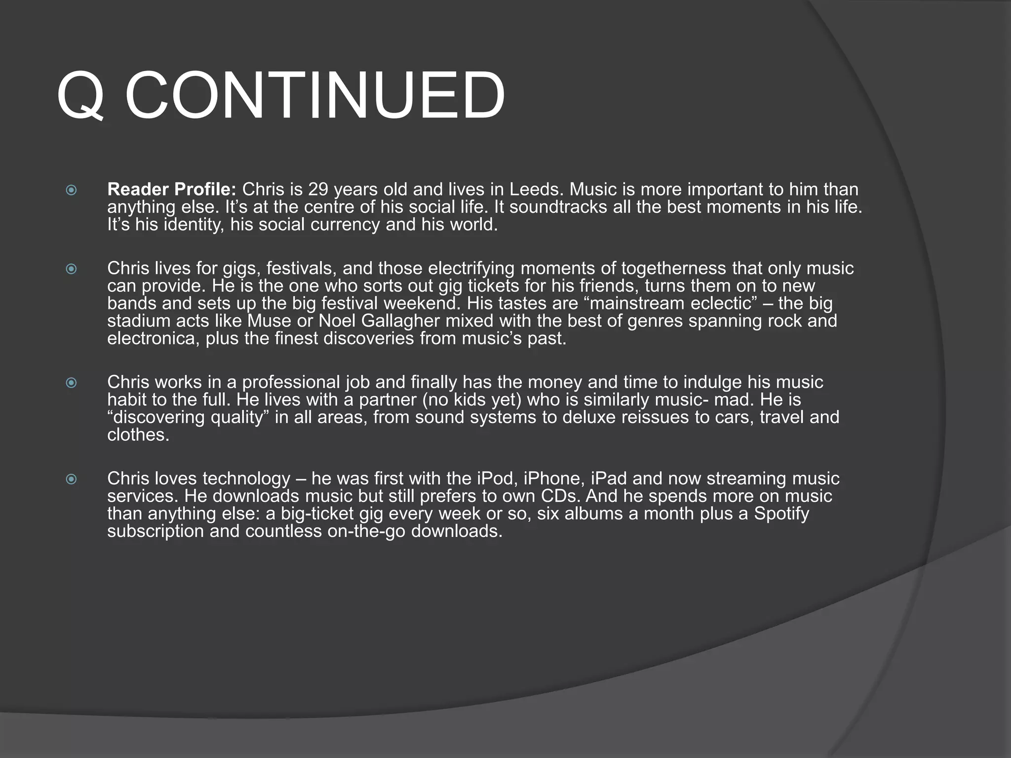
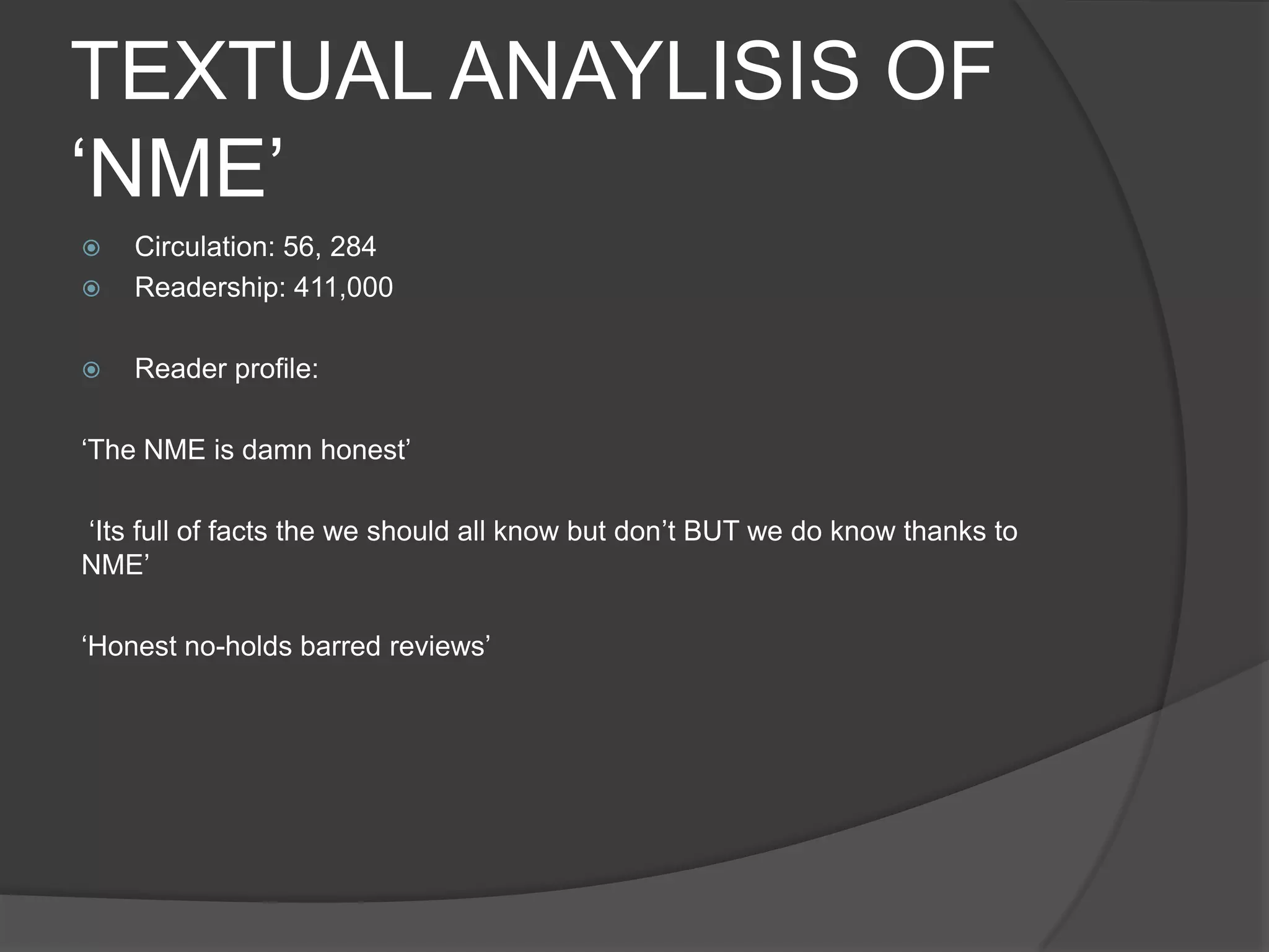
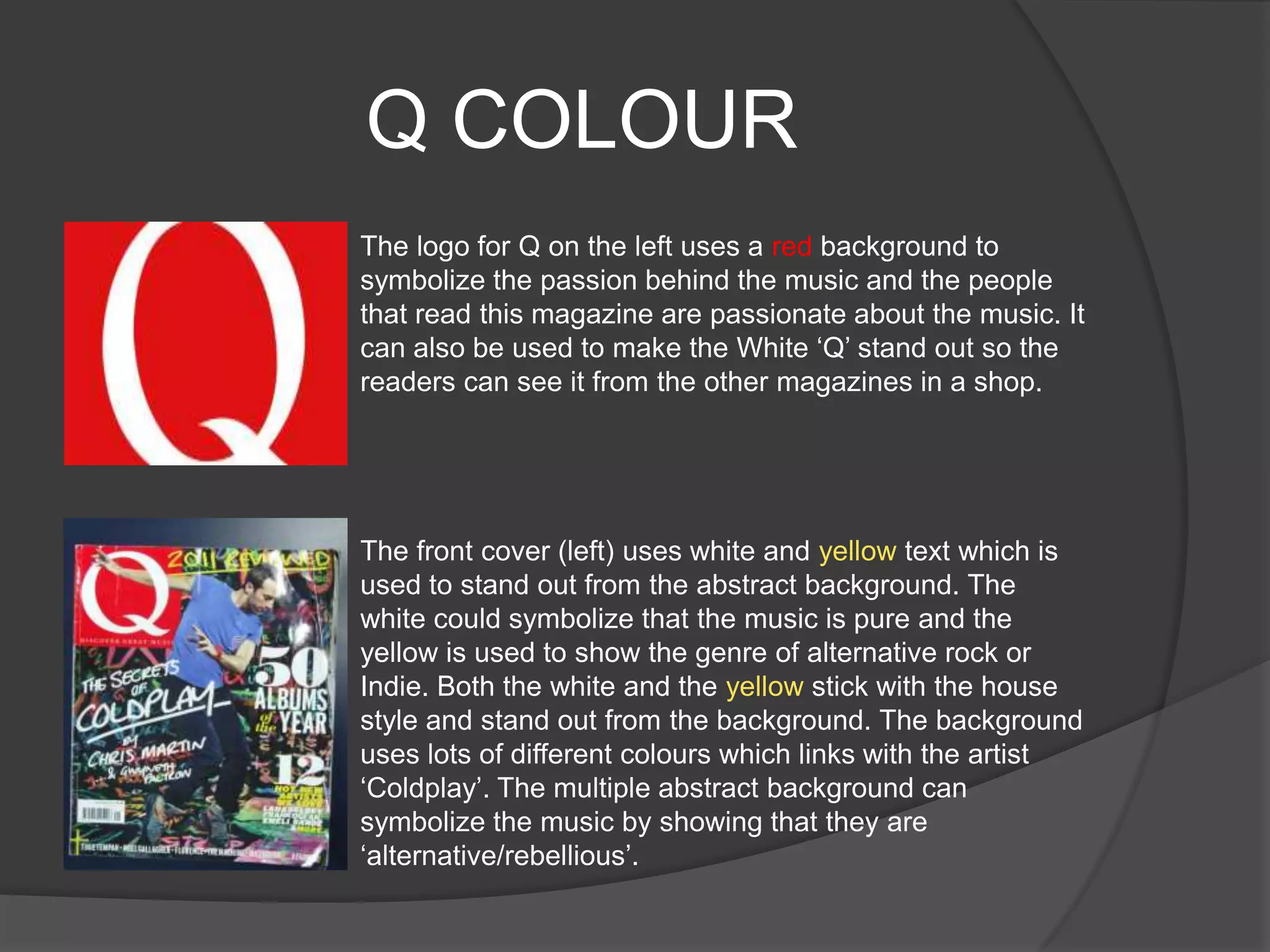
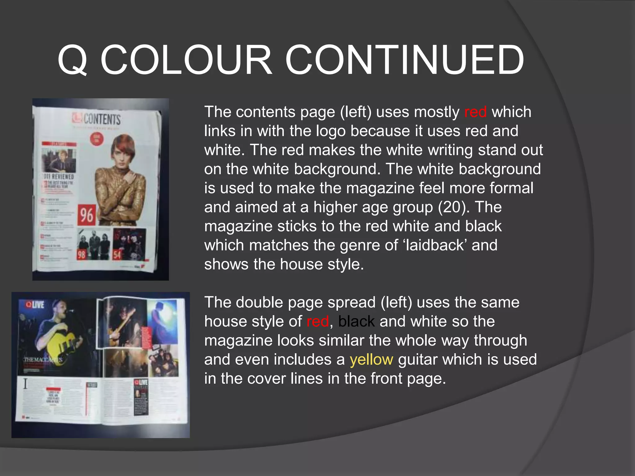
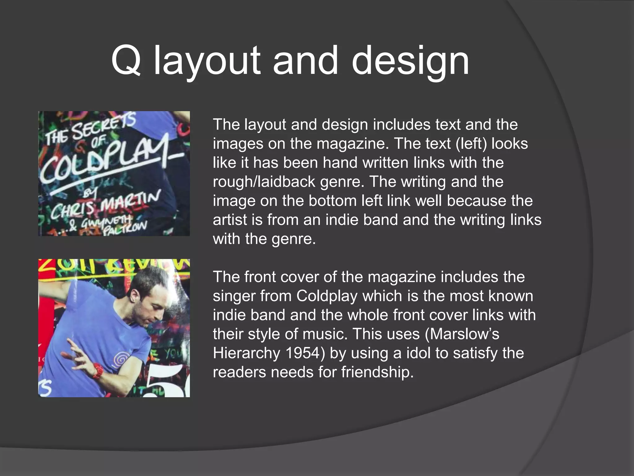
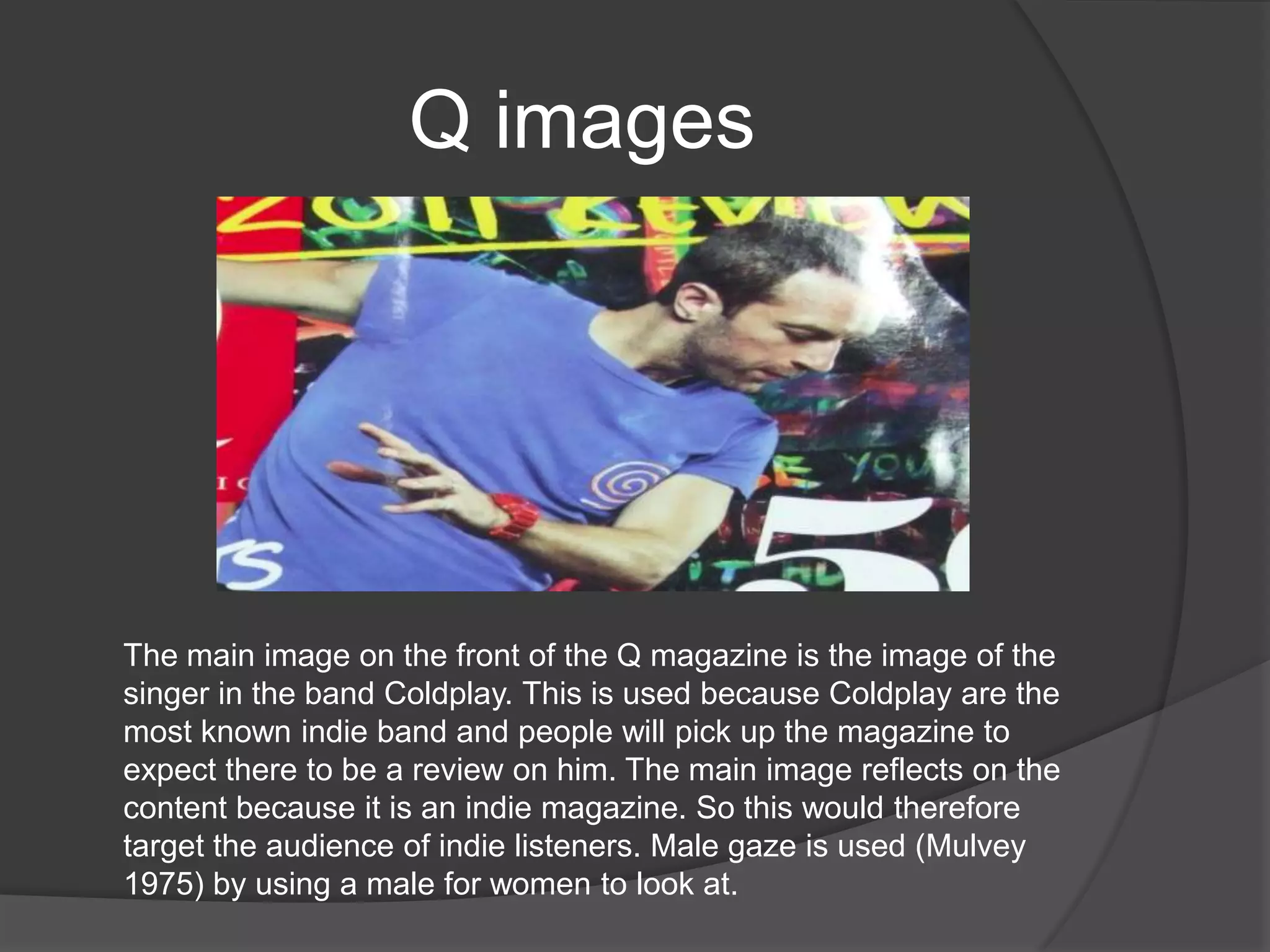
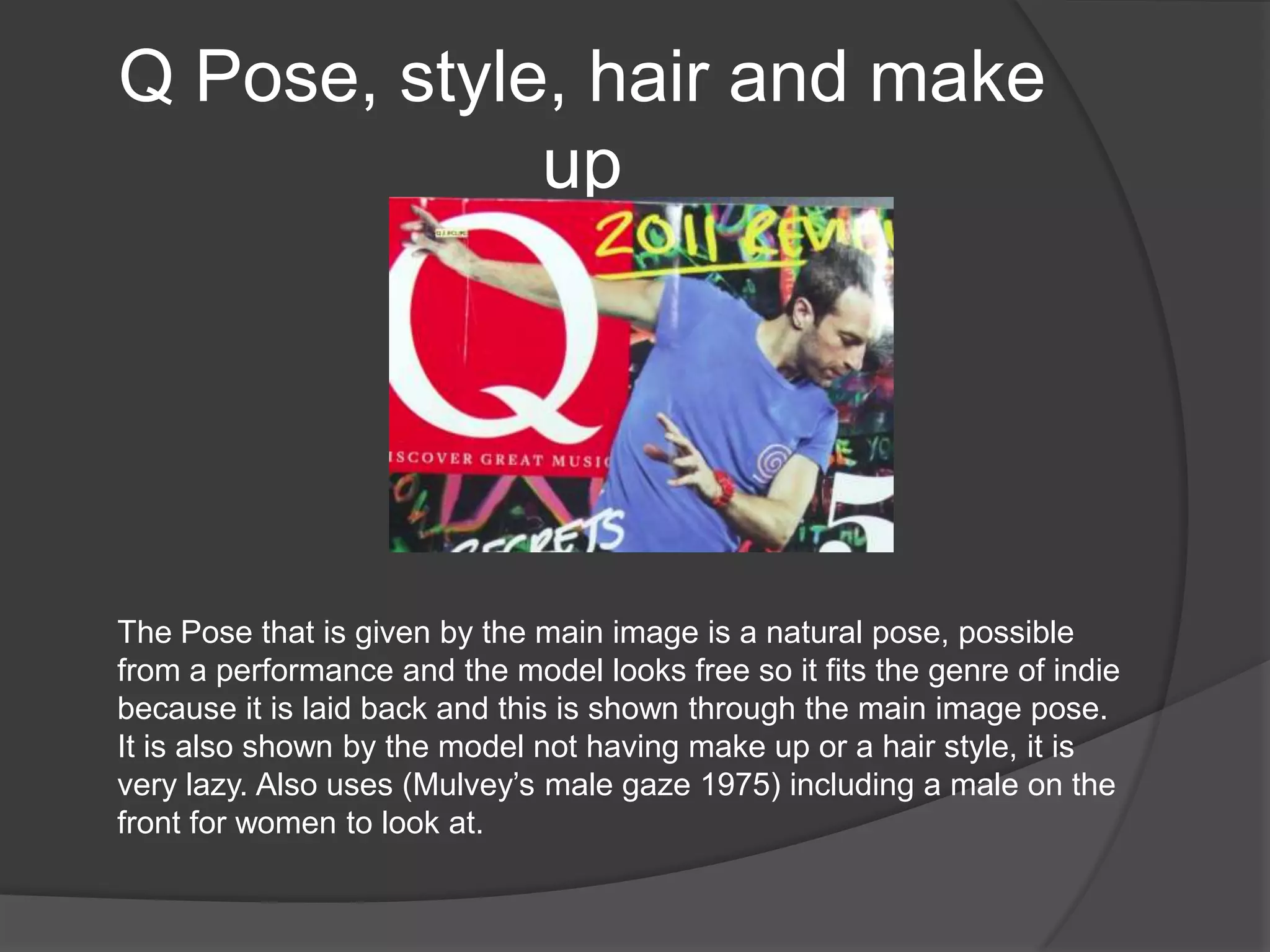
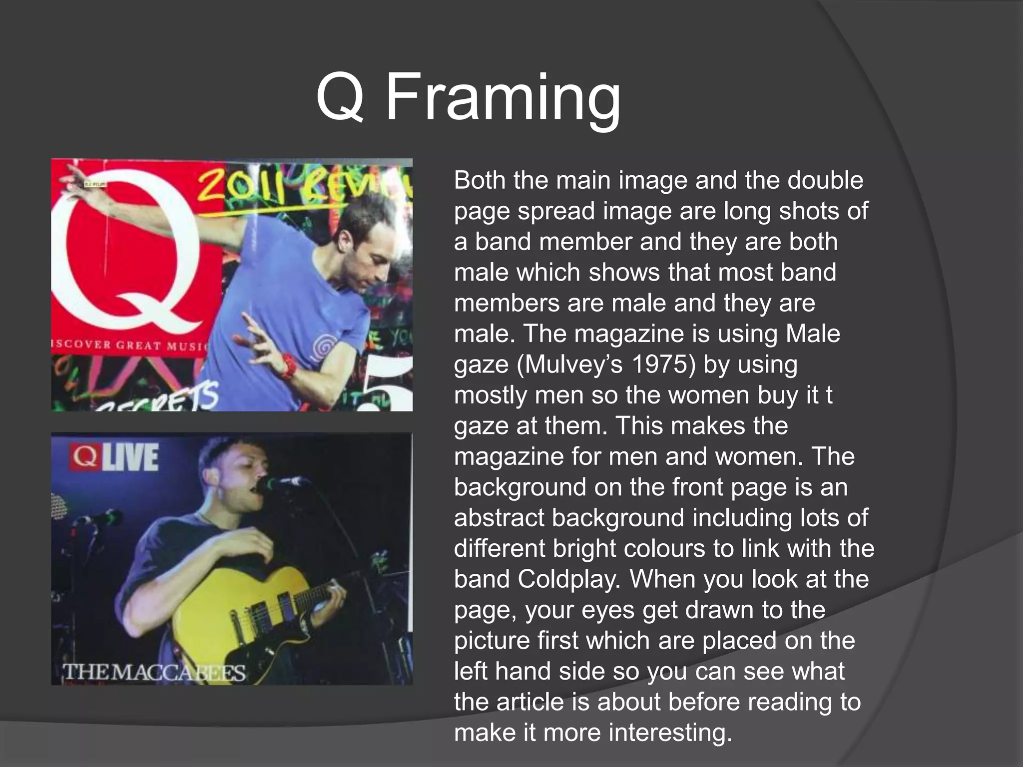
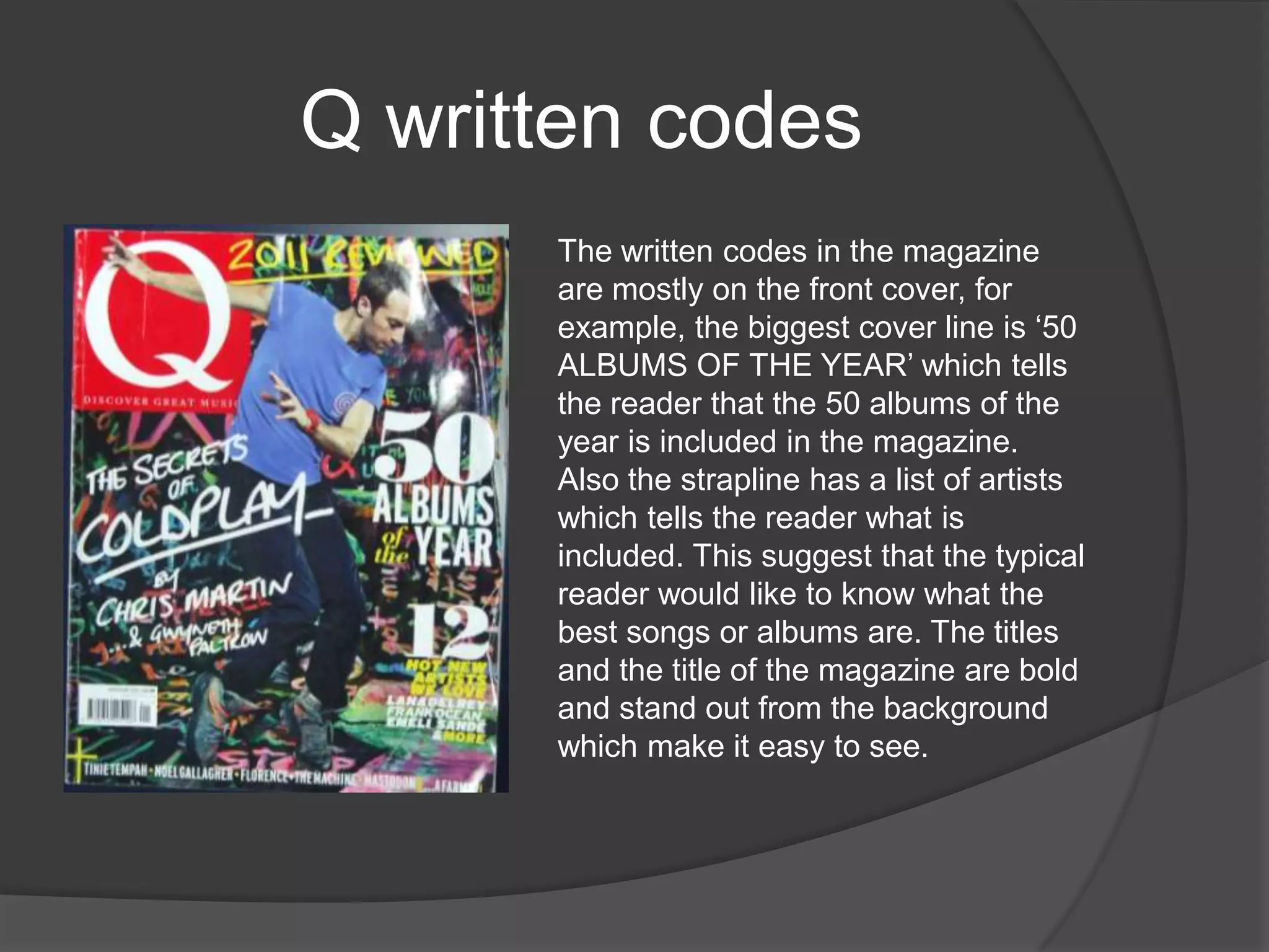
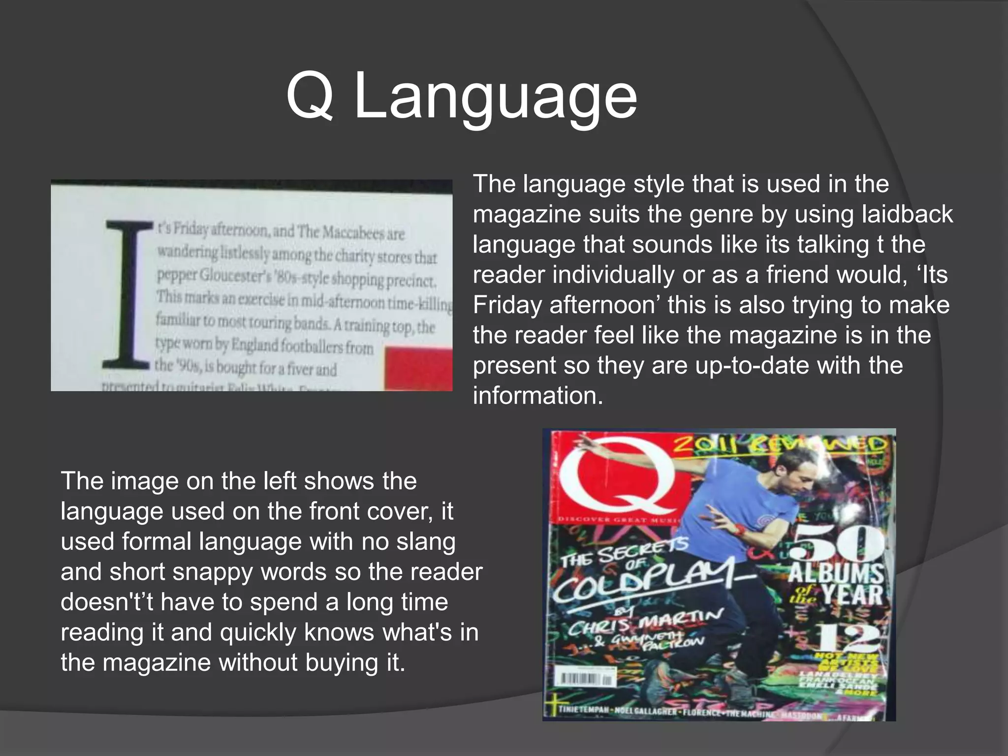
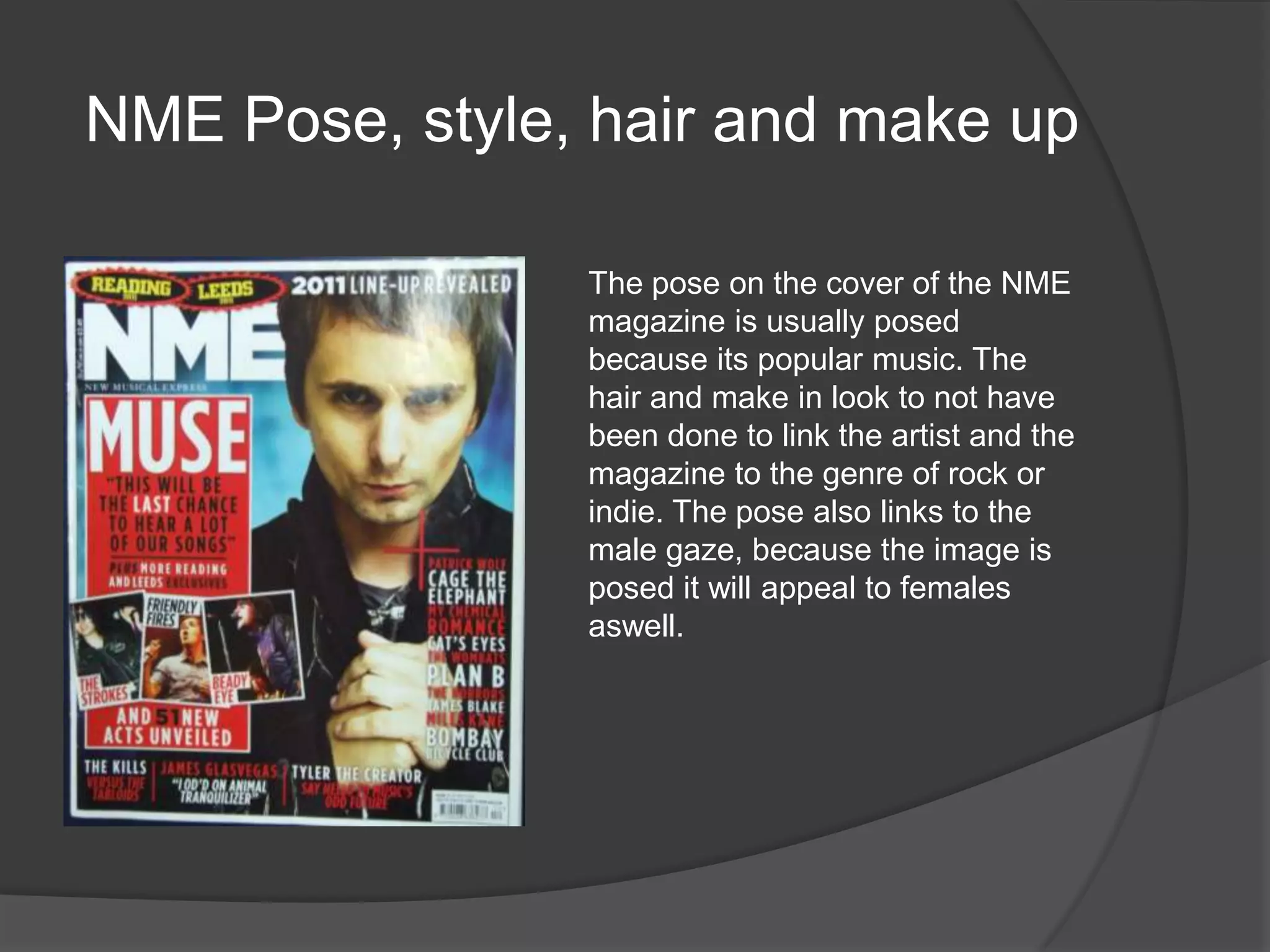
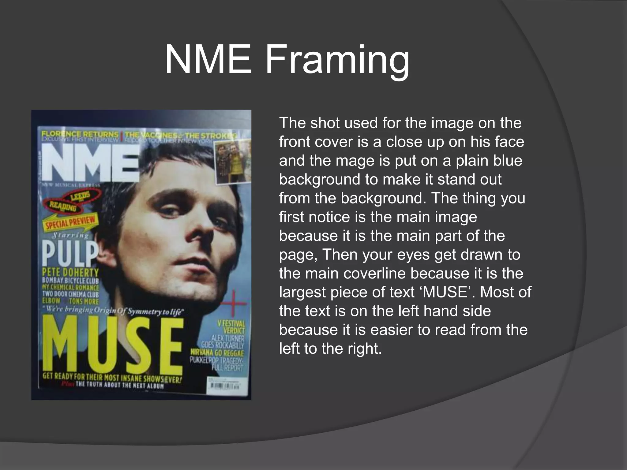
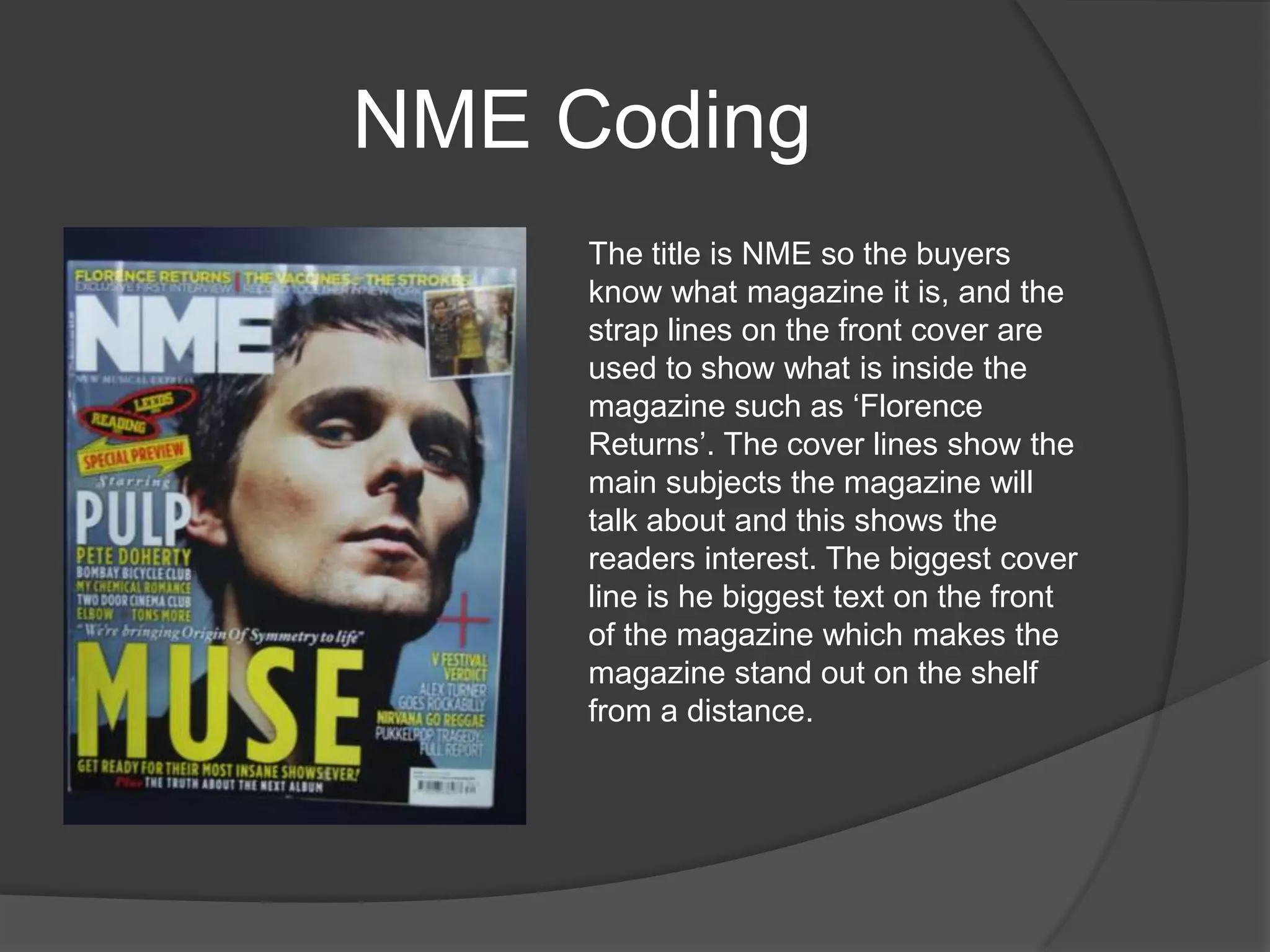
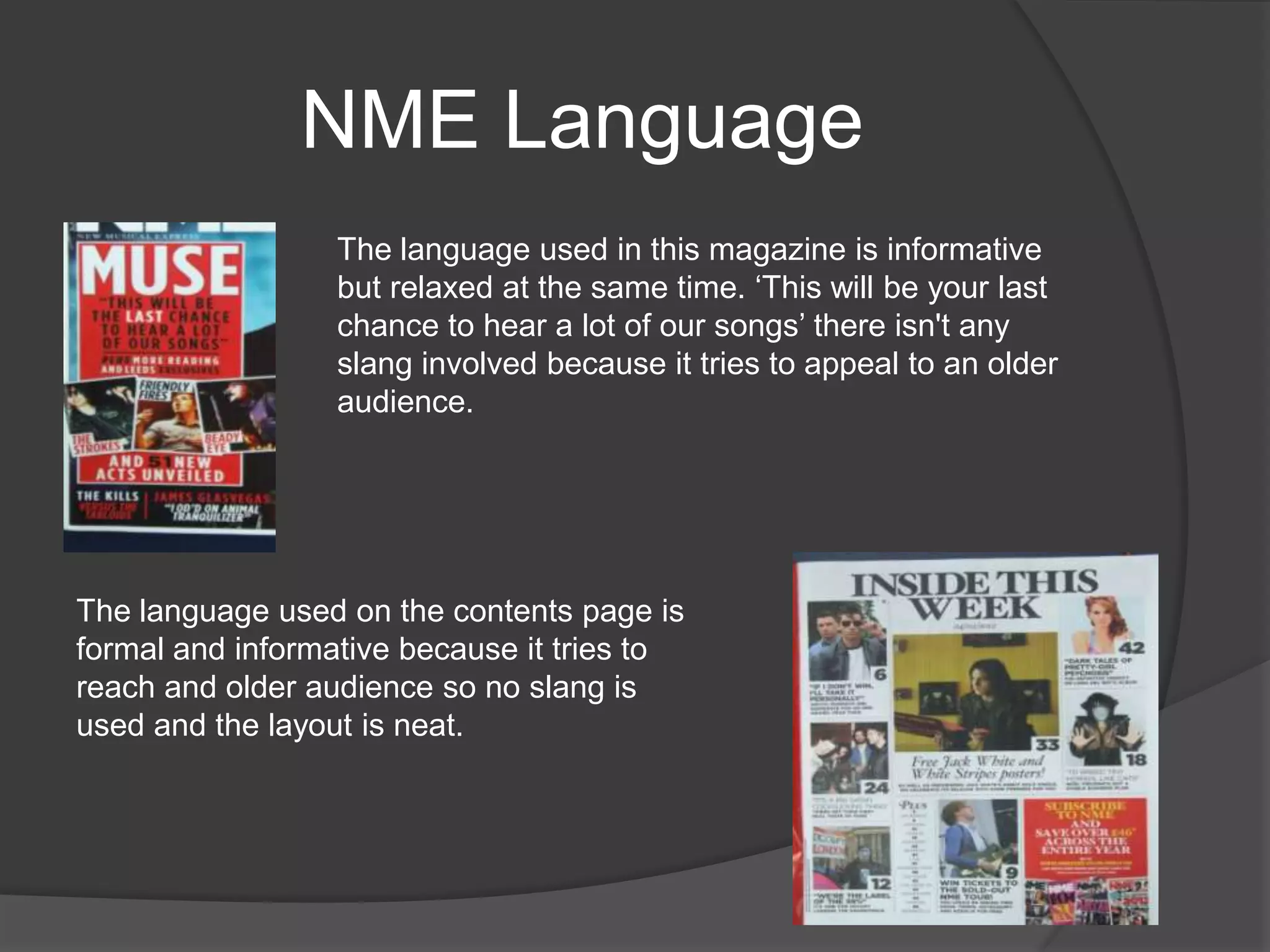
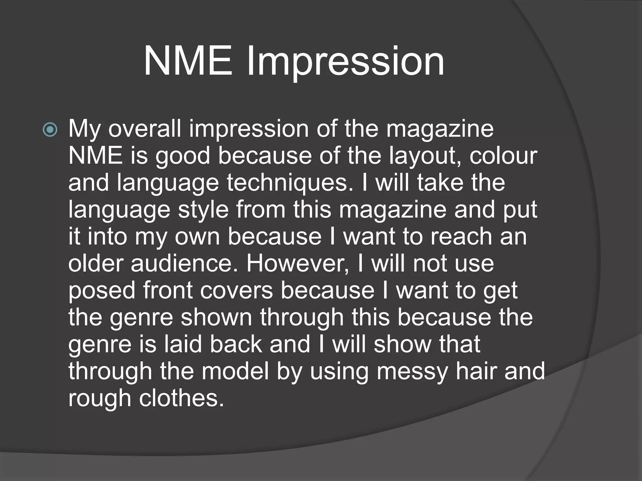
The document provides a textual analysis of the magazines Q and NME. It analyzes their circulation numbers, mission statements, publishers, target audiences, and use of images, language, layout and design. For both magazines, the target audience is music enthusiasts in their late teens to late 20s, and the magazines aim to keep readers informed on the latest music and connect them to their favorite artists through in-depth interviews and reviews. Visual elements like covers, photos and color palettes are designed to attract readers and align with the magazines' rock/indie genres.
The magazine uses specific design elements and colors to attract and engage readers. Red is prominently featured in logos and headers to make elements stand out. Photos are carefully selected to represent the artists and intrigue readers based on music interests. Descriptions provide just enough information to entice learning more. The layout balances white space with relevant content divided into columns for easy reading. Overall the magazine employs intentional design and formatting to draw in readers and market featured musicians.
This document provides an analysis of the cover and contents pages of the Hip-Hop Weekly magazine. On the cover, there are many images of famous rappers which would attract fans. However, the design is described as "hectic" and not very mature. The contents pages layout is praised for clearly showing the stories and sections in an organized manner. The double page spread about Eazy-E is analyzed positively for using iconic black-and-white images of Eazy-E and his son that would appeal to fans, along with a well-organized text layout of the interview.
The document provides an analysis of the front covers and contents pages of two pop music magazines: "Billboard" and "We Love Pop". It discusses the iconic images and signs used on the magazines to appeal to their target audiences. These include prominent pop stars and symbols of femininity. Color schemes and layouts are also examined and related to whether the magazines are aimed more at male or female readers. Both preferred and opposing readings of the magazine covers are considered in terms of the messages they convey about the music industry and role models.
Music magazine reaserch and ideas annabel luceybell101
The document summarizes and compares the covers, contents pages, and sample spreads of several music magazines, including Vibe, NME, Kerrang, Blender, Rolling Stone, and FHM. Key details noted include the target audiences, masthead designs, color schemes, layouts, and types of music featured in each publication. Across magazines, common elements included centering cover images and using colors and fonts that relate to the featured music genres. Differences were also highlighted, such as magazines including one or two cover stars and the use of more or less text in sample spreads.
The document summarizes magazine covers and contents pages for two pop music magazines - "Billboard" and "we love pop". It analyzes iconic images of pop stars on the covers that would be recognizable to the target audience. Color schemes and layouts are also described as appealing to younger female readers. Both preferred and opposing readings are given, such as the magazines portraying positive role models but also unrealistic standards of appearance.
Media cw music magazine reaserch and ideas annabel luceybell101
The document summarizes and compares the covers, contents pages, and sample article spreads of several music magazines, including Vibe, NME, Kerrang, Blender, Rolling Stone, and FHM. Key details noted include the target audiences, visual styles, mastheads, color schemes, and genres of music covered for each magazine. The FHM magazine covers and spreads primarily feature scantily-clad female celebrities to appeal to its male readership.
The document analyzes several music magazines, describing their target audiences, layouts, and content. It finds that NME is the most popular magazine, readers prefer a mixture of pictures and text on double page spreads, and they expect to see the UK Top 40 chart. Research shows the target reader is interested in R&B, spends £2-3 on magazines, and is attracted to magazines based on their front covers.
The document summarizes and compares the covers, contents pages, and sample spreads of several music magazines, including Vibe, NME, Kerrang, Blender, Rolling Stone, and FHM. Key details noted include the target audiences, masthead designs, color schemes, layouts, and types of music featured in each publication. Across magazines, common elements included centering cover images and using colors and designs that relate to the genres of music discussed.
The document provides details about various music magazines, including their target audiences, layouts, and content. It analyzes the covers, contents pages, and double page spreads of magazines like Vibe, Kerrang, NME, Blender, Rolling Stone, and FHM. Key findings are that NME is the most popular magazine, readers prefer a mixture of pictures and text on double page spreads, and covers and content most attract readers to buy a magazine.
- Q Magazine targets educated professionals aged 34 with over 70% falling in the ABC1 socioeconomic group. It has a circulation of 130,179 and readership of 550,000.
- Mojo Magazine also targets educated professionals with an average age of 37. It has a lower circulation of 91,678 but higher readership of 218,000 who are also likely to purchase music.
- In contrast, NME targets younger readers, with 42% being students and an average age of 23. It has the lowest circulation of 33,875 but high readership of 325,000. It appeals to this demographic with colorful graphics and photos on its covers.
The document discusses plans for a pop music magazine. It will be called "Pop Vibes" and cost £1.70. It will be published weekly to appeal to its target audience of 15-25 year olds who spend a lot on music each month. The magazine will have a simple, stylish layout with clear hierarchy. Sample articles and photos are included to showcase the planned style and content which will focus on pop artists, their music, and videos.
The document analyzes the layout and design of magazine covers and contents pages. Key points discussed include:
- Magazine covers use large, centered images and mastheads to draw attention to the main artist or topic. Fonts, colors and photographic styles are chosen to represent and appeal to the target audience.
- Contents pages categorize articles clearly and include images and page references to highlight featured artists or topics. Formats are designed for readability and to interest and inform readers.
- Analyses consider visual elements like fonts, positioning, sizing and color contrasts that impact branding and audience. Discussions provide insights into designing for different age groups and styles of music coverage.
The document discusses research conducted on the audience for a proposed magazine about 1980s music. A survey was distributed on various forums and websites. The results showed that the target audience spans ages 13-19 and 31+, with most interest in the US and UK. Popular 1980s artists like Michael Jackson, Madonna, and Blondie should be featured. Analysis of existing magazines like Q and Mojo found they appeal to both older and younger audiences through their mix of content and designs. Further research on cover designs, readership profiles, and content breakdowns was summarized to inform the planning of the new 1980s music magazine.
RESEARCH AND PLANNING - Music magazine analysisSydneyIsittAger
Both Q magazine and We Love Pop magazine target different audiences through their design choices. Q magazine uses a more mature red color scheme and formal text to appeal to older readers, while We Love Pop uses bright colors and informal, multi-colored text to seem fun and attract younger audiences. The magazines also differ in the types of stories covered, with Q focusing on music backgrounds and We Love Pop emphasizing gossip, as well as the images used on covers and inside pages.
This document summarizes and analyzes various music magazines from the 1980s and 2000s to research styles for a new magazine being created about 1980s music acts making a comeback. Several magazines are examined, including issues of Billboard from 2005 and 1986, No. 1 from the 1980s, and Smash Hits from 2009. Key aspects analyzed include color schemes, photography, writing styles, layouts, and the implied target audiences. Overall, the research aims to understand magazine conventions from different eras to inform the design of a modern special edition focused on 1980s music.
The magazine cover uses bright pink and black colors to appeal to teenagers interested in pop/indie music. A photo of the indie band Foals is featured, with the band having serious expressions, suggesting they are talented but understated. The bold, colorful fonts are eye-catching to the target audience.
This document provides a summary of the key elements and layout of the NME (New Musical Express) magazine cover and inside pages.
The NME cover focuses on the return of the British rock band Pulp with a large black and white photo of lead singer Jarvis Cocker. Additional headlines advertise articles on Liam Gallagher, new albums from My Chemical Romance and Kanye West, and student riots. The simple one-photo layout emphasizes that Pulp is an important enough band to be the sole focus.
Inside, the content page continues the minimalist black, white and red color scheme. It features more photos than text to appeal to teenage readers. Article previews use quotes as headlines and provide context in
The magazine cover features Jake Bugg looking directly at the camera with a stern expression to seem serious and connect with readers. The main story is about him giving up alcohol at age 18, which would attract readers with its personal nature. Other design elements aim to position the magazine as rebellious and promote its target artists, including the informal name "NME", bold colors, and taglines about bands like Nirvana. Overall the cover design strives to intrigue and attract readers through personal stories, prominent images and text, and associations with featured rebellious musicians.
This double page spread in NME magazine features the band The Teenagers. The large main image shows the band casually laying on a bed in a messy bedroom, reflecting their youthful and laidback style. Blue is the dominant color used, representing the indie genre. The title uses a bold retro font that relates to the band's name. The article aims to connect with young readers by discussing the band's sexual references and use of language typically associated with teenagers. Overall, the layout and design elements aim to attract NME's target audience by representing the indie scene and establishing a connection to the featured band.
This document summarizes a double page spread from NME magazine featuring the band The Vaccines. The summary includes:
- The large main image of the band takes up the first page and quarter of the second page, representing its importance.
- The colors blue, black and white are used throughout to represent the indie genre and maintain the magazine's brand identity.
- The article provides insight into the band's increased popularity and short, catchy songs unlike other bands.
The magazine cover features a provocative image of Beyoncé dripping wet in a suggestive pose. The masthead runs across the top in bold red font, and the lead article discusses Beyoncé "stripping down". The target audience is young males interested in hip hop and R&B. Imagery and articles aim to sell artists' sex appeal while staying within the bounds of suggestive rather than explicit content.
The document provides an analysis of the design elements and signifiers used on the front covers of rock and pop music magazines. It examines features like the masthead, headline, cover lines, images, colors and slogans and how they signify the genre of the magazine as either rock or pop. For the rock magazine cover, it identifies dark colors, images of artists with long hair and dark makeup, and content about touring and new artists as signifying the rock genre. For the pop magazine, it finds brighter colors, an image of a pop artist, gossip-focused content and a slogan about getting to the chorus as signifying a focus on pop music.
The document analyzes magazine covers and contents pages. It finds that covers typically feature prominent images of artists and use bold red text for the magazine name. Contents pages inform readers about articles and use red text and images to highlight features. Double page spreads include both images and text about artists. Common conventions across magazines are identified, such as capitalized mastheads and inclusion of artist pictures.
The document analyzes and compares the covers of multiple music magazines. It notes that most covers use black, white and red as core colors. It also discusses similarities in photo angles and studio shots. The target audiences vary by genre but include dance, rock, and indie music fans. Layouts and amount of text differ by magazine as well. "Mix Mag" is described as more sophisticated than others that appear more cluttered.
This document summarizes a magazine article about country music artist Trace Adkins. The main image takes up a full page and shows Adkins wearing a cowboy hat, a symbol of country music. At the top it says "fan exclusive," appealing to readers by making them feel special. Throughout the article there is a consistent green and white color scheme reflecting the calming nature of country music. The masthead font is blurred and words faded, suggesting Adkins' long career while the white text represents the purity and future of his music.
The document analyzes the design elements of the front cover, contents page, and double page spread of a magazine aimed at teenage girls. It finds that the typography, colors, images, layout, and language used are all conventional for the target audience and genre. Sans serif fonts, pink and yellow colors, photos of pop stars, an eye-catching layout, and informal language create a magazine that will appeal to its young, female readers. Key visual elements like mastheads and article titles are emphasized to easily guide the audience through the publication.
El documento describe los pasos para buscar información en la base de datos PubMed y guardar referencias en el programa Refwork. Primero, se prepara una estrategia de búsqueda utilizando operadores booleanos, truncamientos y traducciones al inglés. Luego, se escribe la estrategia en el buscador de PubMed para obtener resultados. Se seleccionan referencias de interés y se envían a Refwork para guardarlas. Finalmente, se importan las referencias a Refwork para organizar y acceder a los textos completos.
La caja fuerte del fin del mundo ( j.a.r.) &&&Miguel Cervera
LO MEJOR QUE HE VISTO ULTIMAMENTE. LA DESPENSA MUNDIAL. UNA GIGANTESCA RESERVA DE SEMILLAS DE TODO EL MUNDO PARA LOS CASOS EN QUE SE NECESITAR REPOBLAR LA TIERRA DEBIDO A UNA CATÁSTROFE NATURAL O ARTIFICIAL.
The focus group provided feedback on a music magazine's target audience, content, and design. For the target age range, 17-21 was deemed more appropriate than 16-21. The content was well-received overall, though some features like holidays were seen as more relevant to older readers. The color scheme and cover image were found suitable for appealing to the female target audience. Suggestions to improve the magazine included adding more cover features and varying the photos more. Ratings for the magazine ranged from 8 to 9.5 out of 10.
The document provides information about two music magazines: Q Magazine and NME Magazine. It summarizes their circulation numbers, readership demographics, mission statements, and reader profiles. It also describes the publishers - Bauer Media Group for Q Magazine and IPC Publishing for NME Magazine. Finally, it analyzes aspects of a sample front cover of Q Magazine such as layout/design, images used, and written codes like cover lines. In summary, the document compares the two magazines and provides a textual analysis of a Q Magazine cover.
The document discusses how the media product adheres to and challenges conventions of real music magazines. It summarizes how the front cover follows conventions like title positioning but challenges font conventions. The contents page challenges conventions by including images with listings but maintains conventions like two-color descriptors. The double page spread mainly follows conventions like column structure and justified text but develops conventions like large drop caps. Overall, the media product aims to balance familiarity through adhering to conventions with uniqueness through selective challenges.
1. The document describes the narrator's experiences during their school holidays, including helping repair their grandparent's old house, spending time with family for holidays like Christmas and New Year's, and caring for their sick grandmother in the hospital.
2. They felt bored at times doing ordinary activities at home but found ways to entertain themselves like playing sports with friends.
3. One holiday was made sad by the loss of their beloved grandmother who they cared for in the hospital for a month before she passed away.
The document discusses the improvements made from the preliminary magazine task to the final product. Specifically, it notes that the final magazine looks more professional with an actual background image compared to a graduated color previously. Additionally, the final magazine's color scheme, fonts, and cover lines are better tailored to the target audience. The document also reflects on learning how to better edit photos and manipulate text to maximize space. While some conventional elements like barcodes and prices remained the same, the overall quality was improved through more experimentation and understanding magazine conventions.
This document outlines three initial ideas for a magazine: a pop music magazine, an alternative rock magazine, and a dance music magazine. Peer feedback is provided for each idea. The feedback suggests that the alternative rock magazine idea has the most potential because the genre is popular but not overdone, while pop and dance magazines are too common. The final decision is to move forward with an alternative rock magazine, targeting ages 15-25, with a rough sketchy style but toned down for older readers, and featuring big indie artists.
The document provides details on the development of the front cover and contents page for a magazine. It describes how the creator flipped and edited an image for the front cover, added the title and slogans, and positioned coverlines and other elements like the barcode according to conventions. For the contents page, the creator designed the logo, added section headings and listings in a way to draw reader attention, and formatted elements consistently. Screenshots illustrate the steps taken in Photoshop to design and layout the pages.
This document discusses how the media product both uses conventions and challenges conventions of real music magazines.
It summarizes that the front cover keeps conventions like the title placement but challenges fonts. The contents page challenges conventions by including images but maintains conventions like two-colored listings.
The double-page spread mainly keeps conventions like column structure and font but develops conventions like large drop caps to draw attention, in line with the target audience of part-time workers and students.
The document outlines a photo shoot plan that includes:
1) Using a 16/17 year old female model to appear slightly older and be inspirational to target readers of a similar age.
2) Giving the model heavy eye makeup and messy curly hair against a natural setting like a field or forest with minimal props and clothing.
3) Photographing the model with a serious pose for the cover and another serious pose plus a natural laughing pose for inside pages to convey emotion and relate to the natural background.
James Rawlinson presents three initial ideas for a magazine to gain feedback:
1) A pop music magazine targeting 16-25 year olds with bold curvy fonts, artist biographies, and a male cover model to attract both genders.
2) An alternative rock magazine for 15-30 year olds with rough sketches, varied colors, and a group shot on the cover. It would include a feature on touring with a band.
3) A dance music magazine for 18-30 year olds with bright colors, artist biographies, and a female mid-shot on the cover to attract males. All magazines would have images on the right and writing on the left for double page spreads.
The document considers potential media distributors for a new music magazine. Bauer Media is discussed as a option because it already distributes the indie-focused magazine Q, but Q may also compete for the same audience. IPC is also considered as it has popular music magazines in Europe and distributes 350 million copies annually, though its indie-focused NME magazine could also compete. Ultimately, Bauer is selected as the best choice due to its stability and large reach in the UK and abroad, while recognizing the competition with Q but that Q has expanded beyond indie music.
The document summarizes research conducted to gain feedback on a proposed new magazine. A random sample and focus group provided input. The random sample provided large-scale primary research, while the focus group allowed for discussion. Most of the target audience is male, aged 16-21, students living in Harlow who enjoy music festivals and video games. Based on this, the magazine will feature these interests and be sold for £2.50 monthly in local shops, with promotions like iTunes gift cards. The chosen layout and features aim to appeal to this British, indie music-loving demographic.
The document provides details on the development of a magazine front cover and contents page. For the front cover, the creator flipped an image horizontally, adjusted its brightness, and added the magazine title and coverlines in different colors. They also included the barcode, price, and issue details. For the contents page, they formatted the listings and descriptors, added images and a pink box for the editor's note. They finalized both pages by continuing branding elements and ensuring readability.
This document outlines three initial ideas for a music magazine - focusing on pop music, alternative rock, and dance music. Feedback from peers is provided for each idea. The final decision is to focus the magazine on alternative rock, targeting an audience of 15-25 year olds. The magazine's style will have rough, sketchy writing and incorporate the colors of the UK flag (red, blue, white, black) to match the genre. Alternative rock is seen as a popular genre not saturated by other magazines.
The document analyzes magazine covers and pages. It discusses conventions like using bold red text for mastheads and key features. Specific magazines analyzed include NME, Q, and Dazed & Confused. Key points made include using artists to attract readers, bright colors catching the eye, and layouts tailored to male or female audiences. Descriptions focus on how visual elements construct meanings and target demographics.
1) The magazine layout is consistent with features down the left side and the band index for easy navigation.
2) The masthead is prominently displayed in red with the tagline "This Week" to emphasize the weekly format.
3) Special features are highlighted with colors and superlatives to attract reader attention.
The document analyzes the design elements of the music magazine "Uncut", including its cover page, contents page, and double page spreads. It finds that the magazine has consistent color schemes throughout and uses a variety of fonts to represent different artists. The target audience is identified as older men, typically ages 40-50, based on the classic rock bands and artists featured from the 1970s onward and the more mature language used. The magazine aims to keep rock music alive for this audience.
The document provides an analysis of the design elements of the front cover and contents page of an indie music magazine. On the front cover, sans-serif fonts in varied sizes are used to draw attention to key information. Red, black, and white are used to create a contemporary style aligned with the genre. The cover image depicts the band in stereotypical rock poses. On the contents page, a mix of serif and sans-serif fonts and bold/plain text are used, along with images of famous artists, to attract readers' attention. The double page spread employs serif fonts, columns, and images of the artist to present information in a conventional magazine format.
This document analyzes the target audience, images, words, colors, layout, and codes/conventions used in the music magazine Q. The target audience is males aged 32 on average with a high social economic status (73% ABC1). Images in Q are high quality photographs of popular artists to appeal to the affluent audience. Text is concise on the front cover but interviews inside provide in-depth information expected by the readership. A simple color scheme and layout make Q visually appealing and easy to read. Conventions include dark colors representing indie music and large photographs for posters, fitting the music magazine genre.
Q Magazine is a monthly UK publication focused on alternative music. It was founded in 1986 to serve an older audience still interested in CDs and albums. The magazine includes interviews, reviews, and lists related to rock and alternative genres. Its target readership is 30-40 year old males interested in those music styles.
The document discusses two music magazines - NME and Q. It provides background information on when each magazine was founded, their target audiences and styles. It also describes example double page spreads from each magazine, analyzing the language, tone, layout, images and how they relate to the magazines' brands. The document serves as inspiration for the student's own magazine cover design.
This document discusses two music magazines - NME and Q Magazine. It provides details on their history, target audiences, and expansion into other media like awards shows and TV channels. Examples of double page spreads from each magazine are examined, analyzing aspects like layout, language, tone, and how they relate to the magazine's brand. The document serves as inspiration for the student's own magazine cover story, focusing on a new up-and-coming band in the style of NME or a profile of a successful established artist like Cee Lo Green for Q Magazine.
The document discusses two music magazines - NME and Q. It provides background information on when each magazine was founded, their target audiences and styles. It also describes example double page spreads from each magazine, analyzing the language, tone, layout, images and how they relate to the magazines' brands. The document serves as inspiration for the student's own magazine cover design.
The document discusses the results of a survey about 80s music audiences. It finds the most popular age groups are 31+ and 13-19. Most listeners are from the US and UK. While many have not read 80s music magazines, Smash Hits was popular. Artists like Michael Jackson, Madonna, and Blondie were favorites. The document also analyzes issues of the magazines MOJO and Q, finding they target a wide audience but with a focus on older readers. Front covers use bright colors and photos to appeal to target demographics.
This document provides an analysis of a 2013 issue of the magazine Rock Sound featuring the band Paramore. It summarizes the magazine's target audience as people aged 15-24 interested in rock music. It notes the magazine connects with readers by giving away free CDs and discussing issues like bullying. The summary describes common design elements across the magazine like consistent colors and use of capital letters. It provides a brief history of Rock Sound, noting it began in 1999 and gains exposure for bands by including free CDs. Finally, it analyzes features of the Paramore-focused cover like images and text used to attract readers.
The document analyzes how an indie band is portrayed in the music magazine NME. NME focuses on promoting new and indie bands. Photos on the cover generally feature the lead singer of male-fronted bands. This particular cover photo shows Liam Gallagher of the band Oasis. The font, color scheme, and design of NME are aimed at younger readers and follow conventions of how indie bands present themselves with plain black, white, and red colors and fonts.
The double-page spread features a large close-up image of rapper Kid Cudi taking up one full page. The dark background and neon smoke make him the main focal point. A quote from his interview is displayed on the left page in varying font sizes and styles. The spread uses his image and an informal writing style to represent him as a confident and rebellious artist who doesn't care what others think, appealing to its young male target audience.
This document discusses planning for a media coursework project involving creating a pop/R&B magazine. It provides background on why the genre was chosen and discusses conventions of pop magazines, including common target audiences and longevity in the market. Example magazines in the genre are also listed and described briefly.
This magazine front cover follows standard conventions:
1) The masthead is in the top left, the main image is in the center, and sell lines are along the left and right sides.
2) Colors like red, black, blue and white are used to maintain the indie music brand identity.
3) The main image features the popular English indie band The Wombats, while sell lines promote other artists to attract readers.
4) Text uses techniques like differing fonts and colors to stand out and draw the eye, following conventions to clearly present information to readers.
The document summarizes the contents page of a music magazine. It discusses the layout of the page which divides it into two sections, with the top half focusing on a review of the band My Chemical Romance. It notes various elements like images being separated from text but captions overlapping images to indicate what they relate to. The page lists the magazine contents in columns to easily find pages. It guides readers to different features, identifying the main feature and articles also on the front cover. The bottom left includes an image of the editor to connect them to readers.
The document provides details on the design and layout of a music magazine cover focusing on the band Oasis. Key points include:
- The cover uses a clear color scheme of black, red, and white with a large pull quote about Oasis on the left side.
- The main photo in the center shows band member Liam Gallagher staring directly at the camera to catch the reader's eye.
- Additional stories are listed down the right side to attract readers interested in other artists.
- Collectors stickers are included to encourage fans to purchase both magazine covers.
- Overall the layout maintains a consistent font, color scheme, and organization to appear polished and professional.
This document discusses two music magazines, NME and Q. It provides details on their histories, target audiences, and multimedia brands. It also analyzes sample double page spreads (DPS) from each magazine, discussing the language, tone, layout, images and how they relate to an envisioned new magazine.
This document discusses different genres of music magazines. It provides examples of the typical cover designs, target audiences, and visual styles for pop, hip hop, classical, rock, and R&B magazines. Pop magazines use bright colors and feature teenage celebrities to target teenage girls. Hip hop magazines use darker colors and feature older rappers. Classical magazines have a light color scheme and focus on recent performances. Rock magazines incorporate dark colors and images of musicians in leather and with instruments. R&B magazines are brightly colored and feature singers with casual clothing.
2. TEXTUAL ANAYLSIS OF
„Q‟
Circulation: 64,596 (Jan-Jun 2012)
Readership: 371,000 (April–Sept 2012)
Mission Statement: Q is the magazine that brings music alive. It draws together
the biggest stars, the most exciting phenomena, the new artists that matter and a
healthy dose of irreverence to create an unmissable widescreen picture of what‟s really
happening in rock and roll right now. Every issue features agenda-setting star
interviews, the month‟s biggest moments in music, and fascinating investigations into
the wider world of rock and roll. Each month Q‟s comprehensive reviews section gives
the last word on all the most important new releases and reissues – and feeds Q‟s
readers‟ hunger for new music to enjoy. Q‟s reviews section is the ultimate critical
overview of music. And magazine‟s unrivalled access brings its readers up close and
personal with the stars who set the agenda. Q is the ultimate rock and roll read.
Andrew Harrison - Editor, Q Magazine
Publishers: Bauer Media Group
3. Q CONTINUED
Reader Profile: Chris is 29 years old and lives in Leeds. Music is more important to him than
anything else. It‟s at the centre of his social life. It soundtracks all the best moments in his life.
It‟s his identity, his social currency and his world.
Chris lives for gigs, festivals, and those electrifying moments of togetherness that only music
can provide. He is the one who sorts out gig tickets for his friends, turns them on to new
bands and sets up the big festival weekend. His tastes are “mainstream eclectic” – the big
stadium acts like Muse or Noel Gallagher mixed with the best of genres spanning rock and
electronica, plus the finest discoveries from music‟s past.
Chris works in a professional job and finally has the money and time to indulge his music
habit to the full. He lives with a partner (no kids yet) who is similarly music- mad. He is
“discovering quality” in all areas, from sound systems to deluxe reissues to cars, travel and
clothes.
Chris loves technology – he was first with the iPod, iPhone, iPad and now streaming music
services. He downloads music but still prefers to own CDs. And he spends more on music
than anything else: a big-ticket gig every week or so, six albums a month plus a Spotify
subscription and countless on-the-go downloads.
4. TEXTUAL ANAYLISIS OF
„NME‟
Circulation: 56, 284
Readership: 411,000
Reader profile:
„The NME is damn honest‟
„Its full of facts the we should all know but don‟t BUT we do know thanks to
NME‟
„Honest no-holds barred reviews‟
5. Q COLOUR
The logo for Q on the left uses a red background to
symbolize the passion behind the music and the people
that read this magazine are passionate about the music. It
can also be used to make the White „Q‟ stand out so the
readers can see it from the other magazines in a shop.
The front cover (left) uses white and yellow text which is
used to stand out from the abstract background. The
white could symbolize that the music is pure and the
yellow is used to show the genre of alternative rock or
Indie. Both the white and the yellow stick with the house
style and stand out from the background. The background
uses lots of different colours which links with the artist
„Coldplay‟. The multiple abstract background can
symbolize the music by showing that they are
„alternative/rebellious‟.
6. Q COLOUR CONTINUED
The contents page (left) uses mostly red which
links in with the logo because it uses red and
white. The red makes the white writing stand out
on the white background. The white background
is used to make the magazine feel more formal
and aimed at a higher age group (20). The
magazine sticks to the red white and black
which matches the genre of „laidback‟ and
shows the house style.
The double page spread (left) uses the same
house style of red, black and white so the
magazine looks similar the whole way through
and even includes a yellow guitar which is used
in the cover lines in the front page.
7. Q layout and design
The layout and design includes text and the
images on the magazine. The text (left) looks
like it has been hand written links with the
rough/laidback genre. The writing and the
image on the bottom left link well because the
artist is from an indie band and the writing links
with the genre.
The front cover of the magazine includes the
singer from Coldplay which is the most known
indie band and the whole front cover links with
their style of music. This uses (Marslow‟s
Hierarchy 1954) by using a idol to satisfy the
readers needs for friendship.
8. Q images
The main image on the front of the Q magazine is the image of the
singer in the band Coldplay. This is used because Coldplay are the
most known indie band and people will pick up the magazine to
expect there to be a review on him. The main image reflects on the
content because it is an indie magazine. So this would therefore
target the audience of indie listeners. Male gaze is used (Mulvey
1975) by using a male for women to look at.
9. Q Pose, style, hair and make
up
The Pose that is given by the main image is a natural pose, possible
from a performance and the model looks free so it fits the genre of indie
because it is laid back and this is shown through the main image pose.
It is also shown by the model not having make up or a hair style, it is
very lazy. Also uses (Mulvey‟s male gaze 1975) including a male on the
front for women to look at.
10. Q Framing
Both the main image and the double
page spread image are long shots of
a band member and they are both
male which shows that most band
members are male and they are
male. The magazine is using Male
gaze (Mulvey‟s 1975) by using
mostly men so the women buy it t
gaze at them. This makes the
magazine for men and women. The
background on the front page is an
abstract background including lots of
different bright colours to link with the
band Coldplay. When you look at the
page, your eyes get drawn to the
picture first which are placed on the
left hand side so you can see what
the article is about before reading to
make it more interesting.
11. Q written codes
The written codes in the magazine
are mostly on the front cover, for
example, the biggest cover line is „50
ALBUMS OF THE YEAR‟ which tells
the reader that the 50 albums of the
year is included in the magazine.
Also the strapline has a list of artists
which tells the reader what is
included. This suggest that the typical
reader would like to know what the
best songs or albums are. The titles
and the title of the magazine are bold
and stand out from the background
which make it easy to see.
12. Q Language
The language style that is used in the
magazine suits the genre by using laidback
language that sounds like its talking t the
reader individually or as a friend would, „Its
Friday afternoon‟ this is also trying to make
the reader feel like the magazine is in the
present so they are up-to-date with the
information.
The image on the left shows the
language used on the front cover, it
used formal language with no slang
and short snappy words so the reader
doesn't‟t have to spend a long time
reading it and quickly knows what's in
the magazine without buying it.
13. Q Overall impression
Overall I think that Q targets their audience very well (17-25)
by using laidback language and a laidback feel throughout
the magazine. This magazines strong points are using a
male model that is well known (Coldplay) so it targets a
wider audience that may not read Q. (Mulvey‟s 1975) male
gaze is used to get the male and female attention witch is a
strong point. However I think that the magazine could be
improved by adding female models in the magazine to get
the attention of more males. But overall it is a good
magazine and I will use some of the elements in my own
magazine such as, the male gaze to get more female
readers and the language style, by talking to the readers
individually as friends and not feeding them information.
14. NME Colour
The colours used in the NME
magazine are red, white and
some yellow text. The red is used
to show passion about the music
inside the magazine. And the
white is used to to make the text
stand out from the blue
background, which is similar to
the red text. The red and white
are consistent throughout the
magazine which shows that the
magazine is for and older
audience and the language is
more formal.
15. NME Layout and design
The layout and design of the NME magazine is formal and
matches the genre type of popular and indie music. The text is
bold and some is hand written to show the indie feel. And as
you can see from both pictures it uses popular artists to make
the reader want to read it because they may be their role
model and this helps the magazine sell more.
16. NME Images
The main image on the front cover of
the NME magazine is a male from a
band. This is used because the
majority of the magazine readers are
male and this will attract the female
attention aswell. This will be known as
the male gaze (1975). This is where a
magazine will use a female to get the
attention of the males and this can be
done in the same way for females. Also
the image could be used because he
could be a role model for young
people, or could link to a large age
group.
17. NME Pose, style, hair and make up
The pose on the cover of the NME
magazine is usually posed
because its popular music. The
hair and make in look to not have
been done to link the artist and the
magazine to the genre of rock or
indie. The pose also links to the
male gaze, because the image is
posed it will appeal to females
aswell.
18. NME Framing
The shot used for the image on the
front cover is a close up on his face
and the mage is put on a plain blue
background to make it stand out
from the background. The thing you
first notice is the main image
because it is the main part of the
page, Then your eyes get drawn to
the main coverline because it is the
largest piece of text „MUSE‟. Most of
the text is on the left hand side
because it is easier to read from the
left to the right.
19. NME Coding
The title is NME so the buyers
know what magazine it is, and the
strap lines on the front cover are
used to show what is inside the
magazine such as „Florence
Returns‟. The cover lines show the
main subjects the magazine will
talk about and this shows the
readers interest. The biggest cover
line is he biggest text on the front
of the magazine which makes the
magazine stand out on the shelf
from a distance.
20. NME Language
The language used in this magazine is informative
but relaxed at the same time. „This will be your last
chance to hear a lot of our songs‟ there isn't any
slang involved because it tries to appeal to an older
audience.
The language used on the contents page is
formal and informative because it tries to
reach and older audience so no slang is
used and the layout is neat.
21. NME Impression
My overall impression of the magazine
NME is good because of the layout, colour
and language techniques. I will take the
language style from this magazine and put
it into my own because I want to reach an
older audience. However, I will not use
posed front covers because I want to get
the genre shown through this because the
genre is laid back and I will show that
through the model by using messy hair and
rough clothes.