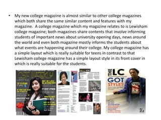
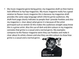
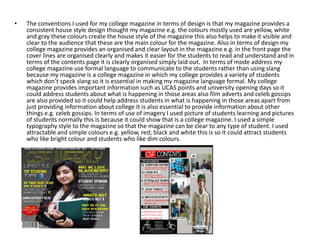
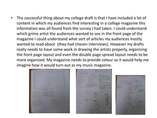
Reflection
• My new college magazine is almost similar to other college magazines
  which both share the same similar content and features with my
  magazine. A college magazine which my magazine relates to is Lewisham
  college magazine; both magazines share contents that involve informing
  students of important news about university opening days, news around
  the world and even both magazine mostly informs the students about
  what events are happening around their college. My college magazine has
  a simple layout which is really suitable for teens in contrast to that
  Lewisham college magazine has a simple layout style in its front cover in
  which is really suitable for the students.
• My music magazine genre being grime; my magazines draft so then had to
  look different to hip hop magazines. My music magazine really has a good
  relation to flavour music magazine this is because my magazines draft
  provides the same copy language which informs grime audiences. My
  draft front page clearly indicates to people that I provide freebies and also
  my magazine is clear about what genre it is because of the artist
  portrayed such as wretch 32 this makes the audiences straight away know
  this is a grime artist. Also the use of dark and dim colours in my magazine
  connotes that grime is a casual and a normal genre. My examples
  compares to the flavour magazine were they use freebies and make it
  clear about its artists chosen and also they use dim colours to show how
  grime is a casual and a normal genre.
•   The conventions I used for my college magazine in terms of design is that my magazine provides a
    consistent house style design thought my magazine e.g. the colours mostly used are yellow, white
    and gray these colours create the house style of the magazine this also helps to make it visible and
    clear to the audience that these are the main colour for the magazine. Also in terms of design my
    college magazine provides an organised and clear layout in the magazine e.g. in the front page the
    cover lines are organised clearly and makes it easier for the students to read and understand and in
    terms of the contents page it is clearly organised simply laid out. In terms of mode address my
    college magazine use formal language to communicate to the students rather than using slang
    because my magazine is a college magazine in which my college provides a variety of students
    which don’t speck slang so it is essential in making my magazine language formal. My college
    magazine provides important information such as UCAS points and university opening days so it
    could address students about what is happening in those areas also film adverts and celeb gossips
    are also provided so it could help address students in what is happening in those areas apart from
    just providing information about college it is also essential to provide information about other
    things e.g. celeb gossips. In terms of use of imagery I used picture of students learning and pictures
    of students normally this is because it could show that is a college magazine. I used a simple
    typography style to the magazine so that the magazine can be clear to any type of student. I used
    attractable and simple colours e.g. yellow, red; black and white this is so it could attract students
    who like bright colour and students who like dim colours.
• When drafting for my college magazine it was clear to me what my fellow
  students wanted in my college magazine just by following the ideas
  chosen from my survey which they answered. So this made it easier for
  me in drafting my ideas of how my magazine will turn out to be. However
  in my college magazine draft I hadn’t added colour to my draft so it was
  not really clear to me on how the magazine will turn out to be with colour.
  Also from my college magazine draft I had not drawn the pictures
  properly. So from just drafting my college magazine this has helped me in
  being informed in the way to approach drafting my music magazine. I
  would use my survey to help me get an understanding of what my
  audiences want in my music magazine. From just creating a recent draft of
  a college magazine it is essential that my layout of my music magazine
  draft being correct because it provides an important guide towards
  creating my music magazine. It is also handy providing colour to my
  magazine draft so it would help me understand clearly in how my
  magazine might turn out with colour.
• The successful thing about my college draft is that I have included a lot of
  content in which my audiences find interesting in a college magazine this
  information was all found from the survey I had taken. I could understand
  which grime artist the audiences wanted to see in the front page of the
  magazine I could understand what sort of articles my audiences mostly
  wanted to read about (they had chosen interviews). However my drafts
  really needs to have some work in drawing the artists properly, organising
  the front page layout and even the double page spread layout needs to be
  more organised. My magazine needs to provide colour so it would help me
  imagine how it would turn out as my music magazine.

Presentation meddy

  • 1.
  • 2.
    • My newcollege magazine is almost similar to other college magazines which both share the same similar content and features with my magazine. A college magazine which my magazine relates to is Lewisham college magazine; both magazines share contents that involve informing students of important news about university opening days, news around the world and even both magazine mostly informs the students about what events are happening around their college. My college magazine has a simple layout which is really suitable for teens in contrast to that Lewisham college magazine has a simple layout style in its front cover in which is really suitable for the students.
  • 3.
    • My musicmagazine genre being grime; my magazines draft so then had to look different to hip hop magazines. My music magazine really has a good relation to flavour music magazine this is because my magazines draft provides the same copy language which informs grime audiences. My draft front page clearly indicates to people that I provide freebies and also my magazine is clear about what genre it is because of the artist portrayed such as wretch 32 this makes the audiences straight away know this is a grime artist. Also the use of dark and dim colours in my magazine connotes that grime is a casual and a normal genre. My examples compares to the flavour magazine were they use freebies and make it clear about its artists chosen and also they use dim colours to show how grime is a casual and a normal genre.
  • 4.
    The conventions I used for my college magazine in terms of design is that my magazine provides a consistent house style design thought my magazine e.g. the colours mostly used are yellow, white and gray these colours create the house style of the magazine this also helps to make it visible and clear to the audience that these are the main colour for the magazine. Also in terms of design my college magazine provides an organised and clear layout in the magazine e.g. in the front page the cover lines are organised clearly and makes it easier for the students to read and understand and in terms of the contents page it is clearly organised simply laid out. In terms of mode address my college magazine use formal language to communicate to the students rather than using slang because my magazine is a college magazine in which my college provides a variety of students which don’t speck slang so it is essential in making my magazine language formal. My college magazine provides important information such as UCAS points and university opening days so it could address students about what is happening in those areas also film adverts and celeb gossips are also provided so it could help address students in what is happening in those areas apart from just providing information about college it is also essential to provide information about other things e.g. celeb gossips. In terms of use of imagery I used picture of students learning and pictures of students normally this is because it could show that is a college magazine. I used a simple typography style to the magazine so that the magazine can be clear to any type of student. I used attractable and simple colours e.g. yellow, red; black and white this is so it could attract students who like bright colour and students who like dim colours.
  • 5.
    • When draftingfor my college magazine it was clear to me what my fellow students wanted in my college magazine just by following the ideas chosen from my survey which they answered. So this made it easier for me in drafting my ideas of how my magazine will turn out to be. However in my college magazine draft I hadn’t added colour to my draft so it was not really clear to me on how the magazine will turn out to be with colour. Also from my college magazine draft I had not drawn the pictures properly. So from just drafting my college magazine this has helped me in being informed in the way to approach drafting my music magazine. I would use my survey to help me get an understanding of what my audiences want in my music magazine. From just creating a recent draft of a college magazine it is essential that my layout of my music magazine draft being correct because it provides an important guide towards creating my music magazine. It is also handy providing colour to my magazine draft so it would help me understand clearly in how my magazine might turn out with colour.
  • 6.
    • The successfulthing about my college draft is that I have included a lot of content in which my audiences find interesting in a college magazine this information was all found from the survey I had taken. I could understand which grime artist the audiences wanted to see in the front page of the magazine I could understand what sort of articles my audiences mostly wanted to read about (they had chosen interviews). However my drafts really needs to have some work in drawing the artists properly, organising the front page layout and even the double page spread layout needs to be more organised. My magazine needs to provide colour so it would help me imagine how it would turn out as my music magazine.