EVALUATION- Question 7
Looking back to your preliminary task, what do you
feel that you have learnt from the progression of it
to the full product?
The blog.
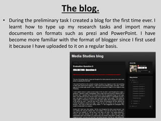
• During the preliminary task I created a blog for the first time ever. I
learnt how to type up my research tasks and import many
documents on formats such as prezi and PowerPoint. I have
become more familiar with the format of blogger since I first used
it because I have uploaded to it on a regular basis.
Photography.
• In the preliminary task I briefly used Photoshop however the quality
of the final product was not as good as the final product because I
was fairly new to using the software so I was unable to create a
media product that looked professional. In contrast with my final
product there was a huge difference in quality as the final product
looks much better. You can see a clear improvement of the
magazines as the colour which was used in the preliminary task did
not complement each other. Unlike in the final product where my
main colour scheme was red, black and white which go together
quite well. The quality of the photographs has also made noticeable
improvement because you can see my understanding of
photography has improved. For example, there are no glares in the
photographs of the final product which would suggest that my
photography skills have improved because in the preliminary task
there were far too many errors.
Magazine Design.
• I have also learnt what colours are appropriate
to use together and which ones aren’t. I learnt
this by experimenting with different colour
schemes but also asking my target audience
through a questionnaire of what colours would
appeal to them. In the preliminary task you can
tell that I did not have much of an idea about
colours because I used many random colours in
order to make it look attractive and colourful.
This made it seem almost childish and gave it an
unprofessional look at the same time. You can
see progression all the way up to the final
product where my choice of colour scheme was
appropriate. I discovered all the meanings and
connotations behind the colours I used to make
it appeal to the target audience and also to
create a magazine that looks more professional.
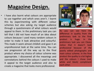
As you can see here the
difference in quality from the
preliminary task to the final
product is huge. In the
preliminary task you can Cleary
notice that it doesn’t look
professional because of the
poorly edited photographs and
main colour scheme. In the final
product the quality is a lot higher
and the colours I chose (red,
white and black) compliment
each other.

Question 7

  • 1.
    EVALUATION- Question 7 Lookingback to your preliminary task, what do you feel that you have learnt from the progression of it to the full product?
  • 2.
    The blog. • Duringthe preliminary task I created a blog for the first time ever. I learnt how to type up my research tasks and import many documents on formats such as prezi and PowerPoint. I have become more familiar with the format of blogger since I first used it because I have uploaded to it on a regular basis.
  • 3.
    Photography. • In thepreliminary task I briefly used Photoshop however the quality of the final product was not as good as the final product because I was fairly new to using the software so I was unable to create a media product that looked professional. In contrast with my final product there was a huge difference in quality as the final product looks much better. You can see a clear improvement of the magazines as the colour which was used in the preliminary task did not complement each other. Unlike in the final product where my main colour scheme was red, black and white which go together quite well. The quality of the photographs has also made noticeable improvement because you can see my understanding of photography has improved. For example, there are no glares in the photographs of the final product which would suggest that my photography skills have improved because in the preliminary task there were far too many errors.
  • 4.
    Magazine Design. • Ihave also learnt what colours are appropriate to use together and which ones aren’t. I learnt this by experimenting with different colour schemes but also asking my target audience through a questionnaire of what colours would appeal to them. In the preliminary task you can tell that I did not have much of an idea about colours because I used many random colours in order to make it look attractive and colourful. This made it seem almost childish and gave it an unprofessional look at the same time. You can see progression all the way up to the final product where my choice of colour scheme was appropriate. I discovered all the meanings and connotations behind the colours I used to make it appeal to the target audience and also to create a magazine that looks more professional. As you can see here the difference in quality from the preliminary task to the final product is huge. In the preliminary task you can Cleary notice that it doesn’t look professional because of the poorly edited photographs and main colour scheme. In the final product the quality is a lot higher and the colours I chose (red, white and black) compliment each other.