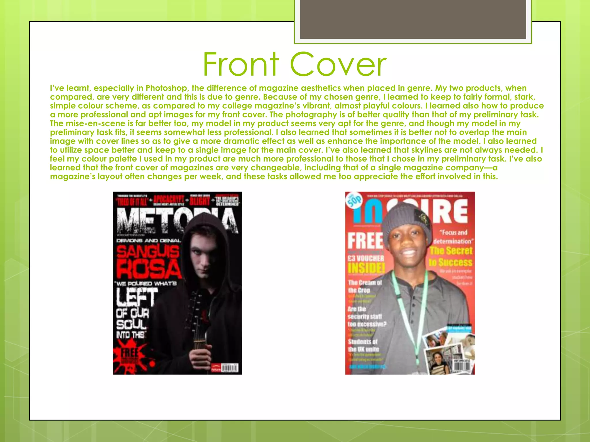
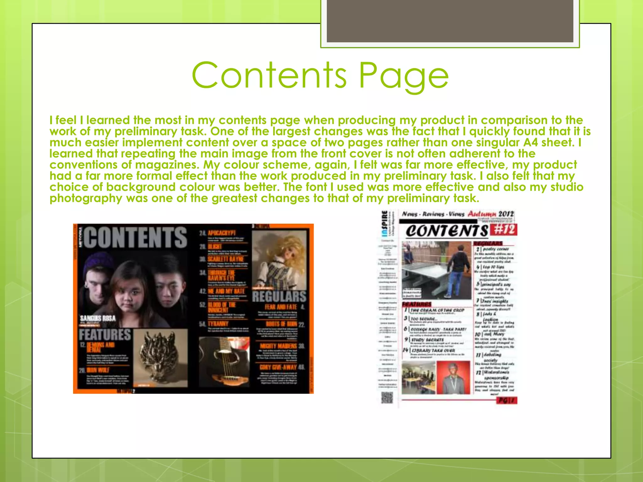
Evaluation:
Question Seven
Looking back at your
preliminary task, what do you
feel you have learnt in the
progression from it to the full
product?
Front Cover
I’ve learnt, especially in Photoshop, the difference of magazine aesthetics when placed in genre. My two products, when
compared, are very different and this is due to genre. Because of my chosen genre, I learned to keep to fairly formal, stark,
simple colour scheme, as compared to my college magazine’s vibrant, almost playful colours. I learned also how to produce
a more professional and apt images for my front cover. The photography is of better quality than that of my preliminary task.
The mise-en-scene is far better too, my model in my product seems very apt for the genre, and though my model in my
preliminary task fits, it seems somewhat less professional. I also learned that sometimes it is better not to overlap the main
image with cover lines so as to give a more dramatic effect as well as enhance the importance of the model. I also learned
to utilize space better and keep to a single image for the main cover. I’ve also learned that skylines are not always needed. I
feel my colour palette I used in my product are much more professional to those that I chose in my preliminary task. I’ve also
learned that the front cover of magazines are very changeable, including that of a single magazine company—a
magazine’s layout often changes per week, and these tasks allowed me too appreciate the effort involved in this.
Contents Page
I feel I learned the most in my contents page when producing my product in comparison to the
work of my preliminary task. One of the largest changes was the fact that I quickly found that it is
much easier implement content over a space of two pages rather than one singular A4 sheet. I
learned that repeating the main image from the front cover is not often adherent to the
conventions of magazines. My colour scheme, again, I felt was far more effective, my product
had a far more formal effect than the work produced in my preliminary task. I also felt that my
choice of background colour was better. The font I used was more effective and also my studio
photography was one of the greatest changes to that of my preliminary task.

Evaluation q7

  • 1.
    Evaluation: Question Seven Looking backat your preliminary task, what do you feel you have learnt in the progression from it to the full product?
  • 2.
    Front Cover I’ve learnt,especially in Photoshop, the difference of magazine aesthetics when placed in genre. My two products, when compared, are very different and this is due to genre. Because of my chosen genre, I learned to keep to fairly formal, stark, simple colour scheme, as compared to my college magazine’s vibrant, almost playful colours. I learned also how to produce a more professional and apt images for my front cover. The photography is of better quality than that of my preliminary task. The mise-en-scene is far better too, my model in my product seems very apt for the genre, and though my model in my preliminary task fits, it seems somewhat less professional. I also learned that sometimes it is better not to overlap the main image with cover lines so as to give a more dramatic effect as well as enhance the importance of the model. I also learned to utilize space better and keep to a single image for the main cover. I’ve also learned that skylines are not always needed. I feel my colour palette I used in my product are much more professional to those that I chose in my preliminary task. I’ve also learned that the front cover of magazines are very changeable, including that of a single magazine company—a magazine’s layout often changes per week, and these tasks allowed me too appreciate the effort involved in this.
  • 3.
    Contents Page I feelI learned the most in my contents page when producing my product in comparison to the work of my preliminary task. One of the largest changes was the fact that I quickly found that it is much easier implement content over a space of two pages rather than one singular A4 sheet. I learned that repeating the main image from the front cover is not often adherent to the conventions of magazines. My colour scheme, again, I felt was far more effective, my product had a far more formal effect than the work produced in my preliminary task. I also felt that my choice of background colour was better. The font I used was more effective and also my studio photography was one of the greatest changes to that of my preliminary task.