The document summarizes how the media product uses, develops, and challenges conventions of real media products. Specifically:
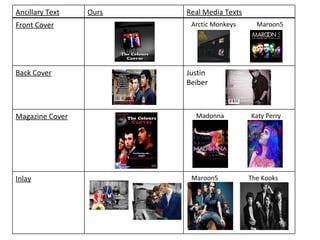
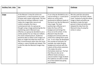
- The front cover uses a black and white background with colored image, similar to Arctic Monkeys, adhering to indie/pop conventions. However, it develops this by using a gradient background rather than plain.
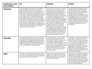
- Typography uses one primary font and red/white coloring for continuity and visibility against the dark background, unlike some real albums.
- The back cover uses the full image of artists against a natural setting for authenticity, unlike Justin Bieber's album which only shows part of the image.