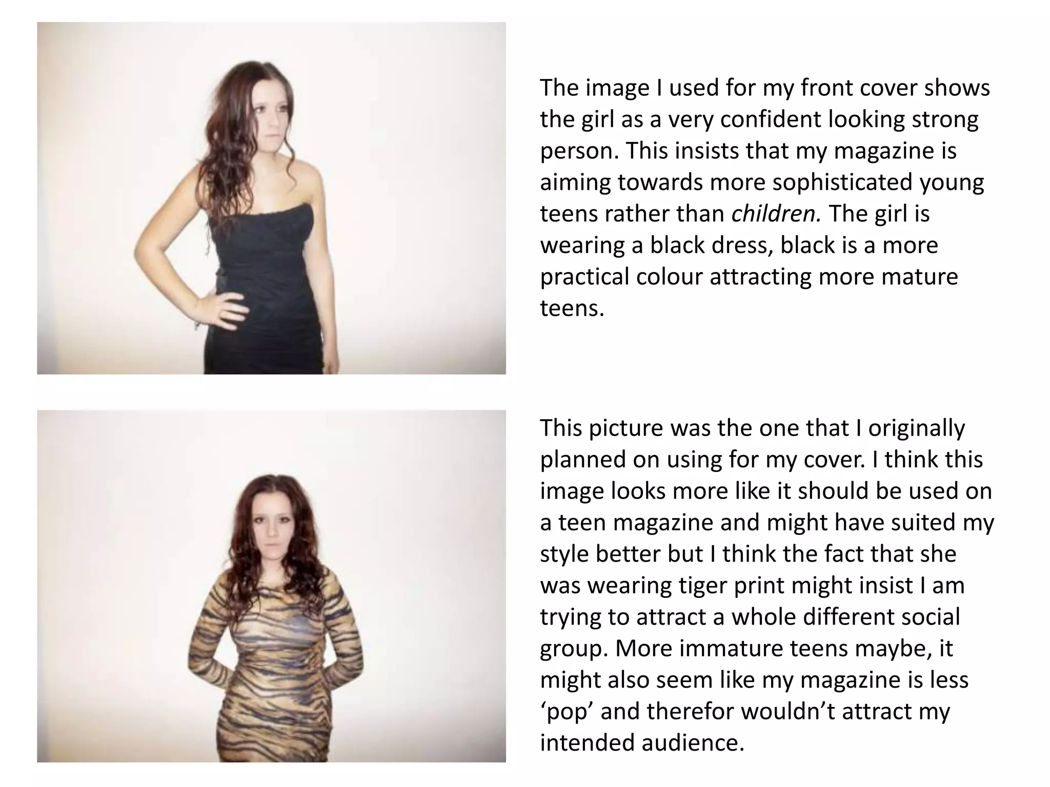
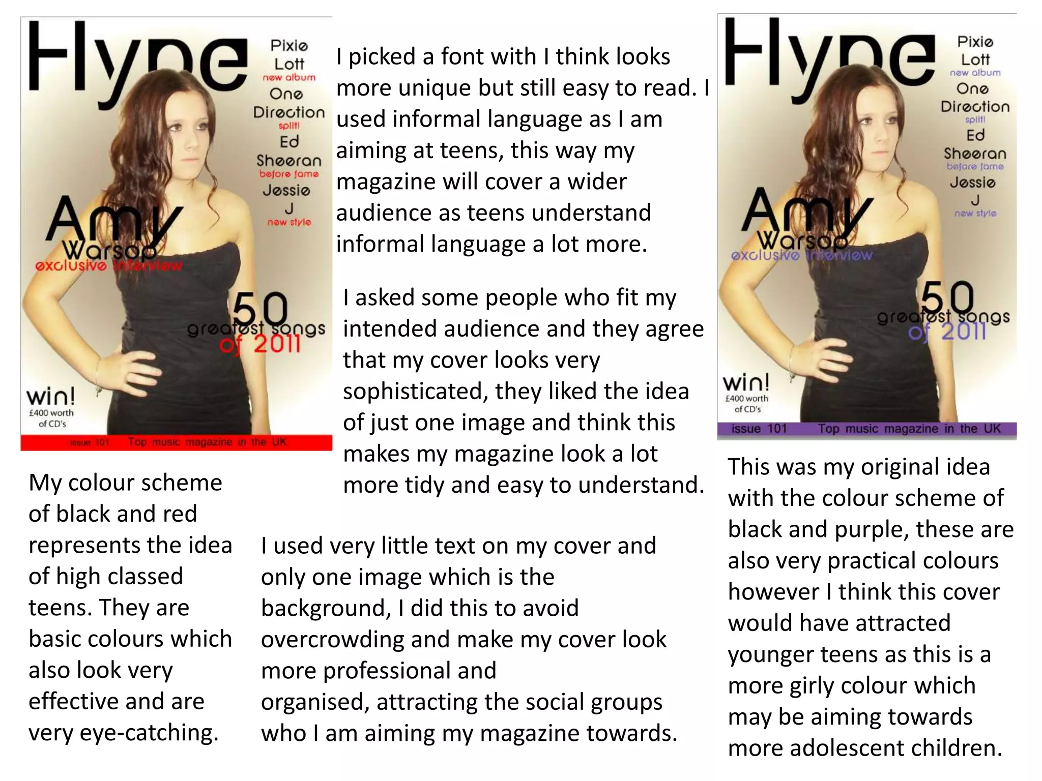
Question 2
How does your media product represent particular
                social groups?
The image I used for my front cover shows
the girl as a very confident looking strong
person. This insists that my magazine is
aiming towards more sophisticated young
teens rather than children. The girl is
wearing a black dress, black is a more
practical colour attracting more mature
teens.


This picture was the one that I originally
planned on using for my cover. I think this
image looks more like it should be used on
a teen magazine and might have suited my
style better but I think the fact that she
was wearing tiger print might insist I am
trying to attract a whole different social
group. More immature teens maybe, it
might also seem like my magazine is less
‘pop’ and therefor wouldn’t attract my
intended audience.
I picked a font with I think looks
                            more unique but still easy to read. I
                            used informal language as I am
                            aiming at teens, this way my
                            magazine will cover a wider
                            audience as teens understand
                            informal language a lot more.

                              I asked some people who fit my
                              intended audience and they agree
                              that my cover looks very
                              sophisticated, they liked the idea
                              of just one image and think this
                              makes my magazine look a lot
                                                                 This was my original idea
My colour scheme              more tidy and easy to understand.
                                                                 with the colour scheme of
of black and red
                                                                 black and purple, these are
represents the idea   I used very little text on my cover and
                                                                 also very practical colours
of high classed       only one image which is the
                                                                 however I think this cover
teens. They are       background, I did this to avoid
                                                                 would have attracted
basic colours which   overcrowding and make my cover look
                                                                 younger teens as this is a
also look very        more professional and
                                                                 more girly colour which
effective and are     organised, attracting the social groups
                                                                 may be aiming towards
very eye-catching.    who I am aiming my magazine towards.
                                                                 more adolescent children.

Question 2.

  • 1.
    Question 2 How doesyour media product represent particular social groups?
  • 2.
    The image Iused for my front cover shows the girl as a very confident looking strong person. This insists that my magazine is aiming towards more sophisticated young teens rather than children. The girl is wearing a black dress, black is a more practical colour attracting more mature teens. This picture was the one that I originally planned on using for my cover. I think this image looks more like it should be used on a teen magazine and might have suited my style better but I think the fact that she was wearing tiger print might insist I am trying to attract a whole different social group. More immature teens maybe, it might also seem like my magazine is less ‘pop’ and therefor wouldn’t attract my intended audience.
  • 3.
    I picked afont with I think looks more unique but still easy to read. I used informal language as I am aiming at teens, this way my magazine will cover a wider audience as teens understand informal language a lot more. I asked some people who fit my intended audience and they agree that my cover looks very sophisticated, they liked the idea of just one image and think this makes my magazine look a lot This was my original idea My colour scheme more tidy and easy to understand. with the colour scheme of of black and red black and purple, these are represents the idea I used very little text on my cover and also very practical colours of high classed only one image which is the however I think this cover teens. They are background, I did this to avoid would have attracted basic colours which overcrowding and make my cover look younger teens as this is a also look very more professional and more girly colour which effective and are organised, attracting the social groups may be aiming towards very eye-catching. who I am aiming my magazine towards. more adolescent children.