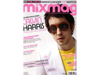
Colour Schemes – Colours used are pink, white and black. This suggests the genre dance music. The
 colour scheme is less serious so they can target a younger audience. The colours are bright and stand
 out against other music magazines which are usually black, white and red. With the colours been so
 bright the magazine could of                                             come out in summer time.
Photography – The picture                                                  Writing style – For a front
has been taken in a studio,                                                cover there is quite a lot of
this is normal for a magazine                                              writing on it. It is also quite
front cover. It also shows                                                 small which is also unusual, as
who the main feature is in                                                 they uses it to get people to
the magazine. a close mid                                                  buy the magazine. However
shot has been used. His                                                    the colour of the texts makes
pose is natural looking, but it                                            it stand out so that could be
is hard to tell with the                                                   used to attract people. The
sunglasses on. It looks like                                               text on the cover tell people
someone has caught him                                                     what is going to be in the
unaware, yet he still looks                                                magazine, this is likely to
cool and relaxed. The main                                                 make people buy it especially
focus is on his face as his                                                if they see things that they
white jacket blends into the                                               really want to read. There is a
background making it the                                                   lot of competitions on the
larger object. His yellow t-                                               cover, this gives the reader
shirt also stands out and                                                  chance to live the ultimate
makes the image bright. We                                                 clubbing life. The reading
can tell what kind of                                                      level is easy to the majority of
magazine it is from the image and what he is wearing. We wouldn’t          the target audience can read
expect such bright colours or sunglasses to be worn on a rock magazine     it.
front cover suggesting it is a dance/clubbing magazine.
Overall Look – The overall look to the magazine is edgy and fun. The bright colours make the magazine
look interesting and fun. The slanted text and image make the magazine different from others and gives it
an edge. We can tell that it is a dance and clubbing magazine from the way it looks.

Text / picture ratio – I
think the text/picture                                                     Fonts – The masthead is
ratio is about 50/50 .                                                     done in a different text,
There is one big picture                                                   which is large, bold and
on the cover this gives the                                                bubbly. This gives us an
magazine which is normal                                                   indication that it is a
for magazine covers to                                                     dance/clubbing magazine
have but it is surrounded                                                  as it doesn’t look serious.
by a lot of text. Most                                                     The text changes for the
magazine covers don’t                                                      rest of the magazine. It is
have much text on them                                                     thin, modern and looks
however this one does.                                                     graphic. This fits in well
They could of done this                                                    with the target audience as
because they want people                                                   they like to be up to date
to buy the magazine and if                                                 with the latest phones and
they have more                                                             IPods. The colour of the
information about the                                                      fonts are the colour
magazine then they could                                                   scheme and stand out
be more likely to buy it.                                                  against the image.
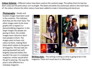
Colour Scheme – Different colour have been used on the contents page. The yellow from his top has
been used, but the pink colour isn’t so bright. The black and white has continued, which is the main base
of the colour scheme the other colours have been added to make it interesting and stand out.

Photography – Studio and
location images have been used
in the contents. This indicates
that they are the main story. The
other images seem to be more
graphic this is expect in a
dance/clubbing magazine. In the
larger images the people are
posing in them, the smaller
images seem natural or don’t
have people in them. The
images seem to have a lot
colour to them, making them
lively which relates to the genre
of magazine. The two lads are
wearing baseball hats with
brightly coloured clothes this
wouldn’t be seen in a rock/pop
magazine, neither would what      Writing style – The writing is telling us what is going to be in the
the girl is wearing. The way the  magazine. There isn't much but it is informative.
pose is also different to a
rock/pop magazine .
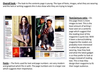
Overall look – The look to the contents page is young. The type of fonts, images, what they are wearing
and the lack or writing suggests this it also show who they are trying to target.


                                                                            Text/picture ratio – On
                                                                            this page there is more
                                                                            images to text. This is the
                                                                            least amount of writing I
                                                                            have seen on a contents
                                                                            page which suggest that
                                                                            the reading level of the
                                                                            magazine is quite low. With
                                                                            it been a dance/clubbing
                                                                            magazine the readers are
                                                                            probably more interested
                                                                            in what the people are
                                                                            wearing, how they look
                                                                            and what the latest gadget
                                                                            is so they prefer to look at
                                                                            images instead of reading
                                                                            text. This is how they
Fonts – The fonts used for text and page numbers are very modern            design their magazine to fit
and graphical which fits in with. The page numbers are in a larger size     their target audience.
which suggests their importance.
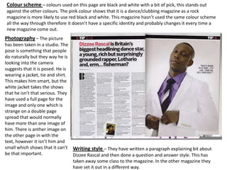
Colour scheme – colours used on this page are black and white with a bit of pick, this stands out
against the other colours. The pink colour shows that it is a dance/clubbing magazine as a rock
magazine is more likely to use red black and white. This magazine hasn’t used the same colour scheme
all the way through therefore it doesn’t have a specific identity and probably changes it every time a
new magazine come out.
Photography – The picture
has been taken in a studio. The
pose is something that people
do naturally but they way he is
looking into the camera
suggests that it is posed. He is
wearing a jacket, tie and shirt.
This makes him smart, but the
white jacket takes the shows
that he isn’t that serious. They
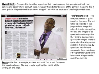
have used a full page for the
image and only one which is
strange on a double page
spread that would normally
have more than one image of
him. There is anther image on
the other page in with the
text, however it isn’t him and
small which shows that it can’t Writing style – They have written a paragraph explaining bit about
be that important.               Dizzee Rascal and then done a question and answer style. This has
                                 taken away some class to the magazine. In the other magazine they
                                 have set it out in a different way.
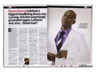
Overall look – Compared to the other magazines that I have analysed this page doesn’t look that
serious and doesn’t have as much class. However this is better because of the genre of magazine it is. It
does give us a impression that it is about a rapper this could be because of the image and text used.

                                                                              Text/picture ratio – The
                                                                              text picture ratio is quite
                                                                              equal on this page. The text
                                                                              takes up one side of the
                                                                              page and the image the
                                                                              other. It is quite unusual for
                                                                              the text and images to be
                                                                              quale as in most magazine
                                                                              they tend to take up more
                                                                              space with images. There is
                                                                              quite a lot of writing on the
                                                                              page but it is broken up by
                                                                              questions and then the
                                                                              answers to them questions.
                                                                              I thought there would have
                                                                              been more images on the
                                                                              page than there is.

Fonts – The fonts are simple, modern and bold. This is so it fits in with
the target audience. The size is quite small so they can fit all the
writing on one page.

Mixmag analysis 2

  • 2.
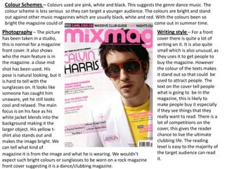
    Colour Schemes –Colours used are pink, white and black. This suggests the genre dance music. The colour scheme is less serious so they can target a younger audience. The colours are bright and stand out against other music magazines which are usually black, white and red. With the colours been so bright the magazine could of come out in summer time. Photography – The picture Writing style – For a front has been taken in a studio, cover there is quite a lot of this is normal for a magazine writing on it. It is also quite front cover. It also shows small which is also unusual, as who the main feature is in they uses it to get people to the magazine. a close mid buy the magazine. However shot has been used. His the colour of the texts makes pose is natural looking, but it it stand out so that could be is hard to tell with the used to attract people. The sunglasses on. It looks like text on the cover tell people someone has caught him what is going to be in the unaware, yet he still looks magazine, this is likely to cool and relaxed. The main make people buy it especially focus is on his face as his if they see things that they white jacket blends into the really want to read. There is a background making it the lot of competitions on the larger object. His yellow t- cover, this gives the reader shirt also stands out and chance to live the ultimate makes the image bright. We clubbing life. The reading can tell what kind of level is easy to the majority of magazine it is from the image and what he is wearing. We wouldn’t the target audience can read expect such bright colours or sunglasses to be worn on a rock magazine it. front cover suggesting it is a dance/clubbing magazine.
  • 3.
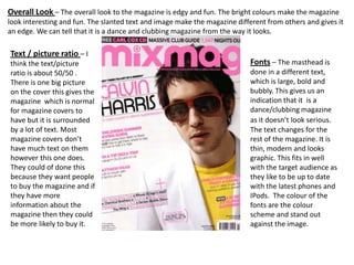
    Overall Look –The overall look to the magazine is edgy and fun. The bright colours make the magazine look interesting and fun. The slanted text and image make the magazine different from others and gives it an edge. We can tell that it is a dance and clubbing magazine from the way it looks. Text / picture ratio – I think the text/picture Fonts – The masthead is ratio is about 50/50 . done in a different text, There is one big picture which is large, bold and on the cover this gives the bubbly. This gives us an magazine which is normal indication that it is a for magazine covers to dance/clubbing magazine have but it is surrounded as it doesn’t look serious. by a lot of text. Most The text changes for the magazine covers don’t rest of the magazine. It is have much text on them thin, modern and looks however this one does. graphic. This fits in well They could of done this with the target audience as because they want people they like to be up to date to buy the magazine and if with the latest phones and they have more IPods. The colour of the information about the fonts are the colour magazine then they could scheme and stand out be more likely to buy it. against the image.
  • 5.
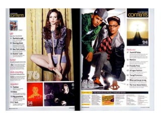
    Colour Scheme –Different colour have been used on the contents page. The yellow from his top has been used, but the pink colour isn’t so bright. The black and white has continued, which is the main base of the colour scheme the other colours have been added to make it interesting and stand out. Photography – Studio and location images have been used in the contents. This indicates that they are the main story. The other images seem to be more graphic this is expect in a dance/clubbing magazine. In the larger images the people are posing in them, the smaller images seem natural or don’t have people in them. The images seem to have a lot colour to them, making them lively which relates to the genre of magazine. The two lads are wearing baseball hats with brightly coloured clothes this wouldn’t be seen in a rock/pop magazine, neither would what Writing style – The writing is telling us what is going to be in the the girl is wearing. The way the magazine. There isn't much but it is informative. pose is also different to a rock/pop magazine .
  • 6.
    Overall look –The look to the contents page is young. The type of fonts, images, what they are wearing and the lack or writing suggests this it also show who they are trying to target. Text/picture ratio – On this page there is more images to text. This is the least amount of writing I have seen on a contents page which suggest that the reading level of the magazine is quite low. With it been a dance/clubbing magazine the readers are probably more interested in what the people are wearing, how they look and what the latest gadget is so they prefer to look at images instead of reading text. This is how they Fonts – The fonts used for text and page numbers are very modern design their magazine to fit and graphical which fits in with. The page numbers are in a larger size their target audience. which suggests their importance.
  • 8.
    Colour scheme –colours used on this page are black and white with a bit of pick, this stands out against the other colours. The pink colour shows that it is a dance/clubbing magazine as a rock magazine is more likely to use red black and white. This magazine hasn’t used the same colour scheme all the way through therefore it doesn’t have a specific identity and probably changes it every time a new magazine come out. Photography – The picture has been taken in a studio. The pose is something that people do naturally but they way he is looking into the camera suggests that it is posed. He is wearing a jacket, tie and shirt. This makes him smart, but the white jacket takes the shows that he isn’t that serious. They have used a full page for the image and only one which is strange on a double page spread that would normally have more than one image of him. There is anther image on the other page in with the text, however it isn’t him and small which shows that it can’t Writing style – They have written a paragraph explaining bit about be that important. Dizzee Rascal and then done a question and answer style. This has taken away some class to the magazine. In the other magazine they have set it out in a different way.
  • 9.
    Overall look –Compared to the other magazines that I have analysed this page doesn’t look that serious and doesn’t have as much class. However this is better because of the genre of magazine it is. It does give us a impression that it is about a rapper this could be because of the image and text used. Text/picture ratio – The text picture ratio is quite equal on this page. The text takes up one side of the page and the image the other. It is quite unusual for the text and images to be quale as in most magazine they tend to take up more space with images. There is quite a lot of writing on the page but it is broken up by questions and then the answers to them questions. I thought there would have been more images on the page than there is. Fonts – The fonts are simple, modern and bold. This is so it fits in with the target audience. The size is quite small so they can fit all the writing on one page.