Analysing Magazine Covers
The Central Image is of Mike
You can immediately tell that         Posner, a famous artist who is
this is a magazine because of it      popular with this Magazines
bold Masthead, catching your          target audience (college
eye and making it clear what the      students). There is also a
magazine is about.                    cover line on a story about
                                      him in the magazine.


Cover lines - these are               This magazine uses a 'three
information about the most            colour' colour scheme so it is
important and the biggest             quite simple but effective. All
articles in the magazine for          the colours work well
example 'I slept with my              together and look stylish and
professor'.                           well presented.

                                      The more important stories
It is also made clear that this       (the Cover Lines) are in
magazine is education                 capital letters to grab your
related because each other the        attention, while the
plugs has something to                explanation of the article is in
do with college life, lectures etc.   lower case to give you some
                                      details and interest you to
                                      read more

                                      Bar code and price - only a
                                      small part of the front the
                                      front cover but very
                                      important.
This Masthead on this
magazine makes it very       This magazine has a header. A
clear as to what the         bit of information and the top
magazine is about and        of the front cover about
what you will expect to      stories you can read about
find in this magazine.       inside the magazine. It is
                             highlighted in orange to grab
                             the readers attention.
The Cover lines of this
front cover give
information about the        The central image is quite
most important and the       simple as it only uses a blue
biggest articles in the      background and the football
magazine.                    player, however this really
                             makes the guy stand out and
This front cover also has    helps to clearly show the topic
Graphic Features.            of this magazine.
Smaller images, to add
interest to teasers, plugs   There are not many colour
etc. This makes the reader   used on this magazine front
even more interested and     cover so to keep it simple but
grabs attention.             effective. All the colours
                             compliment each other
                             something that is important
All of the plugs on this     when designing a front cover.
magazine cover are in
capital letters so to make   Like all magazine front covers
more of an impact and to     this has its bar code, price and
show importance.             date of issue. All important
                             parts of a magazines front
                             cover, giving vital information.
Analysing contents pages
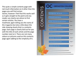
This quite a simple contents page with
not much information on it other than the
pages you will find certain
stories, however I feel that this works well
as it gets straight to the point and any
reader can clearly see where to find
certain articles. You have a
masthead, again telling you the name of
the magazine but also a title down the
side showing clearly that is a contents
page. Each page is clearly laid out for you
with the title of each article and the page
number next to it. There are not many
colours or pictures used on this contents
page again adding to the simplicity of it.
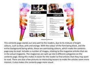
This contents page stands out very well to the readers, due to its mixture of bright
colours, such as blue, pink and orange. With the colour of the font being black, and the
entire background being white, these are contrasting colours, which make the contents
page easy to read. Includes a number of images, relating to the magazine articles that are
in the actual magazine. The magazines are split up into 5 different categories on the
contents page. Doing this makes it easier for the reader to find articles that they may want
to read. There are also a few pictures to interesting teasers to make the articles seem more
interest, it also makes the contents page more visual.

Analysing magazine covers

  • 1.
  • 2.
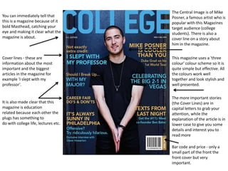
    The Central Imageis of Mike You can immediately tell that Posner, a famous artist who is this is a magazine because of it popular with this Magazines bold Masthead, catching your target audience (college eye and making it clear what the students). There is also a magazine is about. cover line on a story about him in the magazine. Cover lines - these are This magazine uses a 'three information about the most colour' colour scheme so it is important and the biggest quite simple but effective. All articles in the magazine for the colours work well example 'I slept with my together and look stylish and professor'. well presented. The more important stories It is also made clear that this (the Cover Lines) are in magazine is education capital letters to grab your related because each other the attention, while the plugs has something to explanation of the article is in do with college life, lectures etc. lower case to give you some details and interest you to read more Bar code and price - only a small part of the front the front cover but very important.
  • 3.
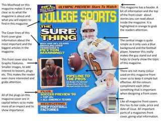
    This Masthead onthis magazine makes it very This magazine has a header. A clear as to what the bit of information and the top magazine is about and of the front cover about what you will expect to stories you can read about find in this magazine. inside the magazine. It is highlighted in orange to grab the readers attention. The Cover lines of this front cover give information about the The central image is quite most important and the simple as it only uses a blue biggest articles in the background and the football magazine. player, however this really makes the guy stand out and This front cover also has helps to clearly show the topic Graphic Features. of this magazine. Smaller images, to add interest to teasers, plugs There are not many colour etc. This makes the reader used on this magazine front even more interested and cover so to keep it simple but grabs attention. effective. All the colours compliment each other something that is important All of the plugs on this when designing a front cover. magazine cover are in capital letters so to make Like all magazine front covers more of an impact and to this has its bar code, price and show importance. date of issue. All important parts of a magazines front cover, giving vital information.
  • 4.
  • 5.
    This quite asimple contents page with not much information on it other than the pages you will find certain stories, however I feel that this works well as it gets straight to the point and any reader can clearly see where to find certain articles. You have a masthead, again telling you the name of the magazine but also a title down the side showing clearly that is a contents page. Each page is clearly laid out for you with the title of each article and the page number next to it. There are not many colours or pictures used on this contents page again adding to the simplicity of it.
  • 6.
    This contents pagestands out very well to the readers, due to its mixture of bright colours, such as blue, pink and orange. With the colour of the font being black, and the entire background being white, these are contrasting colours, which make the contents page easy to read. Includes a number of images, relating to the magazine articles that are in the actual magazine. The magazines are split up into 5 different categories on the contents page. Doing this makes it easier for the reader to find articles that they may want to read. There are also a few pictures to interesting teasers to make the articles seem more interest, it also makes the contents page more visual.