1. In what ways does your media
product use, develop or challenge
forms and conventions of real media
products?
Holly Beaty
How does my media product use
forms of real media products?
• I have focused my Media product on mainly
the magazine NME. I have used ideas that
they use on their magazines and cooperated it
on mine. The genre of my magazine is also
Indie/alternative which is the same as NME.
The layout of my magazine has its own
originality however it is also inspired by NME
again. Overall my magazine competitor would
be NME.
FOCUS VS NME
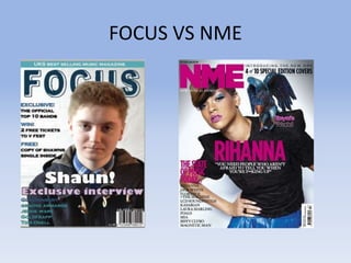
• On my front cover I have used the colours related to what Shaun is
wearing, such as the writing is all in different shades of blue to
brighten it up and it also reflects what Shaun is wearing. On the
NME front cover there is big bold letters saying ‘RIHANNA’ which I
have also done over Shauns body but saying Shaun, I got this idea
from NME. I have also listed all of the bands which will be featured
in my magazine down the side of the magazine which is also what
NME front cover has also done. I do think that there are lots of
similar aspects to my front cover and NME’s front cover. The layout
is very similar as the band names, the artists name and the barcode
are all in the same place. There are a few things different such as I
put Shauns head over the text ‘focus’ however NME have put their
‘NME’ on top of Rihannas head, I didn’t put Shauns head over
‘Focus’ because I believe it would ruin part of the photography and I
didn’t want that. Another thing which is completely different is the
colour scheme however to turn a difference into a similarity would
be that NME have focused their colour scheme on the colours of
Rihanna and I have also focused my colour scheme on the colours
based on what Shaun is wearing.
CONTENT PAGE
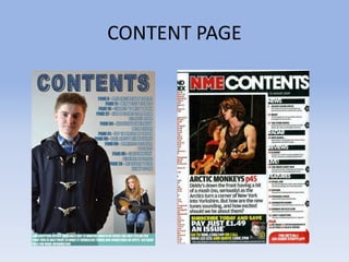
• On the content page I have once again used the same
colour scheme throughout my magazine which is also what
NME has done as their colour scheme is red. I have listed
down the content an page numbers of what will be
appearing in my magazine, this is similar to NME as NME
has also listed their contents down the side of their
magazine however theirs is a bit more scattered around
than mine is which I think can be quite hard to read as
there is so much going on, that’s why I lay out my content
page slightly different to NME. I also wanted to have my
own originality instead of copying another magazine
completely, however without NME I would have highly
struggled making this magazine as NME gave me lots of
inspiration and lots of ideas, some ideas that I wouldn’t
have even thought of myself. I have also added on the
bottom of my content page an offer for subscription in
hope to make it seem realistic.
Double page
spreadsheet
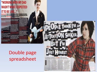
• In my double page spreadsheet I made an interview with one of my
fellow class mates. I asked questions with help of reading through
other music magazines such as the Lily Allen interview with NME. I
also quoted something that Shaun said to give it a sense of urgency
to read which is also what the NME magazine has done with Lily
Allen. I had to add a black box to the image as no fonts were
showing up due to the colour of the image being so light, this was
quite difficult to do. I also made the font red as I think it highlights
where the questions are so you can tell the difference from when
Shaun is speaking than from when the Interviewer is. The red
colour doesn’t follow my Magazine colour scheme however I found
that looking through other magazines for inspiration they didn’t
tend to use the same colour scheme unless it was for their branding
name or for their front cover or content page so I didn’t think it was
necessary. I think that there are lots of similarities between the
NME double page spreadsheet and the FOCUS page spreadsheet
such as the photography is similar and both artists are stood in the
far right hand bottom corner which gives lots of space to write the
article on.

In what ways does your media product use, develop or challenge forms and conventions of real media products?

  • 1.
    1. In whatways does your media product use, develop or challenge forms and conventions of real media products? Holly Beaty
  • 2.
    How does mymedia product use forms of real media products? • I have focused my Media product on mainly the magazine NME. I have used ideas that they use on their magazines and cooperated it on mine. The genre of my magazine is also Indie/alternative which is the same as NME. The layout of my magazine has its own originality however it is also inspired by NME again. Overall my magazine competitor would be NME.
  • 3.
  • 4.
    • On myfront cover I have used the colours related to what Shaun is wearing, such as the writing is all in different shades of blue to brighten it up and it also reflects what Shaun is wearing. On the NME front cover there is big bold letters saying ‘RIHANNA’ which I have also done over Shauns body but saying Shaun, I got this idea from NME. I have also listed all of the bands which will be featured in my magazine down the side of the magazine which is also what NME front cover has also done. I do think that there are lots of similar aspects to my front cover and NME’s front cover. The layout is very similar as the band names, the artists name and the barcode are all in the same place. There are a few things different such as I put Shauns head over the text ‘focus’ however NME have put their ‘NME’ on top of Rihannas head, I didn’t put Shauns head over ‘Focus’ because I believe it would ruin part of the photography and I didn’t want that. Another thing which is completely different is the colour scheme however to turn a difference into a similarity would be that NME have focused their colour scheme on the colours of Rihanna and I have also focused my colour scheme on the colours based on what Shaun is wearing.
  • 5.
  • 6.
    • On thecontent page I have once again used the same colour scheme throughout my magazine which is also what NME has done as their colour scheme is red. I have listed down the content an page numbers of what will be appearing in my magazine, this is similar to NME as NME has also listed their contents down the side of their magazine however theirs is a bit more scattered around than mine is which I think can be quite hard to read as there is so much going on, that’s why I lay out my content page slightly different to NME. I also wanted to have my own originality instead of copying another magazine completely, however without NME I would have highly struggled making this magazine as NME gave me lots of inspiration and lots of ideas, some ideas that I wouldn’t have even thought of myself. I have also added on the bottom of my content page an offer for subscription in hope to make it seem realistic.
  • 7.
  • 8.
    • In mydouble page spreadsheet I made an interview with one of my fellow class mates. I asked questions with help of reading through other music magazines such as the Lily Allen interview with NME. I also quoted something that Shaun said to give it a sense of urgency to read which is also what the NME magazine has done with Lily Allen. I had to add a black box to the image as no fonts were showing up due to the colour of the image being so light, this was quite difficult to do. I also made the font red as I think it highlights where the questions are so you can tell the difference from when Shaun is speaking than from when the Interviewer is. The red colour doesn’t follow my Magazine colour scheme however I found that looking through other magazines for inspiration they didn’t tend to use the same colour scheme unless it was for their branding name or for their front cover or content page so I didn’t think it was necessary. I think that there are lots of similarities between the NME double page spreadsheet and the FOCUS page spreadsheet such as the photography is similar and both artists are stood in the far right hand bottom corner which gives lots of space to write the article on.