{
Q1) In what ways does your media
product use, develop or challenge forms
and conventions of real media products?
Shannon Lewis
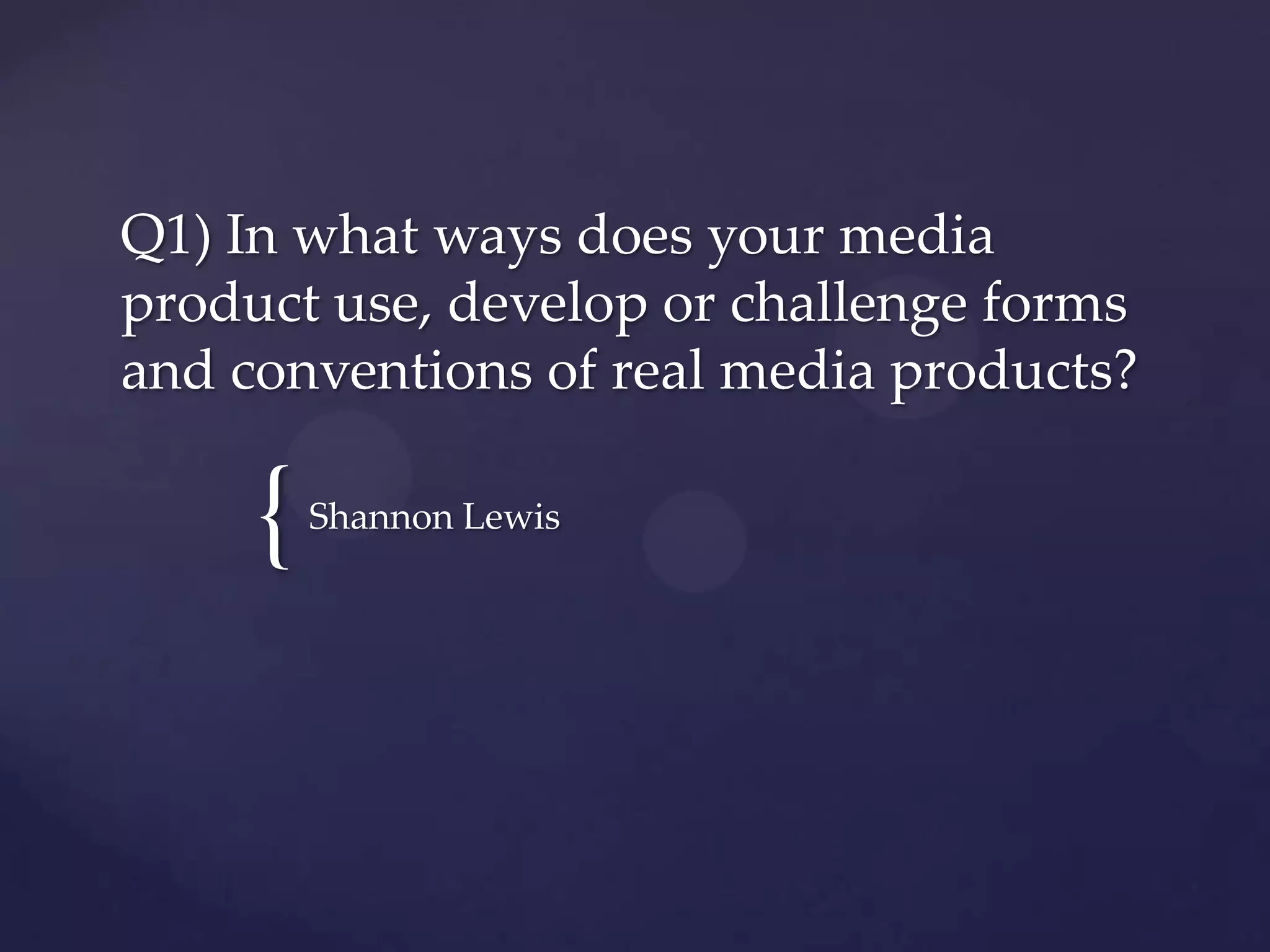
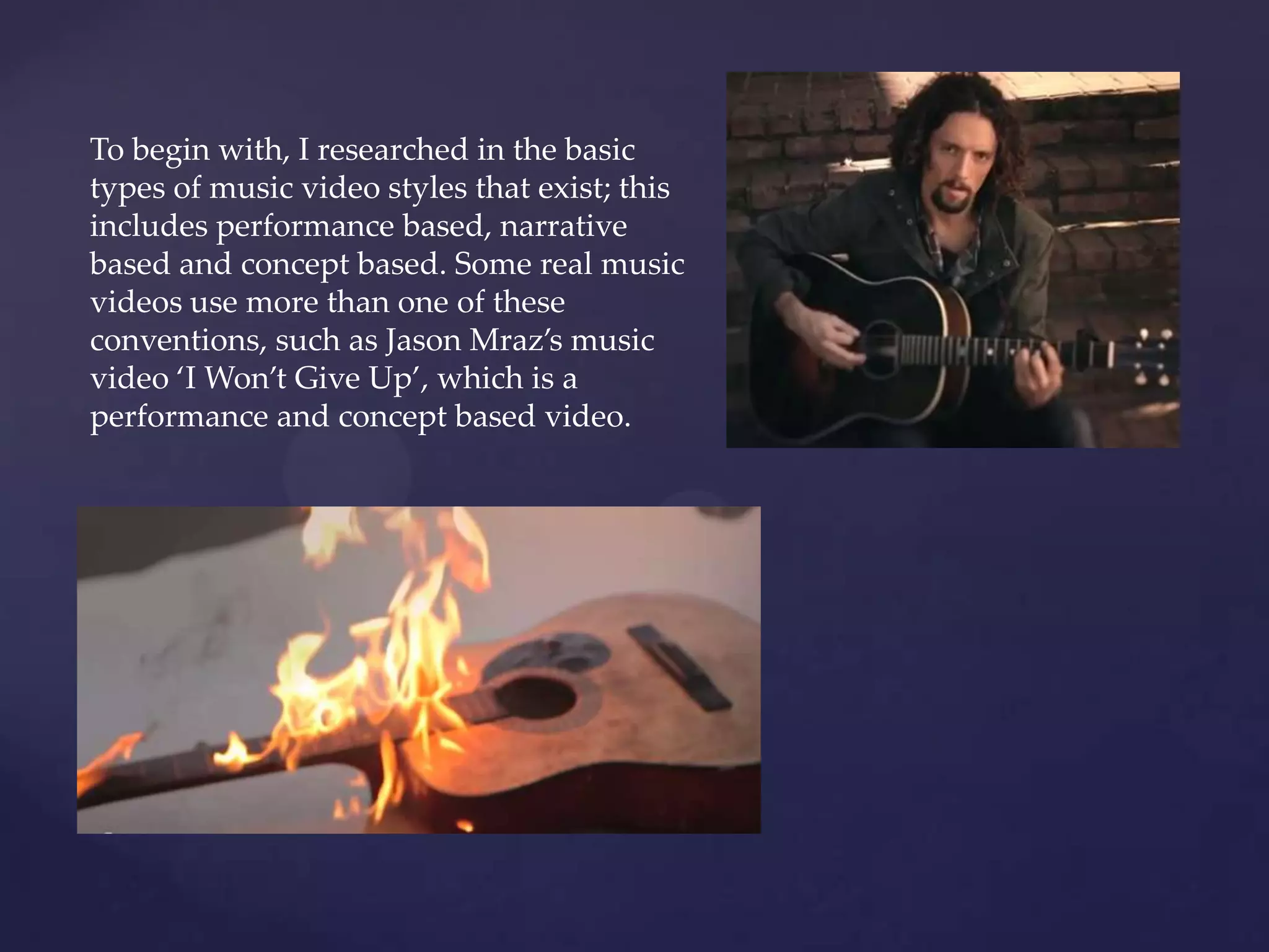
To begin with, I researched in the basic
types of music video styles that exist; this
includes performance based, narrative
based and concept based. Some real music
videos use more than one of these
conventions, such as Jason Mraz’s music
video ‘I Won’t Give Up’, which is a
performance and concept based video.
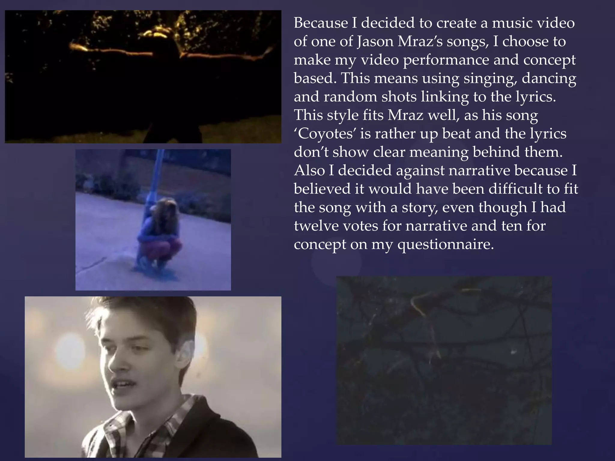
Because I decided to create a music video
of one of Jason Mraz’s songs, I choose to
make my video performance and concept
based. This means using singing, dancing
and random shots linking to the lyrics.
This style fits Mraz well, as his song
‘Coyotes’ is rather up beat and the lyrics
don’t show clear meaning behind them.
Also I decided against narrative because I
believed it would have been difficult to fit
the song with a story, even though I had
twelve votes for narrative and ten for
concept on my questionnaire.
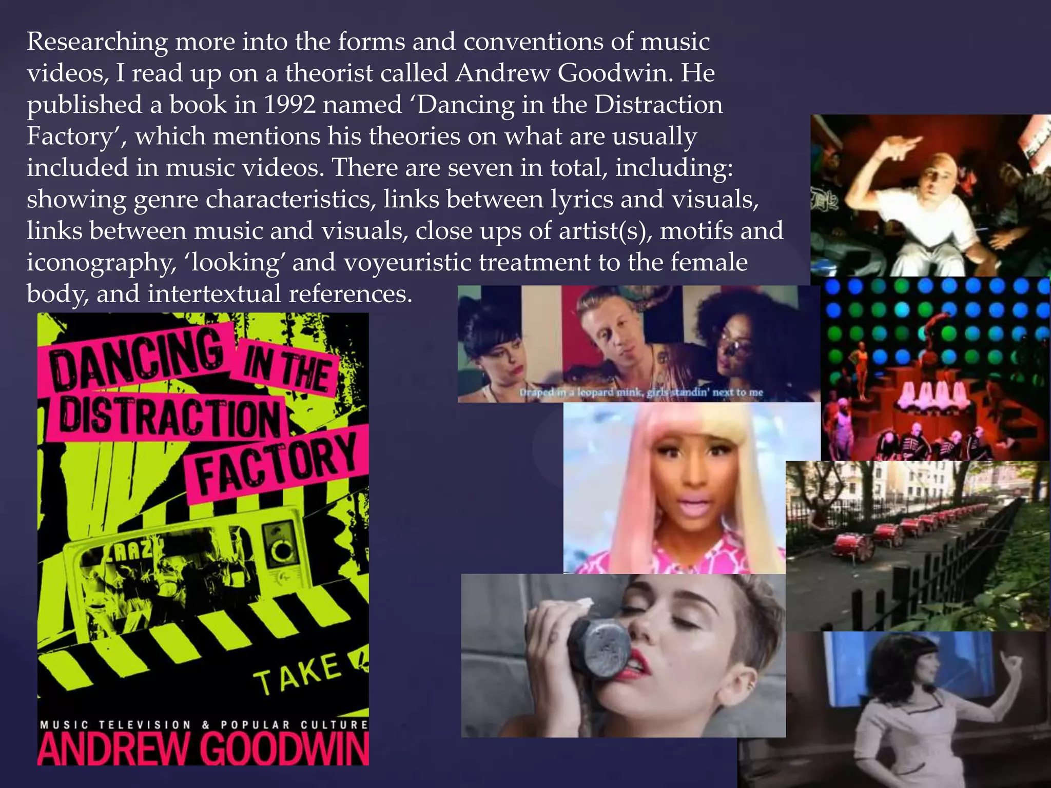
Researching more into the forms and conventions of music
videos, I read up on a theorist called Andrew Goodwin. He
published a book in 1992 named ‘Dancing in the Distraction
Factory’, which mentions his theories on what are usually
included in music videos. There are seven in total, including:
showing genre characteristics, links between lyrics and visuals,
links between music and visuals, close ups of artist(s), motifs and
iconography, ‘looking’ and voyeuristic treatment to the female
body, and intertextual references.
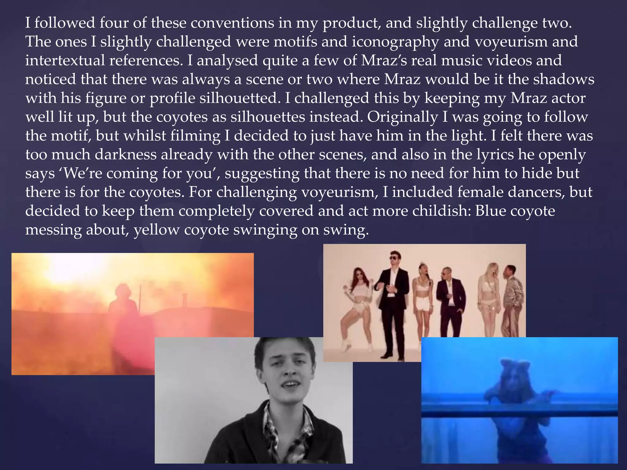
I followed four of these conventions in my product, and slightly challenge two.
The ones I slightly challenged were motifs and iconography and voyeurism and
intertextual references. I analysed quite a few of Mraz’s real music videos and
noticed that there was always a scene or two where Mraz would be it the shadows
with his figure or profile silhouetted. I challenged this by keeping my Mraz actor
well lit up, but the coyotes as silhouettes instead. Originally I was going to follow
the motif, but whilst filming I decided to just have him in the light. I felt there was
too much darkness already with the other scenes, and also in the lyrics he openly
says ‘We’re coming for you’, suggesting that there is no need for him to hide but
there is for the coyotes. For challenging voyeurism, I included female dancers, but
decided to keep them completely covered and act more childish: Blue coyote
messing about, yellow coyote swinging on swing.
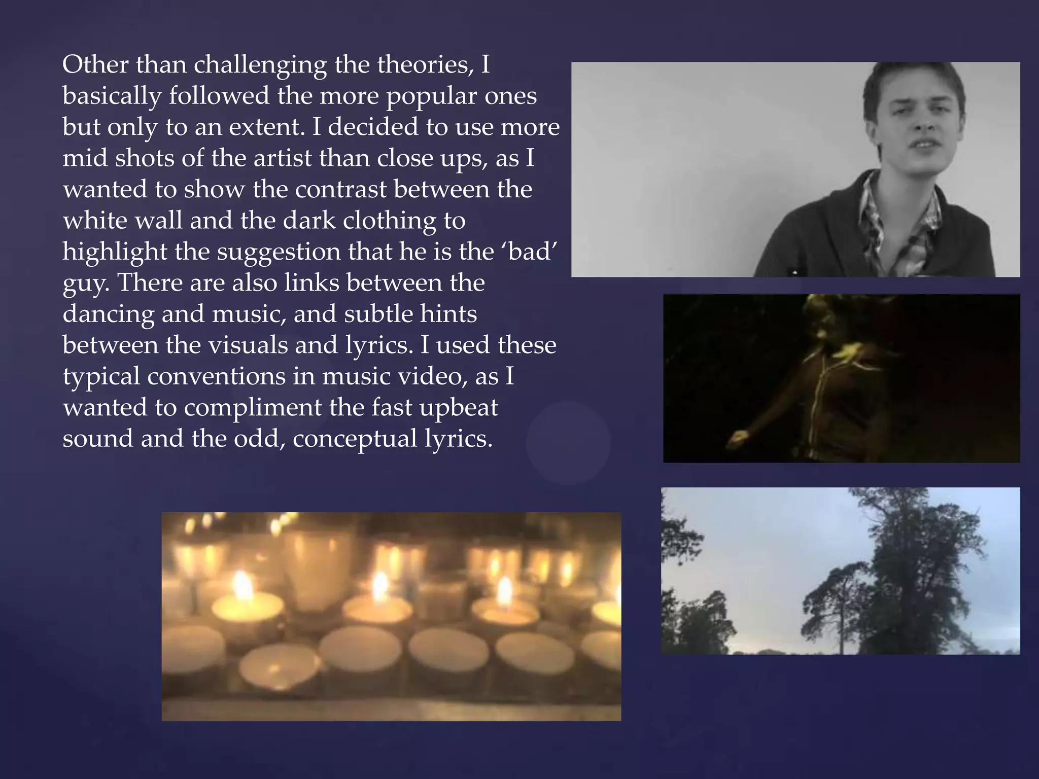
Other than challenging the theories, I
basically followed the more popular ones
but only to an extent. I decided to use more
mid shots of the artist than close ups, as I
wanted to show the contrast between the
white wall and the dark clothing to
highlight the suggestion that he is the ‘bad’
guy. There are also links between the
dancing and music, and subtle hints
between the visuals and lyrics. I used these
typical conventions in music video, as I
wanted to compliment the fast upbeat
sound and the odd, conceptual lyrics.
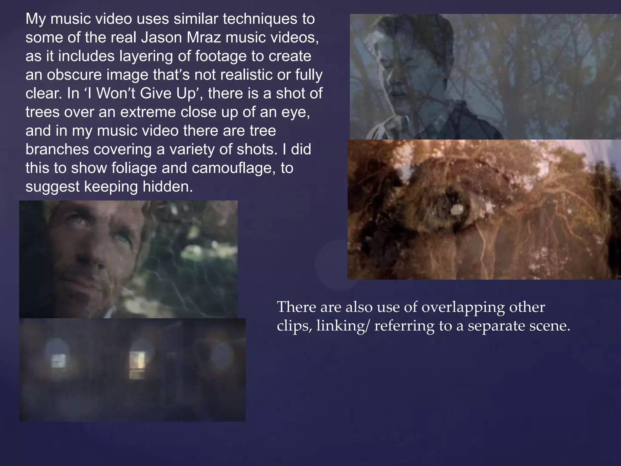
My music video uses similar techniques to
some of the real Jason Mraz music videos,
as it includes layering of footage to create
an obscure image that’s not realistic or fully
clear. In ‘I Won’t Give Up’, there is a shot of
trees over an extreme close up of an eye,
and in my music video there are tree
branches covering a variety of shots. I did
this to show foliage and camouflage, to
suggest keeping hidden.
There are also use of overlapping other
clips, linking/ referring to a separate scene.
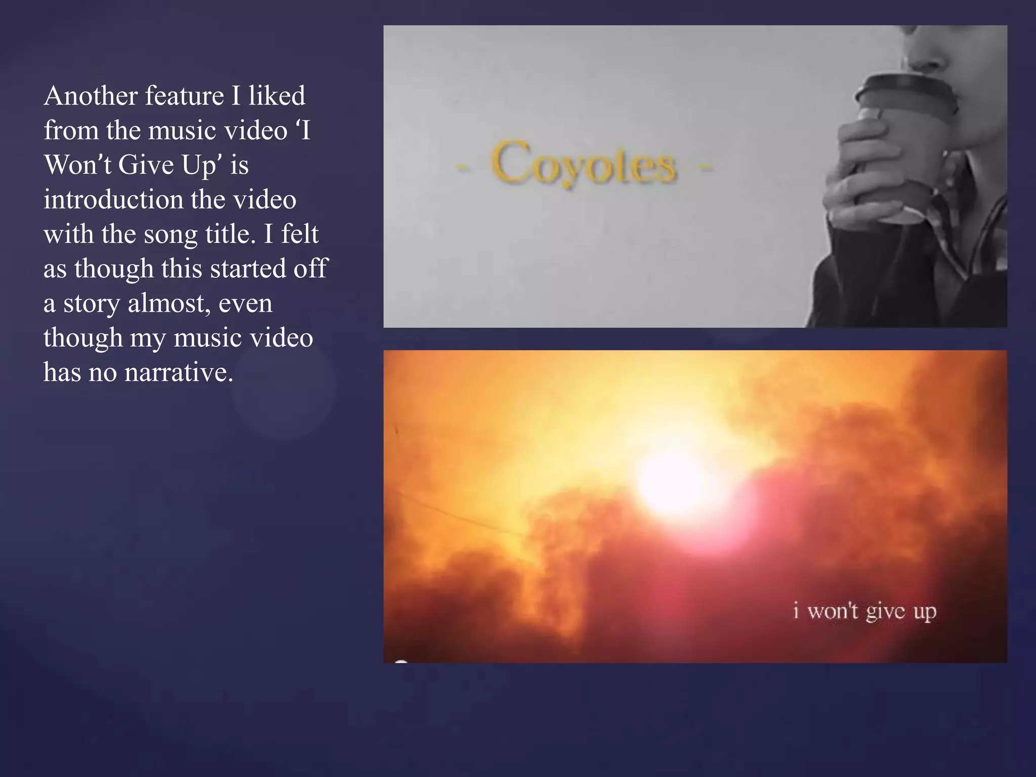
Another feature I liked
from the music video ‘I
Won’t Give Up’ is
introduction the video
with the song title. I felt
as though this started off
a story almost, even
though my music video
has no narrative.
Conventions of Magazine
Adverts
•Name of artist
•Name of album
•Logo or image that links to the album cover
• A name of a well known song from the album – one that has been popular in
the charts
•Release dates
•Can have tour dates
•Website of the artist
•Colour scheme that links with the album and /or artist
•Reviews and ratings
•Where it could be sold
•Where it could be downloaded
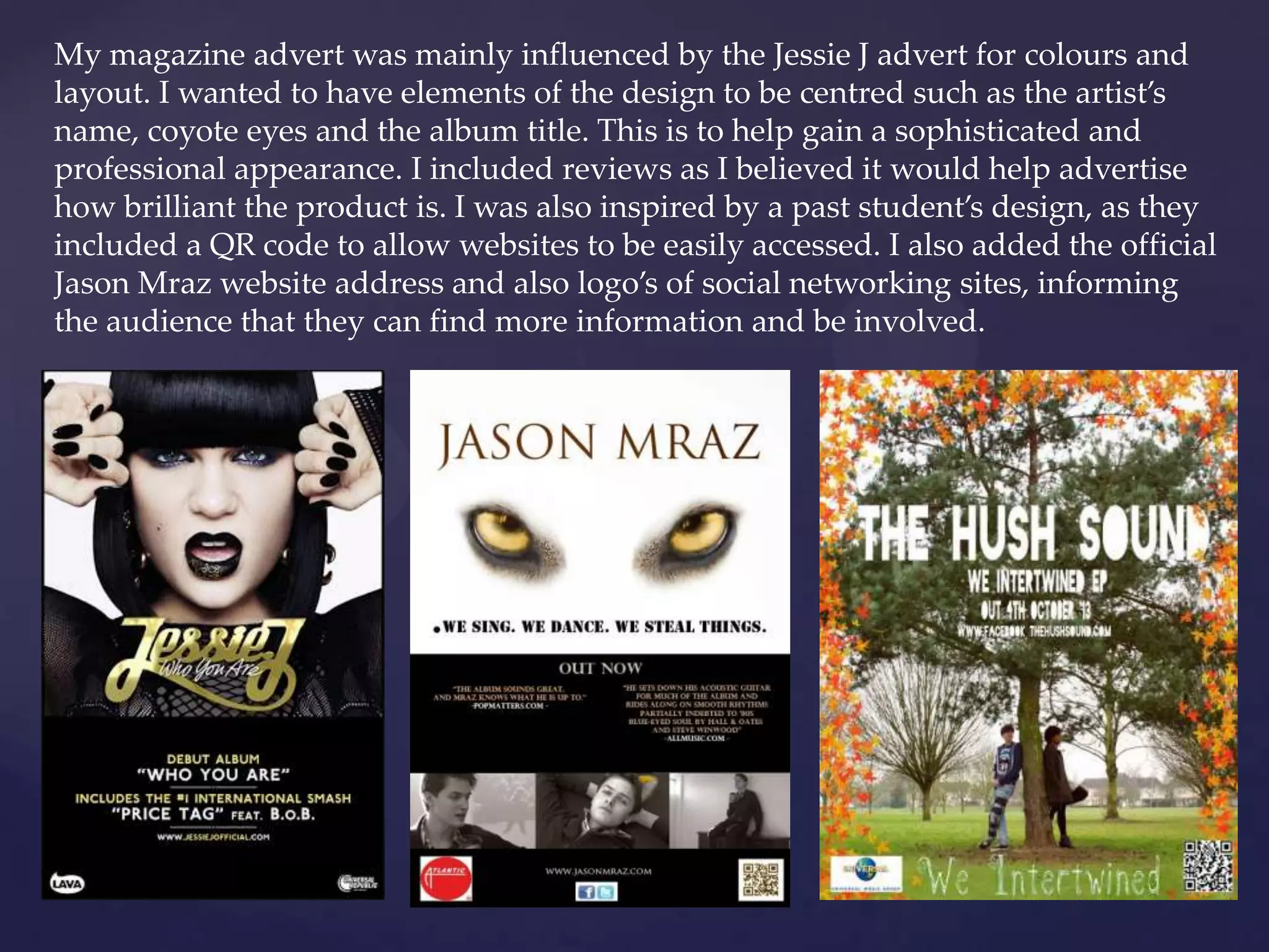
My magazine advert was mainly influenced by the Jessie J advert for colours and
layout. I wanted to have elements of the design to be centred such as the artist’s
name, coyote eyes and the album title. This is to help gain a sophisticated and
professional appearance. I included reviews as I believed it would help advertise
how brilliant the product is. I was also inspired by a past student’s design, as they
included a QR code to allow websites to be easily accessed. I also added the official
Jason Mraz website address and also logo’s of social networking sites, informing
the audience that they can find more information and be involved.
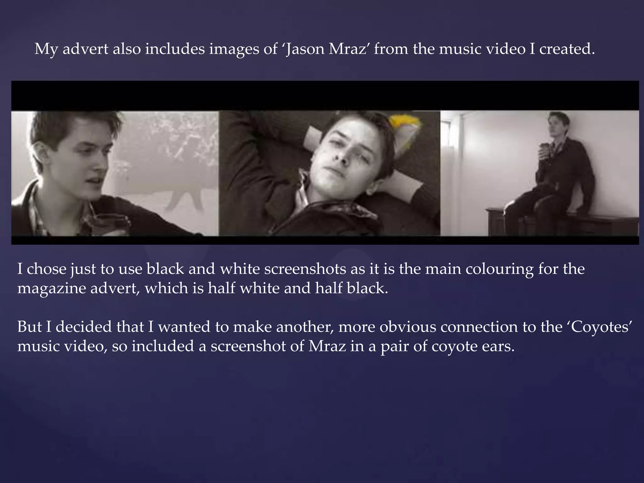
My advert also includes images of ‘Jason Mraz’ from the music video I created.
I chose just to use black and white screenshots as it is the main colouring for the
magazine advert, which is half white and half black.
But I decided that I wanted to make another, more obvious connection to the ‘Coyotes’
music video, so included a screenshot of Mraz in a pair of coyote ears.
Conventions of digi packs
• Eye catching imagery (especially for the front cover)
• Typically includes the artists name on the front cover(however some of Jason
Mraz’s already existing digi packs don't include his name on the front cover)
• Album title
•A list of the tracks included on the dick on the back cover (usually numbered)
•Includes logos of institutions and record labels on the back, along with
copyright text.
•Barcode
•Websites the audience could visit (usually on the back)
•The disc would usually include an image/ design
•A booklet that included either:
 lyrics of the songs
Adverts to other CD’s
Images
Another list to the songs (maybe including extra information:
producers)
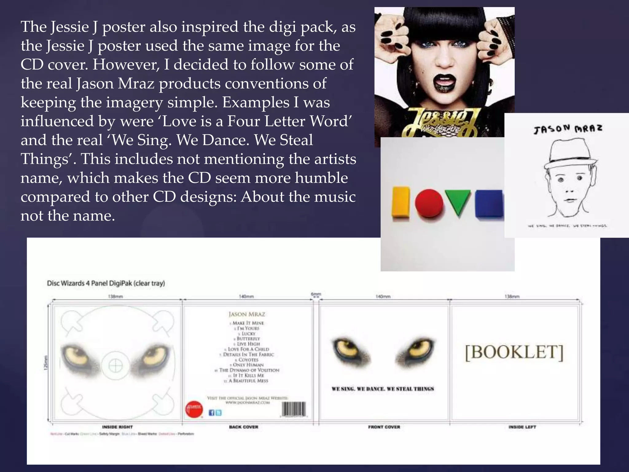
The Jessie J poster also inspired the digi pack, as
the Jessie J poster used the same image for the
CD cover. However, I decided to follow some of
the real Jason Mraz products conventions of
keeping the imagery simple. Examples I was
influenced by were ‘Love is a Four Letter Word’
and the real ‘We Sing. We Dance. We Steal
Things’. This includes not mentioning the artists
name, which makes the CD seem more humble
compared to other CD designs: About the music
not the name.
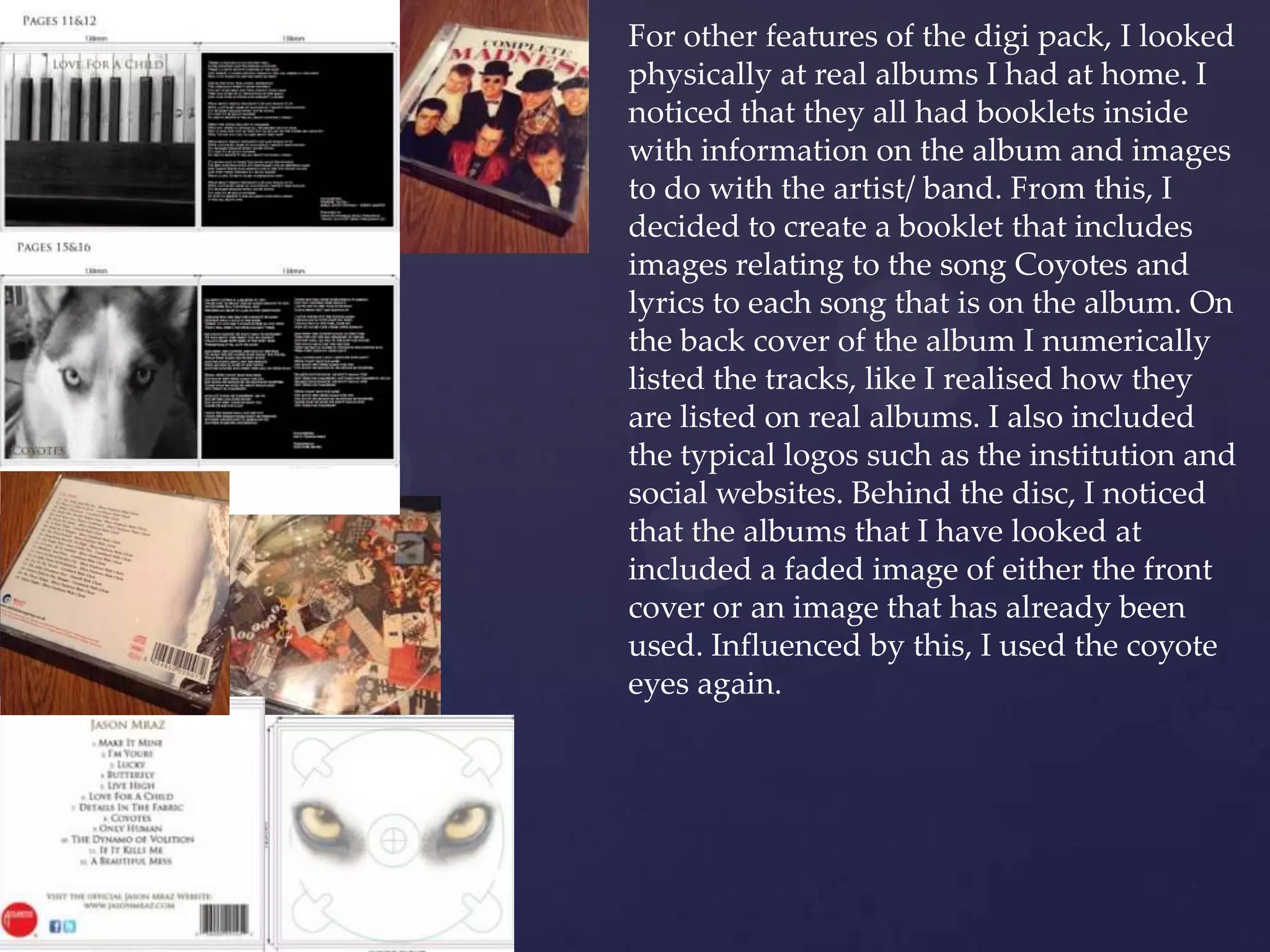
For other features of the digi pack, I looked
physically at real albums I had at home. I
noticed that they all had booklets inside
with information on the album and images
to do with the artist/ band. From this, I
decided to create a booklet that includes
images relating to the song Coyotes and
lyrics to each song that is on the album. On
the back cover of the album I numerically
listed the tracks, like I realised how they
are listed on real albums. I also included
the typical logos such as the institution and
social websites. Behind the disc, I noticed
that the albums that I have looked at
included a faded image of either the front
cover or an image that has already been
used. Influenced by this, I used the coyote
eyes again.
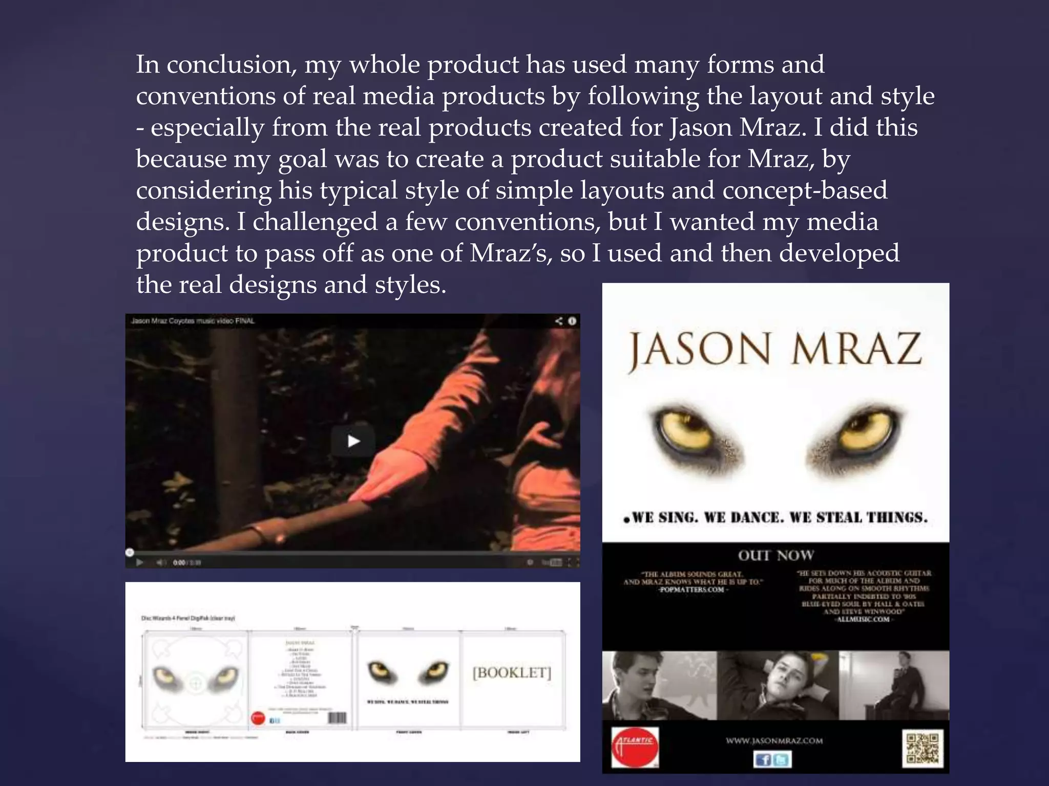
In conclusion, my whole product has used many forms and
conventions of real media products by following the layout and style
- especially from the real products created for Jason Mraz. I did this
because my goal was to create a product suitable for Mraz, by
considering his typical style of simple layouts and concept-based
designs. I challenged a few conventions, but I wanted my media
product to pass off as one of Mraz’s, so I used and then developed
the real designs and styles.

Q1

  • 1.
    { Q1) In whatways does your media product use, develop or challenge forms and conventions of real media products? Shannon Lewis
  • 2.
    To begin with,I researched in the basic types of music video styles that exist; this includes performance based, narrative based and concept based. Some real music videos use more than one of these conventions, such as Jason Mraz’s music video ‘I Won’t Give Up’, which is a performance and concept based video.
  • 3.
    Because I decidedto create a music video of one of Jason Mraz’s songs, I choose to make my video performance and concept based. This means using singing, dancing and random shots linking to the lyrics. This style fits Mraz well, as his song ‘Coyotes’ is rather up beat and the lyrics don’t show clear meaning behind them. Also I decided against narrative because I believed it would have been difficult to fit the song with a story, even though I had twelve votes for narrative and ten for concept on my questionnaire.
  • 4.
    Researching more intothe forms and conventions of music videos, I read up on a theorist called Andrew Goodwin. He published a book in 1992 named ‘Dancing in the Distraction Factory’, which mentions his theories on what are usually included in music videos. There are seven in total, including: showing genre characteristics, links between lyrics and visuals, links between music and visuals, close ups of artist(s), motifs and iconography, ‘looking’ and voyeuristic treatment to the female body, and intertextual references.
  • 5.
    I followed fourof these conventions in my product, and slightly challenge two. The ones I slightly challenged were motifs and iconography and voyeurism and intertextual references. I analysed quite a few of Mraz’s real music videos and noticed that there was always a scene or two where Mraz would be it the shadows with his figure or profile silhouetted. I challenged this by keeping my Mraz actor well lit up, but the coyotes as silhouettes instead. Originally I was going to follow the motif, but whilst filming I decided to just have him in the light. I felt there was too much darkness already with the other scenes, and also in the lyrics he openly says ‘We’re coming for you’, suggesting that there is no need for him to hide but there is for the coyotes. For challenging voyeurism, I included female dancers, but decided to keep them completely covered and act more childish: Blue coyote messing about, yellow coyote swinging on swing.
  • 6.
    Other than challengingthe theories, I basically followed the more popular ones but only to an extent. I decided to use more mid shots of the artist than close ups, as I wanted to show the contrast between the white wall and the dark clothing to highlight the suggestion that he is the ‘bad’ guy. There are also links between the dancing and music, and subtle hints between the visuals and lyrics. I used these typical conventions in music video, as I wanted to compliment the fast upbeat sound and the odd, conceptual lyrics.
  • 7.
    My music videouses similar techniques to some of the real Jason Mraz music videos, as it includes layering of footage to create an obscure image that’s not realistic or fully clear. In ‘I Won’t Give Up’, there is a shot of trees over an extreme close up of an eye, and in my music video there are tree branches covering a variety of shots. I did this to show foliage and camouflage, to suggest keeping hidden. There are also use of overlapping other clips, linking/ referring to a separate scene.
  • 8.
    Another feature Iliked from the music video ‘I Won’t Give Up’ is introduction the video with the song title. I felt as though this started off a story almost, even though my music video has no narrative.
  • 9.
    Conventions of Magazine Adverts •Nameof artist •Name of album •Logo or image that links to the album cover • A name of a well known song from the album – one that has been popular in the charts •Release dates •Can have tour dates •Website of the artist •Colour scheme that links with the album and /or artist •Reviews and ratings •Where it could be sold •Where it could be downloaded
  • 10.
    My magazine advertwas mainly influenced by the Jessie J advert for colours and layout. I wanted to have elements of the design to be centred such as the artist’s name, coyote eyes and the album title. This is to help gain a sophisticated and professional appearance. I included reviews as I believed it would help advertise how brilliant the product is. I was also inspired by a past student’s design, as they included a QR code to allow websites to be easily accessed. I also added the official Jason Mraz website address and also logo’s of social networking sites, informing the audience that they can find more information and be involved.
  • 11.
    My advert alsoincludes images of ‘Jason Mraz’ from the music video I created. I chose just to use black and white screenshots as it is the main colouring for the magazine advert, which is half white and half black. But I decided that I wanted to make another, more obvious connection to the ‘Coyotes’ music video, so included a screenshot of Mraz in a pair of coyote ears.
  • 12.
    Conventions of digipacks • Eye catching imagery (especially for the front cover) • Typically includes the artists name on the front cover(however some of Jason Mraz’s already existing digi packs don't include his name on the front cover) • Album title •A list of the tracks included on the dick on the back cover (usually numbered) •Includes logos of institutions and record labels on the back, along with copyright text. •Barcode •Websites the audience could visit (usually on the back) •The disc would usually include an image/ design •A booklet that included either:  lyrics of the songs Adverts to other CD’s Images Another list to the songs (maybe including extra information: producers)
  • 13.
    The Jessie Jposter also inspired the digi pack, as the Jessie J poster used the same image for the CD cover. However, I decided to follow some of the real Jason Mraz products conventions of keeping the imagery simple. Examples I was influenced by were ‘Love is a Four Letter Word’ and the real ‘We Sing. We Dance. We Steal Things’. This includes not mentioning the artists name, which makes the CD seem more humble compared to other CD designs: About the music not the name.
  • 14.
    For other featuresof the digi pack, I looked physically at real albums I had at home. I noticed that they all had booklets inside with information on the album and images to do with the artist/ band. From this, I decided to create a booklet that includes images relating to the song Coyotes and lyrics to each song that is on the album. On the back cover of the album I numerically listed the tracks, like I realised how they are listed on real albums. I also included the typical logos such as the institution and social websites. Behind the disc, I noticed that the albums that I have looked at included a faded image of either the front cover or an image that has already been used. Influenced by this, I used the coyote eyes again.
  • 15.
    In conclusion, mywhole product has used many forms and conventions of real media products by following the layout and style - especially from the real products created for Jason Mraz. I did this because my goal was to create a product suitable for Mraz, by considering his typical style of simple layouts and concept-based designs. I challenged a few conventions, but I wanted my media product to pass off as one of Mraz’s, so I used and then developed the real designs and styles.