Joshua Millington
 Promotional Poster Analysis

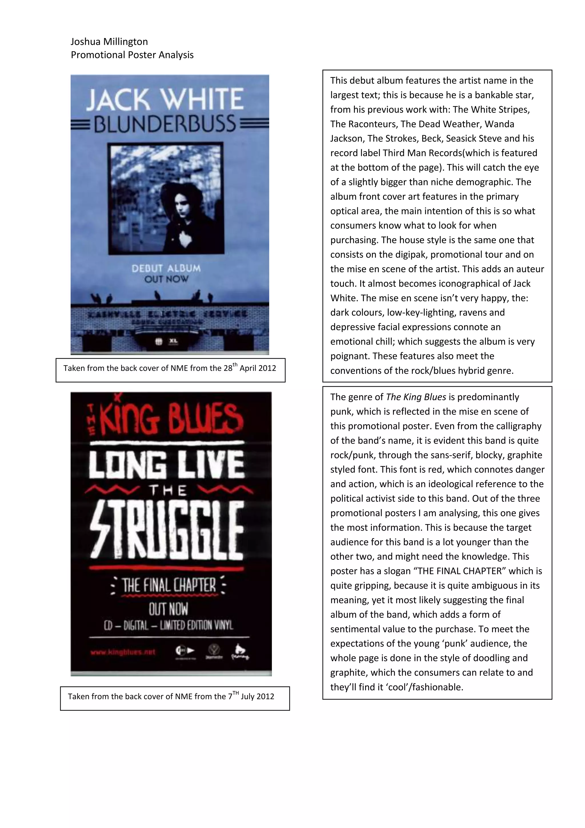
                                                          This debut album features the artist name in the
                                                          largest text; this is because he is a bankable star,
                                                          from his previous work with: The White Stripes,
                                                          The Raconteurs, The Dead Weather, Wanda
                                                          Jackson, The Strokes, Beck, Seasick Steve and his
                                                          record label Third Man Records(which is featured
                                                          at the bottom of the page). This will catch the eye
                                                          of a slightly bigger than niche demographic. The
                                                          album front cover art features in the primary
                                                          optical area, the main intention of this is so what
                                                          consumers know what to look for when
                                                          purchasing. The house style is the same one that
                                                          consists on the digipak, promotional tour and on
                                                          the mise en scene of the artist. This adds an auteur
                                                          touch. It almost becomes iconographical of Jack
                                                          White. The mise en scene isn’t very happy, the:
                                                          dark colours, low-key-lighting, ravens and
                                                          depressive facial expressions connote an
                                                          emotional chill; which suggests the album is very
                                                          poignant. These features also meet the
                                           th
Taken from the back cover of NME from the 28 April 2012   conventions of the rock/blues hybrid genre.

                                                          The genre of The King Blues is predominantly
                                                          punk, which is reflected in the mise en scene of
                                                          this promotional poster. Even from the calligraphy
                                                          of the band’s name, it is evident this band is quite
                                                          rock/punk, through the sans-serif, blocky, graphite
                                                          styled font. This font is red, which connotes danger
                                                          and action, which is an ideological reference to the
                                                          political activist side to this band. Out of the three
                                                          promotional posters I am analysing, this one gives
                                                          the most information. This is because the target
                                                          audience for this band is a lot younger than the
                                                          other two, and might need the knowledge. This
                                                          poster has a slogan “THE FINAL CHAPTER” which is
                                                          quite gripping, because it is quite ambiguous in its
                                                          meaning, yet it most likely suggesting the final
                                                          album of the band, which adds a form of
                                                          sentimental value to the purchase. To meet the
                                                          expectations of the young ‘punk’ audience, the
                                                          whole page is done in the style of doodling and
                                                          graphite, which the consumers can relate to and
                                           TH
                                                          they’ll find it ‘cool’/fashionable.
 Taken from the back cover of NME from the 7 July 2012
Joshua Millington
Promotional Poster Analysis


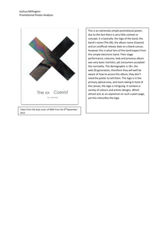
                                                        This is an extremely simple promotional poster,
                                                        due to the fact there is very little context or
                                                        concept, it is basically: the logo of the band, the
                                                        band’s name (The XX), the album name (Coexist)
                                                        and an unofficial release date on a blank canvas.
                                                        However this is what fans of the band expect from
                                                        this simple electronic band. Their stage
                                                        performance, costume, look and previous album
                                                        was very basic inartistic; yet consumers accepted
                                                        this normality. The demographic is 18+, the
                                                        web.20 generation, therefore they will well be
                                                        aware of how to access this album; they don’t
                                                        need the poster to tell them. The logo is in the
                                                        primary optical area, and more taking it most of
                                                        the canvas, the logo is intriguing. It contains a
                                                        variety of colours and artistic designs. Which
                                                        almost acts as an oxymoron on such a plain page,
                                                        yet this intensifies the logo.


                                         th
Taken from the back cover of NME from the 8 September
2012

Promotional poster anaylsis research

  • 1.
    Joshua Millington PromotionalPoster Analysis This debut album features the artist name in the largest text; this is because he is a bankable star, from his previous work with: The White Stripes, The Raconteurs, The Dead Weather, Wanda Jackson, The Strokes, Beck, Seasick Steve and his record label Third Man Records(which is featured at the bottom of the page). This will catch the eye of a slightly bigger than niche demographic. The album front cover art features in the primary optical area, the main intention of this is so what consumers know what to look for when purchasing. The house style is the same one that consists on the digipak, promotional tour and on the mise en scene of the artist. This adds an auteur touch. It almost becomes iconographical of Jack White. The mise en scene isn’t very happy, the: dark colours, low-key-lighting, ravens and depressive facial expressions connote an emotional chill; which suggests the album is very poignant. These features also meet the th Taken from the back cover of NME from the 28 April 2012 conventions of the rock/blues hybrid genre. The genre of The King Blues is predominantly punk, which is reflected in the mise en scene of this promotional poster. Even from the calligraphy of the band’s name, it is evident this band is quite rock/punk, through the sans-serif, blocky, graphite styled font. This font is red, which connotes danger and action, which is an ideological reference to the political activist side to this band. Out of the three promotional posters I am analysing, this one gives the most information. This is because the target audience for this band is a lot younger than the other two, and might need the knowledge. This poster has a slogan “THE FINAL CHAPTER” which is quite gripping, because it is quite ambiguous in its meaning, yet it most likely suggesting the final album of the band, which adds a form of sentimental value to the purchase. To meet the expectations of the young ‘punk’ audience, the whole page is done in the style of doodling and graphite, which the consumers can relate to and TH they’ll find it ‘cool’/fashionable. Taken from the back cover of NME from the 7 July 2012
  • 2.
    Joshua Millington Promotional PosterAnalysis This is an extremely simple promotional poster, due to the fact there is very little context or concept, it is basically: the logo of the band, the band’s name (The XX), the album name (Coexist) and an unofficial release date on a blank canvas. However this is what fans of the band expect from this simple electronic band. Their stage performance, costume, look and previous album was very basic inartistic; yet consumers accepted this normality. The demographic is 18+, the web.20 generation, therefore they will well be aware of how to access this album; they don’t need the poster to tell them. The logo is in the primary optical area, and more taking it most of the canvas, the logo is intriguing. It contains a variety of colours and artistic designs. Which almost acts as an oxymoron on such a plain page, yet this intensifies the logo. th Taken from the back cover of NME from the 8 September 2012