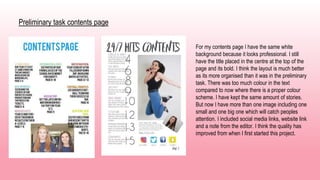
Media coursework
presentation
Question 1: In what ways does your media product use,
develop or challenge forms and conventions of real media
products?
This is another one of my
magazine research's on my
blog which is Q. Since I
wanted my magazine to be
a pop magazine but not as
cheesy as teenage ones, I
had to look at this one as
this was what I wanted
mine to be like. I wanted to
include both aspects of
both magazine styles into
the one I was going to
create.
This is my first
magazine research,
it is ‘we love pop’. I
looked at this
magazine because it
was the typical pop
magazine which I
could incorporate
into my design.
Although I didn’t
want mine to be as
bright and cheesy as
this one.
Front cover
Similar:
• Artists name position
• Stories placed on edges of page
• Model/s in the middle
• Shapes used under some stories
• Artist name goes over their picture
• Background colour/ colour scheme
Differences:
• Title placement
• Q has no barcode or price or date
• My magazine has less stories previewed
Develop:
• Include more stories on cover
• Make title bigger and bolder
• Add something to bottom right space
• Reposition title
Contents page
Similar:
• Title placement
• Picture placement
• Stories on the same side and the
same amount.
Different:
• Colour scheme
• Page number position
• I have social media links
• I included a note from the editor.
• Put my issue number on this page
not front cover.
Develop:
• Maybe have a bigger picture and
less stories
• Put my picture on an actual
background not just white.
Double page spread
Similar:
• One main image overlapping onto article
page like (Q)
• Artists name in top right corner like (Q)
• 3 column article
• Image in the middle (we love pop)
• Headline (we love pop)
• Quote
• Highlighted questions
• Page number
• Drop capital
Differences:
• Colour scheme
• Title position
• Image is in colour on my magazine
Develop:
• Make my coloured questions brighter
• Make quote bigger
• Put caption on picture in text
Question 2: How does your media product represent particular
social groups?
Age
Age is presented in my magazine by using young people for my models in my pictures.
My front cover picture shows young people to look a bit moody which is what older people perceive
them to be like, however my contents page and double page spread show the fun side to young
people which is what they're really like.
My contents page shows neve my
model jumping into the air with a
cheesy smile on her face, I have
also included a picture below that of
Catherine who looks more shy and
quiet but is still seen as friendly.
On my double page spread Abby and Grace
can be seen laughing, joking on in a good
picture which shows what their personalities are
like. It shows them being silly as if they were like
children again, showing they had fun on the
photoshoot.
Then it goes to another photo of grace and Abby
which is in the article of them looking serious
again, being mature like young adults. You can
see the smiles when you look long enough at the
picture.
Gender
My magazine has just images of women on it, I
was going to include a picture of a male model but
I forgot by the time I had come to the end of
improving my magazine. However, the girls in my
magazine represent being role models to the
people who read my magazine, whether they are
teenagers to adults.
Some of my other images that I took but didn’t include in my
magazine show the models to look powerful and happy. For
example these pictures does exactly that.
Young girls also look up to the girl group as inspiration and
like to read about how they have became famous and gotten
to where they have. They are nice girls, which is what parents
love to see their children looking up to them.
Question 3: What kind of media institution might distribute
your media product and why?
I would want the same distributors who distribute Q magazine to do the same for mine. This is because I have tried to make
my magazine very similar to Q as they had the style I wanted mine to be like. I tried to convey this the best that I can by
using the same layout styles, and the same picture styles.
The company who publish Q magazine is Bauer Media Group.
They're a European based media company, their
headquarters is in Hamburg Germany. They
manage more than 600 magazines and other
forms of media. They have a workforce of 11,000
employees in 17 countries.
They also publish Mojo and Kerrang which are
also popular music magazines.
I would want them to publish my magazine
because the ones they have already that I
know about which are music ones, are very
popular and successful which is what I want
mine to be like.
How I would advertise my magazine:
I would use the web and tv to advertise my magazine.
On the internet I would have sponsored adverts come up on
social media websites, which show my magazine and have
persuasive text next to it, including the price and who is in
the magazine to make people want to read it more by
seeing a popular artist.
Here is an
example of
some adverts on
Facebook,
which is a
popular website
so it will catch
peoples
attention.
Here is another 2 examples from Instagram and
twitter.
I would use the TV as a way to advertise my magazine by having a
short advert basically telling the viewer to ‘buy it now before its
gone’ to persuade them that its worth it and very popular so a lot of
people want to read it.
Another way I would advertise my magazine is on a bus stop on
the billboard bit. I would do this because a lot of people see bus
stops and see the adverts on the side of them, so I think this is a
good way to make my magazine be recognized and increase the
popularity of it.
Question 4: Who would be the audience for your media
product?
Name: Bridie
Age: 19
Favourite artist/s: My
favourite artists are Shawn
Mendes and Lady Gaga.
Name: Abby
Age: 20
Favourite artist/s: My
favourite artists are Adele
and Ed Sheeran.
Name: Catherine
Age: 18
Favourite artist/s: My
favourite artist is Shawn
Mendes.
Question 5: How did you attract/address your audience?
I produced a survey on a website called survey monkey,
where I asked my peers to fill it in for me so I could receive
results on how I should create my music magazine, what
colour themes I should use, what kind of photos, e.c.t.
This is what my survey
looked like when people
were answering it.
This is an example of 2 of the
final results from people
voting what they thought.
After I looked over all the results from my survey, the majority of them came to the results that I hoped for.
Therefor I have to do what makes the audience happy and use what they want to make the magazine
suitable for them and follow what my results say. Here are some examples of what I done.
Video feedback from peer:
Rough cut vs final version:
The main difference I can see straight away
is the quality of the pictures. On the rough
cut they are very dark and the models look
like they are in a bad mood and its not very
inviting to read. So for my final version I used
the studio in school and asked the models to
smile faintly not fully so it would look
effective. I also changed one models clothes
to make it look brighter and match colour
scheme.
The font wasn’t easy to read on the previous
clothes of the models either so I changed
that as well. I made the title bolder and
bigger, added a price to the barcode. Added
a date and issue number. And I also added
an extra story.
The first difference I can see is the
content layout. I think the stories all
being under each other with big page
numbers next to them look better than
how it was designed before. I have
changed the pictures and made one
big of a different model, and a second
smaller picture of a different model. I
have also included social media links
and a note from the editor.
I put a page number on there as well
like the magazines in my research
had. I also changed the title by making
the font more bold and having a new
one completely. The only thing I would
change about my final product is the
picture of my model jumping in the air,
I would of got her hand in the image
so it wasnt cut off.
For my final page I have changed the image and put the models in different clothes and a different pose, although this wasn’t
how I was going to have the image, I think it looks better than if I kept it just with a white background. I have added the
magazine name onto this page, I have changed all the font and I put a better picture in the middle of the text to break it all up. I
have kept the quote in the same place. I added a page number and I made the headline fill up the whole gap.
Overall I think my whole magazine looks much better now than what it did on my first rough cut.
Question 6: What have you learnt about technologies from the
process of constructing this product?
When I started the coursework I didn’t have good knowledge of using a camera, or studio lighting, I also didn’t
know how to use the software to edit our magazine on which were Photoshop and in design.
I didn’t know about all the things Photoshop could do, we were taught about all the
tools like clone stamp which can get rid of blemishes and smooth peoples skin out
for example and the magic wand, which will cut out anything in the photo that you
want or the magnetic tool which does the same thing. I used the magic wand to
cut out my double page spread image, it was quick and easy to use.
In design was very easy to use, I could figure out
the layout before starting my magazine which was
better than guessing where I wanted to put
everything by using templates. I could place
pictures and text into the templates and move them
around if I wanted to if I didn’t like the layout.
Lighting and camera:
I didn’t understand how important lighting was when I first started the music magazine, because when I
look at my rough cut pictures I can see how bad they look with bad lighting compared to now with better
lighting it improves the whole look of the magazine. That’s why I used the studio for the second
photoshoot I took so I had better quality images.
I can clearly see the difference straight away with
better lighting and a better set up. There's no
objects in the background of the picture and you
can see the models facial expressions clearer.
I didn’t know anything about the cameras we had to use, I didn’t know how to change the focus
or the shutter speed which I needed to know because with a lot of people using the cameras,
they would change the settings a lot so I would need to know what to do to change them back.
I also had to know how to set up a tripod so I could make sure the pictures weren’t blurry or
unstable.
Question 7: Looking back at your preliminary task what do you
feel you have learnt in the progression from it to the full
product?
Preliminary task front cover
My front cover has improved from my preliminary task
greatly. The image is good on the first task however
the background isn’t as there is too much going on
and the title isn’t very clear with the colour and where
its placed. The stories are all very spaced out and
small. There is no date or issue number on it. And its
very dull.
My final music magazine front cover is much better as
it’s a bright plain background focused on the models in
the centre of the image. The title is in the middle so its
clear, there is a date, issue, barcode and price. There
is more stories and they are longer than on the
preliminary task. Altogether I think I have developed
good editing skills throughout the coursework.
Preliminary task contents page
For my contents page I have the same white
background because it looks professional. I still
have the title placed in the centre at the top of the
page and its bold. I think the layout is much better
as its more organised than it was in the preliminary
task. There was too much colour in the text
compared to now where there is a proper colour
scheme. I have kept the same amount of stories.
But now I have more than one image including one
small and one big one which will catch peoples
attention. I included social media links, website link
and a note from the editor. I think the quality has
improved from when I first started this project.
Final product

Media presentation

  • 1.
  • 2.
    Question 1: Inwhat ways does your media product use, develop or challenge forms and conventions of real media products? This is another one of my magazine research's on my blog which is Q. Since I wanted my magazine to be a pop magazine but not as cheesy as teenage ones, I had to look at this one as this was what I wanted mine to be like. I wanted to include both aspects of both magazine styles into the one I was going to create. This is my first magazine research, it is ‘we love pop’. I looked at this magazine because it was the typical pop magazine which I could incorporate into my design. Although I didn’t want mine to be as bright and cheesy as this one.
  • 3.
    Front cover Similar: • Artistsname position • Stories placed on edges of page • Model/s in the middle • Shapes used under some stories • Artist name goes over their picture • Background colour/ colour scheme Differences: • Title placement • Q has no barcode or price or date • My magazine has less stories previewed Develop: • Include more stories on cover • Make title bigger and bolder • Add something to bottom right space • Reposition title
  • 4.
    Contents page Similar: • Titleplacement • Picture placement • Stories on the same side and the same amount. Different: • Colour scheme • Page number position • I have social media links • I included a note from the editor. • Put my issue number on this page not front cover. Develop: • Maybe have a bigger picture and less stories • Put my picture on an actual background not just white.
  • 5.
    Double page spread Similar: •One main image overlapping onto article page like (Q) • Artists name in top right corner like (Q) • 3 column article • Image in the middle (we love pop) • Headline (we love pop) • Quote • Highlighted questions • Page number • Drop capital Differences: • Colour scheme • Title position • Image is in colour on my magazine Develop: • Make my coloured questions brighter • Make quote bigger • Put caption on picture in text
  • 6.
    Question 2: Howdoes your media product represent particular social groups? Age Age is presented in my magazine by using young people for my models in my pictures. My front cover picture shows young people to look a bit moody which is what older people perceive them to be like, however my contents page and double page spread show the fun side to young people which is what they're really like. My contents page shows neve my model jumping into the air with a cheesy smile on her face, I have also included a picture below that of Catherine who looks more shy and quiet but is still seen as friendly.
  • 7.
    On my doublepage spread Abby and Grace can be seen laughing, joking on in a good picture which shows what their personalities are like. It shows them being silly as if they were like children again, showing they had fun on the photoshoot. Then it goes to another photo of grace and Abby which is in the article of them looking serious again, being mature like young adults. You can see the smiles when you look long enough at the picture.
  • 8.
    Gender My magazine hasjust images of women on it, I was going to include a picture of a male model but I forgot by the time I had come to the end of improving my magazine. However, the girls in my magazine represent being role models to the people who read my magazine, whether they are teenagers to adults. Some of my other images that I took but didn’t include in my magazine show the models to look powerful and happy. For example these pictures does exactly that. Young girls also look up to the girl group as inspiration and like to read about how they have became famous and gotten to where they have. They are nice girls, which is what parents love to see their children looking up to them.
  • 9.
    Question 3: Whatkind of media institution might distribute your media product and why? I would want the same distributors who distribute Q magazine to do the same for mine. This is because I have tried to make my magazine very similar to Q as they had the style I wanted mine to be like. I tried to convey this the best that I can by using the same layout styles, and the same picture styles. The company who publish Q magazine is Bauer Media Group. They're a European based media company, their headquarters is in Hamburg Germany. They manage more than 600 magazines and other forms of media. They have a workforce of 11,000 employees in 17 countries. They also publish Mojo and Kerrang which are also popular music magazines. I would want them to publish my magazine because the ones they have already that I know about which are music ones, are very popular and successful which is what I want mine to be like.
  • 10.
    How I wouldadvertise my magazine: I would use the web and tv to advertise my magazine. On the internet I would have sponsored adverts come up on social media websites, which show my magazine and have persuasive text next to it, including the price and who is in the magazine to make people want to read it more by seeing a popular artist. Here is an example of some adverts on Facebook, which is a popular website so it will catch peoples attention. Here is another 2 examples from Instagram and twitter.
  • 11.
    I would usethe TV as a way to advertise my magazine by having a short advert basically telling the viewer to ‘buy it now before its gone’ to persuade them that its worth it and very popular so a lot of people want to read it. Another way I would advertise my magazine is on a bus stop on the billboard bit. I would do this because a lot of people see bus stops and see the adverts on the side of them, so I think this is a good way to make my magazine be recognized and increase the popularity of it.
  • 12.
    Question 4: Whowould be the audience for your media product? Name: Bridie Age: 19 Favourite artist/s: My favourite artists are Shawn Mendes and Lady Gaga. Name: Abby Age: 20 Favourite artist/s: My favourite artists are Adele and Ed Sheeran. Name: Catherine Age: 18 Favourite artist/s: My favourite artist is Shawn Mendes.
  • 13.
    Question 5: Howdid you attract/address your audience? I produced a survey on a website called survey monkey, where I asked my peers to fill it in for me so I could receive results on how I should create my music magazine, what colour themes I should use, what kind of photos, e.c.t. This is what my survey looked like when people were answering it. This is an example of 2 of the final results from people voting what they thought.
  • 14.
    After I lookedover all the results from my survey, the majority of them came to the results that I hoped for. Therefor I have to do what makes the audience happy and use what they want to make the magazine suitable for them and follow what my results say. Here are some examples of what I done.
  • 15.
  • 16.
    Rough cut vsfinal version: The main difference I can see straight away is the quality of the pictures. On the rough cut they are very dark and the models look like they are in a bad mood and its not very inviting to read. So for my final version I used the studio in school and asked the models to smile faintly not fully so it would look effective. I also changed one models clothes to make it look brighter and match colour scheme. The font wasn’t easy to read on the previous clothes of the models either so I changed that as well. I made the title bolder and bigger, added a price to the barcode. Added a date and issue number. And I also added an extra story.
  • 17.
    The first differenceI can see is the content layout. I think the stories all being under each other with big page numbers next to them look better than how it was designed before. I have changed the pictures and made one big of a different model, and a second smaller picture of a different model. I have also included social media links and a note from the editor. I put a page number on there as well like the magazines in my research had. I also changed the title by making the font more bold and having a new one completely. The only thing I would change about my final product is the picture of my model jumping in the air, I would of got her hand in the image so it wasnt cut off.
  • 18.
    For my finalpage I have changed the image and put the models in different clothes and a different pose, although this wasn’t how I was going to have the image, I think it looks better than if I kept it just with a white background. I have added the magazine name onto this page, I have changed all the font and I put a better picture in the middle of the text to break it all up. I have kept the quote in the same place. I added a page number and I made the headline fill up the whole gap. Overall I think my whole magazine looks much better now than what it did on my first rough cut.
  • 19.
    Question 6: Whathave you learnt about technologies from the process of constructing this product? When I started the coursework I didn’t have good knowledge of using a camera, or studio lighting, I also didn’t know how to use the software to edit our magazine on which were Photoshop and in design. I didn’t know about all the things Photoshop could do, we were taught about all the tools like clone stamp which can get rid of blemishes and smooth peoples skin out for example and the magic wand, which will cut out anything in the photo that you want or the magnetic tool which does the same thing. I used the magic wand to cut out my double page spread image, it was quick and easy to use. In design was very easy to use, I could figure out the layout before starting my magazine which was better than guessing where I wanted to put everything by using templates. I could place pictures and text into the templates and move them around if I wanted to if I didn’t like the layout.
  • 20.
    Lighting and camera: Ididn’t understand how important lighting was when I first started the music magazine, because when I look at my rough cut pictures I can see how bad they look with bad lighting compared to now with better lighting it improves the whole look of the magazine. That’s why I used the studio for the second photoshoot I took so I had better quality images. I can clearly see the difference straight away with better lighting and a better set up. There's no objects in the background of the picture and you can see the models facial expressions clearer. I didn’t know anything about the cameras we had to use, I didn’t know how to change the focus or the shutter speed which I needed to know because with a lot of people using the cameras, they would change the settings a lot so I would need to know what to do to change them back. I also had to know how to set up a tripod so I could make sure the pictures weren’t blurry or unstable.
  • 21.
    Question 7: Lookingback at your preliminary task what do you feel you have learnt in the progression from it to the full product? Preliminary task front cover My front cover has improved from my preliminary task greatly. The image is good on the first task however the background isn’t as there is too much going on and the title isn’t very clear with the colour and where its placed. The stories are all very spaced out and small. There is no date or issue number on it. And its very dull. My final music magazine front cover is much better as it’s a bright plain background focused on the models in the centre of the image. The title is in the middle so its clear, there is a date, issue, barcode and price. There is more stories and they are longer than on the preliminary task. Altogether I think I have developed good editing skills throughout the coursework.
  • 22.
    Preliminary task contentspage For my contents page I have the same white background because it looks professional. I still have the title placed in the centre at the top of the page and its bold. I think the layout is much better as its more organised than it was in the preliminary task. There was too much colour in the text compared to now where there is a proper colour scheme. I have kept the same amount of stories. But now I have more than one image including one small and one big one which will catch peoples attention. I included social media links, website link and a note from the editor. I think the quality has improved from when I first started this project.
  • 23.