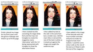
SCREENSHOTS AND
ANALYSIS
Firstly I placed my image
for my front cover onto
the grid on InDesign and
lined it up to fit the page.
I then created my title
consisting of a large white
font and then two red
triangles to create the
magazines name
‘alternative’ with the ‘a’s’
being represented with
triangles to show the
alternative theme.
I then added my text to
the side in the same font
but a smaller size, I did the
main titles in red and the
rest of the text in white so
it stood out against the
image and caught the
audiences eye.
I then added in the image
of the barcode with the
issue number and date
and price to make my
magazine look more
realistic. I used the same
colour code as the rest of
the text so it fitted in with
the rest of the magazine.
I finally added the artists
name in a larger font so
people new this was the
main article and was
important. I also then added
the win tickets box and used
white background so it stood
out and grabbed the
audiences attention.
I added my title using
the same font as the
front cover so they
linked and also used the
triangle as the ‘a’ so it
also kept the same
theme running through
the magazine.
I then added my page
numbers and contents
keeping with the same
font and same colours
so the magazine looked
professional and
matched well.
I then added the final pictures
with their page numbers to
also create anchorage
between the image and the
text and made these images
smaller to make sure they did
not take attention away from
the main image.
I next added my first
photo and large page
number to create
anchorage between
the image and the
text. This image is the
biggest as it is the
main one.
I put my image as the
background so I would then be
able to put the text on top of it.
I then added my title as the
groups name in wrote so it
stood out and overlapped the 3
slightly so make it more stylish.
I then added my article in
columns and put a slug at the
bottom to make it more
realistic. Ii did the text black on
a white background so it would
stand out.
I finally added my hanging indent so it conformed
to how most magazines display their articles.

Screen shots offcila

  • 1.
  • 2.
    Firstly I placedmy image for my front cover onto the grid on InDesign and lined it up to fit the page. I then created my title consisting of a large white font and then two red triangles to create the magazines name ‘alternative’ with the ‘a’s’ being represented with triangles to show the alternative theme. I then added my text to the side in the same font but a smaller size, I did the main titles in red and the rest of the text in white so it stood out against the image and caught the audiences eye. I then added in the image of the barcode with the issue number and date and price to make my magazine look more realistic. I used the same colour code as the rest of the text so it fitted in with the rest of the magazine.
  • 3.
    I finally addedthe artists name in a larger font so people new this was the main article and was important. I also then added the win tickets box and used white background so it stood out and grabbed the audiences attention.
  • 4.
    I added mytitle using the same font as the front cover so they linked and also used the triangle as the ‘a’ so it also kept the same theme running through the magazine. I then added my page numbers and contents keeping with the same font and same colours so the magazine looked professional and matched well. I then added the final pictures with their page numbers to also create anchorage between the image and the text and made these images smaller to make sure they did not take attention away from the main image. I next added my first photo and large page number to create anchorage between the image and the text. This image is the biggest as it is the main one.
  • 5.
    I put myimage as the background so I would then be able to put the text on top of it. I then added my title as the groups name in wrote so it stood out and overlapped the 3 slightly so make it more stylish. I then added my article in columns and put a slug at the bottom to make it more realistic. Ii did the text black on a white background so it would stand out.
  • 6.
    I finally addedmy hanging indent so it conformed to how most magazines display their articles.